Categories
Website

Website Accessibility How To for Business Owners

Struggling to make your website truly accessible can feel daunting for small to medium-sized businesses in New Zealand. When you rely solely on automated checks, hidden usability issues often slip through unnoticed, affecting users with disabilities. The most effective accessibility solutions combine machine-driven scans and real person testing, as recommended by experts from Harvard and Yale. Discover how a balanced approach delivers lasting improvements in inclusive digital design for compliance, better user experiences, and broader market reach.

Table of Contents

Quick Summary

Key InsightExplanation
1. Regularly assess website accessibilityConduct ongoing evaluations using automated tools and manual testing to identify accessibility barriers for all users.
2. Implement accessible design featuresPrioritise high contrast, legible typography, and keyboard navigability to enhance usability for users with diverse abilities.
3. Optimise media and interactive elementsEnsure all media has captions and transcripts; interactive elements must be accessible via keyboards and screen readers.
4. Validate accessibility with diverse testingCombine automated scans with user testing involving individuals with disabilities to uncover nuanced accessibility issues.
5. Maintain continuous accessibility updatesEstablish a routine for regular audits and updates to keep your website compliant with evolving accessibility standards.

Step 1: Assess your current website accessibility

Website accessibility begins with a comprehensive evaluation of your existing digital platform. Understanding how users with diverse abilities interact with your website is crucial for creating an inclusive online experience.

To conduct a thorough accessibility assessment, you’ll want to leverage both automated tools and manual testing techniques. Accessibility testing methods recommended by digital experts involve a multi-step approach:

  • Run automated accessibility scanning tools
  • Perform manual keyboard navigation checks
  • Test with screen readers
  • Review colour contrast and visual design
  • Evaluate mobile responsiveness

Automated tools can quickly identify code-level issues, flagging potential barriers like missing alt text, improper heading structures, and colour contrast problems. These tools provide immediate insights into areas requiring improvement.

Manual testing allows you to experience your website from different user perspectives. By navigating your site using only a keyboard or testing with screen reading software, you’ll discover nuanced accessibility challenges that automated tools might miss.

Here’s how manual and automated accessibility testing compare:

AspectManual TestingAutomated Tools
Type of Issues FoundUser experience challengesCode-level accessibility errors
Required ExpertiseHuman judgement and empathyTechnical knowledge of standards
Speed of ExecutionSlower, detailed reviewFast, broad scanning
Best Use CaseIdentifying nuanced issuesDetecting widespread errors quickly
LimitationMay miss hidden code errorsMisses user interaction challenges

Accessibility is not a one-time task but an ongoing commitment to inclusive digital design.

Net Branding recommends business owners approach website accessibility as a continuous improvement process, regularly reviewing and updating their digital platforms to ensure maximum inclusivity.

Pro tip: Consider engaging users with disabilities during your testing process to gain authentic insights into potential navigation challenges.

Step 2: Implement accessible website design features

Creating an accessible website requires thoughtful design strategies that accommodate users with diverse abilities. Accessible design principles emphasise creating digital experiences that are perceivable, operable, and inclusive for everyone.

Key accessible design features include:

  • Maintaining high colour contrast ratios
  • Using clear and legible typography
  • Providing alternative text for images
  • Ensuring keyboard navigability
  • Designing consistent page layouts
  • Implementing scalable text options
  • Creating descriptive link texts

Prioritising visual legibility involves selecting fonts and colour schemes that remain readable across different devices and visual capabilities. For instance, using sans-serif fonts with adequate sizing and ensuring sufficient contrast between text and background colours can dramatically improve readability for users with visual impairments.

Accessibility is about creating digital experiences that work for everyone, regardless of their abilities.

Net Branding recommends adopting the Web Content Accessibility Guidelines as a comprehensive framework for inclusive design. These guidelines provide structured recommendations for developing websites that are perceivable, operable, understandable, and robust.

Designer adjusts accessible web design features

Pro tip: Test your website’s accessibility using multiple screen readers and assistive technologies to gain comprehensive insights into potential user experience barriers.

Step 3: Optimise media and interactive elements

Ensuring your website’s media and interactive components are universally accessible is crucial for creating an inclusive digital experience. Accessible digital tools require strategic design that accommodates users with diverse abilities.

Key strategies for media and interactive element optimisation include:

  • Adding captions to all video content
  • Providing audio transcripts
  • Ensuring keyboard navigability for interactive elements
  • Creating descriptive alternative text for images
  • Implementing clear focus states for interactive controls
  • Designing compatibility with screen reading technologies
  • Maintaining consistent interaction patterns

Optimising multimedia accessibility involves more than simply adding captions. You need to consider how users with different abilities interact with your content. For example, video players should have controls that are operable through keyboard navigation and provide comprehensive audio descriptions for visually impaired users.

Accessibility is not an afterthought but a fundamental design principle that ensures digital inclusivity.

Net Branding recommends following Web Content Accessibility Guidelines to comprehensively address interactive element design. These guidelines provide a structured approach to creating digital experiences that work for everyone.

Pro tip: Conduct regular accessibility audits using assistive technologies to continuously improve your website’s interactive experience.

Step 4: Validate accessibility with tools and user testing

Validating website accessibility requires a comprehensive approach that combines automated scanning and human-centric testing methods. Accessibility validation strategies involve multiple assessment techniques to uncover potential barriers for users with diverse abilities.

Critical validation steps include:

  • Running automated accessibility scanning tools
  • Performing manual keyboard navigation tests
  • Testing with screen reader technologies
  • Conducting user testing with individuals with disabilities
  • Reviewing WCAG compliance checklist
  • Checking colour contrast ratios
  • Verifying alternative text descriptions

Comprehensive testing goes beyond automated tools. While digital scanning platforms can quickly identify technical issues, they cannot fully replicate the nuanced user experience. Engaging real users with different abilities provides invaluable insights into potential navigation challenges and interaction barriers.

Effective accessibility validation requires both technological assessment and human perspective.

Net Branding recommends multi-method accessibility testing that integrates automated scanning, manual review, and direct user feedback. This holistic approach ensures your digital platform remains inclusive and user-friendly.

Pro tip: Create a recurring accessibility audit schedule to continuously monitor and improve your website’s usability for all users.

Infographic showing key steps for website accessibility

Step 5: Maintain accessibility through ongoing updates

Ensuring your website remains accessible is a continuous process that demands consistent attention and strategic planning. Accessibility maintenance practices involve integrating digital inclusivity into every stage of your website’s lifecycle.

Key ongoing maintenance strategies include:

  • Scheduling regular accessibility audits
  • Updating content with inclusive language
  • Reviewing and testing new website features
  • Training staff on accessibility standards
  • Monitoring technological changes
  • Updating assistive technology compatibility
  • Documenting accessibility improvements

Proactive accessibility management requires more than periodic checks. Your digital platform should evolve continuously, adapting to emerging technologies and changing user needs. This means regularly reviewing your website’s design, functionality, and content to ensure ongoing compliance with the latest Web Content Accessibility Guidelines.

Accessibility is a journey of continuous improvement, not a destination to be reached.

Net Branding recommends developing sustainable accessibility processes that integrate inclusive design principles into your standard website maintenance workflow. This approach helps prevent accessibility decay and demonstrates your commitment to digital inclusivity.

Below is a summary of accessibility maintenance responsibilities:

RoleKey ResponsibilityBusiness Benefit
Web AdministratorSchedule regular auditsEnsures ongoing compliance
Content EditorUse inclusive languageImproves user engagement
DesignerUpdate visual elements for accessibilityEnhances brand reputation
DeveloperTest new features for accessibilityPrevents costly future rework
Staff TrainerProvide accessibility educationBuilds organisational capacity

Pro tip: Create a dedicated accessibility checklist and assign responsibility to a team member to ensure consistent and systematic updates.

Make Your Website Truly Accessible and Engaging Today

Struggling with website accessibility challenges like poor keyboard navigation or inadequate alt text can hold back your business from reaching a wider audience. This article highlights crucial concepts such as the importance of manual testing, following WCAG guidelines, and ongoing accessibility maintenance — all essential to delivering inclusive digital experiences. If you want to transform these insights into a practical, user-friendly website your customers can easily access and engage with, expert assistance is just a click away.

https://responsivewebsitedesign.co.nz

Explore how our tailored WordPress design and development services can help you implement these vital accessibility features effectively. Visit our Website Archives for helpful resources and start with our comprehensive solutions at https://responsivewebsitedesign.co.nz. Ensure your website stands out with enhanced usability, responsiveness, and SEO optimisation tailored specifically for New Zealand businesses. Don’t let accessibility hurdles stop your growth. Partner with us now to build an inclusive online presence designed to support your business objectives and customer needs.

Frequently Asked Questions

How can I assess the current accessibility of my website?

To assess your website’s accessibility, conduct both automated scans and manual testing. Start by running accessibility scanning tools and then perform manual checks using keyboard navigation and screen readers to identify areas for improvement.

What are key features of accessible web design for my business?

Key features of accessible web design include high colour contrast ratios, clear typography, and alternative text for images. Prioritise these aspects in your design to ensure your website is easy to use for everyone, particularly those with disabilities.

How can I optimise multimedia content for accessibility?

Optimise multimedia content by adding captions to videos, providing audio transcripts, and ensuring all interactive elements are navigable via keyboard. Implement these strategies to make your digital content accessible to a wider audience.

What steps should I take to validate the accessibility of my website?

To validate your website’s accessibility, combine automated scanning tools with user testing involving individuals with disabilities. Conduct these assessments regularly to uncover potential barriers and make necessary adjustments to enhance user experience.

How can I maintain website accessibility over time?

Maintain website accessibility by scheduling regular audits, updating content with inclusive language, and training your team on accessibility standards. Establish a recurring schedule, aiming for at least quarterly reviews, to ensure your site remains user-friendly and compliant.

What roles should be assigned to ensure ongoing accessibility?

Assign specific roles, such as a Web Administrator for audit scheduling and a Designer for updating visual elements. Clearly define responsibilities to create an effective team dedicated to maintaining accessibility, which can improve overall user engagement.

Categories
Website

Why Invest in Mobile Optimisation for NZ SMEs

Rows of customers scrolling and shopping on their phones have become the norm for retail businesses across New Zealand. If your WordPress website fails to deliver a responsive website design, you risk frustrating shoppers and losing out on valuable sales. Mobile optimisation goes beyond shrinking your site to fit a smaller screen. This article outlines actionable strategies for crafting seamless, fast-loading mobile experiences that boost visibility and customer engagement where it matters most.

Table of Contents

Key Takeaways

PointDetails
Importance of Mobile OptimisationMobile optimisation is crucial for New Zealand SMEs to enhance user experience and digital presence across different devices.
Types of Mobile Optimisation SolutionsBusinesses should consider responsive, adaptive, dedicated mobile sites, or progressive web apps based on their specific needs.
Impact on User EngagementEffective mobile optimisation fosters faster loading times and intuitive navigation, significantly boosting user engagement and retention.
SEO BenefitsImplementing mobile optimisation strategies enhances local search visibility and improves website rankings, driving organic traffic for SMEs.

Mobile optimisation explained for websites

Mobile optimisation represents a critical strategy for New Zealand small and medium enterprises (SMEs) seeking to enhance their digital presence and user experience. At its core, mobile optimisation involves designing websites that seamlessly adapt to various mobile device screens, ensuring content remains readable, accessible, and functionally engaging across smartphones and tablets.

The fundamental goal of mobile optimisation is to create a responsive website design that automatically adjusts layout, images, and functionality based on the user’s screen size. Mobile-friendly design principles emphasise creating digital experiences that work efficiently across different devices and platforms. This approach goes beyond simply shrinking desktop content – it requires strategic reimagining of how information is presented and interacted with on smaller screens.

Key components of effective mobile optimisation include:

  • Flexible grid layouts that reorganise content dynamically
  • Scalable images that maintain quality at different resolutions
  • Touch-friendly navigation elements
  • Simplified menu structures
  • Fast loading speeds optimised for mobile networks
  • Readable font sizes that don’t require zooming

Net Branding recognises that mobile optimisation isn’t just about technical implementation – it’s about creating intuitive, user-centric digital experiences. Websites must load quickly, be easy to navigate with fingers, and present information clearly without overwhelming mobile users.

Pro tip: Test your website’s mobile responsiveness using free online tools to identify potential user experience barriers and improvement opportunities.

Types of mobile optimisation solutions

Mobile optimisation encompasses several strategic approaches designed to enhance website performance and user experience across different mobile devices. Mobile optimisation techniques primarily include three fundamental solutions that New Zealand SMEs can implement to improve their digital presence.

The primary types of mobile optimisation solutions are:

  • Responsive Web Design: A fluid approach where website layouts automatically adapt to different screen sizes and orientations
  • Adaptive Web Design: Uses predefined layout configurations for specific device types
  • Dedicated Mobile Sites: Separate websites specifically designed for mobile users
  • Progressive Web Apps (PWAs): Advanced web applications offering app-like experiences directly through browsers

Each solution offers unique advantages for businesses seeking to create compelling mobile experiences. Mobile-friendly design strategies emphasise creating intuitive interfaces that prioritise user navigation, readability, and performance across various devices.

Net Branding recognises that selecting the right mobile optimisation solution depends on specific business requirements, target audience, and technical infrastructure. Responsive design remains the most versatile option, providing consistent user experiences without maintaining multiple site versions.

Below is a comparison of mobile optimisation solutions to help businesses choose the best approach:

Solution TypeMaintenance NeedsUser Experience QualityImplementation Cost Level
Responsive Web DesignLow ongoing effortConsistent across devicesModerate, one-time expense
Adaptive Web DesignMedium, updates requiredCustom for device segmentsHigher due to complexity
Dedicated Mobile SitesHigh, two sites to updateOptimised for mobile onlyCostly, separate development
Progressive Web AppsModerate, frequent updatesApp-like, offline accessVariable, can be substantial

Pro tip: Conduct comprehensive user testing across multiple devices to determine which mobile optimisation solution best suits your specific business needs.

How mobile optimisation boosts user engagement

Mobile optimisation represents a critical strategy for transforming user interactions and driving meaningful engagement across digital platforms. User retention strategies demonstrate that personalised mobile experiences significantly influence customer satisfaction and loyalty for New Zealand small businesses.

Key ways mobile optimisation enhances user engagement include:

  • Faster website loading speeds
  • Intuitive, touch-friendly navigation
  • Personalised content delivery
  • Seamless cross-device experiences
  • Reduced friction in user interactions
  • Improved visual accessibility

Performance metrics play a crucial role in understanding engagement. Mobile app performance research confirms that well-optimised websites dramatically reduce user abandonment rates by creating smoother, more responsive digital experiences.

Customer browses mobile site in Wellington cafe

Net Branding recognises that modern consumers expect instant, seamless digital interactions. By implementing strategic mobile optimisation techniques, businesses can create compelling user experiences that not only attract but also retain customers across various digital touchpoints.

Pro tip: Implement regular user experience testing and analyse mobile performance metrics to continuously refine your website’s mobile engagement strategy.

SEO and search benefits for NZ businesses

Search engine optimisation has become increasingly critical for New Zealand businesses seeking digital visibility. Mobile-first SEO strategies demonstrate that local businesses can significantly improve their online presence by implementing targeted mobile optimisation techniques.

Key SEO benefits for New Zealand businesses include:

  • Enhanced local search visibility
  • Improved website ranking on Google
  • Higher organic traffic generation
  • Increased mobile user engagement
  • Better conversion rates
  • Competitive advantage in digital marketplaces

Net Branding understands that SEO evolution in New Zealand requires businesses to adapt continuously. AI-powered search engines and mobile-first indexing are transforming how consumers discover and interact with local businesses, making technical SEO expertise more crucial than ever.

Infographic showing mobile optimisation benefits

The most successful New Zealand businesses recognise that SEO is not just about keywords, but about creating comprehensive, authoritative content that genuinely serves user intent across multiple digital platforms.

This summary highlights the impact of mobile optimisation on business outcomes:

Benefit AreaMeasurable ImpactTypical Result for SMEs
User EngagementIncreased average session durationImproved customer retention
SEO PerformanceHigher mobile search rankingsGreater local traffic influx
Conversion RatesReduced bounce and exit ratesMore purchases and enquiries
Brand PerceptionEnhanced mobile brand imageMore positive customer feedback

Pro tip: Regularly audit your website’s mobile SEO performance and update your content strategy to align with emerging AI-driven search trends.

Costs, risks, and common mistakes

Mobile optimisation involves strategic investments and potential pitfalls that New Zealand small businesses must carefully navigate. Mobile design research highlights critical risks associated with poor implementation that can significantly impact digital performance.

Common mobile optimisation mistakes include:

  • Ignoring responsive design principles
  • Overloading mobile pages with heavy graphics
  • Neglecting page loading speed
  • Using non-adaptive design templates
  • Inconsistent cross-device user experiences
  • Complex navigation structures

Financial considerations for mobile optimisation range from modest investments to more comprehensive digital transformation projects. Businesses typically face expenses related to:

  1. Website redesign and development
  2. Performance testing and optimization
  3. Ongoing technical maintenance
  4. Mobile-specific content creation
  5. Analytics and monitoring tools

Net Branding understands that while upfront costs might seem challenging, the long-term benefits of mobile optimization far outweigh initial investments. Implementing strategic mobile solutions can prevent potential revenue losses caused by poor digital experiences.

Pro tip: Conduct a comprehensive mobile performance audit before investing to identify specific optimization needs and potential cost-saving opportunities.

Unlock Your Business Potential with Expert Mobile Optimisation

Mobile optimisation remains a critical challenge for New Zealand SMEs striving to improve user engagement and search engine rankings. If your website struggles with slow loading speeds, complicated navigation, or inconsistent experiences across devices then tailored mobile solutions are the key. Your goal is clear: create a responsive, fast, and intuitive platform that delights customers and improves SEO performance.

https://responsivewebsitedesign.co.nz

At ResponsiveWebsiteDesign, we specialise in crafting WordPress websites that are fully mobile responsive and customised to meet your business objectives. Explore our reliable Website Archives for insights into creating visually engaging and high-performing sites. Don’t let poor mobile optimisation hold your business back. Take the first step towards lasting digital success today by partnering with experts focused on your unique needs and growth. Learn more about boosting your visibility with proven SEO strategies or start your transformation now by visiting https://responsivewebsitedesign.co.nz.

Frequently Asked Questions

What is mobile optimisation for websites?

Mobile optimisation involves designing websites that adapt seamlessly to various mobile device screens, enhancing readability, accessibility, and user engagement across smartphones and tablets.

Why is mobile optimisation important for small businesses?

Mobile optimisation is crucial for small businesses because it improves user experience, enhances search engine visibility, and drives higher engagement and conversion rates among mobile users.

What are the primary types of mobile optimisation solutions?

The main types of mobile optimisation solutions include responsive web design, adaptive web design, dedicated mobile sites, and progressive web apps (PWAs), each offering unique advantages based on business needs.

How does mobile optimisation impact SEO?

Effective mobile optimisation boosts SEO by improving local search visibility, increasing website rankings on search engines, and enhancing overall user engagement, thus driving higher organic traffic and conversion rates.

Categories
Website

Why Choose Professional Design for Business Success

Standing out in the crowded New Zealand market often feels impossible when your website design falls short. For small and medium business owners, losing potential customers to confusing navigation or slow-loading pages can be both frustrating and costly. Investing in professional design means transforming your website into a strategic asset that combines technical expertise, universal design principles, and compelling visuals to create a seamless eCommerce experience and build lasting trust with your audience.

Table of Contents

Key Takeaways

PointDetails
Professional Design as a Strategic AssetInvesting in professional design enhances business communication and strengthens brand perception.
Impact on User ExperienceQuality design improves user interaction, leading to higher customer satisfaction and loyalty.
Long-Term ROI of DesignProfessional design ensures brand consistency and higher returns by minimizing future fixes and enhancing user engagement.
Avoiding Design PitfallsSkimping on design can result in significant hidden costs, negatively affecting conversion rates and brand credibility.

What Sets Professional Design Apart

Professional design transcends basic visual creation, representing a strategic approach that transforms business communication and user experience. Unlike amateur designs, professional designers combine artistic skill with strategic understanding to deliver impactful visual solutions.

Professional designers distinguish themselves through several critical capabilities:

  • Comprehensive user understanding through universal design principles
  • Strategic visual communication aligned with business objectives
  • Technical expertise in layout, color theory, and typography
  • Ability to create inclusive designs serving diverse audiences

The hallmark of professional design lies in its intentionality. Where amateur designs might look attractive, professional designs are crafted to achieve specific business goals. Graphic designers create visual concepts that communicate ideas effectively, inspiring and captivating consumers through carefully selected elements.

Professional designers invest significantly in understanding target audiences. They meticulously analyse cultural contexts, user demographics, and psychological triggers to develop designs that resonate deeply. This approach ensures visual communication is not just aesthetically pleasing but strategically powerful.

Professional design transforms visual communication from decoration to strategic business asset.

Key technical differentiators include advanced skills in:

  1. Sophisticated layout techniques
  2. Precise color psychology application
  3. Advanced typography selection
  4. Responsive design principles

Net Branding recognises that professional design goes beyond mere aesthetics. It’s about creating visual narratives that connect emotionally with target audiences while meeting precise business communication objectives.

Pro Tip: Invest in professional design as a strategic business tool, not just a visual enhancement.

How Expert Design Drives Business Growth

Business growth in today’s competitive landscape demands more than traditional marketing strategies. Expert design emerges as a powerful catalyst for organisational advancement, transforming visual communication into a strategic business tool.

Professional design drives business growth through several critical mechanisms:

  • Design-led innovation that opens new market opportunities
  • Enhanced customer engagement through strategic visual storytelling
  • Improved product-market alignment
  • Differentiation from competitors through unique visual identity

By implementing human-centered design principles, businesses can create solutions that directly address customer needs. This approach goes beyond aesthetic appeal, focusing on developing products and services that solve real-world problems efficiently.

The strategic impact of expert design is multifaceted. Professional designers analyse market trends, user behaviours, and psychological triggers to create visual communications that resonate deeply with target audiences. This nuanced understanding enables businesses to communicate more effectively, build stronger brand connections, and ultimately drive revenue growth.

Expert design transforms business communication from a cost centre to a strategic growth engine.

Key growth strategies through professional design include:

  1. Developing intuitive user interfaces
  2. Creating memorable brand experiences
  3. Simplifying complex information
  4. Generating emotional connections with customers

Net Branding understands that design is not just about looking good—it’s about creating meaningful connections that translate directly into business performance and market success.

Designer working at messy creative desk

Pro Tip: Treat design as a strategic investment, not just a visual expense.

User Experience, Brand Trust, And SEO Impact

User experience represents the critical intersection where design, technology, and customer perception converge. Effective digital interactions directly influence how customers perceive and engage with a brand, making professional design a pivotal factor in business success.

Key components of exceptional user experience include:

  • Intuitive navigation pathways
  • Responsive and accessible design
  • Clear and compelling visual communication
  • Seamless interaction across multiple devices

Professional design transforms user experience by creating strategic touchpoints that build brand trust. When websites and digital platforms communicate clearly and function smoothly, businesses signal reliability and competence to their audience.

The relationship between user experience, brand trust, and search engine optimization is intricate. Search engines increasingly prioritize websites that demonstrate superior usability, loading speed, and user engagement. This means that investing in professional design is not just about aesthetics—it’s about creating digital experiences that both users and algorithms appreciate.

Professional design bridges the gap between technical functionality and emotional connection.

Critical SEO and trust-building strategies through design include:

  1. Creating mobile-responsive layouts
  2. Optimising page load speeds
  3. Implementing clear navigation structures
  4. Ensuring content readability and accessibility

Net Branding recognises that modern businesses must view design as a strategic communication tool that goes far beyond visual appeal.

Below is a summary of how professional design enhances user experience, brand trust, and SEO performance:

Area ImprovedProfessional Design EffectBusiness Outcome
User ExperienceStreamlines navigation and usabilityIncreased customer satisfaction
Brand TrustBuilds credibility and reliabilityHigher customer loyalty
SEO ImpactOptimises site speed and structureImproved search rankings

Pro Tip: Prioritise user-centric design that speaks directly to your target audience’s needs and expectations.

Key Differences: DIY Versus Professional Design

Professional design represents a strategic approach that goes far beyond simple visual creation. Systematic design methodologies distinguish professional designers from do-it-yourself attempts, ensuring comprehensive and sophisticated outcomes for businesses.

Key differences between DIY and professional design include:

  • Technical expertise and advanced skill sets
  • Comprehensive understanding of user experience
  • Strategic approach to visual communication
  • Adherence to industry design standards
  • Sophisticated problem-solving capabilities

DIY design often emerges from good intentions but lacks the depth of professional expertise. Businesses attempting to create their own design solutions frequently encounter challenges such as inconsistent branding, poor user experience, and technical limitations that can undermine their professional image.

Professional designers bring specialised knowledge that transforms design from a mere visual exercise into a strategic business tool. They understand complex user interactions, implement universal design principles, and create solutions that are not just aesthetically pleasing but functionally superior.

Here’s a comparison of DIY versus professional design approaches and their business impact:

AspectDIY DesignProfessional Design
Brand ConsistencyOften inconsistentAlways aligned with standards
User EngagementFrequently limitedDesigned for maximum impact
Technical QualityBasic or unpolishedAdvanced and refined
Long-term ROITypically low due to fixesHigh via strategic focus

DIY design represents enthusiasm, while professional design delivers strategic excellence.

Critical professional design advantages include:

  1. Comprehensive usability testing
  2. Advanced accessibility considerations
  3. Consistent brand representation
  4. Technically optimised digital experiences

Net Branding recognises that true design excellence requires more than creativity—it demands strategic thinking, technical proficiency, and a deep understanding of business objectives.

Infographic on DIY versus professional design

Pro Tip: Invest in professional design as a strategic business asset, not a cosmetic expense.

Common Pitfalls When Skimping On Design

Design shortcuts can devastate business performance in ways most entrepreneurs never anticipate. Overlooking user experience considerations represents a critical mistake that undermines digital effectiveness and customer engagement.

Common design pitfalls businesses encounter include:

  • Inconsistent visual branding
  • Poor user navigation pathways
  • Inadequate mobile responsiveness
  • Limited accessibility features
  • Confusing information architecture

Businesses that attempt to minimise design investment frequently discover hidden costs far exceeding potential savings. Poorly designed digital platforms create friction points that drive potential customers away, reducing conversion rates and damaging brand perception.

Professional designers understand that effective design is more than aesthetic decoration. They strategically map user journeys, anticipate potential interaction challenges, and create intuitive experiences that guide customers seamlessly towards desired actions.

Cheap design is always the most expensive option in the long run.

Specific risks of inadequate design include:

  1. Reduced customer trust
  2. Lower conversion rates
  3. Increased customer frustration
  4. Diminished brand credibility

Net Branding recognises that design represents a strategic investment, not merely a visual expense. Quality design communicates professionalism, builds trust, and creates meaningful connections with target audiences.

Pro Tip: Invest in professional design as a strategic business asset that generates long-term returns.

Elevate Your Brand with Professional Website Design

Struggling to turn your business goals into impactful digital experiences is a common challenge faced by many. This article highlights the importance of strategic, user-focused professional design to build trust, improve user engagement and drive growth. If your website lacks consistency, responsiveness or SEO power you need solutions that align perfectly with your business objectives and audience needs.

ResponsiveWebsiteDesign specialises in creating visually engaging and SEO-optimised WordPress websites tailored for New Zealand businesses. Our expertise goes beyond aesthetics to deliver mobile responsive layouts, intuitive navigation and brand consistency that transform websites into strategic assets. Learn how we help businesses overcome common pitfalls and build websites that connect, convert and grow by exploring our Website Archives and discover insights from our Uncategorized Archives.

https://responsivewebsitedesign.co.nz

Ready to turn your design challenges into growth opportunities Act now to partner with ResponsiveWebsiteDesign and unlock the full potential of expert WordPress solutions designed to boost your brand, increase trust and enhance SEO performance. Contact us today and take the next step towards a professional website that truly works for your business.

Frequently Asked Questions

What is the difference between professional design and DIY design?

Professional design involves a strategic approach and technical expertise, leading to consistent branding, superior user experiences, and a higher return on investment, whereas DIY design often lacks this depth and can result in inconsistent and unpolished outcomes.

How does professional design contribute to business growth?

Professional design enhances business growth by creating unique visual identities, improving customer engagement, aligning products with market needs, and driving emotional connections with consumers, ultimately transforming design into a strategic asset for business success.

Why is user experience important in professional design?

User experience is crucial in professional design as it influences how customers perceive and interact with a brand. Great user experience ensures intuitive navigation, accessibility, and responsiveness, leading to increased customer satisfaction and retention.

How does professional design impact SEO performance?

Professional design positively impacts SEO performance by optimising site structure, improving loading speeds, and ensuring mobile responsiveness, which aligns with search engine algorithms that prioritise user-friendly websites.

Categories
Website

7 Top Conversion Optimisation Tips for WordPress Websites

Trying to get more visitors to take action on your WordPress website can be frustrating. Sometimes, even with great content, people hesitate or get lost before they reach your contact form or checkout page. If you want more signups, sales, or enquiries, there are proven steps you can follow to make your website work harder for your business.

This guide brings together practical tips drawn from trusted sources to help you create a smoother pathway for your visitors. You will discover how the right calls to action, smart navigation choices, and technical improvements can help turn browsers into loyal customers. Get ready to uncover practical changes you can make now for a more effective and reliable website.

Table of Contents

Quick Summary

TakeawayExplanation
1. Use Clear Calls to ActionCreate prominent action buttons with concise messaging to guide user behaviour and increase conversions.
2. Ensure Mobile ResponsivenessDesign websites that function well on all devices to cater to over 60% of internet traffic coming from mobiles.
3. Choose Reliable HostingOpt for robust hosting providers that guarantee speed and uptime to enhance user experience and trust.
4. Simplify NavigationDevelop intuitive navigation to reduce user frustration and improve engagement on your site.
5. Incorporate Trust SignalsShowcase customer reviews and certifications to establish credibility and reassure potential buyers.

1. Set Clear Calls to Action for Every Page

Every WordPress website needs strategic calls to action that guide visitors towards taking specific steps. Your webpage should tell users exactly what you want them to do next with crystal clear messaging and prominent design elements.

Designing effective calls to action requires understanding user psychology and clear communication principles. By providing users with straightforward navigation and unmistakable action buttons, you reduce confusion and increase the likelihood of conversion.

Why Calls to Action Matter

Without clear direction, website visitors will feel lost and quickly navigate away. Your calls to action serve as digital signposts that help users understand their next potential interaction. Whether you want them to purchase a product, sign up for a newsletter, or request a quote, your action buttons must be prominent and persuasive.

Key Elements of Effective Calls to Action

  • Visibility: Make buttons stand out using contrasting colours
  • Clarity: Use action oriented language like “Get Started” or “Request Quote”
  • Placement: Position buttons where users naturally look
  • Size: Ensure buttons are large enough to be easily clickable
  • Urgency: Create a sense of immediate value or limited opportunity

Strategic Placement Techniques

Consider embedding calls to action throughout your WordPress website. Accessible page navigation ensures users can quickly understand and act on your website’s purpose. Top right corners, centre page sections, and bottom of content areas work exceptionally well for placing compelling action buttons.

Specific WordPress Considerations

WordPress offers multiple plugins and design options to create engaging calls to action. Leverage tools that allow A/B testing to understand which button designs and messages resonate most with your audience. Net Branding recommends using plugins that integrate seamlessly with your website’s existing design aesthetic.

Top Tip: Test multiple call to action designs and track conversion rates to continuously refine your approach.

2. Improve Mobile Responsiveness for Better Engagement

Mobile responsiveness is no longer optional for WordPress websites. Your online presence must adapt seamlessly across all devices to ensure optimal user experience and engagement.

Understanding responsive design principles helps businesses create websites that look great and function perfectly on smartphones, tablets, and desktops. Modern web design demands a fluid approach that prioritises user accessibility and visual consistency.

Why Mobile Responsiveness Matters

Over 60% of internet traffic now comes from mobile devices. Websites that fail to adapt risk losing potential customers instantly. A responsive design ensures your content remains readable, navigable, and visually appealing regardless of screen size.

Key Mobile Responsiveness Strategies

  • Fluid Grid Layouts: Design flexible frameworks that scale proportionally
  • Adaptive Images: Ensure graphics resize without losing quality
  • Touch Friendly Navigation: Create larger buttons and intuitive menus
  • Fast Loading Speeds: Optimise images and minimise complex scripts
  • Readable Typography: Use fonts and sizes that work across devices

Technical Implementation

WordPress offers numerous themes and plugins designed with mobile first approaches in mind. Net Branding recommends selecting responsive frameworks that automatically adjust content presentation without requiring manual intervention.

Performance Considerations

Mobile responsive websites should load quickly and provide smooth interactions. Compress images, leverage browser caching, and minimise external script dependencies to enhance mobile performance. Regular testing across different devices helps identify and resolve potential user experience issues.

Top Tip: Conduct monthly mobile responsiveness audits using free online tools to continuously improve your website’s cross device performance.

3. Use Fast, Reliable Website Hosting

The foundation of any high performing WordPress website is robust and reliable hosting. Your web hosting directly impacts site speed, user experience, and ultimately your online business success.

Reliable hosting platforms provide the critical infrastructure that determines how quickly and consistently your website performs. Think of hosting as the digital real estate where your online presence resides.

Why Hosting Performance Matters

Website speed is not just a technical detail it is a crucial conversion factor. Research indicates that websites loading beyond three seconds risk losing up to 53% of potential visitors. A slow website translates directly into lost revenue and diminished user trust.

Key Hosting Performance Considerations

  • Server Response Time: Measure how quickly your server responds to requests
  • Uptime Guarantees: Ensure your website remains accessible
  • Bandwidth Allocation: Support consistent traffic without slowdowns
  • Security Features: Protect against potential cyber threats
  • Technical Support: Access reliable assistance when needed

Technical Infrastructure

Net Branding recommends selecting hosting providers that offer specialised WordPress hosting solutions. These providers understand the unique requirements of WordPress sites and can provide optimised server configurations that enhance performance.

Scalability and Future Proofing

Choose a hosting solution that allows easy upgrades as your business grows. Dependable hosting ensures uninterrupted access and provides the flexibility to adapt to increasing website traffic and complexity.

Investment Perspective

Consider hosting an investment rather than an expense. Quality hosting at around NZD 30 per month can significantly improve your website’s performance, user experience, and potential conversion rates.

Top Tip: Conduct quarterly performance audits of your hosting service to ensure you are receiving optimal speed and reliability for your investment.

4. Simplify Navigation to Enhance User Experience

Website navigation is the roadmap that guides visitors through your digital landscape. A well designed navigation system can transform casual browsers into engaged customers.

Effective navigation design requires understanding how users interact with your website and creating intuitive pathways that feel natural and effortless. Your goal is to eliminate confusion and make information discovery seamless.

Why Navigation Matters

Poor navigation leads to increased bounce rates and frustrated users. Visitors make split second decisions about whether to explore further or leave your site. Clear menus, logical structure, and predictable link placements build user confidence and encourage deeper engagement.

Key Navigation Optimization Strategies

  • Logical Menu Hierarchy: Organise content in clear meaningful categories
  • Consistent Link Placement: Keep navigation elements in predictable locations
  • Clear Descriptive Labels: Use straightforward language for menu items
  • Minimal Menu Options: Limit top level menu choices to 5 or 6
  • Mobile Friendly Design: Ensure navigation works smoothly on all devices

Accessibility Considerations

In page navigational aids like skip links and clear headings dramatically improve user experience. Net Branding recommends implementing keyboard navigation support and ensuring screen reader compatibility to make your website inclusive.

Technical Implementation

WordPress offers numerous themes and plugins that can help streamline navigation. Consider conducting user testing to validate your navigation design and identify potential areas of improvement. Regular refinement keeps your website feeling fresh and user friendly.

Performance Perspective

Simple intuitive navigation is not just about aesthetics it is a critical conversion optimization strategy. Each click should feel purposeful and bring users closer to their desired outcome reducing friction in their online journey.

Top Tip: Conduct quarterly user experience audits to identify and eliminate navigation bottlenecks that might prevent visitors from converting.

5. Add Trust Signals like Reviews and Certifications

In the digital marketplace, trust is the currency that transforms casual visitors into committed customers. Building credibility through strategic trust signals can dramatically improve your WordPress website’s conversion potential.

Trust signals provide critical validation that reassure potential customers about your business authenticity and reliability. They act as digital recommendations that mitigate user hesitation and reduce perceived risk.

Why Trust Signals Matter

Modern consumers are discerning and sceptical. They seek tangible proof of your business capabilities before making purchasing decisions. Trust signals serve as social proof that validates your professional credentials and demonstrates real world success.

Effective Trust Signal Strategies

  • Customer Reviews: Display genuine verified customer experiences
  • Professional Certifications: Showcase industry recognised qualifications
  • Client Testimonials: Include detailed success stories
  • Security Badges: Display website security and payment protection icons
  • Industry Awards: Highlight recognised achievements

Implementation Techniques

Organizational trust measurement frameworks emphasise transparency and authenticity. Net Branding recommends using WordPress plugins that can integrate verified review systems and certification displays seamlessly into your website design.

Authenticity Considerations

Ensure all trust signals are genuine and current. Fabricated or outdated endorsements can damage your reputation more than they help. Regularly update testimonials and remove expired certifications to maintain credibility.

Psychological Impact

Well placed trust signals can reduce user anxiety and create a sense of comfort. They communicate professionalism and reduce the perceived risk of engaging with your business online.

Top Tip: Conduct annual reviews of your trust signals to ensure they remain current and accurately represent your business capabilities.

6. Optimise Forms for Fewer Abandonments

Online forms represent critical conversion points where potential customers decide whether to engage or abandon your website. Strategic form design can significantly reduce user friction and improve completion rates.

Form design best practices focus on creating seamless user experiences that encourage rather than discourage information submission. Understanding user psychology is key to developing forms that feel effortless and welcoming.

Why Form Optimization Matters

Complex or confusing forms can cause up to 67% of potential customers to abandon their purchase journey. Every unnecessary field or unclear instruction represents a potential lost conversion for your business.

Key Form Optimization Strategies

  • Minimise Required Fields: Request only essential information
  • Clear Visual Design: Use clean single column layouts
  • Mobile Responsiveness: Ensure forms work perfectly on all devices
  • Inline Validation: Provide real time feedback on user inputs
  • Progress Indicators: Show users how close they are to completion

Technical Implementation

Accessible form design principles emphasise creating semantic markup that supports smooth user interactions. Net Branding recommends leveraging WordPress plugins that offer advanced form customisation and accessibility features.

Psychological Considerations

Break longer forms into multi step processes to reduce cognitive load. This approach makes data entry feel more manageable and less overwhelming for users. Strategic placement of trust signals can also increase form completion confidence.

Performance Metrics

Regularly analyse form abandonment rates. Track which fields cause most friction and continuously refine your design. Small incremental improvements can lead to significant conversion rate increases.

Top Tip: Conduct monthly form performance audits to identify and eliminate potential user experience barriers.

7. Analyse Visitor Behaviour to Refine Strategies

Understanding how visitors interact with your WordPress website is crucial for continuous improvement and increased conversions. Data driven insights unlock the potential to create more engaging and effective online experiences.

Visitor behaviour analysis enables businesses to make informed decisions about website design and functionality. By tracking user interactions, you can identify pain points and opportunities for optimisation.

Why Behaviour Analysis Matters

Every click, scroll, and interaction provides valuable information about your website’s performance. Most businesses overlook critical insights that could dramatically improve their conversion rates and user engagement.

Key Behaviour Analysis Techniques

  • Heat Maps: Visualise where users click and scroll
  • User Session Recordings: Watch real user interactions
  • Conversion Funnel Tracking: Identify drop off points
  • Exit Intent Analysis: Understand why visitors leave
  • Time on Page Metrics: Measure content engagement

Technical Implementation

Stakeholder engagement methods highlight the importance of continuous monitoring. Net Branding recommends using WordPress plugins like Google Analytics and Hotjar to gather comprehensive user behaviour data.

Performance Insights

Regular analysis helps you understand user preferences and challenges. Look for patterns such as pages with high bounce rates or forms with low completion rates. These insights guide targeted improvements that enhance overall website performance.

Strategic Refinement

Behavioural data is not just numbers it is a roadmap for creating more intuitive and user friendly website experiences. Treat each data point as an opportunity to make your website more effective and engaging.

Top Tip: Conduct monthly behaviour analysis sessions to identify and address website performance bottlenecks.

Below is a comprehensive table summarising the key strategies and considerations for optimising a WordPress website as discussed in the article.

AspectStrategy/ConsiderationsDesired Outcome
Calls to ActionUse clear, visible, and strategically placed buttons with action-oriented languageIncrease user engagement and conversion rates
Mobile ResponsivenessImplement responsive design ensuring adaptability across all devicesEnhance user experience and retention
Website HostingInvest in reliable, fast, and WordPress-optimised hostingImprove site speed, uptime, and overall performance
Navigation DesignSimplify website menus and implement user-centric, mobile-friendly navigationReduce user confusion and improve content accessibility
Trust SignalsDisplay customer reviews, security badges, and professional endorsementsBuild user trust and credibility
Form OptimisationSimplify forms, minimise fields, and ensure mobile compatibilityDecrease form abandonment and increase conversion rates
Visitor Behaviour AnalysisUse tools like heatmaps and session recordings to understand user interactionsIdentify improvements to enhance website functionality and engagement

This table provides a concise summary of effective techniques to optimise various elements of a WordPress website, aiming to improve engagement, usability, and user trust.

Boost Your WordPress Website Conversions with Expert Support

Are you facing challenges with mobile responsiveness, site speed, or optimising your calls to action on your WordPress website Our article “7 Top Conversion Optimisation Tips for WordPress Websites” highlights these critical pain points and practical strategies to overcome them. Whether it is improving navigation clarity or adding trust signals, addressing these areas can significantly enhance user engagement and conversion rates.

https://responsivewebsitedesign.co.nz

Take the next step towards a professional, responsive, and SEO-optimised WordPress website tailored specifically to your business goals. At ResponsiveWebsiteDesign, we specialise in delivering customised WordPress solutions that enhance user experience and boost online sales. Explore our Website Archives – ResponsiveWebsiteDesign for insights or learn more about effective optimisation techniques in the SEO Archives – ResponsiveWebsiteDesign. Connect with us now to transform your digital presence into a conversion powerhouse.

Frequently Asked Questions

What are the best practices for writing effective calls to action on WordPress websites?

To write effective calls to action, ensure they are visible, use clear and action-oriented language, and place them strategically on the page. Experiment with different colours and sizes to see which designs lead to increased user engagement over a month.

How can I improve the mobile responsiveness of my WordPress site?

Improving mobile responsiveness involves using fluid grid layouts, ensuring images adapt to different screen sizes, and testing touch-friendly navigation. Aim to provide a seamless experience across all devices within 30 days.

What should I consider when choosing a WordPress hosting provider?

When selecting a hosting provider, focus on server response time, uptime guarantees, and security features. Opt for a service that also offers reliable technical support to address any issues quickly, ideally assessing options within two weeks.

How can I simplify navigation on my WordPress site to enhance user experience?

To simplify navigation, organise content into clear categories, use descriptive labels, and limit top-level menu options to no more than six. Consider user testing for improvements, making updates within the next quarter.

What trust signals should I add to my WordPress website to build credibility?

Add customer reviews, professional certifications, and security badges to your website. Regularly update these trust signals to maintain authenticity, aiming for a review every three months.

What are effective strategies for optimising forms to reduce abandonment rates?

To optimise forms, minimise required fields, use clear designs, and incorporate inline validation for user feedback. Implement these strategies within the next month to see a significant reduction in abandonment rates.

Categories
Website

Step-by-Step Guide to UX Optimisation for Business Sites

Struggling to turn website visitors into loyal customers on your WordPress site? For business owners across New Zealand, the smallest design flaw or confusing form can push users away, costing sales and credibility. By focusing on a user-centred approach and leveraging proven feedback techniques like UX surveys, you can uncover hidden friction points and build a site that feels effortless to explore. Discover practical steps to create an engaging experience that keeps customers coming back.

Table of Contents

Quick Summary

Key TakeawayExplanation
1. Assess User Experience ThoroughlyUse heat mapping and UX surveys to identify specific pain points in user behaviour on your site.
2. Set Measurable UX GoalsLink your objectives to business outcomes, focusing on reducing abandonment rates or increasing engagement metrics.
3. Implement Targeted EnhancementsPrioritise changes that address high-impact issues and test them with real users for effectiveness.
4. Test Changes for UsabilityConduct usability testing to ensure improvements meet user needs and measure their impact against set goals.
5. Continually Monitor PerformanceRegularly track key UX metrics and engage your team in refining the site for ongoing optimisation.

Step 1: Assess current user experience issues

Before you can improve your website, you need to understand what’s actually frustrating your visitors. This step involves gathering real data about how people interact with your site and identifying the friction points that might be costing you sales or engagement. You’re essentially becoming a detective, looking for clues about where your current user experience is falling short.

Start by observing actual user behaviour on your site. Tools like heat mapping software show you exactly where visitors click, scroll, and spend time. You might discover that people are clicking on elements that aren’t actually clickable, or scrolling past your most important content entirely. Watch for patterns. If multiple visitors behave the same way, that’s usually a sign of a design problem rather than user confusion.

Gather feedback directly from your customers about their experience. UX surveys help pinpoint areas needing improvement by collecting information about how visitors feel when they use your site. Ask specific questions like “Could you find what you needed?” or “What was confusing about the checkout process?” This qualitative data reveals problems that analytics alone might miss. You’ll discover pain points that affect customer satisfaction and identify opportunities for continuous improvement.

Analyse your analytics to find where visitors drop off. If people are abandoning your contact form or leaving before completing a purchase, that’s a red flag. Look at bounce rates on specific pages, time spent on each section, and where visitors go after landing on your site. Adopting a user-centred approach means understanding and responding to the individual needs of your visitors, which helps you increase customer satisfaction and build trust.

Net Branding and other experienced agencies often start with this assessment phase because it saves time and money later. You’re not guessing about what to fix; you’re making decisions based on actual user behaviour. Document everything you find. Create a simple list of issues ranked by impact. Which problems affect the most visitors? Which ones cost you the most conversions?

Here’s a summary of common user experience assessment methods and their key benefits for website improvements:

Assessment MethodWhat It RevealsTypical Tools/ApproachesBusiness Impact
Heat MappingClick and scroll patternsHotjar, Crazy EggIdentifies lost conversion areas
UX SurveysVisitor perceptions, pain pointsUserTesting, QualtricsInforms targeted improvements
Analytics ReviewVisitor drop-off, bounce ratesGoogle Analytics, MatomoPinpoints funnel leakages
Direct Customer FeedbackSpecific frustrations, requestsFeedback forms, interviewsHighlights urgent design fixes

Pro tip Set up a feedback form on your exit pages asking visitors why they’re leaving, then prioritise fixing the top three reasons mentioned most frequently.

Step 2: Define clear UX improvement goals

Now that you know what’s broken, it’s time to set specific targets for fixing it. Clear goals transform vague frustrations into measurable outcomes that guide your entire optimisation effort. Without them, you’re making changes in the dark and hoping something sticks.

Start by connecting your UX improvements to business outcomes. Defining goals involves clarifying project scope and success criteria that align with your user needs and business objectives. If your assessment revealed that visitors abandon your checkout, your goal might be “reduce checkout abandonment by 25% in six months.” If people can’t find your contact form, your goal could be “increase form submissions by 40%.” These aren’t just nice to haves; they directly impact your revenue and customer satisfaction.

Consider impact at multiple levels when setting your targets. You want goals that reduce business risk, increase customer retention, and improve your return on investment. At the same time, your improvements should genuinely enhance the user experience by supporting satisfaction and accessibility. A well optimised site that’s faster to load and easier to navigate benefits both your bottom line and your customers’ experience. This balance ensures your efforts create real value.

Engage your team and key stakeholders in defining these goals. Your sales team knows what’s stopping conversions. Your customer support staff hears complaints daily. Your analytics expert can see the data patterns. By bringing everyone into the goal setting process, you get better insights and stronger buy in when it’s time to implement changes. This collaborative approach also helps embed UX thinking into regular business cycles.

Write your goals down clearly and make them measurable. “Improve the user experience” is too vague. “Increase the average page load speed from 4.2 seconds to under 2.5 seconds” is actionable. Give each goal a timeframe, a success metric, and ownership. Share these goals with your team so everyone understands what success looks like and why it matters.

Pro tip Set one overarching goal and three to five supporting goals; too many targets dilute focus and make tracking progress confusing.

Step 3: Implement targeted design enhancements

With your goals defined, it’s time to start making changes. Targeted design enhancements aren’t about redesigning your entire site. They’re strategic, focused improvements based on the issues you identified and the goals you set. Think of them as surgical fixes rather than major reconstruction.

Team discussing targeted UX design updates

Start with the highest impact problems first. If your data showed that 40% of visitors abandon your site on the homepage, that’s where you focus. If the checkout process has the most friction, prioritise fixing that flow. You’re being deliberate about where you spend time and resources. Quick wins build momentum and show your team that this effort produces real results.

Use human-centred design approaches that involve users throughout the entire improvement process. Don’t just guess at solutions. Test your ideas with real visitors before rolling them out to everyone. This might mean creating mockups, running A/B tests, or gathering feedback on specific changes. The goal is to understand what actually works for your audience, not what you think should work.

Focus on the core aspects of user experience. Targeted design enhancements address ergonomic, cognitive, and emotional aspects by considering how users interact with your system. Make buttons easier to click. Simplify form fields. Improve readability with better spacing and typography. Speed up page loads. Each change removes friction and makes the experience more pleasant.

Implement changes iteratively rather than all at once. Roll out one or two enhancements, measure the impact, then move to the next set. This approach lets you see what’s actually working and adjust quickly if something isn’t having the desired effect. Your WordPress site can be updated regularly without disrupting the overall user experience.

Net Branding and similar agencies recommend testing enhancements with real users before full deployment, then monitoring results against your defined goals to ensure improvements deliver the outcomes you’re targeting.

Pro tip Start with the smallest viable change that addresses your biggest pain point, measure it thoroughly for two weeks, then expand to the next enhancement.

Step 4: Test changes for usability and engagement

You’ve made your improvements, but now comes the critical part. Testing reveals whether your changes actually work for real people or if they’re creating new problems. This is where you shift from assumptions to evidence.

Start with usability testing involving actual users. Usability testing collects qualitative and quantitative data such as task completion rates, time on task, and errors to identify whether your changes solve the problems you intended. Ask a small group of representative customers to perform common tasks on your updated site. Watch where they struggle. Listen to their comments. Are they faster at completing checkout? Can they find what they’re looking for more easily? Do they understand your calls to action?

Combine quantitative metrics with qualitative feedback from your visitors. Numbers tell you what happened but don’t explain why. If your form abandonment dropped 15%, that’s great. But did visitors abandon it because the form was still confusing, or did they leave before reaching it because of something else entirely? Ask your testers why they made certain choices. Record their honest reactions. This combination of data types gives you the complete picture.

Test in realistic conditions whenever possible. Your WordPress site behaves differently on mobile than desktop. Your customers might be visiting during their lunch break on a phone or at their desk on a large monitor. Test both scenarios to understand how your changes perform across different contexts. Watch for emotional responses too. Did visitors become frustrated? Did they smile? These reactions matter because engagement isn’t just about clicks and conversions.

Measure against your defined goals. If you aimed to reduce checkout abandonment by 25%, measure whether you achieved that target. If your goal was to increase form submissions by 40%, track whether you’re getting closer. This keeps your testing focused and lets you determine whether to implement changes permanently, adjust them, or try a different approach entirely.

Pro tip Run tests with five to eight real users and observe their behaviour for 15 to 20 minutes each; this reveals major usability issues without requiring expensive, large-scale testing.

Step 5: Monitor ongoing performance and refine UX

UX optimisation isn’t a one-time project that ends when you launch changes. Your site lives in a constantly changing environment where user behaviour shifts, technology evolves, and new competitors emerge. Monitoring keeps you ahead of these changes and ensures your improvements continue delivering results.

Infographic showing steps in UX optimisation

Set up tracking for the key metrics that matter to your business. Key Performance Indicators in UX design are quantifiable metrics that help track the success of UX activities and provide insights into user behaviour and engagement. Common metrics include page load time, bounce rate, time on page, form completion rate, and conversion rate. Track user satisfaction through surveys or feedback forms. Monitor accessibility improvements if that was part of your goals. These numbers become your dashboard for understanding what’s working.

Below is a comparison of key UX performance metrics and their relevance for ongoing monitoring:

MetricWhat It MeasuresWhy It Matters
Page Load TimeSite speedAffects visitor retention
Bounce RateEarly site exitsIndicates poor first impression
Time on PageContent engagementShows value or confusion
Form Completion RateConversion successDirectly impacts sales leads
Accessibility ScoreUsability for all usersExpands market reach

Review your data regularly. Don’t just collect metrics and ignore them. Set a schedule to examine your analytics weekly or monthly, depending on your site traffic. Look for patterns and trends. Are certain pages still underperforming? Did your improvements plateau after an initial boost? Is mobile traffic behaving differently than desktop traffic? These questions guide your next round of refinements.

Continuous improvement requires monitoring UX performance across multiple levels including business outcomes and user satisfaction to ensure your changes deliver lasting value. Your goals from step two should be your reference point. Are you on track to reduce checkout abandonment by 25%? Are form submissions increasing toward your target? If you’re falling short, you need to understand why and adjust accordingly.

Involve your team in this ongoing process. Share your findings with designers, developers, and leadership. Let your customer support staff share feedback about visitor complaints they’re hearing. This creates a culture where everyone understands that UX improvement is continuous, not a project with an end date. Your WordPress site can be refined gradually based on real performance data rather than assumptions.

Pro tip Set up automated alerts in your analytics tool so you’re notified immediately when a key metric drops unexpectedly, allowing you to investigate problems before they affect more visitors.

Elevate Your Business Website with Expert UX Optimisation

Are you struggling with high bounce rates, confusing navigation, or abandoned checkouts? These common user experience challenges can severely impact your online success. This guide’s focus on assessing real user behaviour, setting clear goals, and targeted design improvements aligns perfectly with what your business website needs to truly engage visitors and boost conversions. When every click matters, an optimised UX becomes your strongest asset.

https://responsivewebsitedesign.co.nz

Take control of your website’s performance today with professional support from ResponsiveWebsiteDesign. We specialise in custom WordPress designs that are not only visually engaging but also strategically optimised for user experience and SEO. Explore how our Website Archives offer insights into transforming your site or learn proven tactics in our SEO Archives to attract and retain customers. Ready to create a responsive, user-friendly site that turns visitors into loyal clients Visit ResponsiveWebsiteDesign and start your journey towards measurable UX improvements now.

Frequently Asked Questions

What are the first steps for UX optimisation on my business site?

Start by assessing current user experience issues to identify friction points that affect sales and engagement. Use tools like heat mapping software to observe user behaviour and gather feedback through UX surveys to uncover specific areas needing improvement.

How do I set measurable goals for UX improvements?

Define clear and specific goals that connect UX improvements to business outcomes. For example, aim to reduce checkout abandonment by 25% within six months or increase form submissions by 40% — ensure these goals are actionable and easy to measure.

What types of design enhancements should I prioritise?

Focus on the highest impact problems based on your assessment data. Implement targeted design enhancements, such as improving the checkout process or simplifying form fields, to remove friction points and improve user satisfaction.

How can I test the usability of the changes made to my site?

Conduct usability testing with real users to observe their interactions with your site after implementing changes. Measure task completion rates and gather qualitative feedback to understand their experience — aim to test with five to eight users for effective insights.

How do I monitor ongoing performance after UX improvements?

Set up tracking for key performance indicators that matter to your business, like page load time and conversion rates. Regularly review these metrics to identify patterns and ensure continuous improvement of the user experience.

What should I do if my UX improvements don’t show desired results?

If your improvements are not yielding results, analyse user behaviour data and feedback for insights into potential issues. Adjust your strategies based on what you uncover, and re-test to measure the new impact — focus on refining one area at a time for clarity.

Categories
Website

What Is UX Design and Why It Matters

Running a business in New Zealand means your website is often the first impression you make. Many small business owners confuse design with true user experience, believing a visually attractive site automatically translates into happy customers. The reality is that UX design is the process of creating products, systems, or services that are intuitive, meaningful, and efficient, reaching far beyond simple looks. This introduction helps clarify these differences, guiding you toward practical steps for a more effective and customer-friendly online presence.

Table of Contents

Key Takeaways

PointDetails
Understanding UX DesignUX design is more than aesthetics; it’s about creating intuitive and efficient experiences throughout the entire user journey.
Research is EssentialSkipping user research leads to assumptions that can damage usability; always validate with actual user feedback.
UX vs. UI vs. Web DesignRecognise that UX focuses on the overall user experience, UI is about visual elements, and web design encompasses technical implementation.
Iterate and TestContinuously testing designs with real users improves functionality and user satisfaction, reducing friction in customer interactions.

Defining UX Design and Common Misconceptions

User experience design sounds simple on the surface, but it’s far more nuanced than most people realise. At its core, UX design is the process of creating products, systems, or services that are intuitive, meaningful, and efficient by focusing on every aspect of a user’s interaction with them. This goes beyond just making something look nice or function without errors. It encompasses the entire journey a user takes, including their emotions, expectations, and the context in which they use your product. For New Zealand business owners, understanding this distinction is critical because many still confuse UX design with graphic design or assume it’s merely about making a website “pretty.” The reality is far different, and the consequences of this misunderstanding can cost you customers and revenue.

One of the most persistent misconceptions is that UX design is the same as UI design. UI, or user interface design, focuses specifically on the visual elements and interactive components you see and click on. UX is broader. Think of it this way: UI is the buttons, colours, and layouts. UX is how you feel when you navigate through them, whether you find what you need, and whether you trust the process enough to complete a purchase. Another common myth is that UX is simply about usability, but usability is actually just one component of the larger UX picture. A website might be technically usable but still create frustration, confusion, or mistrust in visitors. UX design considers the emotional and psychological dimensions alongside functionality.

The definition of UX has evolved significantly since its origins in the 1970s, and there’s still tension between how academics frame it and how industry professionals apply it in practice. For a small business owner in Auckland or Wellington, what matters most is this: good UX design directly impacts your bottom line. When customers can find products easily, understand your value proposition clearly, and complete transactions without friction, they’re more likely to buy again and recommend you to others. Conversely, poor UX creates barriers that drive potential customers to your competitors. Many businesses invest thousands into marketing only to lose sales because their website experience frustrates visitors. When working with a web design agency, ensure they understand that UX encompasses research, strategy, and testing, not just the final visual design. The best websites combine aesthetics with function, guided by genuine user needs and behaviour.

Pro tip: When evaluating a web designer or agency, ask specifically about their UX process including user research, wireframing, and testing phases rather than just focusing on visual portfolio examples.

How UX Differs From UI and Web Design

These three terms get thrown around interchangeably in digital circles, but they represent distinctly different disciplines with different goals and skill sets. Understanding the differences matters enormously for New Zealand business owners because it affects how you brief your designer, what you should expect from your investment, and whether your website actually achieves your business objectives. UX design is fundamentally about creating a seamless, enjoyable experience for users as they interact with your entire product or service. UI design, by contrast, focuses specifically on the visual and interactive elements. Web design sits somewhere in the middle but with its own emphasis. Think of it this way: UX is the strategy and psychology, UI is the buttons and colours, and web design is about the overall visual presentation and technical structure of your website.

Let’s break this down with a practical example. Imagine you own a café in Wellington and want to build an online ordering system. A UX designer would research how busy professionals order coffee, what information they need at each step, whether they trust your payment system, and how quickly they can place an order. They would map the entire customer journey from discovering your site to receiving a confirmation email. A UI designer would then take those insights and create the visual interface: designing the button styles, choosing a colour palette that reflects your brand, creating icons for different coffee types, and ensuring the form fields are visually clear and interactive. A web designer would handle the technical implementation, website structure, responsiveness across devices, and how all the visual elements fit together on different screen sizes. UI design focuses on the interactive components and visual appearance, whilst UX encompasses the entire user journey and emotional experience.

Here’s what makes this distinction critical for your business. A website can look absolutely stunning visually but fail completely at UX if users can’t find what they need, if the checkout process has unnecessary steps, or if they feel uncertain about security. Conversely, a website with excellent UX but mediocre UI might function perfectly but fail to create the emotional connection that builds brand trust. The best websites succeed because they combine all three: strategic user experience, thoughtful interface design, and solid web development. When you’re evaluating web design agencies or freelancers, ask them directly how they approach each component. Do they conduct user research? Do they create wireframes and test with actual users? Or do they jump straight to visual design? A quality agency recognises that creating a user-centered experience requires research-driven strategy supported by usability testing and genuine user insights, not just aesthetic choices.

Business owners observe user testing session

For small businesses with limited budgets, this distinction also helps you prioritise your investment. If your current website has poor UX, investing in visual redesign alone won’t solve the problem. You need to fix the underlying experience first. Many businesses waste thousands on making their website prettier when they should be solving the fundamental friction points in the customer journey. A good digital partner helps you understand which issues matter most to your bottom line and addresses them strategically rather than simply updating the look and feel.

Here’s a concise comparison of UX, UI, and web design roles to clarify their unique business value:

DisciplineMain FocusKey ActivitiesBusiness Impact
UX DesignEntire user journeyResearch, strategy, testingBoosts conversions, user loyalty
UI DesignVisual interface and interactionLayouts, colours, iconsBuilds brand trust, supports UX
Web DesignWebsite structure and developmentCoding, site architectureEnsures stability, cross-device use

Pro tip: When hiring a web design agency, request examples of their UX research process, user testing methods, and how they measure success beyond visual aesthetics such as conversion rates or user task completion.

Key Principles and Steps in UX Design

Good UX design isn’t magic or guesswork. It follows a structured approach built on proven principles and repeatable processes that can be applied to any product or service. Understanding these principles and steps is essential because they’re what separate websites that actually convert customers from ones that look nice but fail to perform. The foundation of effective UX design rests on several core principles. Human-centred design means putting your users at the absolute centre of every decision rather than what you think looks good or what you personally prefer. Usability ensures your website or application is easy to navigate and accomplish tasks without frustration. Accessibility guarantees that people with different abilities can use your site, which is both ethically important and legally required under various regulations. Iterative testing involves continuously gathering feedback from real users and refining your design based on what you learn. These principles work together to create experiences that genuinely serve user needs rather than serving the business at the expense of the user.

Infographic showing UX design steps and principles

The practical UX design process typically follows four main phases that work in sequence and often cycle back on themselves. First comes research and discovery, where you study your target audience, understand their pain points, and define exactly what problems you’re solving. This isn’t optional or something to rush through. Real research might involve user interviews with your actual customers, surveys, analytics review, and competitive analysis. You’re building a detailed picture of who uses your site and why. Second is defining requirements, where you translate those research insights into specific user needs and business goals. What must your website accomplish? Who are your priority users? What are the critical success metrics? Third comes design and prototyping, where designers create wireframes, mockups, and interactive prototypes based on the requirements. This is where prototyping becomes a crucial tool for testing design concepts before investing in full development. Finally, testing and iteration involves putting your designs in front of actual users, gathering feedback, and making refinements. This cycle often repeats multiple times before launch and continues after your site goes live.

For New Zealand small business owners, understanding this process matters because it directly impacts whether your investment pays off. Many businesses skip research entirely and jump straight to design, which is like building a house without understanding who will live there or what they need. Others invest in one round of design and launch without testing, missing obvious friction points that cost them sales. The most successful approach balances user needs, business goals, and technical feasibility throughout. You don’t need to be a UX expert yourself, but you need to work with people or agencies who follow this disciplined process. When evaluating potential design partners, ask them specifically about their research methods, how they involve users in the design process, and what testing approaches they use. A quality partner like Net Branding will walk you through each phase and show you concrete evidence from real users that their design decisions are sound.

To help small business owners prioritise UX activities, here’s a summary of the four key steps and their main outcomes:

StepWhat HappensMain Outcome
Research & DiscoveryStudy users, analyse needsIdentify real problems
Define RequirementsSet goals, outline constraintsClear design objectives
Design & PrototypeCreate wireframes, mockupsUsable solutions to test
Testing & IterationGather feedback, refine designReduce friction, increase success

Pro tip: Before committing to a major website redesign, conduct at least one round of user testing with five to ten actual customers to identify the biggest pain points, then prioritise fixing those issues first rather than doing a complete visual overhaul.

The Role of UX in Website Success

You could have the best products or services in New Zealand, but if your website frustrates visitors, they’ll never buy from you. This is where UX design becomes your most important business asset. The relationship between UX and business success is direct and measurable. When your website is thoughtfully designed around user needs, visitors stay longer, find what they’re looking for faster, and most importantly, they convert into paying customers. Poor UX creates friction at every step. Users abandon carts, leave without exploring your offerings, and worst of all, they tell others about their bad experience. Good UX removes these barriers. Effective UX design directly increases user satisfaction and engagement, which translates into higher conversion rates, increased customer loyalty, and sustainable business growth. This isn’t theoretical. Every percentage point improvement in conversion rate directly impacts your revenue. A small ecommerce business might see the difference between breaking even and doubling profits simply by fixing UX issues that were costing them sales.

Consider what happens when someone visits your website. They arrive with a specific goal: maybe they want to buy a product, book a service, or find information. If your site makes that task easy, they succeed and you win. If your site confuses them, makes them scroll endlessly searching for a button, or makes them question whether your payment is secure, they leave. This isn’t their fault. It’s a UX failure. The best websites create what researchers call “low friction” experiences. Customers move through each step with minimal confusion or effort. Navigation is intuitive. Information is clearly organised. Calls to action are obvious. Forms don’t ask for unnecessary information. Payment processes inspire confidence. These aren’t accidents. They’re the result of deliberate UX design decisions informed by understanding how real users behave. When you reduce friction, you reduce the reasons people abandon your site. You also reduce support inquiries because fewer people get stuck or confused. This saves you money whilst simultaneously improving the customer experience and increasing sales.

For New Zealand businesses competing in increasingly crowded markets, UX is your competitive advantage. Your competitors likely have similar products or services at similar prices. What differentiates you is the experience you create. A customer who has a smooth, pleasant experience on your website is more likely to return, spend more money, recommend you to others, and remain loyal even if a competitor offers a slightly lower price. This is the power of UX. It builds emotional connection and trust. When combined with strategic user experience design processes, you gain insights into exactly what your customers want and need, then you deliver it in a way that makes them feel understood and valued. This creates positive word-of-mouth marketing that’s worth far more than any paid advertising. Many business owners underestimate UX because they can’t see it directly the way they see a new paint job or new product. But the numbers tell the story. Websites with good UX have higher conversion rates, lower bounce rates, more repeat customers, and better search engine rankings because visitors stay longer and engage more deeply. These metrics matter to your business. They matter to your growth. They matter to your ability to compete and win in your market.

Pro tip: Track your website’s current conversion rate, average session duration, and bounce rate as baselines, then after implementing UX improvements, measure these same metrics again to quantify the exact financial impact of better design.

Common Mistakes and How to Avoid Them

Most businesses that fail with UX design make predictable mistakes that are entirely avoidable. The first and most costly mistake is skipping user research altogether. Business owners often assume they already know what their customers want, so they skip research and jump straight to design. This rarely ends well. You end up building a website based on assumptions rather than evidence, which means you’re probably solving the wrong problems. Real research doesn’t need to be expensive. It might involve interviewing five to ten of your actual customers, surveying website visitors, or reviewing your analytics to understand where people get stuck. The insight you gain from this investment pays dividends throughout the entire project. Another common trap is focusing exclusively on aesthetics. A website that looks beautiful but is difficult to navigate, confuses visitors about your value proposition, or makes it hard to complete transactions is worse than useless. It actively damages your business. Design should serve function, not the other way around. The goal is a website that’s both visually appealing and genuinely easy to use. This requires balancing design beauty with usability, and it’s why working with experienced designers who understand both disciplines matters so much.

A third mistake that catches many New Zealand businesses is neglecting accessibility. Some business owners think accessibility is only about following legal requirements, but it’s actually about expanding your market. If your website doesn’t work for people with different abilities, you’re excluding potential customers and limiting your reach. Accessible design benefits everyone, not just people with disabilities. Clear fonts help people with vision issues but also improve readability for everyone. Proper colour contrast makes content easier to read in bright sunlight. Keyboard navigation helps people using assistive technologies but also speeds up navigation for experienced users. Additionally, underestimating user diversity and failing to incorporate meaningful user feedback leads to designs that don’t serve your actual audience. This happens when businesses design for themselves rather than their users. What makes sense to you might be completely opaque to your customers.

Perhaps the most damaging mistake is launching without testing. Many businesses invest months in building a website, then launch it without putting it in front of actual users first. They discover problems only after customers start complaining or, worse, after they’ve already lost sales. Testing doesn’t require waiting until everything is perfect. You can test wireframes, prototypes, or partially completed designs. Show your website to five or ten real users and watch them try to accomplish specific tasks. Do they find what they’re looking for? Do they understand your value proposition? Can they complete a purchase or inquiry without confusion? Their feedback is gold. It identifies problems you would never catch yourself because you know your own website too well. The best approach is to test early and often throughout the design process, then continue testing after launch. Your website isn’t finished when it goes live. It’s an ongoing evolution based on real user behaviour and feedback. When you avoid these common mistakes, you position your business to create a website that actually works for your customers, which means it works for your bottom line. This is why choosing a design partner who prioritises research, testing, and accessibility matters so much to your long-term success.

Pro tip: Before your next design project, commit to testing with at least ten real users at the wireframe stage, then again with prototypes, and once more before launch to catch and fix problems early when changes are cheapest.

Elevate Your Business With User-Centred Website Design

Understanding the true value of UX design means recognising the critical challenges your customers face when interacting with your website. If your visitors struggle with navigating your site, completing purchases, or feeling confident about your brand, you are likely losing valuable opportunities without even knowing it. The article emphasises the importance of research, testing, and human-centred design principles to create seamless user journeys that convert visitors into loyal customers. If you identify with these pain points and want a website that balances usability, accessibility, and beautiful interface design, it is time to take action.

https://responsivewebsitedesign.co.nz

At Responsive Website Design, we specialise in WordPress website design and development tailored for New Zealand businesses that demand more than just a pretty site. Our expert team integrates proven UX methodologies — including research, wireframing, user testing, and ongoing optimisation — into every project. We ensure your website is mobile responsive, SEO optimised, and built to deliver memorable user experiences that drive growth. Explore how our custom WordPress development and ecommerce solutions can remove friction from your customer journey today. Don’t wait for lost sales. Partner with us now to transform your website into your most powerful business asset.

Frequently Asked Questions

What is UX design?

UX design, or user experience design, is the process of creating products, systems, or services that provide meaningful and relevant experiences to users. It focuses on every aspect of a user’s interaction, ensuring the journey is intuitive, efficient, and engaging.

How does UX design differ from UI design?

While UX design focuses on the overall experience and journey a user has with a product, UI design specifically deals with the visual elements and interactive components, such as buttons and layouts. UX encompasses the user’s feelings and emotions throughout their interaction, while UI is about the product’s appearance.

Why is good UX design important for my business?

Good UX design directly impacts your business’s bottom line. A well-designed website that prioritises user experience can lead to higher conversion rates, increased customer loyalty, and ultimately, greater revenue. Poor UX can create barriers that drive potential customers away.

What are the key principles of effective UX design?

The key principles of effective UX design include human-centred design, usability, accessibility, and iterative testing. These principles ensure that the website or application is not only easy to use but also meets the diverse needs of all users, enhancing their overall experience.

Categories
Website

7 Essential Steps for Your Website Launch Checklist

Launching a successful WordPress website for your business in New Zealand involves far more than picking a template and hitting publish. You want your site to attract the right visitors, work reliably, and reflect your brand’s purpose. Yet, with so many decisions—hosting, content, design, security—it’s easy to feel overwhelmed or end up with a site that misses the mark.

The good news is you can sidestep common headaches when you start with the right steps. This list will guide you through proven strategies that lay a strong foundation, from defining your goals and target audience to securing your site and promoting it confidently.

Each insight gives you clear action points so your website looks professional, functions smoothly, and delivers real value to your customers. Get ready to discover the practical tips that make a difference from the moment you start building your site.

Table of Contents

Quick Summary

TakeawayExplanation
1. Define clear goals for your websiteEstablish specific and measurable website goals before starting design to ensure strategic choices are made throughout development.
2. Understand your target audienceIdentify primary, secondary, and tertiary audiences to tailor your content and design, ensuring relevance and engagement.
3. Select reliable hosting servicesChoose a hosting provider that prioritises stability, security, and performance to maintain website accessibility and user experience.
4. Use a mobile-responsive themeSelect a theme that adjusts across all devices to enhance user experience and improve search engine rankings.
5. Regularly test site functionalityImplement ongoing testing for links, forms, and usability to catch errors early and maintain a professional website appearance.

1. Define Your Website Goals and Target Audience

Before you build a single page or choose a colour scheme, you need to know exactly why your website exists and who it’s meant to serve. This foundational step determines everything that comes after. Your website goals act as a compass, guiding decisions about content, design, layout, and functionality. Without clear goals, you’ll find yourself making choices based on trends or guesses rather than strategy. When your business is growing fast, it’s tempting to rush past this step and jump straight into design. That’s where most website launches stumble.

Setting SMART tactical goals means defining measurable outcomes that matter to your users, your stakeholders, content managers, and developers. Are you trying to generate leads? Increase online sales? Build brand awareness? Educate your audience? These aren’t vague wishes. They’re specific targets with measurable outcomes. For example, a small business owner selling handmade furniture might set a goal of “generate 25 qualified leads per month through the website” rather than “get more customers online.” This clarity transforms your entire project. When you’re working with a web designer or development agency like Net Branding, having these goals documented means they can build a site that actually drives results instead of just looking pretty.

Your target audience is equally critical. You can’t write content that resonates with everyone, and trying to will dilute your message into something that connects with no one. Prioritise audiences into primary, secondary, and tertiary groups so you can tailor your content strategy accordingly. Your primary audience might be small business owners aged 35 to 55 looking to improve their online presence. Your secondary audience could be marketing managers researching WordPress solutions. Your tertiary audience might include those casually exploring web design options. Each group needs slightly different messaging, content depth, and calls to action. When you understand these groups, you can craft copy and design choices that speak directly to their needs and concerns. A New Zealand manufacturer targeting export markets needs different content than a local service provider targeting their neighbourhood.

Here’s the practical part: write down your goals and audience description before any design work begins. Spend a couple of hours documenting who your ideal customer is, what problem your website solves for them, and what you want them to do when they visit. Share this with your web development team. This single document becomes the North Star that keeps your entire project aligned. Without it, scope creep happens, timelines slip, and you end up launching a site that doesn’t quite hit the mark.

Pro tip Write your website goals as if statements (“Our website’s goal is to…”) and describe your primary audience in a single paragraph, including their age, occupation, main challenge, and what success looks like for them.

2. Secure Reliable Hosting and Set Up WordPress

Your website lives on a server somewhere, and choosing the right hosting provider is one of the most critical decisions you’ll make. A poor hosting choice will haunt you with slow loading times, security vulnerabilities, and unexpected downtime that costs you customers. WordPress requires hosting that can handle the demands of a dynamic content management system, and not all hosting providers are created equal. The difference between cheap hosting and reliable hosting becomes painfully obvious the moment your site goes down during peak business hours. You need hosting that prioritises stability, security, and performance from day one.

Reliable hosting means your site stays online when customers need it most. Professional server infrastructure provides benefits like power redundancy, physical security, environmental controls, and high speed connectivity that keep your WordPress installation running smoothly. Think about what happens when there’s a power outage or a hardware failure. With proper redundancy in place, your site barely blinks. Your hosting provider should maintain managed data centres with professional oversight ensuring uptime, compliance, and peace of mind. For a small to medium-sized New Zealand business, you need a host that understands WordPress specifically and offers features like automatic backups, security scanning, and easy one-click WordPress installation. Many hosts promote “unlimited” this and “unlimited” that, but what you really need is dedicated resources that won’t slow down when other customers on the same server get busy.

Setting up WordPress properly requires more than just clicking “install” in your hosting control panel. You’ll want to configure essential security settings from the start, including strong database prefixes, secure file permissions, and regular backup schedules. Your WordPress installation should sit on hosting that offers SSL certificates (the little lock icon in your browser), automatic updates, and protection against common attacks. When you’re working with a web designer or development agency to build your site, they’ll handle much of this technical setup, but understanding what goes on behind the scenes helps you make better hosting decisions. Choose a host that offers solid WordPress support, which means their team actually knows WordPress and can help when issues arise, rather than generic support staff who know nothing about content management systems. The FROM NZD $50 per month range gives you plenty of quality options that won’t leave you compromised.

Pro tip Select hosting before building your WordPress site and ensure your provider offers automatic daily backups and one click restoration, so you’re never more than 24 hours away from recovering your entire site if something goes wrong.

3. Install a Mobile-Responsive Theme

More than half of all web traffic now comes from mobile devices, yet many small business websites still look terrible on smartphones. A mobile-responsive theme automatically adjusts your website’s layout, images, and content to fit whatever screen size someone is viewing on, whether it’s a desktop monitor, tablet, or phone. Without this, visitors on mobile devices will pinch and zoom their way through your site, get frustrated, and leave. Your theme choice happens early in the WordPress setup process, but its impact lasts for years. Get this wrong and you’re fighting an uphill battle with user experience and search engine rankings.

Responsive design ensures optimal display across all devices, enhancing user engagement and making your site accessible to everyone regardless of what they’re using to browse. When you’re selecting a WordPress theme, prioritise those that feature responsive design from the ground up, not as an afterthought. Popular modern themes like Astra, Ultra, and Neve adapt seamlessly to mobile devices and support popular page builders, allowing you to create polished, fast-loading websites without coding expertise. These themes also handle the technical side of mobile optimisation, meaning you don’t have to worry about obscure settings or complex customisation. Test any theme you’re considering by viewing it on an actual smartphone before committing. The way it looks on a desktop is interesting, but the way it performs on a phone is what actually matters. A theme that looks gorgeous on your computer but appears broken on a mobile device is worse than useless.

Choose a theme that’s actively maintained by its developers, meaning regular updates for security and compatibility. Look for themes that include customisation options so you can match your brand colours, fonts, and layout without hiring a developer. Speed matters enormously, so check that your theme doesn’t bloat your site with unnecessary code. If you’re working with a web design agency like those at Net Branding, they’ll help you select a theme that balances aesthetics with functionality and performance. The right theme becomes the foundation for everything you build on top of it. When you launch your site, visitors will experience a professional, polished presence whether they’re on a phone, tablet, or desktop computer. That consistency builds trust and keeps people engaged long enough to take action.

Pro tip Test your chosen theme on real mobile devices before finalising your selection, and verify that contact forms, buttons, and navigation menus work smoothly on smaller screens where touch interaction replaces mouse clicks.

4. Optimise Content for SEO and Readability

Content is the reason people visit your website, yet most small business owners treat it as an afterthought. You can have the most beautiful design and fastest hosting on the planet, but if your content doesn’t answer visitor questions or rank in search results, nobody will ever find you. SEO and readability aren’t opposing forces. They work together. The best content balances what search engines want to see with what real humans actually want to read. When you get this right, both your visitors and Google are happy.

Strategic keyword selection and quality content creation form the foundation of content optimisation. This doesn’t mean stuffing your pages with keywords until they read like spam. Instead, research what your target customers actually search for when they need your products or services, then weave those terms naturally throughout your content. A plumber in Auckland might target phrases like “emergency plumber Auckland” or “burst pipe repair near me” rather than generic terms like “plumbing.” Your page titles, headings, and first 100 words carry more weight with search engines, so focus your keywords there. Descriptive titles aren’t just for SEO though. They tell visitors what your page is actually about before they decide whether to click. A title like “5 Signs Your Water System Needs Replacement” beats “Services” every time because it sets clear expectations.

Readability determines whether visitors stay on your page long enough to become customers. Break your content into short paragraphs and use subheadings liberally so people can scan your page quickly. Most web visitors don’t read word for word. They scan, looking for information that matches what they came to find. Shorter sentences are easier to process than long, complex ones. Use bullet points to highlight key benefits or features. Add images with descriptive alt text, which helps both accessibility and SEO. Image alt text is the hidden text that appears when an image doesn’t load, and it’s another opportunity to mention relevant keywords naturally. When you’re planning your website content strategy, think about the journey your customer takes from discovering a problem to choosing a solution, then create pages that address each stage. A well-structured website guides visitors toward taking action, whether that’s calling your business, filling out a contact form, or making a purchase.

Pro tip Write each page as if you’re answering a specific customer question, then optimise that page for the keywords people actually use when searching for that answer in Google.

5. Test Site Functionality and Fix Errors

Launching a website with broken links, non-functioning contact forms, or pages that look bizarre on mobile devices is like opening a restaurant with a broken front door. Your visitors will notice the problems immediately and leave without giving you a second chance. Testing isn’t something you do at the very end as an afterthought. It’s an ongoing process that starts before you officially launch and continues throughout your site’s life. Thorough testing catches embarrassing mistakes before your customers experience them, protecting your reputation and ensuring your investment actually works.

Website testing ensures functionality, usability, security, and compatibility across all devices and browsers where your customers might visit. Start by testing every single link on your website manually. Click through your navigation menu. Try submitting contact forms from different devices. Test that email notifications actually arrive in your inbox when someone fills out a form. Check that product pages work correctly if you’re selling anything online. Visit your site from a smartphone, tablet, and desktop computer to confirm everything displays properly on each screen size. Test in multiple browsers including Chrome, Firefox, Safari, and Edge because websites sometimes behave differently depending on which browser people use. One link broken on your home page could sit there for months, damaging your credibility every single time someone tries to click it.

Performance testing matters too. Your website should load in under three seconds on a standard mobile connection. Slow loading times frustrate visitors and actually hurt your search engine rankings. Test your contact forms with real submissions to ensure they’re capturing information correctly and sending confirmations to customers. Check that your ecommerce checkout process works smoothly if you’re accepting payments online. Look for error messages, typos, or formatting problems in your product descriptions and service pages. Most importantly, test that your site stays online and responsive when traffic increases. A web design agency like Net Branding will handle much of this testing for you, but understanding what gets tested helps you catch issues before they affect your business. Create a simple spreadsheet listing every major function on your site, then methodically test each one. Document any problems you find and prioritise fixing the critical issues before launch.

Pro tip Test your entire site on at least one real mobile device before launch, not just your desktop browser, because the mobile experience is where most people will actually interact with your business.

6. Set Up Security, Backups, and Performance Tools

Your website stores valuable business data. Customer information, payment details, email addresses, and sensitive business records all live on your server, making your site an attractive target for hackers. A security breach doesn’t just damage your reputation. It can cost you thousands in recovery expenses and expose you to legal liability if customer data gets stolen. Backups are your safety net. They ensure that if something goes catastrophically wrong, you can restore your entire website to a previous working state within hours instead of days. Performance tools keep your site running fast and smoothly, which directly impacts both user satisfaction and search engine rankings.

Security starts with the basics. Your WordPress installation should automatically update whenever new versions are released, which patches security vulnerabilities before hackers can exploit them. Install a reputable security plugin that monitors for suspicious activity, blocks brute force attacks, and scans your files for malware. Use strong passwords for your WordPress admin account and database. Create regular backups that store copies of your entire website, including all files and databases, on a separate server. Robust backup and recovery plans ensure data availability and rapid recovery if something goes wrong. Your hosting provider should offer automatic daily backups, but it’s wise to also keep manual backups stored somewhere safe like cloud storage. If hackers encrypt your files with ransomware, you’ll be incredibly grateful you have backups they can’t access. Test your backups occasionally by actually restoring them to confirm they work. A backup that doesn’t restore is just taking up space.

Performance optimisation tools monitor how fast your website loads and identify bottlenecks slowing things down. These tools measure your page speed on mobile and desktop connections, identify oversized images or bloated code, and suggest improvements. A site that loads in two seconds will retain far more visitors than one that takes eight seconds. Caching plugins store static versions of your pages so they load faster for repeat visitors. Image optimisation reduces file sizes without losing quality. Performance monitoring tools alert you if your site becomes unreachable so you can fix problems before customers notice. When you’re working with a web design agency like Net Branding, they’ll typically configure these security and performance tools as part of the launch process. However, understanding what these tools do helps you appreciate their value and maintain them properly after launch. Think of security, backups, and performance as insurance for your online business. You hope you’ll never need them, but you’re protected when problems inevitably arise.

Pro tip Configure automated daily backups on your hosting account and test a full backup restoration once per month to ensure your backup strategy actually works when you need it most.

7. Launch and Promote Your New Website

Your website is finally built, tested, and ready to go live. But the moment you launch is just the beginning, not the finish line. Without promotion, your beautiful new website will sit there quietly collecting digital dust while your competitors’ sites attract customers. A website launch requires a coordinated promotion strategy that tells people your site exists and gives them reasons to visit. This is where your investment starts generating returns. Think of launch promotion as the grand opening of a physical store. You wouldn’t open a shop and expect people to randomly walk in without telling anyone about it.

Start promotion before your website officially goes live by building anticipation with your existing audience. Email your customer list letting them know the new site is coming and what to expect. Post about it on your social media accounts over the week leading up to launch. Let your staff, business partners, and professional contacts know so they can share the news. On launch day, send a formal announcement email to your full contact list with a direct link to your new site. Proven strategies to promote your new website include technical SEO optimisation, content marketing, and social media engagement that boost visibility and user interaction. Submit your website to Google Search Console and Bing Webmaster Tools so search engines know your site exists and can begin indexing your pages. This process typically takes a few weeks, but it’s the only way people will find you through search results. Consider writing a blog post about your website launch and share it across your social channels, encouraging people to visit and explore what you offer.

After launch, promotion doesn’t stop. Continue posting valuable content on your blog and social media that drives people back to your website. Encourage customers to leave reviews or testimonials on your Google Business Profile or your website itself. Social proof matters tremendously. When potential customers see that others have had positive experiences with your business, they’re more likely to engage with you. Consider running paid advertising campaigns on Google Ads or social media platforms to reach people actively searching for what you offer. These campaigns aren’t expensive when targeted properly and can generate immediate traffic while you’re building organic visibility. Schedule regular site audits to monitor your performance, track which pages attract the most visitors, and identify opportunities to improve. Track how many visitors arrive from each source so you know what promotion strategies are working and where to focus your efforts. A website is never truly finished. Ongoing promotion and optimisation keep it fresh and relevant, driving consistent traffic and customer inquiries that translate into sales.

Pro tip Launch with a specific promotion campaign tied to a business milestone or seasonal event, then measure results using Google Analytics to understand which channels deliver the most valuable traffic to your new site.

The table below summarises the essential steps and principles for effective website creation and launch as delineated throughout the article, providing actionable insights for readers.

Main TopicDetailsKey Takeaways
Define Website Goals and Target AudienceEstablish measurable, specific objectives and clearly identify primary, secondary, and tertiary audiences.Ensures alignment between the website’s purpose and user needs, maximising effectiveness.
Secure Reliable Hosting and Set Up WordPressChoose a hosting provider tailored for WordPress; set up essential configurations and security measures.Guarantees site stability, performance, and resilience against technical issues.
Install a Mobile-Responsive ThemeSelect themes designed for responsiveness across devices, ensuring consistent user experience.Enhances accessibility and engagement regardless of user devices.
Optimise Content for SEO and ReadabilityCreate content that balances search engine rankings with user engagement and clarity.Improves visibility and user comprehension, supporting conversion goals.
Test Site Functionality and Fix ErrorsValidate every link, form, and feature across devices and browsers; address any identified concerns.Prevents reputation damage and ensures a smooth user experience at launch.
Set Up Security, Backups, and Performance ToolsImplement robust security measures, daily backups, and performance monitoring utilities.Provides protection, data integrity, and optimal operational efficiency.
Launch and Promote Your WebsiteExecute a structured marketing strategy to drive visitor traffic and generate awareness.Maximises exposure and encourages engagement and conversion.

Take Control of Your Website Launch with Expert Support

Launching a new website involves many essential steps from defining clear goals to ensuring mobile responsiveness, security, and ongoing promotion. If you are feeling overwhelmed by the technical setup, SEO strategy, or performance optimisation, you are not alone. Many business owners struggle to align their website with their ambitions while avoiding costly mistakes and delays. The pain points mentioned like hosting reliability, SEO content optimisation, and mobile-friendly design are precisely what we specialise in delivering with confidence.

https://responsivewebsitedesign.co.nz

Discover how our team at ResponsiveWebsiteDesign can partner with you through every stage of your website journey. Whether you need custom WordPress development, ecommerce solutions, or ongoing website maintenance, we tailor our services to meet your unique goals. Take the stress out of launching by trusting experts who understand how critical each detail is for your success. Learn more about optimising your online presence and boosting search rankings at our SEO Archives and explore practical insights in our Website Archives. Ready to get started and see real results? Visit ResponsiveWebsiteDesign today and take the first step towards a professional, reliable, and performance-driven website that works for your business.

Frequently Asked Questions

What are the key goals I should define for my website?

Defining your website goals is crucial for a successful launch. Focus on measurable outcomes that align with your business needs, such as generating leads or increasing online sales. Write down specific goals, like “generate 25 qualified leads per month,” to guide your content and design decisions.

How do I choose the right hosting for my website?

Choosing reliable hosting ensures your website remains accessible and performs well. Look for a provider that offers strong security features, automatic backups, and solid customer support tailored for WordPress. Evaluate options based on criteria such as uptime guarantees and performance ratings within your budget.

Why is a mobile-responsive theme important for my website?

A mobile-responsive theme adjusts your website layout for different devices, enhancing user experience and engagement. To ensure accessibility, select a theme that automatically adapts to screen sizes, allowing visitors to navigate smoothly on phones or tablets. Test your chosen theme on mobile devices to verify functionality before launching.

What steps should I take to optimise my website content for SEO?

Optimising your website content for SEO involves incorporating relevant keywords naturally and structuring your content for readability. Begin by researching the terms your target audience uses when searching for your products or services. Apply these keywords strategically in titles, headings, and the first 100 words of your content.

How can I effectively test my website before launch?

Testing your website before launch is crucial to identify and fix potential errors. Click through all links, test contact forms, and view your site on multiple devices and browsers to ensure everything functions correctly. Document any issues and prioritise fixing critical problems to enhance user experience.

What should I do after launching my website to promote it?

Post-launch promotion is essential to attract visitors to your new website. Use email announcements, social media posts, and content marketing to drive traffic. Consider integrating ongoing strategies to engage your audience, such as regular blog updates and paid advertising campaigns to boost visibility.

Categories
Website

How to Optimise for Mobile Users and Boost Conversions

Many New Zealand businesses lose customers simply because their websites struggle on mobile devices. When a potential buyer tries to browse, slow pages, awkward menus, or fuzzy images quickly drive them away. With mobile device usage continuing to dominate user behaviour worldwide, ensuring your site performs well on phones and tablets is key to winning sales. This guide walks you through practical steps to assess, fix, and elevate your website for every mobile visitor.

Table of Contents

Quick Summary

Key InsightExplanation
1. Assess mobile friendlinessManually test your website on various mobile devices to identify usability issues before implementing changes.
2. Simplify mobile navigationPrioritise key menu items and use a hamburger menu to enhance user experience and guide visitors effectively.
3. Optimise images for speedReduce image file sizes and use responsive techniques to ensure quick loading times and a smoother experience.
4. Update mobile SEO strategiesAdapt your keyword strategy for mobile users, focusing on local optimisation and proper structured data.
5. Conduct usability testingGather feedback from real users to identify friction points and validate improvements made to your mobile site.

Step 1: Assess Current Mobile Friendliness

Before you make any changes to your mobile experience, you need to understand where you currently stand. Many New Zealand business owners assume their websites work well on mobile devices without actually testing them. This step involves a thorough evaluation of how your site performs across mobile devices and what obstacles might be preventing visitors from converting. You’ll need to identify specific issues like slow loading times, unresponsive design elements, or poor navigation that could be costing you sales.

Start by manually testing your website on actual mobile devices. Grab a smartphone and tablet, then navigate through your site like a customer would. Open your homepage, click through several product or service pages, and attempt to complete a conversion action like filling out a contact form or making a purchase. Notice what feels awkward or difficult. Does text resize properly? Can you tap buttons easily without hitting the wrong ones? Do images display clearly or do they take forever to load? These real world experiences reveal issues that automated tools might miss. Try accessing your site on different mobile browsers as well, since a page might function differently on Chrome versus Safari.

Next, use the W3C mobile testing standards to conduct a more technical assessment. This authoritative specification evaluates whether your pages meet established mobile friendliness criteria. You can also check your site’s mobile performance using Google’s mobile friendly test, which provides detailed feedback on responsiveness, tap target sizing, and viewport configuration. Additionally, review your Google Search Console data to see mobile usability issues that search engines have identified. Pay special attention to pages that receive high traffic but show warning signs like high bounce rates or low average session duration, as these indicate potential mobile experience problems.

Analyse your current mobile conversion rates by comparing them to your desktop performance. Use your website analytics to determine what percentage of visitors use mobile devices and how their behaviour differs from desktop users. Current research shows that mobile device usage continues to dominate user behaviour worldwide, so understanding your own mobile traffic patterns is crucial for business growth. If your mobile conversion rate is significantly lower than your desktop rate, you have a clear opportunity to improve. Document these metrics as your baseline so you can measure improvement later.

Here’s a comparison of common mobile website issues and their impact on business performance:

IssueHow It Affects UsersImpact on Business
Slow loading timesFrustrates and delays usersHigher bounce rates, lost sales
Unresponsive layoutDifficult navigationReduced conversions, lower satisfaction
Poor tap targetsAccidental misclicksIncreased form abandonment or errors
Blurry/slow imagesUnprofessional appearanceDamaged brand trust, fewer purchases
Hidden navigationHard to find key pagesMissed enquiries, decreased engagement

If your website was built several years ago without mobile optimisation in mind, you might discover that it fails basic mobile tests entirely. This is actually quite common, and understanding the full scope of the problem helps you plan your next steps. Some businesses discover their site isn’t even visible to mobile search engines properly, which explains why they’re missing out on potential customers. Others find that whilst their site technically works on mobile, the user experience is so poor that visitors leave almost immediately. When you uncover serious mobile friendliness issues, this often becomes the moment when business owners realise why they need professional help. This is where partnering with a specialist web development team becomes valuable. A web design and development agency can conduct a comprehensive audit and create a strategic plan to address all mobile issues, ensuring your website actually converts visitors into customers. Our team at Net Branding regularly helps New Zealand businesses discover and fix mobile problems they didn’t even know existed.

Pro tip Document every issue you find during testing using screenshots and notes, organised by priority level. This information becomes invaluable when you brief a web developer or plan your optimisation strategy, saving time and ensuring nothing gets overlooked.

Step 2: Streamline Design for Mobile Navigation

Mobile navigation works differently than desktop navigation because visitors have far less screen space and patience. Your primary goal here is to simplify how users find what they need on your site. When someone lands on your mobile site, they should understand immediately how to reach key pages, products, or services. Confusing or complicated navigation is one of the fastest ways to send mobile visitors back to your competitors.

Woman testing mobile navigation design

Start by auditing your current navigation structure. Most websites built for desktop have too many menu items crammed into a small space on mobile. You might have a navigation bar with fifteen different links that makes sense on a large screen but becomes completely unusable on a phone. Effective mobile navigation design considers the physical constraints of touchscreen devices and limited screen real estate. The solution is to prioritise ruthlessly. Identify your five to seven most important navigation items that align with what mobile users actually want to do. If you run a local plumbing business, your mobile navigation might include Home, Services, Emergency Contact, Book Now, and Testimonials. That’s it. Everything else can be tucked into secondary menus or footers where it belongs.

Implement a hamburger menu (the three horizontal lines icon) that collapses your full navigation into a tappable button. This is standard on mobile and users expect it. However, don’t hide absolutely everything behind that menu. Your most critical call-to-action, like a phone number or booking button, should remain visible and accessible without opening menus. Make your touchable buttons and links large enough that people can tap them accurately without hitting neighbouring elements. Aim for at least 48 pixels of spacing around clickable elements. Your footer should also contain key navigation links and contact information since mobile users often scroll all the way down rather than hunting for navigation at the top.

Consider how navigation impacts both user experience and search engine discoverability. When search engines crawl your site, they follow your navigation links to understand your content structure. A poorly organised navigation can prevent important pages from being discovered by search engines, which hurts your visibility for local searches. This is particularly important for New Zealand businesses competing locally. Make sure your navigation uses clear, descriptive link text rather than vague labels like “Click Here” or “More.” Use words that describe where the link actually goes. Your mobile navigation should guide both people and search engines efficiently through your content.

If your current website has overly complicated navigation, this is another area where professional web design expertise becomes invaluable. The team at Net Branding specialises in redesigning navigation structures that actually work for mobile users whilst maintaining search visibility. We test navigation patterns with real users to identify what works and what frustrates visitors. A responsive design approach ensures your navigation adapts beautifully across all device sizes rather than trying to squeeze desktop navigation onto small screens.

Below is a summary of mobile navigation improvements and their benefits:

Navigation FeatureUser BenefitSEO Benefit
Prioritised menu itemsQuick access to key linksImproved crawlability
Clear, descriptive link textEasier decision-makingEnhanced keyword relevance
Visible call-to-actionFaster conversionsIncreased engagement signals
Footer navigationEasy reach at scroll bottomStrong internal linking

Pro tip Test your mobile navigation by using your phone with one hand only, like most people do. If you can’t navigate easily with your thumb while holding the device, your menu structure needs simplification.

Step 3: Optimise Images and Page Speed

Images are often the culprits behind slow mobile websites, yet they’re also essential for engaging visitors and converting them into customers. A single large, unoptimised image can take several seconds to load on a mobile connection, which sends visitors away before they ever see your content. Your goal in this step is to dramatically reduce file sizes without sacrificing visual quality. When done properly, your pages will load in seconds rather than minutes, and mobile users will actually stay around long enough to make a purchase.

Start by auditing all the images on your website. Take note of their file sizes and dimensions. Many website owners simply upload images directly from their camera or design software without any compression. A photo that looks perfectly fine on a desktop monitor might be 5 megabytes in size, which is catastrophic for mobile users. Use image editing tools to resize images to the exact dimensions you need for display. If an image will only be 400 pixels wide on mobile, there’s no point uploading a 2000 pixel wide file. Next, compress your images aggressively. Modern compression removes unnecessary data without visible quality loss. You want to aim for image files under 200 kilobytes for most website images. Consider using next-generation image formats like WebP, which provide superior compression compared to older JPEG and PNG formats. WebP files are typically 25 to 35 percent smaller than equivalent JPEG files whilst maintaining the same visual quality.

Implement responsive image techniques using HTML attributes to serve different image versions based on device type and screen size. This means a mobile phone receives a smaller, faster-loading image whilst a desktop user gets the full resolution version. This approach dramatically improves mobile page speed without degrading the desktop experience. Lazy loading is another technique worth implementing, where images only start downloading when users scroll near them rather than loading everything at page load. This can cut your initial page load time in half. Beyond images, review other elements slowing your site. Unminified code, excessive plugins, and poor hosting can all contribute to sluggish performance. The role of page speed extends beyond user experience, affecting your search engine rankings as well. Google explicitly factors page speed into its ranking algorithm, meaning a slow site loses visibility for mobile searches.

If your website is running on old hosting or built with inefficient code, these technical optimisations become complex. This is where partnering with a web development specialist becomes worthwhile. Our team at Net Branding conducts detailed performance audits and implements image optimisation strategies tailored to your specific content. We handle everything from format conversion to lazy loading implementation, ensuring your mobile pages load at peak performance. A properly optimised website not only keeps visitors engaged but also dramatically improves your chances of ranking higher in local search results.

Pro tip Use Google PageSpeed Insights to test your current mobile page speed and receive specific recommendations for improvement. Run the same test after implementing optimisations to measure your progress in real numbers.

Step 4: Implement Effective Mobile SEO Tactics

Mobile search behaviour differs dramatically from desktop searches. People on mobile devices use different keywords, search with more intent to take immediate action, and expect faster results. Your SEO strategy needs to account for these differences or you’ll miss out on valuable local search traffic. This step focuses on optimising your website specifically for how mobile users search and what search engines reward when ranking mobile results.

Infographic showing mobile SEO strategy overview

Start by updating your keyword strategy for mobile searchers. People searching on phones tend to use shorter, more conversational phrases. They’re often looking for immediate solutions like “plumber near me” or “urgent services today” rather than the longer, more descriptive queries desktop users might type. Research mobile-specific keywords using Google Keyword Planner and analyse what search terms bring visitors to your competitors’ websites. Create content that directly addresses these mobile search queries. Your product pages, service descriptions, and blog posts should use language that matches how people actually search on their phones. Mobile users are also more likely to have local intent, so incorporating your location into your content is critical. Use phrases like “in Auckland” or “serving Wellington” throughout your pages to capture these location-based searches.

Implement structured data markup, which helps search engines understand your content better. Mobile SEO best practices include adding schema markup that identifies your business type, location, services offered, and customer reviews. This markup appears invisible to visitors but tells Google exactly what your page is about, which improves your visibility in mobile search results and can trigger rich snippets that make your listing stand out. Optimise your meta titles and descriptions specifically for mobile displays, where space is limited. Mobile title tags should be 50 characters or fewer, and meta descriptions around 120 characters, to display fully without truncation. These elements appear in search results and directly influence whether people click through to your site. Make sure your most important keywords appear early in these elements so mobile searchers understand immediately what your page offers.

Ensure your website architecture supports mobile SEO. Technical SEO factors like crawlability and responsive design fundamentally affect how search engines index your content. Mobile-first indexing means Google now primarily uses the mobile version of your site to determine rankings. If your mobile site is missing content, slower, or harder to crawl than your desktop version, you’ll suffer in search rankings. Implement proper internal linking on mobile that guides both users and search engines through your content hierarchy. Use descriptive anchor text that makes it clear where links lead. Building mobile SEO expertise requires understanding both technical factors and user behaviour. Our specialists at Net Branding conduct comprehensive mobile SEO audits and implement strategies tailored to your New Zealand market position. We optimise everything from keyword targeting to structured data implementation, ensuring your mobile presence generates qualified leads from local search results.

Pro tip Focus on local keyword optimisation first, as these typically have higher conversion rates for New Zealand small businesses and face less national competition than broader search terms.

Step 5: Test and Verify Mobile User Experience

All the optimisations you’ve implemented need validation before you declare your mobile site ready. Testing reveals whether your improvements actually work in the real world and whether visitors genuinely find your site easy to use. This step involves both technical testing and real user feedback to ensure your mobile experience converts visitors into customers.

Begin with systematic usability testing involving actual people using your mobile site. Ask friends, family members, or local business contacts to navigate your website on their own phones and complete key actions like filling out a contact form or viewing your services. Watch how they interact with your site without giving them instructions. Do they struggle finding what they need? Do they accidentally tap the wrong buttons? Do they give up halfway through a process? These observations reveal friction points that analytics alone won’t show. Take notes on every hesitation, every confused look, and every moment they have to think about what to do next. Beyond informal testing, consider using user experience surveys to collect structured feedback from mobile users. Ask specific questions about their experience, such as whether navigation was intuitive, if pages loaded quickly, and whether they felt confident completing actions. Quantifiable feedback helps prioritise which issues to fix first.

Complement user testing with technical verification using user-centered testing methods that measure accessibility, performance, and functionality across devices. Test your site on multiple real devices including older smartphones, current models, and tablets. Avoid relying solely on browser emulation tools, which don’t perfectly replicate actual device behaviour. Check that forms work properly on mobile keyboards, that buttons respond to taps with appropriate feedback, and that interactive elements function correctly. Verify your site is accessible to people with disabilities by testing screen reader compatibility and ensuring sufficient colour contrast. Use tools like Google Mobile-Friendly Test and Lighthouse to identify remaining technical issues. Track conversion metrics before and after your optimisations to measure whether improvements actually increased sales or inquiries. Compare your mobile conversion rate to your desktop rate to identify any remaining disparities.

If your testing reveals significant issues or your conversion rates remain stubbornly low despite improvements, professional analysis becomes worthwhile. The team at Net Branding conducts comprehensive mobile user experience testing and provides detailed recommendations for improvement. We use both qualitative and quantitative methods to understand exactly why visitors leave without converting, then implement targeted solutions. Our approach focuses on measurable outcomes, ensuring every change you make serves the ultimate goal of boosting mobile conversions.

Pro tip Create a simple spreadsheet tracking key mobile metrics like page load time, bounce rate, and conversion rate before and after each major change, allowing you to see exactly which improvements drive real business results.

Take Control of Your Mobile Experience and Boost Conversions Today

Many businesses struggle with slow loading times, complicated navigation and poor mobile SEO that drive potential customers away. If you recognise these mobile friendliness challenges from the article, you are not alone. Achieving a smooth, engaging mobile experience that turns visitors into loyal customers requires expert guidance and tailored solutions focused on your unique goals. This is where our specialised WordPress services can make a real difference.

https://responsivewebsitedesign.co.nz

Explore our comprehensive offerings in Website Archives – ResponsiveWebsiteDesign and SEO Archives – ResponsiveWebsiteDesign to see how we create fast, responsive and SEO-optimised websites designed specifically for New Zealand businesses. Visit Responsive Website Design now to partner with a trusted digital agency that supports you from initial design through mobile performance optimisation and ongoing management. Let us help you transform your mobile presence and capture more sales starting today.

Frequently Asked Questions

How can I assess my website’s mobile friendliness?

To assess your website’s mobile friendliness, manually test it on various mobile devices by navigating through key pages and completing actions like filling out forms. Note any difficulties you encounter, such as slow loading times or unresponsive elements, and aim to document these findings for future improvements.

What are the key elements to simplify for mobile navigation?

To simplify mobile navigation, prioritise your most important links, ideally just five to seven, and implement a hamburger menu to condense the structure. Ensure that your critical actions, like contact buttons, remain visible for easy access.

How do I optimise images for a faster mobile experience?

Optimise images by reducing their file sizes and using proper formats that ensure fast loading without losing quality. Aim to keep most images under 200 kilobytes by resizing and compressing them effectively, which can significantly enhance your page loading speed.

What are effective mobile SEO tactics I should implement?

Focus on mobile-specific keywords and implement structured data markup to improve visibility in search results. Ensure that your content includes local terms and that your meta titles and descriptions are optimised for mobile display to attract more visits.

How can I test if my mobile site improvements are effective?

To test the effectiveness of your mobile site improvements, conduct usability tests with real users, observing their interactions with key actions on your site. Track your conversion metrics before and after changes, and aim for a measurable increase in mobile conversions within a few weeks after implementing the optimisations.

Categories
Website

Role of Images in Websites – Boosting UX and SEO

What captures attention first when you land on a website often determines whether you stay or click away. For small to medium New Zealand businesses, images are more than just decoration. They are powerful visual aids that clarify your message quickly and create immediate engagement, especially where words alone fall short. By using well presented and relevant images, you not only improve clarity and credibility but also help your WordPress website stand out to both users and search engines.

Table of Contents

Key Takeaways

PointDetails
Importance of ImagesImages are crucial for engaging visitors and enhancing comprehension, acting as vital communication tools on websites.
Optimisation MattersChoosing the right image format and optimising images for load speed enhances user experience and improves SEO rankings.
Legal ComplianceProper licensing and usage of images safeguard against legal issues and build trust with your audience.
Strategic SelectionHigh-quality, relevant images lead to increased engagement and conversions, making them essential assets rather than optional additions.

Defining the Role of Images Online

When you visit a website, what captures your attention first? Most likely it’s the images. Online, images have evolved far beyond simple decoration. They function as powerful visual aids that enhance understanding by illustrating concepts quickly and effectively, often where words alone would be insufficient. For small to medium New Zealand business owners, understanding this shift is critical because it directly affects how your website visitors engage with your content and how search engines rank your site.

Images online serve multiple purposes simultaneously. They capture and maintain attention in visually driven environments where users scroll through content at lightning speed, making the difference between someone staying on your page and bouncing away within seconds. Quality images that are well presented and relevant improve clarity and credibility, whilst poor or irrelevant images actively damage your message and user experience. Think of it this way: if you’re selling a product or service, a blurry photo or generic stock image tells your customer you don’t take your business seriously. Conversely, professional, relevant imagery tells them you’ve invested in showing them what they’re actually getting.

The role of images in digital contexts has fundamentally changed. Digital technology has elevated images as vital tools for knowledge representation, transforming them from mere visual embellishments into active communicators that convey meaning alongside text, support arguments, and engage audiences more deeply. This shift reflects how users across the globe now interact with and consume digital content. When someone visits your WordPress website, they’re not just reading paragraphs. They’re scanning headlines, glancing at images, and making snap judgements about whether your business is trustworthy and worth their time. That’s the reality of modern web behaviour.

For your business specifically, this means images aren’t optional extras. They’re essential components supporting communication and engagement with your audience. Whether you’re running an ecommerce store on WooCommerce or a service based website, your image choices impact both user experience and your search engine ranking. Images help users understand your offerings faster, reduce cognitive load, and create emotional connections with your brand. When paired with proper optimisation, they also improve your SEO performance, helping more potential customers find you in search results. The right images make visitors stay longer, explore more pages, and ultimately take action—whether that’s making a purchase, requesting a quote, or contacting you.

This is where many New Zealand business owners stumble. They understand they need images, but they upload whatever they find without considering file size, alt text, or relevance. That’s leaving money and ranking power on the table. At Responsive Website Design, we see this regularly. When we redesign websites for our clients, optimising their images often creates one of the most noticeable improvements in both user experience and search visibility. Images become strategic assets rather than afterthoughts, and that distinction matters enormously for your bottom line.

Pro tip: Start by auditing your current website images. Are they professional quality? Do they actually show what you’re describing in your text? Are the file sizes reasonable (optimised for web, not desktop publication)? If you’re cringing at any of your answers, that’s your first priority for improvement.

Image Types and Web Optimisation Standards

Not all image formats are created equal. The choice between JPEG, PNG, GIF, SVG, and WebP matters far more than most business owners realise. Web image optimisation involves selecting image types based on use cases and applying standards that balance quality with file size to ensure fast loading and responsiveness. Each format has distinct advantages and trade-offs. JPEG works brilliantly for photographs and complex images with many colours because it compresses well without creating massive file sizes. PNG excels at graphics, logos, and images requiring transparency, though the files tend to be larger. GIF remains useful for simple animations, while SVG is perfect for scalable graphics and icons that need to look crisp on any device. For your New Zealand business website, choosing the wrong format means slower page loads, frustrated visitors, and lower search engine rankings.

Optimisation goes far beyond just picking a format. It involves applying compression methods, whether lossy or lossless, to reduce file size without destroying visual quality. Think of lossy compression like taking a photograph and reducing detail slightly to make the file smaller. Lossless compression, conversely, removes only unnecessary data without affecting what viewers actually see. Resolution matters equally. A hero image at the top of your homepage doesn’t need to be the same resolution as a tiny thumbnail. This is where responsive images come in. Modern websites serve different image sizes to different devices, so mobile users aren’t downloading desktop-sized files that drain their data and patience. Resolutions and formats must be chosen to suit different devices and platforms, ensuring accessibility and visual consistency across the web.

Optimising page speed significantly impacts user experience and conversion rates, and images are often the biggest culprit when pages load slowly. A single unoptimised image can add seconds to your loading time. Your visitors won’t wait. Studies consistently show that even one second of delay causes meaningful drops in engagement and sales. For ecommerce businesses especially, this is money walking out the door. When we work with clients at Responsive Website Design, image optimisation frequently delivers the fastest performance improvements. We ensure proper sizing, resolution, and format for web use whilst avoiding pixelation or unnecessary bloat. Web standards emphasise relevance of images to the content and combining them effectively with text, not just throwing pictures at your pages and hoping something sticks.

Person waiting for slow website load

Here’s where sourcing comes in. Using original or professionally sourced images matters more than you might think. Generic stock photos scream “this business doesn’t care enough to invest in their appearance.” Your customers notice. They make unconscious judgements based on image quality, and those judgements affect whether they trust you. If you’re using stock images, ensure they’re high quality and genuinely relevant to your content. Poor image choices undermine your entire message, no matter how well written your copy is. The technical presentation also counts. Images need proper alt text for accessibility and SEO. They need to be compressed without looking terrible. They need to match your brand aesthetic and colour scheme. All of this combines to create websites that feel polished, professional, and trustworthy.

Here’s a comparison of common website image formats and their typical NZ business uses:

Image FormatBest Use CaseCompression TypeNotable Limitation
JPEGProduct photos, blog imagesLossyNo support for transparency
PNGLogos, images needing transparencyLosslessLarger file sizes
GIFSimple animationsLossless (8-bit colour)Limited colour range
SVGIcons, graphics, logosVector (scalable)Not suited for photos
WebPProduct and banner imagesLossy/LosslessLimited old browser support

Pro tip: Use free tools like TinyPNG or ImageOptim to compress your images before uploading, then always add descriptive alt text that includes your target keywords but reads naturally to screen reader users.

Impact on User Experience and Engagement

Picture this: a visitor lands on your website and sees a wall of text. No images. No visual breaks. They scroll for three seconds and leave. That scenario plays out thousands of times daily across New Zealand businesses. Images significantly enhance readability and engagement by simplifying complex information through visual storytelling, transforming dry content into something people actually want to consume. When you’re running a service based business or selling products online, this distinction is everything. Images aren’t decorative luxuries. They’re functional tools that determine whether visitors stay and explore or bounce immediately to your competitor’s site.

The mechanics are straightforward but powerful. Images serve to focus reader attention, reduce cognitive load, and illustrate procedural or conceptual elements that might be difficult to grasp through text alone. Think about it this way: explaining how to install a product is one thing. Showing step by step photographs of the installation process is entirely different. Your customers understand instantly. They feel more confident making a purchase because they’ve already visualised the experience. This is why ecommerce websites with quality product photography consistently outperform those with poor images. The same principle applies whether you’re selling software services, professional consulting, or physical goods. Well selected images positively impact user engagement by breaking up text and aiding comprehension, helping users understand, interpret, and remember your message far more effectively than words alone.

Engagement translates directly to business outcomes. When users spend more time on your site, read more of your content, and absorb your message clearly, they’re more likely to take action. They book appointments. They request quotes. They add items to their cart and complete purchases. Effective use of images converts dry or complex data into more compelling narratives, increasing user interaction and retention of key messages. At Responsive Website Design, we see this pattern repeatedly. Clients who invest in quality imagery experience longer session times, lower bounce rates, and higher conversion rates. Images also cater to the increasing visually oriented behaviour of online audiences. Modern website visitors aren’t readers first. They’re scanners. They want information presented visually and quickly. Websites that ignore this reality lose customers to competitors who understand it.

Beyond raw engagement, images make your website more accessible and attractive. They create emotional connections with your brand. They break monotony and signal that you’ve invested in your online presence. Poor quality images do the opposite. They suggest neglect. They undermine your credibility. When improving user experience for your business website, image selection and placement rank among the highest impact changes you can make. Strategic image use doesn’t just make your site look better. It fundamentally changes how visitors perceive your business, how long they stay engaged, and ultimately whether they become customers. For a small to medium New Zealand business owner, this is practical advantage that directly affects your bottom line. One quality image strategically placed can be worth more than an entire paragraph of persuasive copy because it communicates instantly, emotionally, and memorably.

Pro tip: Place images near relevant text sections to guide the reader’s eye and break up long paragraphs, but avoid scattering images randomly without purpose, as this creates visual chaos rather than clarity.

SEO Benefits and Search Visibility Insights

Google doesn’t just rank websites based on text. Search engines have become increasingly sophisticated at understanding images, and they reward websites that use them strategically. Including effective visuals such as images and infographics can improve SEO by making pages more attractive to users, which increases engagement metrics like time on site and reduces bounce rates. When your visitors spend more time consuming your content because it’s visually interesting, Google takes notice. Those engagement signals tell the algorithm your page deserves higher rankings. For New Zealand businesses competing in crowded search results, this is a genuine competitive advantage. Your competitor with mediocre images is losing ranking power whilst you’re gaining it through strategic visual content.

The mechanics of image SEO are practical and measurable. Well labelled images with appropriate alt text and captions enhance search engine understanding of page content, aiding in better indexing and higher rankings. Alt text isn’t just for accessibility. It’s how search engines understand what your images show. Without it, you’re leaving SEO value on the table. Consider this example: if you upload a photo without alt text, Google can’t effectively index it. But if you add alt text like “professional WordPress website design for Auckland businesses,” suddenly that image becomes discoverable for relevant search queries. From an SEO perspective, images can boost search visibility when optimised correctly with descriptive file names, alt texts, and captions closely tied to page keywords. This isn’t complicated, but it does require intention. Most business owners never do it. That’s your opportunity.

Visually engaging content creates a flywheel effect for your search rankings. Higher shareability on social platforms indirectly contributes to improved visibility and backlinks, which are crucial ranking factors. When someone shares your article because of a compelling image, others see it. Some of those people link to your content from their websites. Those backlinks signal authority to Google, pushing you higher in rankings. Images also improve crawlability by search engines and enhance accessibility, supporting SEO goals alongside visual appeal. Your website becomes faster loading when images are optimised correctly, which is another ranking factor. Better engagement metrics follow. Higher rankings drive more traffic. More traffic means more opportunities for conversions. It’s interconnected. Understanding SEO’s role in web design means recognising that images aren’t separate from your SEO strategy. They’re central to it.

Here’s what many business owners miss: proper image optimisation requires attention to multiple factors simultaneously. File names matter. Alt text matters. Caption quality matters. Image placement matters. Page load speed matters. Each element individually improves your SEO slightly. Combined, they create substantial ranking improvements. At Responsive Website Design, we’ve seen clients jump from page three to page one in Google search results primarily through image optimisation and other on-page improvements. For an ecommerce business, better search visibility means more qualified traffic landing on product pages. For a service based business, it means more potential customers finding you when they search for solutions you provide. The investment in proper image implementation pays dividends immediately and compounds over time as your domain authority grows and more pages accumulate ranking power. Your images aren’t just making your website look professional. They’re making it discoverable.

Pro tip: Create a simple spreadsheet tracking your images: file name, alt text used, keyword targeted, and page location, then audit it quarterly to identify optimization opportunities you may have missed.

Best Practices for Image Use and Compliance

Using images on your website isn’t just about aesthetics or engagement. It carries legal responsibilities that many New Zealand business owners overlook completely. Best practices for image use emphasise legal and ethical considerations, including verifying copyright status and using public domain or Creative Commons licensed images. When you upload an image to your WordPress site without checking its licence, you’re exposing your business to potential legal action. Copyright holders can pursue damages. Your website could be forced offline. It’s not worth the risk, and it’s easily avoidable. The reality is straightforward: if you didn’t create the image yourself, you need permission to use it.

Infographic showing image UX and SEO benefits

Compliant image use starts with sourcing. You have several legitimate options. Public domain images are free to use without restriction because copyright has expired or the creator relinquished rights. Creative Commons licensed images allow use under specific conditions, which vary by licence type. Some require attribution. Some restrict commercial use. Some prohibit modifications. You must read and follow the licence terms precisely. Paid stock photo services like Unsplash, Pexels, or Pixabay offer high quality images legally. When you do use images from these sources, maintain documentation proving you have the right to use them. This protects you if questions arise later. Compliant use of images includes selecting high quality, relevant images that support content meaning and ensuring legal use by respecting copyright restrictions. This responsible approach enhances clarity and maintains integrity in your digital content whilst protecting your business from unnecessary risk.

Beyond legal compliance comes practical quality standards. Images must maintain proportionality and resolution to avoid distortion. A stretched image looks unprofessional. A pixelated image damages your credibility. Using captions where helpful improves both user experience and SEO. Captions give context, explain what users are seeing, and provide additional keyword opportunities for search engines. Acknowledgment of image sources demonstrates integrity and builds trust with your audience. More importantly, it protects you legally by showing you respected the creator’s work. Avoiding images that confuse or distract users ensures your visual content supports your message rather than undermining it. At Responsive Website Design, we’ve seen clients receive cease and desist letters because they used unlicensed images. The cost to rectify that situation, both financially and in terms of stress, far exceeds the cost of properly sourced images from the start.

Below is a practical summary contrasting compliant and risky image use for NZ business websites:

Practice TypeDescriptionImpact on Business
CompliantLicensed or original imagery, proper attribution, alt text providedLegal safety, enhanced trust
Non-compliantUnlicensed stock, no attribution, missing alt textLegal risk, reduced credibility

Accessibility compliance matters equally. Providing alt texts for screen readers ensures people with visual impairments can understand your images, which also supports SEO as we discussed previously. Avoiding decorative filler ensures images serve meaningful purposes rather than cluttering your pages. Website compliance for New Zealand businesses includes meeting accessibility standards under the Human Rights Act and the Web Accessibility Standards, which specifically address image accessibility requirements. Failing to comply isn’t just ethically questionable. It can expose you to legal claims. The practical investment in proper image sourcing, licensing, accessibility implementation, and documentation is minimal compared to the protection it provides. For a small to medium business owner, this diligence builds long term asset value. Your website becomes genuinely compliant, risk free, and defensible. That peace of mind, combined with better user experience and SEO performance, makes best practices the only rational choice.

Pro tip: Create a simple image inventory for your website documenting the source, licence type, and attribution requirement for every image you use, then keep this file in your website’s backend documentation folder for easy reference and legal protection.

Elevate Your Website with Strategic Image Use for Better UX and SEO

Understanding the critical role images play in enhancing user experience and boosting SEO is the first step towards transforming your online presence. If you find yourself struggling with slow loading times, low visitor engagement or poor search rankings due to unoptimised or irrelevant images, you are not alone. Many New Zealand businesses miss out on the power of properly optimised, relevant visuals that build trust, reduce bounce rates and improve discoverability. Our expertise aligns perfectly with these challenges to turn your images into strategic assets rather than just decorative extras.

https://responsivewebsitedesign.co.nz

Ready to harness the full potential of your website images to keep visitors engaged and improve your search engine rankings? Explore our comprehensive Website Archives for insights and practical tips. Partner with us at Responsive Website Design to create visually compelling, SEO optimised WordPress websites tailored for New Zealand businesses. Don’t let poor image choices hold back your business growth. Contact us today to start your website transformation journey and deliver an exceptional user experience that drives results.

Frequently Asked Questions

What is the role of images in enhancing website user experience?

Images are crucial for capturing attention, simplifying complex information, and creating emotional connections with users. They break up text, improving readability and encouraging users to stay on the page longer.

How do images impact website SEO performance?

Images improve SEO by enhancing engagement metrics like time on site and reducing bounce rates. Properly optimized images with alt text and relevant file names help search engines understand the content better, leading to higher rankings.

What are the best image formats for websites and their purposes?

JPEG is ideal for photographs, PNG is great for graphics and logos needing transparency, GIF is useful for simple animations, SVG is perfect for scalable graphics, and WebP offers both lossy and lossless compression. Choosing the right format can significantly affect load times and quality.

How can I optimize images to improve my website’s loading speed?

Optimizing images involves selecting the appropriate format, compressing files using tools like TinyPNG or ImageOptim, and ensuring images are sized correctly for their placement on your site. This reduces page load times and enhances user experience.

Categories
Website

How to Plan Website Content for SEO Success

Building a successful website goes far beyond picking colours or setting up a few pages. For small and medium business owners across New Zealand, a clear content strategy shapes not only how your business appears online but also how well it attracts and engages real customers. Understanding both your goals and audience is the foundation that drives strong website results and long term growth, setting the stage for a WordPress redesign that delivers more value for your business.

Table of Contents

Quick Summary

Key InsightExplanation
1. Define website goals clearlyEstablish specific objectives to guide content creation and measure success effectively.
2. Understand your audience deeplyGather demographic and psychographic data to tailor content that resonates with varied audience needs.
3. Map site structure methodicallyCreate a clear site map to enhance user navigation and align content with business objectives.
4. Conduct thorough keyword researchIdentify relevant keywords to target content based on actual search behaviour and intent.
5. Create detailed content plansDevelop specific content outlines for each page, including goals, keywords, and calls to action.

Step 1: Define your website goals and audience

Before you publish anything online, you need to know exactly what you want your website to achieve and who you’re trying to reach. This foundation shapes every content decision you’ll make moving forwards. Without clarity here, you’re essentially building a house without knowing who will live in it or what rooms they actually need.

Start by asking yourself what business outcomes matter most. Are you trying to generate sales leads? Build brand awareness? Provide customer support? Sell products directly through ecommerce? Perhaps you want to establish yourself as an industry authority. Write these goals down specifically. Instead of “increase sales,” you might write “generate 50 qualified leads per month for our services” or “increase online shop revenue by 35% within six months.” These concrete targets give your content strategy direction and let you measure success later.

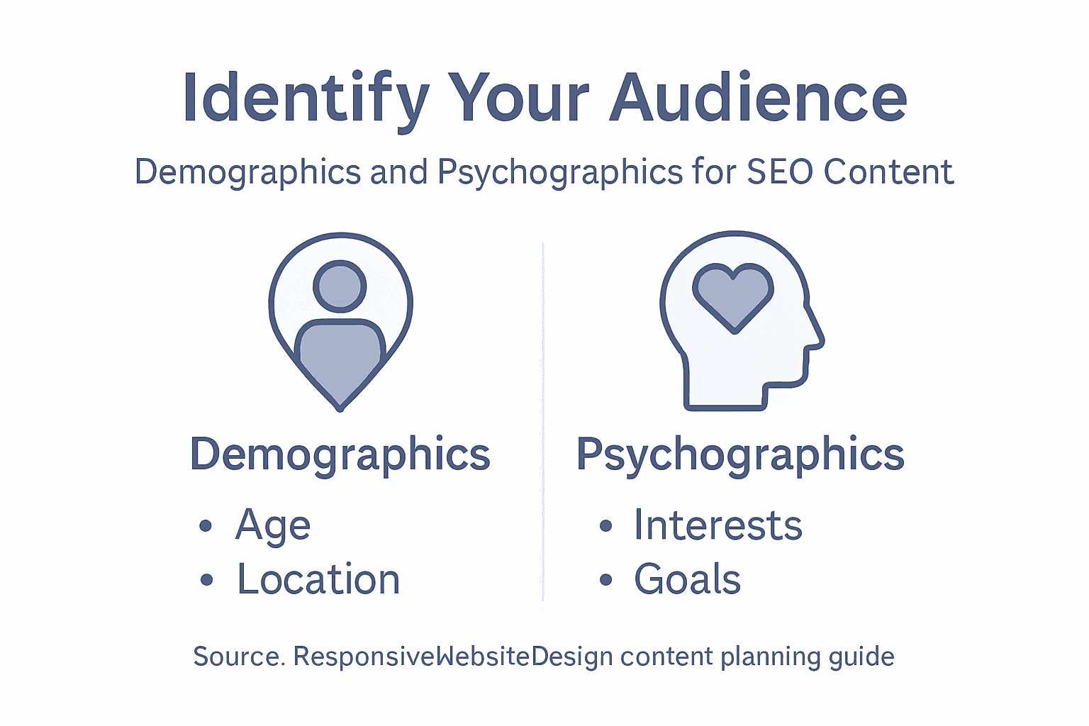
Now comes the equally important part: understanding your audience. Recognising and analysing your audience is fundamental to creating content that actually resonates. Think beyond simple demographics. Who needs your products or services? Small business owners? Parents? Homeowners? What problems do they face? What questions keep them up at night? When someone lands on your website searching for a solution, what specific result are they hoping to find?

For a WordPress website redesign project, you might be targeting small business owners who currently have outdated sites but lack technical knowledge. Or perhaps you’re reaching established companies looking to improve their mobile responsiveness and search engine rankings. Your audience might include decision makers concerned about security and ongoing maintenance costs, as well as marketing managers worried about whether the site will actually drive traffic. Each of these people has different concerns, different knowledge levels, and different reasons for visiting your site.

Dig into the details by gathering both demographic and psychographic information. Demographic data includes age, location, company size, and industry. Psychographic data covers values, pain points, interests, and buying behaviours. You could conduct surveys, review customer conversations, analyse website analytics if you have an existing site, or even have informal chats with your current clients. Ask them how they found you, what they were looking for, what convinced them to choose your services, and what frustrated them about other options. These conversations are gold.

Infographic showing website audience research steps

Consider also the different types of people who might visit your site. Understanding your target audience helps guide decisions about both design and language, and your audience might include business partners, potential customers, existing clients needing support, investors, or industry peers. Each group might need different information presented differently. Your existing customers might need easy access to support resources and account management. Prospective customers might need case studies, pricing information, and trust signals. Partners might need integration documentation or wholesale information.

To clarify key audience analysis terms, here is a summary table:

TermExample ValueRole in Content Strategy
DemographicsAge 35-50, NZ regionTailor tone and examples
PsychographicsValues efficiencyAddress motivations, ease concerns
Audience Persona“Sarah,” retail ownerGuide content for specific needs
Audience SegmentInvestors, end-usersPlace relevant info for each group

Once you’ve defined your goals and audience, document everything. Create an audience profile or persona that describes your ideal customer or visitor. Give them a name, a background story, specific goals, and the challenges they face. This might seem like extra work, but when you’re writing a blog post or planning a product page six months from now, you’ll check that persona and instantly remember who you’re writing for. You’ll make better content decisions because you’re not writing for everyone anymore. You’re writing for Sarah, the small business owner in Auckland who’s frustrated with her current website’s slow loading times and wants something modern that actually converts visitors into customers.

Professional tip Document your top three audience personas and your primary website goal in a simple one-page document you can reference throughout your content planning. Share this with anyone involved in creating content so everyone stays aligned on who you’re serving and why.

Step 2: Map key website pages and structure

Now that you understand your goals and audience, it’s time to plan what pages your website actually needs and how they connect together. This is where you move from strategy into practical architecture. Mapping your site structure acts like a blueprint that guides both your content creation and how visitors navigate through your website.

Start by listing every page your website should have based on what your audience needs and what supports your business goals. For a WordPress website redesign targeting small business owners, your essential pages might include a homepage that makes a strong first impression, an about page that builds trust and tells your story, a services or products page that explains what you offer, a portfolio or case studies section showing real results, a contact page with clear next steps, and perhaps a blog for ongoing content. Some businesses need additional pages like pricing, frequently asked questions, testimonials, team bios, or resource libraries. Don’t overthink this yet. Just brain dump all the pages that make sense for your specific situation.

Here is a comparison of common website page purposes to guide planning:

Page TypeMain ObjectiveTypical Visitors
HomepageBrand introductionNew/prospective clients
ServiceExplain offeringsSolution-seekers
About UsBuild trust/credibilityPartners, investors
BlogShare expertise/newsReturning/engaged users

Once you have your list, think about how these pages relate to each other. Creating a well-organised page structure improves navigation and accessibility for all your visitors. Consider which pages should be easily accessible from the main navigation menu, which ones can live in footers or secondary menus, and which pages support other pages. Your homepage might link to your top services, which then link to individual service detail pages, which might reference case studies or testimonials. This hierarchy shows visitors the path through your site and helps search engines understand what matters most.

Woman mapping website structure on conference whiteboard

Visualise your site structure as a map or diagram. At the top sits your homepage as the main entry point. Below that, you might have primary category pages like Services, About, or Products. Under those sit more specific pages. This hierarchical approach works because visitors can move down into more detailed information or back up to the main categories. It prevents your site from becoming a confusing web where every page links to every other page. When someone lands on a service detail page, they can see they’re viewing a specific service under your overall services offerings, then navigate back up if they want to explore something else.

Think about the relationships between content types. Are you creating blog posts that support your service pages? Does each service page link to relevant case studies? Do your FAQ answers reference specific solutions? These connections create a logical content ecosystem where your different pages work together to move visitors towards your goals. A visitor reading a blog post about website redesign benefits might click through to your website redesign service page, then to a case study showing results you achieved, then to your contact page. That’s the journey you’re mapping.

Consider user experience in your structure. Semantic HTML elements and consistency in navigation reduce confusion and enhance how people find information. Every page should have the same main navigation menu in the same location. Key information like contact details and business hours should appear in consistent places across pages. The structure should work equally well on mobile phones and desktop computers since many of your visitors will be browsing on different devices.

Document your site structure clearly. You might use a simple outline, a visual diagram created in a tool like Figma or Google Drawings, or even just a numbered list showing parent pages and child pages. This document becomes your reference point when you’re writing content or making decisions about which page deserves the most attention. At this stage, you’re not finalising everything permanently. Your site structure can evolve as your business grows, but having a clear map means you’re not creating content randomly hoping it fits somewhere.

One practical thing to remember is that some pages serve multiple purposes. Your homepage might include service summaries that link to detailed service pages, customer testimonials that build trust, and a clear call to action that moves people towards becoming leads or customers. Don’t force every page to do just one thing, but do keep purposes clear so visitors and search engines understand what each page is primarily about.

Professional tip Create a one-page site map showing your page hierarchy and how they connect, then share it with your team and any content creators so everyone understands the structure before writing begins.

Step 3: Research and prioritise target keywords

Keywords are the words and phrases your potential customers type into Google when they’re looking for what you offer. Researching and prioritising the right keywords means you’re not just guessing what content to create. You’re building your strategy around actual search behaviour and customer intent. This step transforms your content plan from generic to specific, targeting the exact language your audience uses.

Start by brainstorming keywords related to your business, services, and solutions. Think about how your audience actually talks about their problems and what they’re searching for. If you run a WordPress website design business in New Zealand targeting small business owners, your keywords might include “WordPress website design Auckland”, “responsive website redesign New Zealand”, “small business website builder”, “WooCommerce website development”, or “SEO friendly WordPress sites”. Don’t limit yourself to single words. Many searches include multiple words, and these longer phrases often have less competition and higher purchase intent. Someone searching “buy website design” is probably not as ready to buy as someone searching “affordable WordPress website design for small business”. Selecting precise and relevant keywords increases content visibility and helps connect with your target audience when they’re actively searching.

Now use keyword research tools to understand search volume, competition, and opportunity. Tools like Google Keyword Planner (free with a Google account), Ahrefs, Semrush, or Ubersuggest show you how many people search for specific terms each month and how difficult it would be to rank for them. You’re looking for the sweet spot, not too many searches (which means high competition) and not too few (which means low demand). A keyword with 500 monthly searches and moderate competition might be more valuable than one with 10,000 monthly searches dominated by major corporations. As a small business, you want keywords where you can realistically compete and win.

Create separate lists for different types of keywords. Head terms are short, broad keywords like “website design” or “SEO services”. Long-tail keywords are longer and more specific like “SEO services for small business in Auckland” or “WordPress ecommerce website design”. Long-tail keywords usually have lower search volume but much higher intent. Someone searching “website design” might just be casually browsing, but someone searching “WordPress ecommerce website design for online store” is probably ready to hire someone. In your content strategy, you want a mix. Target some broader keywords on your main service pages, then use long-tail keywords for blog posts and supporting pages.

Consider keyword variations and how people actually phrase things. Good keyword selection involves choosing terms that are relevant and likely to be used by your target audience. Think about synonyms, related terms, and different ways people express the same need. “Website redesign”, “website rebuild”, “website overhaul”, and “website refresh” all mean roughly the same thing, but people search for them differently. You might use “website redesign” as your primary keyword but mention the variations throughout your content so you capture all these searches.

Prioritise your keywords based on relevance to your business goals and audience needs combined with search opportunity. Map keywords to your page structure. Your homepage might target your most important broad keywords. Service pages each get their own primary keyword and supporting keywords. Blog posts can target longer-tail keywords and informational searches. This ensures every piece of content you create has a clear purpose and targets specific searches. Someone searching “website content planning for SEO” is searching for something different than someone searching “website design Auckland”, and your content should address these different needs on different pages.

Don’t chase every possible keyword. Focus on those that align with your audience, your services, and your business goals. A keyword might have 1,000 monthly searches, but if it’s not relevant to what you offer or what your audience needs, it’s wasted effort. You’re building a sustainable content strategy, not trying to rank for everything overnight. One well-targeted keyword that brings qualified visitors who become clients is worth far more than 10 irrelevant keywords that bring traffic that bounces immediately.

Professional tip Create a simple spreadsheet listing your top 20 keywords with their monthly search volume, competition level, and which page or content piece will target each one, then review and update it quarterly as search trends evolve.

Step 4: Create a content plan for each page

You’ve identified your goals, mapped your site structure, and prioritised your keywords. Now it’s time to create a specific content plan for each page. This is where your strategy becomes reality. A detailed content plan acts as a blueprint for every page on your website, ensuring consistency, clarity, and alignment with your business objectives.

Start by selecting your highest-priority page. This is often your homepage or your most important service page. Ask yourself what this page needs to accomplish. A content plan aligns website content with business goals and audience needs by defining clear content goals and developing buyer personas to guide creation. For a homepage, your goals might include introducing your business, building trust, showcasing your main services, and encouraging visitors to take action. For a service page, your goal is likely to convince someone that your specific service solves their problem and compel them to contact you.

Once you know the goal, outline what information needs to be on that page and in what order. Think about your visitor’s mindset when they land on this page. What do they need to know first? What questions do they have? What objections might they have? Your homepage visitor might first need to understand what your business does and who you serve. Then they need to see proof that you deliver results. Then they need a clear way to take the next step. A service page visitor needs to understand the problem, see how your service solves it, understand your process or approach, see results or testimonials from past clients, and finally, know how to get started. This logical flow moves visitors from awareness through consideration to action.

Write a headline that matches what people are searching for. Remember those keywords you researched? Your page headline should incorporate your primary keyword naturally. If someone lands on your “WordPress website redesign” page after searching for that exact phrase, they need to see it immediately so they know they’re in the right place. Follow your headline with a clear subheading or introductory paragraph that answers the visitor’s most pressing question. If they’re on your pricing page, they want to know your pricing. If they’re on your about page, they want to understand your story and credibility. Don’t make them dig.

Plan the supporting content sections. Most pages work well with three to five main sections, each addressing a specific part of your visitor’s journey. On a service page you might have sections for “The Problem”, “How Our Service Works”, “Results You Can Expect”, “Client Testimonials”, and “Ready to Get Started”. Each section has a specific purpose. Avoid rambling sections that try to do too much. Keep sections focused, clear, and scannable. Many visitors skim rather than read every word, so use subheadings, short paragraphs, and bullet points strategically.

Consider what type of content serves each section best. Some sections work better with written paragraphs, others with bullet points, images, or testimonials. A “How It Works” section might benefit from numbered steps or a visual diagram. A “Why Choose Us” section might work best with feature boxes and icons. A “Client Results” section might feature short case studies or before and after comparisons. Content strategy encompasses planning, creating, delivering, and governing website content with attention to clarity, accessibility, and search engine optimisation. Think about your audience’s preferences too. Small business owners reviewing your WordPress design services might prefer straightforward case studies showing real business results over lengthy technical explanations.

Incorporate your target keyword naturally throughout the page. Use it in your headline, subheadings, and early in your opening paragraph. Mention related keywords and variations as you write naturally. If your page is about “WordPress website redesign”, you might also mention “website rebuild”, “WordPress site overhaul”, “responsive website design”, or “modern WordPress development”. This helps search engines understand what your page is about whilst keeping your writing natural and readable.

Plan for calls to action throughout the page. Don’t just have one call to action at the very bottom. Include them strategically at logical stopping points. After introducing your services, invite visitors to learn more or book a consultation. After sharing results, invite them to start their project. After testimonials, invite them to join satisfied clients. These invitations guide visitors toward taking action rather than simply bouncing away.

Finally, decide what supporting elements you need. Do you need images? Videos? Client logos? Testimonials? A contact form? These supporting elements break up text visually, build credibility, and help maintain visitor interest. Plan where each element goes and what it communicates. Then document all of this in a simple outline or template you can share with your content writer or team member who’ll create the actual content.

Professional tip Create a one-page content brief for each page including the primary goal, target keyword, main sections, content type for each section, and key calls to action, then use this as your reference when writing or editing the actual content.

Step 5: Review, refine and finalise your content strategy

You’ve created a comprehensive content strategy with clear goals, mapped pages, targeted keywords, and detailed content plans. Now comes the critical final step. Review, refine, and finalise your strategy before you start publishing. This is where you catch gaps, eliminate inconsistencies, and ensure everything works together as a cohesive whole. Taking time to refine your strategy now prevents costly mistakes and wasted effort down the line.

Start by stepping back and reviewing your entire strategy as if you’ve never seen it before. Print out your goals document, your site map, your keyword list, and your content briefs. Read through them one page at a time. Does everything align? If your business goal is to generate qualified leads, do all your pages have clear calls to action inviting people to get in touch? If your audience is busy small business owners with limited technical knowledge, are your explanations clear and jargon-free? If your target keywords include location-based terms like “WordPress website design Auckland”, does your content actually address the Auckland market and highlight local relevance? Inconsistencies here are red flags that need fixing before you proceed.

Conduct a thorough content audit by examining what content already exists. If you’re redesigning a WordPress website, you likely have existing pages and content. Which of these pages still serve your current goals and audience? Which pages are outdated or no longer relevant? Which could be improved? Ongoing review and refinement are critical to ensure relevance and effectiveness, including analysing performance metrics and updating content to maintain accuracy and authority. Look at your website analytics if you have access. Which pages get the most traffic? Which pages have the highest bounce rates, meaning visitors leave immediately? High traffic pages might deserve more resources and refinement. High bounce rate pages might need rethinking entirely. This data-driven perspective prevents you from spending effort on content that isn’t working.

Identify any gaps in your content plan. Are there obvious questions your audience has that none of your pages answer? Are there keywords you want to target that don’t map to any page? For example, you might realise that small business owners searching for “website redesign cost” need a page addressing pricing or investment, but you haven’t planned for this. Better to catch this now and add it to your strategy than to launch and realise visitors are leaving because their questions aren’t answered. Gaps represent missed opportunities to capture qualified traffic.

Review your keyword assignments to ensure each page has one primary keyword and supporting related terms. Avoid keyword cannibalisation where multiple pages target the same primary keyword. If both your “Services” page and your “WordPress Website Design” service detail page target “WordPress website design”, they compete with each other in search results. Usually, your more specific service page should own that keyword whilst your services overview page targets a broader term. This prevents your own pages from fighting for the same search position.

Evaluate your calls to action. Are they clear? Specific? Action-oriented? “Get in touch” is vague. “Book a free 30 minute WordPress website consultation” is specific and compelling. Review whether your calls to action match the visitor’s stage in their journey. Someone on your homepage might respond to “learn about our process”. Someone on a detailed service page might be ready for “request a quote” or “schedule a consultation”. Effective content strategy requires establishing clear roles, workflows, and performance indicators to sustain ongoing quality and alignment. Think about whether your calls to action guide visitors toward your desired outcomes.

Consider accessibility and user experience. Can visitors find what they need quickly? Is your site navigation intuitive? Are your pages scannable with clear headings and short paragraphs? Have you considered mobile users who might be browsing on phones? If you’re planning a WordPress redesign with Net Branding or another development partner, this is the time to ensure your content strategy aligns with their design and technical recommendations.

Finally, document your decision making. Create a one-page summary explaining your strategy, the reasoning behind it, and what success looks like. Define the key performance indicators you’ll track. Will you measure success by leads generated, traffic increase, time on page, or something else? Setting clear metrics now means you can actually measure whether your strategy is working after launch. Schedule a quarterly review to assess performance and make refinements based on real data rather than assumptions.

Professional tip Before finalising, have someone outside your organisation review your content plan and strategy, as fresh eyes catch things you’ve become too close to notice.

Unlock SEO Success with Expert WordPress Content Planning

Planning website content that truly resonates with your audience and ranks well on search engines can be challenging. You might be struggling with defining clear goals, mapping your pages effectively, or choosing the right keywords that bring qualified traffic to your business. The concepts of audience personas, site structure, and keyword prioritisation outlined in this article are essential but require the right technical and creative skills to turn into a successful online presence.

https://responsivewebsitedesign.co.nz

ResponsiveWebsiteDesign understands these challenges and offers tailored Website Archives – ResponsiveWebsiteDesign solutions that bring your content strategy to life through custom WordPress design and SEO optimisation. From an initial website redesign to ongoing content management and performance enhancements, our team supports New Zealand businesses every step of the way. Ready to move from planning to profit? Visit https://responsivewebsitedesign.co.nz to start building a responsive, engaging, and search-ready website today. Don’t miss the opportunity to boost your online visibility with expert help from our SEO Archives – ResponsiveWebsiteDesign specialists.

Frequently Asked Questions

How do I define my website goals for SEO success?

To define your website goals for SEO success, identify specific outcomes such as generating leads or increasing sales. Write down these goals clearly and aim for measurable targets, like “generating 50 qualified leads per month” to guide your content strategy effectively.

What should I consider when identifying my target audience for my website?

When identifying your target audience, consider demographics like age and location, as well as psychographics such as values and pain points. Conduct surveys or gather insights from existing clients to create detailed audience personas that reflect their needs and concerns.

How can I structure my website to enhance user experience?

To enhance user experience, create a well-organised site structure with clear navigation that guides visitors through your content. Map out your pages hierarchically, ensuring key pages are easily accessible to facilitate a smooth journey for your visitors, ideally within two clicks.

What is the best approach for selecting keywords for my website content?

The best approach for selecting keywords is to brainstorm related phrases and use keyword research to evaluate search volume and competition. Focus on a mix of head terms and long-tail keywords, ensuring each page targets specific keywords that align with your business goals.

How do I create a content plan for each page of my website?

To create a content plan for each page, outline the page’s purpose, the information it should convey, and the logical flow of content. Break down the content into sections, designate relevant headers, and plan clear calls to action to guide visitors toward their next steps.

What should I do before finalising my content strategy?

Before finalising your content strategy, review your plans for consistency and alignment with your goals. Consider seeking feedback from someone outside your organisation to identify any gaps or areas for improvement that you may have overlooked.