
Over 80 percent of online visitors leave a website if the layout feels confusing or hard to use. For many Australian businesses, this reality means first impressions are everything when building an effective web presence. Understanding how layout, user goals, and mobile responsiveness intersect is crucial for reaching your ideal audience and achieving real results. This guide breaks down the practical steps to crafting a website layout that supports business growth and delivers a seamless user experience.
Table of Contents
- Stage 1: Define Your Business Goals And Target Users
- Stage 2: Assess Layout Options For Mobile Responsiveness
- Stage 3: Map Content Structure To Layout Frameworks
- Stage 4: Match Layouts To User Journey And SEO Needs
- Stage 5: Test Layout Choices For Usability And Engagement
Quick Summary
| Significant Insight | Detailed Explanation |
|---|---|
| 1. Clearly Define Business Goals | Establish specific objectives for your website to guide its design and functionality effectively. |
| 2. Prioritise Mobile Responsiveness | Ensure your site adapts seamlessly across devices, enhancing user experience and accessibility. |
| 3. Create User-Centric Layouts | Develop designs based on detailed user personas to meet their needs and expectations effectively. |
| 4. Integrate User Journey with SEO | Design layouts that naturally guide visitors towards desired actions while optimising for search engines. |
| 5. Conduct Rigorous Usability Testing | Systematically evaluate your design’s performance through various testing methods for continuous improvement. |
Stage 1: Define your business goals and target users
Building a successful website starts with crystal clear understanding of your business objectives and the specific users you want to attract. Aligning website design with core business goals creates a strategic digital platform that drives real results.
The first step involves conducting a comprehensive assessment of your business vision. Ask yourself critical questions: What do you want visitors to do when they arrive at your site? Are you aiming to generate sales leads, showcase services, provide information, or establish brand credibility? Each goal requires a different layout strategy. For instance, an ecommerce site needs prominent product displays and easy purchasing pathways, while a service based business might prioritise clear service descriptions and contact mechanisms.
Understanding your target audience is equally crucial. Research demographic details like age, income level, professional background, and online behaviour. Create detailed user personas that represent your ideal customers. These profiles will guide design decisions about visual aesthetics, navigation structure, and content placement. By mapping user expectations and preferences, you can craft a website layout that speaks directly to their needs and motivates desired actions.
Warning: Avoid generic designs that attempt to please everyone. A targeted approach always outperforms a generic one. By precisely defining your business goals and user profile, you transform your website from a simple online brochure into a powerful business development tool.
Stage 2: Assess layout options for mobile responsiveness
Mobile responsiveness has become a critical factor in website design, with advanced automated repair approaches transforming how websites adapt across devices. Your goal in this stage is to evaluate layout strategies that ensure seamless user experience regardless of screen size or device type.

Start by understanding the core principles of responsive design. This means creating a flexible layout that automatically adjusts content, images, and navigation elements to fit different screen dimensions. Responsive design techniques typically involve using fluid grid systems, flexible images, and CSS media queries that trigger layout changes based on device characteristics. Consider implementing a mobile first approach where you design for smaller screens initially and then progressively enhance the layout for larger displays.
Key considerations for mobile responsiveness include simplifying navigation menus, ensuring touch friendly button sizes, optimising image loading speeds, and maintaining readable text sizes across devices. Prioritise content hierarchy by making critical information immediately visible and reducing visual clutter. Test your proposed layouts using multiple device emulators and actual mobile devices to verify consistent performance.
Warning: Avoid complex multi column layouts that become unreadable on smaller screens. Simple linear layouts that stack content vertically often provide the most intuitive mobile experience. Your ultimate goal is creating a website that feels native and comfortable regardless of how users access your digital platform.
Stage 3: Map content structure to layout frameworks
Designing an effective website layout requires strategic alignment between your content and its visual presentation. Understanding how to leverage advanced CSS grid layout techniques will transform your approach to structuring digital content across different devices and screen sizes.
Begin by breaking down your website content into logical sections and hierarchical components. Flexbox layout models provide exceptional flexibility for arranging elements with precision. Consider how different content types navigation menus, text blocks, images, and call to action buttons will interact within your chosen framework. Each section should have a clear purpose and visual priority that guides users intuitively through your site.
Pay close attention to content density and visual breathing room. Avoid overcrowding your layout with too many elements. Instead, create intentional white spaces that help users focus on critical information. Test your proposed layout by asking whether each section communicates its purpose clearly and supports your overall business objectives. Remember that a well structured layout is not just about aesthetics but about creating a seamless user experience that encourages engagement and conversions.
Warning: Do not sacrifice readability for design complexity. Your layout should always prioritise user comprehension and ease of navigation over trendy visual effects. The most successful websites balance visual appeal with functional clarity.
Stage 4: Match layouts to user journey and SEO needs
Creating a website layout that seamlessly integrates user experience and search engine optimisation requires strategic planning. Innovative click behaviour models reveal critical insights into how users navigate multi block mobile pages, highlighting the importance of intentional design that guides visitor interactions.
Your layout must strategically direct users through a logical progression that matches their expected journey. Adaptive web design principles suggest creating multiple layout versions that respond to different devices while maintaining a consistent narrative flow. Begin by mapping out your primary user personas and their potential pathways through your website. Consider how each layout element header placement, navigation structure, content hierarchy can nudge visitors towards desired actions like making enquiries or completing purchases.
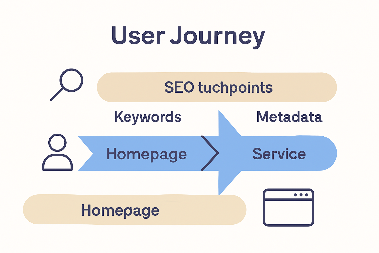
Pay particular attention to content placement and visual cues that support both user engagement and search engine visibility. Critical information should appear above the fold with clear hierarchical signals that help both human visitors and search engine crawlers understand your page structure. This means prioritising key messages, using descriptive headings, and ensuring that your most important content receives visual and structural prominence.
Warning: Avoid sacrificing readability for SEO complexity. Your layout must feel intuitive and natural while subtly guiding users towards their goals. The most effective designs appear effortless yet strategically engineered to support both user experience and search engine performance.
Stage 5: Test layout choices for usability and engagement
Automated web page repair approaches demonstrate the critical importance of systematically testing website layouts to ensure optimal user experience and engagement. Your goal in this stage is to rigorously evaluate how well your proposed design performs across different user interactions and device configurations.
Implement a comprehensive testing strategy that goes beyond visual assessment. Utilise specialised testing frameworks to objectively measure layout performance. This involves conducting multiple types of assessments click path analysis, heat mapping, user feedback sessions, and device responsiveness tests. Pay attention to key metrics like time spent on page, bounce rates, and user navigation patterns. These insights will reveal how intuitively users interact with your proposed layout and where potential friction points might exist.
Consider recruiting a diverse group of test participants who represent your target audience. Their feedback will provide nuanced insights into how different user segments perceive and interact with your website design. Create scenarios that simulate real world user journeys and observe how easily participants can accomplish key tasks like finding information, making purchases, or submitting enquiries.
Warning: Avoid confirmation bias during testing. Be prepared to critically evaluate your design choices and embrace constructive feedback that challenges your initial assumptions. The most successful website layouts emerge from iterative refinement based on genuine user experiences.
Transform Your Business Success with Expert Website Layouts
Choosing the right website layout is crucial to turning visitors into loyal customers. This article highlights key challenges like defining clear business goals, crafting mobile responsive designs, and aligning layouts with user journeys and SEO needs. These pain points often leave businesses struggling to create a website that truly drives engagement and conversions.
If you feel overwhelmed by the complexity of mapping content structure or worry about usability testing slowing your growth you are not alone. At ResponsiveWebsiteDesign, we specialise in transforming these challenges into opportunities through custom WordPress designs that focus on your unique business goals. Whether you need a flexible mobile-first layout or SEO-optimised content frameworks, our solutions help you build an online presence that is visually engaging and built to perform.
Ready to turn your website into a powerful tool that speaks directly to your customers and boosts your revenue Get expert support from our team today Explore more insights in our Website Archives and start your journey with ResponsiveWebsiteDesign. Don’t settle for generic layouts when you can have a tailored digital strategy designed for your business success.
Frequently Asked Questions
How can I define my business goals to choose the right website layout?
To define your business goals, identify what you want visitors to do when they arrive at your site, such as generating sales leads or providing information. Create a list of at least three clear objectives that will guide your layout decisions.
What key factors should I consider for mobile responsiveness in my website layout?
When designing for mobile responsiveness, consider simplifying navigation menus, optimising image loading speeds, and ensuring text readability. Start with a mobile-first design approach and test layouts on multiple devices to ensure usability across screen sizes.
How do I map content structure to my website layout effectively?
Break down your website content into clear sections and prioritise visual hierarchy to guide users intuitively through your site. Use layout techniques like Flexbox to arrange elements and create intentional white spaces that enhance readability and focus.
What steps can I take to align my website layout with user journeys and SEO needs?
Map out distinct user personas and their pathways through your site, ensuring that layout elements guide users toward desired actions like completing purchases. Prioritise important content above the fold and use descriptive headings to support both user engagement and search engine visibility.
How should I test my website layout for usability and user engagement?
Implement a comprehensive testing strategy that includes click path analysis, user feedback sessions, and device responsiveness tests. Conduct these assessments with a diverse group of participants to gather nuanced insights and improve your layout based on real user experiences.