
Over half of global internet traffic now comes from mobile devices, making responsive design a necessity for any website project. As users expect smooth and visually appealing experiences on every screen, how your site looks and functions across phones, tablets, and desktops can determine its success. By understanding the critical steps to preparing and optimizing your website, you set the stage for a seamless browsing experience that keeps visitors engaged everywhere.
Table of Contents
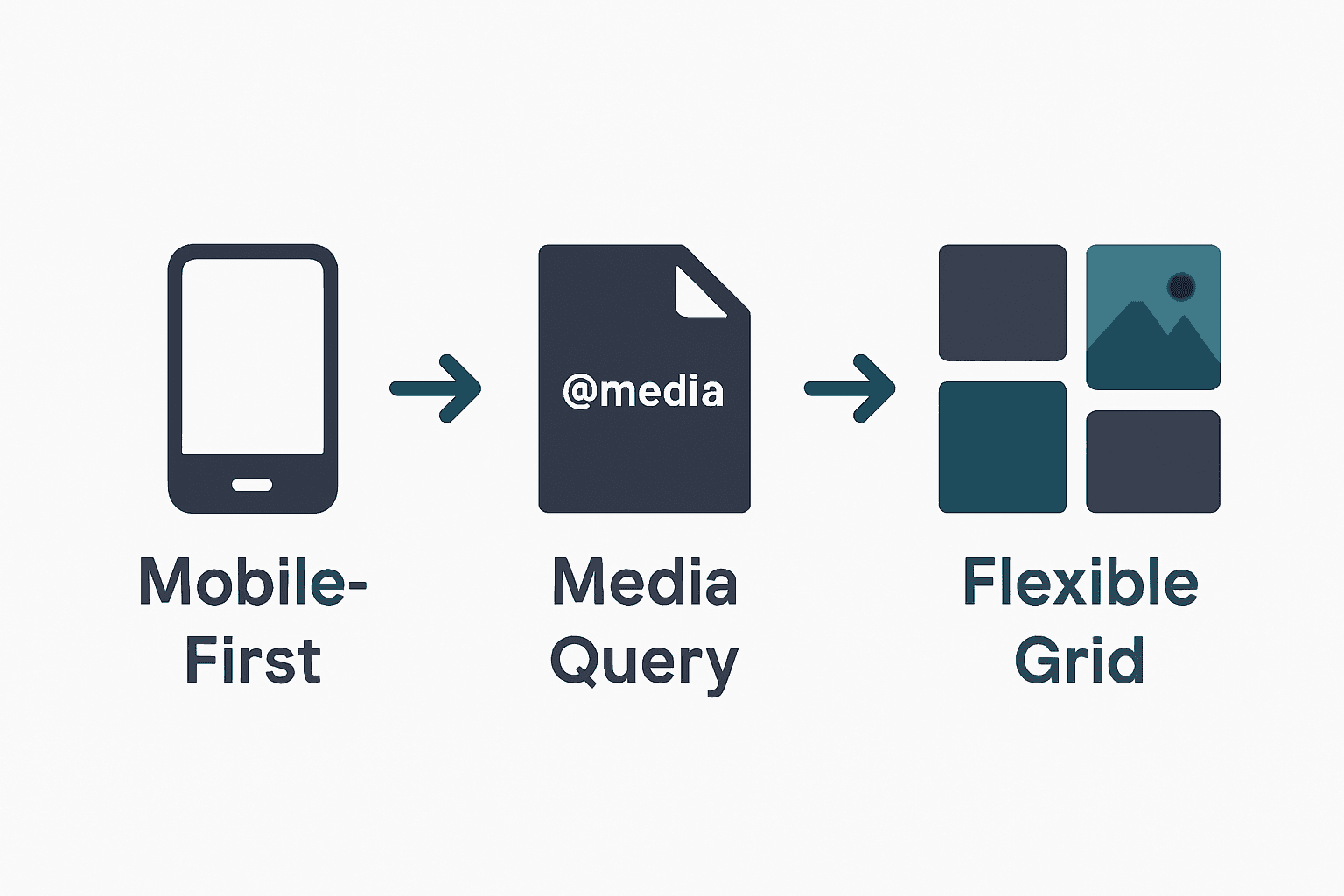
- Step 1: Prepare Your Website Project for Responsive Design
- Step 2: Implement Mobile-First Layouts Using CSS Media Queries
- Step 3: Apply Flexible Grids and Responsive Images
- Step 4: Enhance User Experience with Touch Interactions
- Step 5: Test and Optimize Responsiveness Across Devices
Quick Summary
| Key Point | Explanation |
|---|---|
| 1. Design for Mobile First | Start your project by creating designs for smaller screens before progressively enhancing for larger ones. |
| 2. Use CSS Media Queries | Implement breakpoints thoughtfully so that styles adapt based on content flow rather than specific devices. |
| 3. Create Flexible Grids | Utilize CSS flexbox or grid systems to allow content to resize dynamically across different screen sizes. |
| 4. Optimize for Touch Interactions | Design interactive elements with larger target areas to ensure ease of use on touch devices. |
| 5. Test on Real Devices | Always validate responsiveness and usability on actual devices, not just through emulation tools. |
Step 1: Prepare Your Website Project for Responsive Design
Preparing your website project for responsive design requires strategic planning and thoughtful implementation. In this critical first step, you will establish the foundational architecture that enables your website to adapt seamlessly across multiple devices and screen sizes.
According to developer.mozilla.org, the initial preparation involves structuring your HTML with semantic elements and organizing your CSS to facilitate adaptability. This means adopting a mobile-first approach where you design for the smallest screen sizes initially. Start by creating a simple, linear layout that can be progressively enhanced for larger screens. Your key objectives are establishing a flexible design system and ensuring core content remains accessible regardless of device.
As recommended by theclientside.net, begin by prioritizing mobile user experience. This strategy involves designing your website interface for mobile platforms first before scaling up to larger screen sizes. Implement a viewport meta tag in your HTML to control page dimensions and scaling. Choose breakpoints based on your content’s natural flow rather than rigid device specifications.
Warning: Avoid the common mistake of designing for desktop first and then attempting to squeeze content into mobile layouts. This backward approach often results in cluttered and inefficient mobile experiences.
By following these preparation steps, you are setting the groundwork for a responsive website that provides consistent functionality and aesthetic appeal across smartphones, tablets, and desktop computers. The next phase will involve implementing specific responsive design techniques and testing your layout.
Step 2: Implement Mobile-First Layouts Using CSS Media Queries
Mobile-first layout design is a strategic approach to creating responsive websites that adapt seamlessly across different device sizes. In this step, you will learn how to construct flexible CSS layouts that prioritize mobile user experience while providing scalability for larger screens.
According to developer.mozilla.org, implementing mobile-first layouts requires writing CSS that targets default styles for the smallest screen sizes first. Begin by establishing a single-column layout with fundamental design elements. This base design serves as the foundation for your responsive website. As recommended, use CSS media queries to introduce breakpoints where design elements will change to accommodate larger screens.
As explained by geeksforgeeks.org, define initial base styles for mobile devices without media queries. Then progressively enhance your design by applying media queries as viewport size increases. For example, set a default font size and padding for mobile and then use media queries to increase these values for tablets and desktop screens. This method ensures your design scales appropriately while maintaining usability across different devices.
Warning: Avoid creating overly complex media query breakpoints. Stick to logical content-based transitions rather than targeting specific device dimensions.
By mastering these mobile-first layout techniques, you will create websites that provide an optimal viewing experience regardless of screen size. The next phase involves testing and refining your responsive design implementation.
Step 3: Apply Flexible Grids and Responsive Images
Creating a responsive website requires strategic implementation of flexible layouts and adaptive image techniques. In this step, you will learn how to design grid systems and handle images that seamlessly adjust across different device screens.
According to developer.mozilla.org, applying flexible grids involves using advanced CSS techniques like flexbox or grid layout to create a dynamic structure. These methods allow your content containers to adapt intelligently to various screen sizes. For images, the recommendation is straightforward set their maximum width to 100% and height to auto. This approach ensures images scale proportionally within their containing elements without losing visual quality or causing distortion.
As explained by theclientside.net, incorporating flexible design means using percentage-based widths for containers and elements. This technique allows content to resize and reflow naturally based on the viewport. When implementing responsive images, use CSS to make them fluid by setting width to 100% and height to auto. This method guarantees that visual elements maintain their aspect ratio and adapt gracefully across different devices.
Warning: Avoid using fixed pixel dimensions for images or grid layouts. Rigid measurements can break your responsive design and create awkward display issues on various screen sizes.
By mastering these flexible grid and image techniques, you will create websites that look professional and function smoothly across smartphones, tablets, and desktop computers.
 The next phase involves testing your responsive design to ensure consistent performance.
Step 4: Enhance User Experience with Touch Interactions
Designing websites that provide seamless touch interactions is crucial for creating engaging mobile experiences. In this step, you will learn how to optimize your website for touch-based navigation and interactions that feel natural and intuitive.
According to developer.mozilla.org, enhancing touch interactions requires thoughtful design of interactive elements. The key is to create buttons and links with sufficient size and spacing to prevent accidental taps. Implement touch-friendly gestures like swiping and pinching to improve navigation. Use CSS properties such as ‘hover’ and ‘active’ to provide visual feedback that helps users understand their interactions.
As explained by theclientside.net, designing for touch means creating interactive elements with larger touch targets. This involves using CSS to style buttons and links that are easy to tap accurately. Incorporate intuitive touch gestures and ensure that interactive elements remain accessible across different screen orientations and sizes.
Warning: Avoid creating tiny tap targets or cluttered interfaces. Small interactive elements can frustrate users and lead to poor website usability.
By implementing these touch interaction strategies, you will create a more engaging and user-friendly mobile experience. The next phase involves testing your touch interactions to ensure smooth and intuitive navigation.
Step 5: Test and Optimize Responsiveness Across Devices
Ensuring your website functions flawlessly across different devices is the final critical step in creating a responsive design. In this phase, you will learn comprehensive strategies to validate and refine your website’s performance and user experience.
According to developer.mozilla.org, testing and optimizing responsiveness requires a multi-dimensional approach. Begin by utilizing browser developer tools to simulate various device viewports and systematically identify potential layout issues. Conduct thorough user testing on actual devices to assess real-world usability and functionality. Focus on optimizing loading times through strategic techniques such as minimizing CSS and JavaScript files, compressing images, and implementing efficient caching strategies.
As explained by theclientside.net, effective responsiveness testing involves emulating different device environments and gathering direct insights into user interactions. Use browser developer tools to inspect layouts across multiple screen sizes, and complement this digital testing with evaluations on physical devices. Prioritize performance optimization by reducing file sizes, compressing visual assets, and developing efficient loading mechanisms.
Warning: Avoid relying exclusively on emulation tools. Always test on actual physical devices to capture nuanced user experiences that simulators might miss.
By implementing these comprehensive testing and optimization techniques, you will create a robust responsive website that delivers consistent performance across smartphones, tablets, and desktop computers. The next step involves ongoing monitoring and iterative improvements to maintain peak user experience.
Build Mobile-Friendly Websites That Truly Connect With Your Customers
Struggling to create a website that looks and works brilliantly on every device is a common challenge for many business owners. This article covers key concepts like mobile-first design, flexible grids, and touch interactions to help you build responsive websites that deliver a seamless user experience. Yet, turning these strategies into a fully functioning site that reflects your brand and engages visitors can feel overwhelming.
At ResponsiveWebsiteDesign, we specialise in crafting custom WordPress websites tailored to New Zealand businesses. Our approach ensures your website is not only visually engaging and mobile responsive but also SEO optimised to boost your online presence. Explore our expertise in responsive design through our Website Archives where we share insights about effective design and development.
Don’t let the technical details hold your business back. Take the next step towards a website that works perfectly on mobiles, tablets and desktops by partnering with experts dedicated to your success. Visit ResponsiveWebsiteDesign today to start your journey to a professional, mobile-friendly website that grows your business.
Frequently Asked Questions
What is responsive design, and why is it important for mobile-friendly websites?
Responsive design ensures your website automatically adjusts its layout and content to fit various screen sizes and devices. This is crucial for providing a seamless user experience across smartphones, tablets, and desktops, ultimately boosting user engagement and search engine rankings.
How do I start my website project for responsive design?
Begin by structuring your HTML with semantic elements, adopting a mobile-first approach. Focus on creating a simple layout that can be enhanced for larger screens; this foundational preparation is key for effective responsive design.
What are mobile-first layouts in responsive design?
Mobile-first layouts prioritize the mobile experience by designing for small screens first, then scaling up for larger devices. Start with a single-column layout and use CSS media queries to add styles for tablets and desktops as the viewport size increases.
How can I implement flexible grids for my responsive website?
Use CSS techniques like flexbox or grid layout to create flexible grids that adapt to different screen sizes. Set container widths using percentage-based measurements, enabling your layout to naturally resize based on the device viewport.
What touch interactions should I optimize for a mobile-friendly website?
Design interactive elements like buttons and links with sufficient size and spacing to ensure they are easy to tap. Incorporate touch gestures such as swiping and provide visual feedback using CSS, making navigation intuitive for users on mobile devices.
How do I test and optimize my responsive website across devices?
Utilize browser developer tools to simulate various devices and check for layout consistency. Additionally, conduct user testing on actual devices to gather feedback and focus on optimizing loading times by minimizing files and compressing images.