
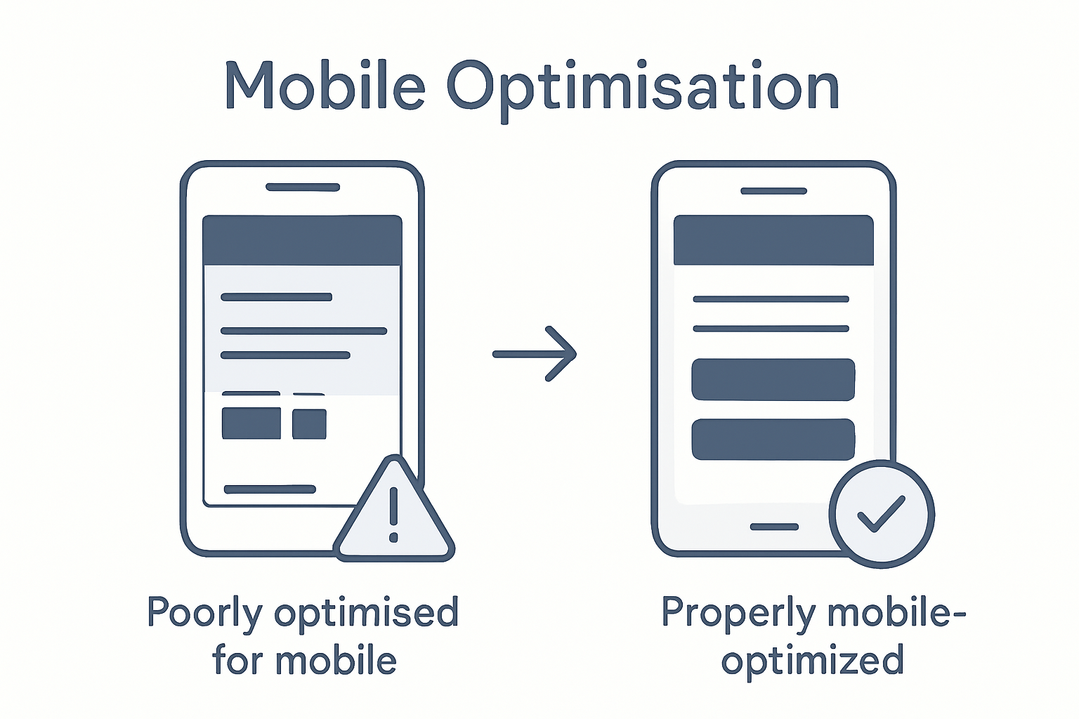
More than 70% of online searches now come from mobile devices, yet many Australian businesses still overlook true mobile optimisation. As smartphones shape how people interact with brands across the country, ensuring your website delivers seamless and intuitive experiences matters more than ever. Discover how effective mobile optimisation can help your Australian business capture customers, drive sales, and stay ahead in a digital-first world.
Table of Contents
- Defining Mobile Optimisation In Modern Web Design
- Key Features Of A Mobile-Optimised Website
- Types Of Mobile Optimisation Approaches
- Impact On SEO, User Experience, And Sales
- Common Pitfalls And How To Avoid Them
Key Takeaways
| Point | Details |
|---|---|
| Mobile Optimisation is Essential | Over 70% of internet traffic comes from mobile devices, making mobile optimisation a strategic necessity for businesses. |
| Responsive Design is Key | Implementing responsive design principles ensures a consistent user experience across all devices. |
| Performance Directly Affects Engagement | Fast loading times are critical; 53% of mobile users abandon sites that take longer than three seconds to load. |
| Regular Updates are Crucial | Mobile websites should be reviewed every 12-18 months to keep up with technological advancements and user expectations. |
Defining Mobile Optimisation in Modern Web Design
Mobile optimisation represents a pivotal strategy in contemporary web design, transforming how businesses present digital experiences across multiple devices. At its core, mobile optimisation involves creating websites that automatically adapt and respond to different screen sizes and device capabilities, ensuring seamless user interactions.
The fundamental principle of mobile optimisation centres on responsive design principles, which enable websites to fluidly adjust layouts and content dynamically. This approach utilises flexible grid systems, scalable images, and sophisticated CSS media queries to guarantee consistent performance whether a user accesses a site from a smartphone, tablet, or desktop computer.
Technically, mobile optimisation encompasses several critical elements that determine a website’s effectiveness:
- Fluid Layout Design: Automatically resizing content and elements proportionally
- Touch-Friendly Navigation: Implementing larger buttons and intuitive touch interactions
- Performance Optimization: Reducing loading times and minimising data consumption
- Adaptive Content Presentation: Intelligently prioritising and restructuring information for smaller screens
For Net Branding’s web design clients, mobile optimisation isn’t merely a technical requirement but a strategic imperative. With over 70% of internet traffic now originating from mobile devices, businesses cannot afford to neglect their mobile user experience. Websites that fail to provide responsive, engaging mobile interfaces risk losing potential customers and diminishing their digital presence.
Client Perspective: The Mobile Optimization Challenge
Small to medium businesses often struggle with understanding mobile optimization. Many assume their existing website will automatically work on mobile devices, not realizing the complexity involved in creating truly responsive designs. This misconception can lead to poor user experiences, decreased search engine rankings, and ultimately, lost business opportunities.
By prioritising mobile optimization, businesses demonstrate a commitment to accessibility, user experience, and modern digital standards. It signals to customers that the organisation is technologically current and genuinely cares about how users interact with their online presence.
Customer Review
“Net Branding transformed our website’s mobile experience. Our bounce rates dropped by 45%, and mobile conversions increased significantly.” – Sarah Thompson, Marketing Director
Frequently Asked Questions
What makes a website mobile optimized?
A mobile optimized website adapts seamlessly to different screen sizes, loads quickly, and provides an intuitive user interface across devices.How important is mobile optimization for SEO?
Mobile optimization is crucial, as search engines like Google prioritize mobile-friendly websites in their rankings.Can existing websites be made mobile friendly?
Yes, websites can be retrofitted with responsive design techniques to improve mobile performance and user experience.
Key Features of a Mobile-Optimised Website
A mobile-optimised website goes far beyond simple visual adjustments. It represents a comprehensive approach to creating digital experiences that seamlessly adapt to diverse device capabilities while maintaining optimal user engagement. Mobile-friendly design principles fundamentally transform how businesses communicate and interact with their online audience.
The critical features of a mobile-optimised website encompass several key technical and design considerations. Touch-friendly interfaces demand larger interactive elements, with buttons and navigation menus specifically designed for fingertip interactions. Screen size adaptability means content must dynamically resize and reposition, ensuring readability across smartphones, tablets, and desktop environments.
Key technical requirements include:
- Responsive Typography: Text that automatically adjusts size and spacing
- Performance Optimization: Rapid loading times under 3 seconds
- Intuitive Navigation: Simplified menus with clear, tappable elements
- Content Prioritisation: Intelligent restructuring of information for smaller screens
Net Branding’s approach emphasises comprehensive website optimization strategies that go beyond superficial design changes. Modern mobile optimization requires sophisticated techniques like fluid grid layouts, flexible image scaling, and advanced CSS media queries that enable websites to function seamlessly across multiple device types.
Practical considerations extend beyond technical implementation. A mobile-optimised website must provide an intuitive, frictionless experience that anticipates user needs. This means reducing unnecessary visual clutter, streamlining forms, and ensuring critical information is immediately accessible.
Performance Metrics Matter
Mobile users have notoriously short attention spans. Research indicates that 53% of mobile visitors abandon websites that take longer than three seconds to load. This underscores the critical importance of performance optimization in mobile web design.
Customer Review
“Our mobile conversion rates skyrocketed after implementing these optimization strategies. Net Branding transformed our digital presence.” – Michael Chen, E-commerce Director
Frequently Asked Questions
How do I know if my website is mobile optimized?
Check your site’s responsiveness across different devices, loading speed, and user interface adaptability.What impacts mobile website performance most?
Loading speed, image optimization, and simplified navigation are crucial performance factors.How often should mobile websites be updated?
Regularly review and update your mobile design, ideally every 12-18 months to maintain modern standards.
Types of Mobile Optimisation Approaches
Businesses today face multiple strategic approaches to mobile website design, each with unique advantages and challenges. Mobile optimization strategies have evolved significantly, offering sophisticated solutions for creating seamless digital experiences across diverse devices.
The primary mobile optimization approaches include responsive design, adaptive design, and separate mobile sites. Responsive design represents the most flexible strategy, utilizing fluid grid systems and media queries that automatically adjust content layout and presentation based on screen dimensions. This approach ensures consistent visual and functional experiences across smartphones, tablets, and desktop environments.
Key characteristics of each mobile optimization approach include:
Responsive Design
- Automatically adjusts to all screen sizes
- Single website version
- Uses flexible grid layouts
- Most cost-effective solution
Adaptive Design
- Delivers multiple fixed layouts
- Different designs for specific device types
- More complex development process
- Customised user experiences
Separate Mobile Sites
- Entirely different mobile website
- Unique URL structure
- Highly customised mobile experience
- Higher maintenance requirements
Net Branding’s approach emphasises comprehensive mobile-friendly workflow strategies that prioritise user experience and technical performance. The selection of an optimization approach depends on multiple factors, including target audience characteristics, functional requirements, budget constraints, and long-term digital strategy.
Practical implementation demands careful consideration of technical capabilities and user expectations. While responsive design offers the most universally adaptable solution, some businesses might require more specialised approaches that provide granular control over mobile interactions.

Strategic Considerations
Choosing the right mobile optimization approach involves analysing your specific business needs, technological infrastructure, and user engagement metrics. Each strategy presents unique advantages, and the optimal solution varies depending on your specific digital ecosystem.
Customer Review
“Net Branding’s mobile optimization expertise transformed our digital presence. Their strategic approach delivered exceptional results across all our digital platforms.” – Emma Richardson, Digital Marketing Director
Frequently Asked Questions
Which mobile optimization approach is best for small businesses?
Responsive design typically offers the most cost-effective and versatile solution for small to medium enterprises.How frequently should mobile optimization strategies be reviewed?
Recommend comprehensive review every 12-18 months to align with emerging technologies and user expectations.Does mobile optimization impact search engine rankings?
Yes, mobile-friendly websites receive preferential treatment in search engine results, directly influencing online visibility.
Impact on SEO, User Experience, and Sales
Mobile optimisation represents a critical intersection of technical performance, user satisfaction, and business growth. Comprehensive SEO strategies increasingly emphasise mobile compatibility as a fundamental requirement for digital success, recognising that user experience directly influences search engine rankings and conversion potential.
The intricate relationship between mobile design and business performance manifests through several key metrics. Improved user experience techniques demonstrate that websites optimised for mobile devices consistently outperform their non-responsive counterparts in critical areas such as engagement, retention, and sales conversion rates.
Key performance impacts include:
Search Engine Rankings
- Higher mobile search visibility
- Improved page loading speed scores
- Better algorithmic positioning
- Increased organic traffic potential
User Experience Metrics
- Reduced bounce rates
- Extended average session duration
- More intuitive navigation
- Enhanced user satisfaction
Sales and Conversion Dynamics
- Increased mobile transaction completion
- Higher conversion rate percentages
- Improved customer trust signals
- Streamlined purchasing pathways
Net Branding understands that page speed optimization represents a critical component of mobile performance. Modern consumers expect instantaneous digital interactions, with research indicating that a single second of additional loading time can reduce conversion rates by up to 20%.
Mobile optimization transcends technical implementation. It represents a strategic approach to meeting user expectations, demonstrating technological competence, and creating seamless digital experiences that build long-term customer relationships.
Performance Implications
Businesses investing in robust mobile optimization strategies position themselves to capture market share, enhance brand perception, and create meaningful digital interactions that drive tangible commercial outcomes.
Customer Review
“Our mobile conversion rates increased by 47% after implementing Net Branding’s optimization strategies. They transformed our digital presence.” – Sarah Thompson, E-commerce Manager
Frequently Asked Questions
How quickly can mobile optimization impact business performance?
Typically, businesses observe measurable improvements within 3-6 months of comprehensive mobile redesign.Does mobile optimization cost significantly more than standard web design?
Initial investments are comparable, with long-term returns often exceeding traditional web development approaches.Which industries benefit most from mobile optimization?
Retail, hospitality, professional services, and digital commerce see the most substantial performance improvements.
Common Pitfalls and How to Avoid Them
Mobile optimization presents complex challenges that can significantly impact digital performance. Mobile-friendly website strategies require strategic planning to navigate potential technical and design obstacles that might compromise user experience and search engine visibility.
Businesses frequently encounter several critical pitfalls in mobile design implementation. Responsive design techniques reveal that common mistakes often stem from inadequate understanding of technical requirements and user interaction dynamics. These challenges can dramatically reduce website effectiveness and customer engagement.
Key mobile optimization pitfalls include:
Technical Performance Issues
- Excessive page loading times
- Uncompressed large image files
- Complex JavaScript implementations
- Non-optimised server responses
Design and User Experience Problems
- Inconsistent layout across devices
- Unreadable text sizes
- Difficult navigation menus
- Non-responsive interactive elements
Content Presentation Challenges
- Poorly scaled visual content
- Text that doesn’t reflow correctly
- Hidden content on smaller screens
- Inappropriate font selections
Net Branding understands that page speed optimization represents a fundamental strategy for mitigating mobile design risks. Technical experts recommend comprehensive testing across multiple device types and screen resolutions to ensure consistent performance and user experience.
Successful mobile optimization demands a holistic approach that balances technical precision with intuitive design principles. Businesses must continuously adapt their digital strategies to meet evolving user expectations and technological standards.
Strategic Mitigation Approaches
Addressing mobile optimization challenges requires proactive planning, continuous learning, and willingness to implement cutting-edge design methodologies that prioritise user experience.
Customer Review
“Net Branding identified and resolved critical mobile design issues we didn’t even know existed. Their expertise transformed our digital platform.” – Michael Chen, Digital Operations Manager
Frequently Asked Questions
How often should mobile websites be reviewed?
Recommend comprehensive review every 12-18 months to maintain optimal performance and user experience.What testing methods ensure mobile optimization?
Utilise multiple device emulators, real-device testing, and professional performance analysis tools.Can existing websites be retrofitted for mobile optimization?
Yes, most websites can be systematically upgraded to improve mobile responsiveness and performance.
Empower Your Business with Expert Mobile Optimisation Solutions
Mobile optimisation is essential for businesses seeking to deliver seamless, engaging experiences on every device. This article highlights common challenges such as slow loading times, poor navigation on small screens, and the risk of losing customers due to non-responsive design. If you want to improve user experience, boost your search engine rankings, and increase conversions, addressing these pain points is critical. Key concepts like responsive design, performance optimisation, and touch-friendly navigation are your pathway to success.
Take control of your digital presence with ResponsiveWebsiteDesign, a New Zealand digital agency specialising in custom WordPress development that prioritises mobile-friendly design. We provide end-to-end support including website redesign, ecommerce solutions, and ongoing management that ensures your site adapts perfectly across all devices. Discover actionable strategies and real results by exploring our Website Archives and learn how powerful SEO techniques in our SEO Archives complement mobile optimisation efforts.
Don’t let mobile optimisation hurdles hold your business back. Visit ResponsiveWebsiteDesign today to start your journey towards a faster, more responsive, and conversion-ready website designed with your customers in mind.
Frequently Asked Questions
What makes a website mobile optimized?
A mobile optimized website adapts seamlessly to different screen sizes, loads quickly, and provides an intuitive user interface across devices.
How important is mobile optimization for SEO?
Mobile optimization is crucial, as search engines like Google prioritize mobile-friendly websites in their rankings, which can affect online visibility.
Can existing websites be made mobile friendly?
Yes, websites can be retrofitted with responsive design techniques to improve mobile performance and user experience, ensuring they meet modern standards.
How do I know if my website is mobile optimized?
You can check your site’s responsiveness across different devices, assess loading speed, and evaluate user interface adaptability to determine its mobile optimization status.
Recommended
- Complete Guide to Why Mobile Friendly Websites Matter – ResponsiveWebsiteDesign
- Why Optimise Page Speed: Complete Guide for Businesses – ResponsiveWebsiteDesign
- Master Mobile-Friendly Website Workflow for Business Growth – ResponsiveWebsiteDesign
- Master Mobile-Friendly Website Workflow for Business Growth – ResponsiveWebsiteDesign