
Many New Zealand businesses lose customers simply because their websites struggle on mobile devices. When a potential buyer tries to browse, slow pages, awkward menus, or fuzzy images quickly drive them away. With mobile device usage continuing to dominate user behaviour worldwide, ensuring your site performs well on phones and tablets is key to winning sales. This guide walks you through practical steps to assess, fix, and elevate your website for every mobile visitor.
Table of Contents
- Step 1: Assess Current Mobile Friendliness
- Step 2: Streamline Design for Mobile Navigation
- Step 3: Optimise Images and Page Speed
- Step 4: Implement Effective Mobile Seo Tactics
- Step 5: Test and Verify Mobile User Experience
Quick Summary
| Key Insight | Explanation |
|---|---|
| 1. Assess mobile friendliness | Manually test your website on various mobile devices to identify usability issues before implementing changes. |
| 2. Simplify mobile navigation | Prioritise key menu items and use a hamburger menu to enhance user experience and guide visitors effectively. |
| 3. Optimise images for speed | Reduce image file sizes and use responsive techniques to ensure quick loading times and a smoother experience. |
| 4. Update mobile SEO strategies | Adapt your keyword strategy for mobile users, focusing on local optimisation and proper structured data. |
| 5. Conduct usability testing | Gather feedback from real users to identify friction points and validate improvements made to your mobile site. |
Step 1: Assess Current Mobile Friendliness
Before you make any changes to your mobile experience, you need to understand where you currently stand. Many New Zealand business owners assume their websites work well on mobile devices without actually testing them. This step involves a thorough evaluation of how your site performs across mobile devices and what obstacles might be preventing visitors from converting. You’ll need to identify specific issues like slow loading times, unresponsive design elements, or poor navigation that could be costing you sales.
Start by manually testing your website on actual mobile devices. Grab a smartphone and tablet, then navigate through your site like a customer would. Open your homepage, click through several product or service pages, and attempt to complete a conversion action like filling out a contact form or making a purchase. Notice what feels awkward or difficult. Does text resize properly? Can you tap buttons easily without hitting the wrong ones? Do images display clearly or do they take forever to load? These real world experiences reveal issues that automated tools might miss. Try accessing your site on different mobile browsers as well, since a page might function differently on Chrome versus Safari.
Next, use the W3C mobile testing standards to conduct a more technical assessment. This authoritative specification evaluates whether your pages meet established mobile friendliness criteria. You can also check your site’s mobile performance using Google’s mobile friendly test, which provides detailed feedback on responsiveness, tap target sizing, and viewport configuration. Additionally, review your Google Search Console data to see mobile usability issues that search engines have identified. Pay special attention to pages that receive high traffic but show warning signs like high bounce rates or low average session duration, as these indicate potential mobile experience problems.
Analyse your current mobile conversion rates by comparing them to your desktop performance. Use your website analytics to determine what percentage of visitors use mobile devices and how their behaviour differs from desktop users. Current research shows that mobile device usage continues to dominate user behaviour worldwide, so understanding your own mobile traffic patterns is crucial for business growth. If your mobile conversion rate is significantly lower than your desktop rate, you have a clear opportunity to improve. Document these metrics as your baseline so you can measure improvement later.
Here’s a comparison of common mobile website issues and their impact on business performance:
| Issue | How It Affects Users | Impact on Business |
|---|---|---|
| Slow loading times | Frustrates and delays users | Higher bounce rates, lost sales |
| Unresponsive layout | Difficult navigation | Reduced conversions, lower satisfaction |
| Poor tap targets | Accidental misclicks | Increased form abandonment or errors |
| Blurry/slow images | Unprofessional appearance | Damaged brand trust, fewer purchases |
| Hidden navigation | Hard to find key pages | Missed enquiries, decreased engagement |
If your website was built several years ago without mobile optimisation in mind, you might discover that it fails basic mobile tests entirely. This is actually quite common, and understanding the full scope of the problem helps you plan your next steps. Some businesses discover their site isn’t even visible to mobile search engines properly, which explains why they’re missing out on potential customers. Others find that whilst their site technically works on mobile, the user experience is so poor that visitors leave almost immediately. When you uncover serious mobile friendliness issues, this often becomes the moment when business owners realise why they need professional help. This is where partnering with a specialist web development team becomes valuable. A web design and development agency can conduct a comprehensive audit and create a strategic plan to address all mobile issues, ensuring your website actually converts visitors into customers. Our team at Net Branding regularly helps New Zealand businesses discover and fix mobile problems they didn’t even know existed.
Pro tip Document every issue you find during testing using screenshots and notes, organised by priority level. This information becomes invaluable when you brief a web developer or plan your optimisation strategy, saving time and ensuring nothing gets overlooked.
Step 2: Streamline Design for Mobile Navigation
Mobile navigation works differently than desktop navigation because visitors have far less screen space and patience. Your primary goal here is to simplify how users find what they need on your site. When someone lands on your mobile site, they should understand immediately how to reach key pages, products, or services. Confusing or complicated navigation is one of the fastest ways to send mobile visitors back to your competitors.

Start by auditing your current navigation structure. Most websites built for desktop have too many menu items crammed into a small space on mobile. You might have a navigation bar with fifteen different links that makes sense on a large screen but becomes completely unusable on a phone. Effective mobile navigation design considers the physical constraints of touchscreen devices and limited screen real estate. The solution is to prioritise ruthlessly. Identify your five to seven most important navigation items that align with what mobile users actually want to do. If you run a local plumbing business, your mobile navigation might include Home, Services, Emergency Contact, Book Now, and Testimonials. That’s it. Everything else can be tucked into secondary menus or footers where it belongs.
Implement a hamburger menu (the three horizontal lines icon) that collapses your full navigation into a tappable button. This is standard on mobile and users expect it. However, don’t hide absolutely everything behind that menu. Your most critical call-to-action, like a phone number or booking button, should remain visible and accessible without opening menus. Make your touchable buttons and links large enough that people can tap them accurately without hitting neighbouring elements. Aim for at least 48 pixels of spacing around clickable elements. Your footer should also contain key navigation links and contact information since mobile users often scroll all the way down rather than hunting for navigation at the top.
Consider how navigation impacts both user experience and search engine discoverability. When search engines crawl your site, they follow your navigation links to understand your content structure. A poorly organised navigation can prevent important pages from being discovered by search engines, which hurts your visibility for local searches. This is particularly important for New Zealand businesses competing locally. Make sure your navigation uses clear, descriptive link text rather than vague labels like “Click Here” or “More.” Use words that describe where the link actually goes. Your mobile navigation should guide both people and search engines efficiently through your content.
If your current website has overly complicated navigation, this is another area where professional web design expertise becomes invaluable. The team at Net Branding specialises in redesigning navigation structures that actually work for mobile users whilst maintaining search visibility. We test navigation patterns with real users to identify what works and what frustrates visitors. A responsive design approach ensures your navigation adapts beautifully across all device sizes rather than trying to squeeze desktop navigation onto small screens.
Below is a summary of mobile navigation improvements and their benefits:
| Navigation Feature | User Benefit | SEO Benefit |
|---|---|---|
| Prioritised menu items | Quick access to key links | Improved crawlability |
| Clear, descriptive link text | Easier decision-making | Enhanced keyword relevance |
| Visible call-to-action | Faster conversions | Increased engagement signals |
| Footer navigation | Easy reach at scroll bottom | Strong internal linking |
Pro tip Test your mobile navigation by using your phone with one hand only, like most people do. If you can’t navigate easily with your thumb while holding the device, your menu structure needs simplification.
Step 3: Optimise Images and Page Speed
Images are often the culprits behind slow mobile websites, yet they’re also essential for engaging visitors and converting them into customers. A single large, unoptimised image can take several seconds to load on a mobile connection, which sends visitors away before they ever see your content. Your goal in this step is to dramatically reduce file sizes without sacrificing visual quality. When done properly, your pages will load in seconds rather than minutes, and mobile users will actually stay around long enough to make a purchase.
Start by auditing all the images on your website. Take note of their file sizes and dimensions. Many website owners simply upload images directly from their camera or design software without any compression. A photo that looks perfectly fine on a desktop monitor might be 5 megabytes in size, which is catastrophic for mobile users. Use image editing tools to resize images to the exact dimensions you need for display. If an image will only be 400 pixels wide on mobile, there’s no point uploading a 2000 pixel wide file. Next, compress your images aggressively. Modern compression removes unnecessary data without visible quality loss. You want to aim for image files under 200 kilobytes for most website images. Consider using next-generation image formats like WebP, which provide superior compression compared to older JPEG and PNG formats. WebP files are typically 25 to 35 percent smaller than equivalent JPEG files whilst maintaining the same visual quality.
Implement responsive image techniques using HTML attributes to serve different image versions based on device type and screen size. This means a mobile phone receives a smaller, faster-loading image whilst a desktop user gets the full resolution version. This approach dramatically improves mobile page speed without degrading the desktop experience. Lazy loading is another technique worth implementing, where images only start downloading when users scroll near them rather than loading everything at page load. This can cut your initial page load time in half. Beyond images, review other elements slowing your site. Unminified code, excessive plugins, and poor hosting can all contribute to sluggish performance. The role of page speed extends beyond user experience, affecting your search engine rankings as well. Google explicitly factors page speed into its ranking algorithm, meaning a slow site loses visibility for mobile searches.
If your website is running on old hosting or built with inefficient code, these technical optimisations become complex. This is where partnering with a web development specialist becomes worthwhile. Our team at Net Branding conducts detailed performance audits and implements image optimisation strategies tailored to your specific content. We handle everything from format conversion to lazy loading implementation, ensuring your mobile pages load at peak performance. A properly optimised website not only keeps visitors engaged but also dramatically improves your chances of ranking higher in local search results.
Pro tip Use Google PageSpeed Insights to test your current mobile page speed and receive specific recommendations for improvement. Run the same test after implementing optimisations to measure your progress in real numbers.
Step 4: Implement Effective Mobile SEO Tactics
Mobile search behaviour differs dramatically from desktop searches. People on mobile devices use different keywords, search with more intent to take immediate action, and expect faster results. Your SEO strategy needs to account for these differences or you’ll miss out on valuable local search traffic. This step focuses on optimising your website specifically for how mobile users search and what search engines reward when ranking mobile results.
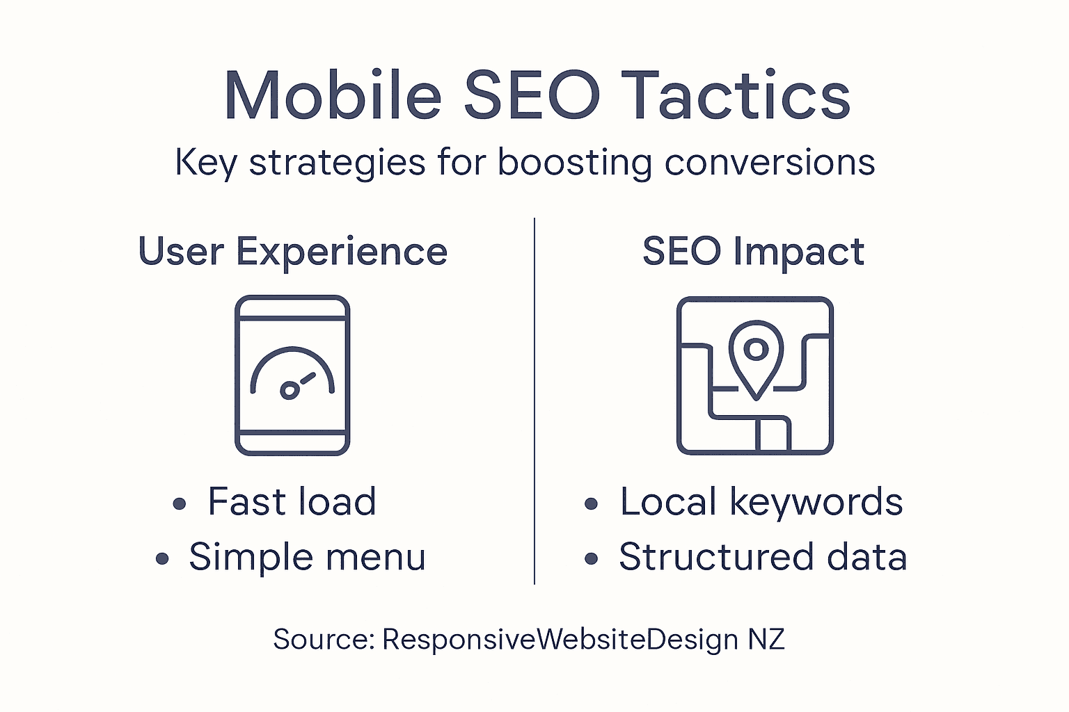
Start by updating your keyword strategy for mobile searchers. People searching on phones tend to use shorter, more conversational phrases. They’re often looking for immediate solutions like “plumber near me” or “urgent services today” rather than the longer, more descriptive queries desktop users might type. Research mobile-specific keywords using Google Keyword Planner and analyse what search terms bring visitors to your competitors’ websites. Create content that directly addresses these mobile search queries. Your product pages, service descriptions, and blog posts should use language that matches how people actually search on their phones. Mobile users are also more likely to have local intent, so incorporating your location into your content is critical. Use phrases like “in Auckland” or “serving Wellington” throughout your pages to capture these location-based searches.
Implement structured data markup, which helps search engines understand your content better. Mobile SEO best practices include adding schema markup that identifies your business type, location, services offered, and customer reviews. This markup appears invisible to visitors but tells Google exactly what your page is about, which improves your visibility in mobile search results and can trigger rich snippets that make your listing stand out. Optimise your meta titles and descriptions specifically for mobile displays, where space is limited. Mobile title tags should be 50 characters or fewer, and meta descriptions around 120 characters, to display fully without truncation. These elements appear in search results and directly influence whether people click through to your site. Make sure your most important keywords appear early in these elements so mobile searchers understand immediately what your page offers.
Ensure your website architecture supports mobile SEO. Technical SEO factors like crawlability and responsive design fundamentally affect how search engines index your content. Mobile-first indexing means Google now primarily uses the mobile version of your site to determine rankings. If your mobile site is missing content, slower, or harder to crawl than your desktop version, you’ll suffer in search rankings. Implement proper internal linking on mobile that guides both users and search engines through your content hierarchy. Use descriptive anchor text that makes it clear where links lead. Building mobile SEO expertise requires understanding both technical factors and user behaviour. Our specialists at Net Branding conduct comprehensive mobile SEO audits and implement strategies tailored to your New Zealand market position. We optimise everything from keyword targeting to structured data implementation, ensuring your mobile presence generates qualified leads from local search results.
Pro tip Focus on local keyword optimisation first, as these typically have higher conversion rates for New Zealand small businesses and face less national competition than broader search terms.
Step 5: Test and Verify Mobile User Experience
All the optimisations you’ve implemented need validation before you declare your mobile site ready. Testing reveals whether your improvements actually work in the real world and whether visitors genuinely find your site easy to use. This step involves both technical testing and real user feedback to ensure your mobile experience converts visitors into customers.
Begin with systematic usability testing involving actual people using your mobile site. Ask friends, family members, or local business contacts to navigate your website on their own phones and complete key actions like filling out a contact form or viewing your services. Watch how they interact with your site without giving them instructions. Do they struggle finding what they need? Do they accidentally tap the wrong buttons? Do they give up halfway through a process? These observations reveal friction points that analytics alone won’t show. Take notes on every hesitation, every confused look, and every moment they have to think about what to do next. Beyond informal testing, consider using user experience surveys to collect structured feedback from mobile users. Ask specific questions about their experience, such as whether navigation was intuitive, if pages loaded quickly, and whether they felt confident completing actions. Quantifiable feedback helps prioritise which issues to fix first.
Complement user testing with technical verification using user-centered testing methods that measure accessibility, performance, and functionality across devices. Test your site on multiple real devices including older smartphones, current models, and tablets. Avoid relying solely on browser emulation tools, which don’t perfectly replicate actual device behaviour. Check that forms work properly on mobile keyboards, that buttons respond to taps with appropriate feedback, and that interactive elements function correctly. Verify your site is accessible to people with disabilities by testing screen reader compatibility and ensuring sufficient colour contrast. Use tools like Google Mobile-Friendly Test and Lighthouse to identify remaining technical issues. Track conversion metrics before and after your optimisations to measure whether improvements actually increased sales or inquiries. Compare your mobile conversion rate to your desktop rate to identify any remaining disparities.
If your testing reveals significant issues or your conversion rates remain stubbornly low despite improvements, professional analysis becomes worthwhile. The team at Net Branding conducts comprehensive mobile user experience testing and provides detailed recommendations for improvement. We use both qualitative and quantitative methods to understand exactly why visitors leave without converting, then implement targeted solutions. Our approach focuses on measurable outcomes, ensuring every change you make serves the ultimate goal of boosting mobile conversions.
Pro tip Create a simple spreadsheet tracking key mobile metrics like page load time, bounce rate, and conversion rate before and after each major change, allowing you to see exactly which improvements drive real business results.
Take Control of Your Mobile Experience and Boost Conversions Today
Many businesses struggle with slow loading times, complicated navigation and poor mobile SEO that drive potential customers away. If you recognise these mobile friendliness challenges from the article, you are not alone. Achieving a smooth, engaging mobile experience that turns visitors into loyal customers requires expert guidance and tailored solutions focused on your unique goals. This is where our specialised WordPress services can make a real difference.
Explore our comprehensive offerings in Website Archives – ResponsiveWebsiteDesign and SEO Archives – ResponsiveWebsiteDesign to see how we create fast, responsive and SEO-optimised websites designed specifically for New Zealand businesses. Visit Responsive Website Design now to partner with a trusted digital agency that supports you from initial design through mobile performance optimisation and ongoing management. Let us help you transform your mobile presence and capture more sales starting today.
Frequently Asked Questions
How can I assess my website’s mobile friendliness?
To assess your website’s mobile friendliness, manually test it on various mobile devices by navigating through key pages and completing actions like filling out forms. Note any difficulties you encounter, such as slow loading times or unresponsive elements, and aim to document these findings for future improvements.
What are the key elements to simplify for mobile navigation?
To simplify mobile navigation, prioritise your most important links, ideally just five to seven, and implement a hamburger menu to condense the structure. Ensure that your critical actions, like contact buttons, remain visible for easy access.
How do I optimise images for a faster mobile experience?
Optimise images by reducing their file sizes and using proper formats that ensure fast loading without losing quality. Aim to keep most images under 200 kilobytes by resizing and compressing them effectively, which can significantly enhance your page loading speed.
What are effective mobile SEO tactics I should implement?
Focus on mobile-specific keywords and implement structured data markup to improve visibility in search results. Ensure that your content includes local terms and that your meta titles and descriptions are optimised for mobile display to attract more visits.
How can I test if my mobile site improvements are effective?
To test the effectiveness of your mobile site improvements, conduct usability tests with real users, observing their interactions with key actions on your site. Track your conversion metrics before and after changes, and aim for a measurable increase in mobile conversions within a few weeks after implementing the optimisations.
Recommended
- Master Mobile-Friendly Website Workflow for Business Growth – ResponsiveWebsiteDesign
- Master Mobile-Friendly Website Workflow for Business Growth – ResponsiveWebsiteDesign
- 7 Key Advantages of Mobile-Friendly Sites for Business Owners – ResponsiveWebsiteDesign
- Mobile Optimisation: Why It Matters for Your Business – ResponsiveWebsiteDesign
- chatbot – Sparkly HR