Updating your WordPress website content can feel challenging when you want to attract genuine customers in New Zealand while rising in search results. Good content means more than listing basic plumbing services. It must show your expertise and answer real questions people have. Focusing on plumbing expertise and local relevance will make your website stand out, improve SEO rankings, and help visitors feel confident in your skills.
Table of Contents
- Step 1: Review Existing Plumbing Website Content
- Step 2: Research Current Plumbing SEO Trends
- Step 3: Revise Website Text for Readability and Keywords
- Step 4: Optimise Images and Meta Tags Correctly
- Step 5: Test Content Updates Across Devices
- Step 6: Monitor Website Performance After Changes
Quick Summary
| Key Point | Explanation |
|---|---|
| 1. Review Your Website Content | Regular content reviews boost online visibility and attract customers by identifying areas for improvement. |
| 2. Focus on Local SEO | Targeting local keywords and optimising for local search helps connect with customers in your area. |
| 3. Enhance Content Readability | Clear and accessible content keeps users engaged and reduces bounce rates, improving overall site performance. |
| 4. Optimise Images and Meta Tags | Properly optimising images and meta tags enhances search visibility and user engagement, attracting more visitors. |
| 5. Monitor Website Performance | Regularly tracking performance metrics reveals the effectiveness of changes and helps maintain website quality. |
Step 1: Review existing plumbing website content
Reviewing your plumbing website content is crucial for improving online visibility and attracting potential customers. Your goal is to assess current content effectiveness and identify opportunities for enhancement that will boost search rankings and engage visitors.
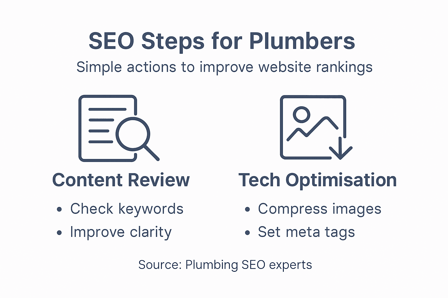
To conduct a comprehensive content review, focus on several key areas. Optimise content for local SEO by ensuring your pages target relevant local keywords and address common customer questions. Start by evaluating your existing service pages, blog posts, and informational content with these critical criteria:
- Check current content relevance to customer needs
- Analyse keyword integration and search intent alignment
- Review technical accuracy of plumbing information
- Assess readability and user engagement potential
- Verify local service area representation
Effective content should establish your plumbing expertise while directly addressing potential customer concerns. This means creating educational material that demonstrates technical knowledge and builds trust. Your content must go beyond basic service descriptions and provide genuine value.
Plumbing website content should transform technical information into accessible, helpful guidance for potential customers.
Carefully examine each webpage for opportunities to incorporate targeted keywords naturally, improve readability, and showcase your professional capabilities. The goal is creating content that simultaneously satisfies search engine algorithms and provides meaningful information to potential clients.
Specialist Recommendation: Conduct a thorough audit every six months to ensure your website content remains current, relevant, and optimised for both search engines and customer engagement.
Step 2: Research current plumbing SEO trends
Researching current SEO trends for your plumbing website is essential to stay competitive and improve your online visibility. Your objective is to identify the latest strategies that will help potential customers find your services more easily.
Local SEO strategies have become increasingly critical for plumbing businesses. This means focusing on geographic-specific approaches that connect you directly with customers in your service area. Key areas to investigate include:
- Google Business Profile optimisation
- Local directory listings
- Customer review acquisition
- Targeted local keyword research
- Mobile search performance
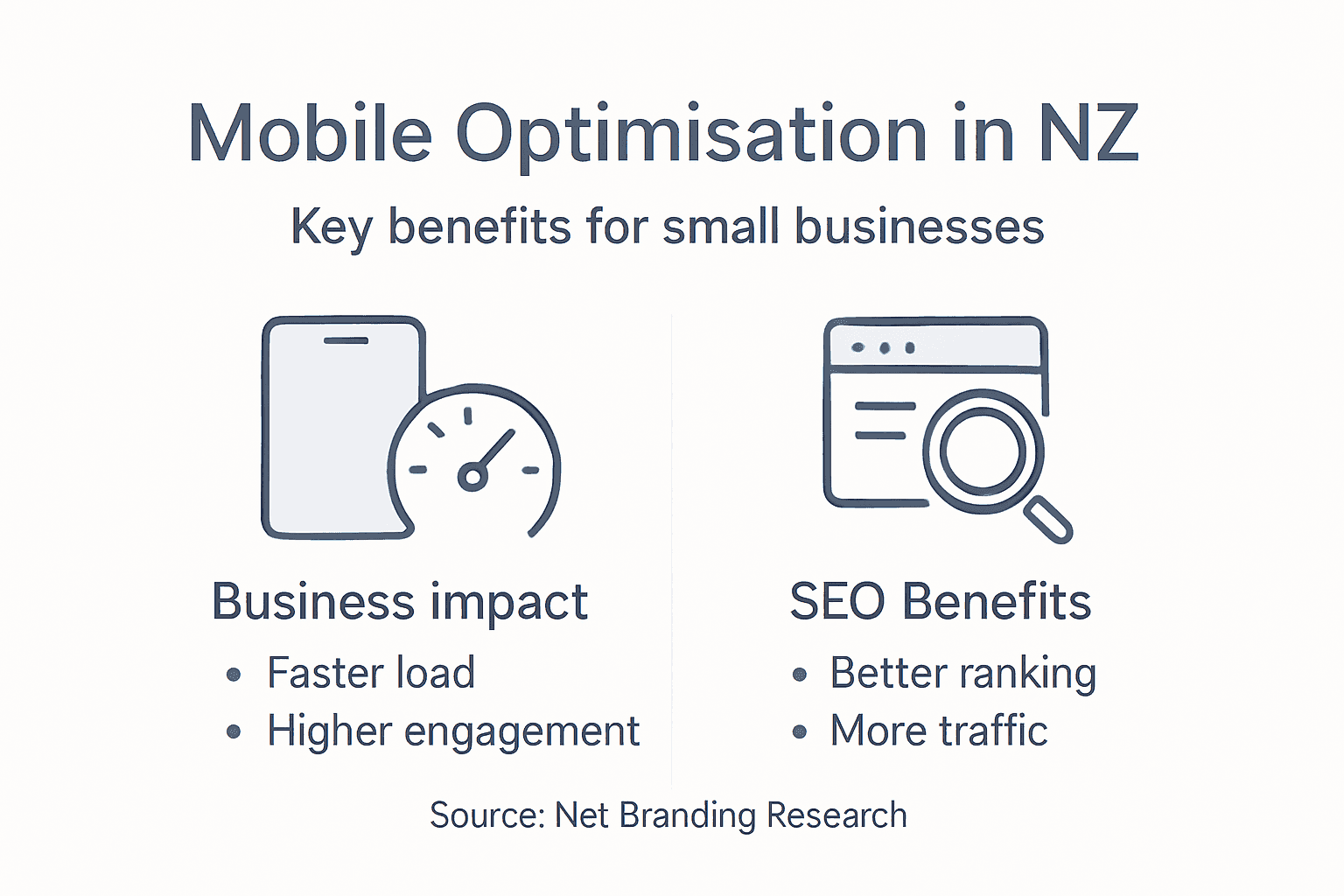
Technical SEO aspects are equally important for plumbing websites. Modern search algorithms prioritise websites that offer fast loading speeds and mobile-friendly designs. Investigate how your current website performs across different devices and platforms.
Successful plumbing SEO requires a holistic approach that combines technical performance with genuine, helpful content.
Content strategy remains a cornerstone of effective SEO. Focus on creating informative articles that address common plumbing questions, showcase your expertise, and provide genuine value to potential customers. This approach not only improves search rankings but also builds trust with your audience.
Specialist Recommendation: Conduct SEO trend research quarterly to ensure your digital strategy remains current and competitive in the rapidly evolving online landscape.
Step 3: Revise website text for readability and keywords
Revising your plumbing website content requires a strategic approach to improve both user engagement and search engine performance. Your goal is to create text that speaks directly to potential customers while satisfying complex search algorithms.
Content readability strategies play a crucial role in keeping visitors engaged and reducing bounce rates. This means transforming technical plumbing language into clear, accessible content that resonates with your target audience. Key considerations include:
- Use simple, straightforward vocabulary
- Break complex ideas into shorter paragraphs
- Implement clear, descriptive headings
- Maintain a consistent, conversational tone
- Balance technical accuracy with readability
Keyword integration is equally important. Strategic keyword placement helps search engines understand your content’s relevance without compromising natural language flow. Avoid keyword stuffing by embedding terms naturally and focusing on semantic relevance.
Effective website content balances technical expertise with genuine, user-friendly communication.
Analyse your existing text critically. Look for opportunities to replace jargon with plain language, streamline sentence structure, and highlight your unique plumbing expertise. Remember that good SEO writing serves the reader first, with search engines as a secondary consideration.

Specialist Recommendation: Utilise readability tools to assess and improve your content’s clarity, aiming for a reading level that speaks directly to your target customer base.
Step 4: Optimise images and meta tags correctly
Optimising your plumbing website’s images and meta tags is critical for improving search visibility and user engagement. Your objective is to create a more discoverable and technically sound website that attracts potential customers.
Image optimization strategies can significantly enhance your website’s performance and search rankings. This involves carefully selecting and preparing visual content that communicates your plumbing expertise effectively. Key considerations include:
- Use descriptive, keyword-rich file names
- Compress images for faster loading
- Select appropriate file formats (WebP recommended)
- Create meaningful alt text for accessibility
- Ensure images are responsive across devices
Meta tag optimization requires attention to detail. Strategic meta description writing helps search engines understand your page content while enticing users to click. Focus on crafting concise, compelling summaries that include relevant plumbing-related keywords.
High-quality visual content and precise meta tags transform your website from invisible to irresistible.
Pay close attention to technical details like image file sizes, responsive design, and semantic HTML structure. These elements not only improve search engine understanding but also enhance user experience for potential customers seeking plumbing services.
Specialist Recommendation: Regularly audit your website’s visual and metadata elements to maintain peak search performance and user engagement.
Here’s a summary of essential SEO elements for plumbing websites and their business value:
| Element | Purpose | Business Impact |
|---|---|---|
| Local Keyword Targeting | Attracts customers from your service area | Increases relevant traffic |
| Informational Content | Educates and builds trust with visitors | Enhances reputation, conversions |
| Fast Page Load Speeds | Improves user experience and SEO rankings | Reduces bounce rate, ranks higher |
| Responsive Design | Ensures website accessibility on all devices | Broadens reach, boosts engagement |
| Meta Tag Optimisation | Improves page visibility in search results | Higher click-through rates |
Step 5: Test content updates across devices
Testing your plumbing website content updates across multiple devices ensures a consistent and professional online experience for potential customers. Your mission is to verify that your website looks and functions perfectly regardless of screen size or device type.
Website testing strategies are essential for maintaining a seamless user experience. This process involves thoroughly examining how your content renders and performs across different platforms. Key areas to evaluate include:
- Desktop browser compatibility
- Mobile responsiveness
- Tablet display consistency
- Loading speed on various devices
- Touch interface functionality
Technical testing tools can help identify potential issues before they impact user experience. Focus on verifying that text remains readable, images display correctly, and navigation remains intuitive across all screen sizes.
Comprehensive device testing transforms potential technical obstacles into a smooth, professional online experience.
Pay special attention to responsive design elements that adapt seamlessly to different screen dimensions. This includes checking that your plumbing service descriptions, contact forms, and visual content maintain their clarity and impact across desktop, tablet, and mobile platforms.
Specialist Recommendation: Conduct device testing at least monthly to ensure your website remains technically robust and visually appealing across all digital platforms.
Step 6: Monitor website performance after changes
Monitoring your plumbing website’s performance after content updates is crucial to understanding the impact of your SEO efforts. Your objective is to track key metrics that reveal how your changes influence website visibility and user engagement.
Website performance tracking requires systematic attention to multiple critical indicators. Establishing a comprehensive monitoring strategy helps you quickly identify and address potential issues. Key metrics to investigate include:
- Organic search traffic levels
- Page load speeds
- Keyword ranking positions
- User engagement rates
- Conversion performance
Technical performance monitoring provides insights into how search engines and users interact with your updated content. Pay particular attention to search ranking fluctuations that might indicate positive or negative impacts from your recent modifications.
Consistent monitoring transforms website updates from guesswork into strategic improvements.
Utilise analytical tools that offer real-time data and trend analysis. These resources help you understand not just what is happening with your website, but why changes are occurring and how to respond effectively.
Specialist Recommendation: Set up automated monitoring alerts to receive immediate notifications about significant performance changes, enabling rapid response and continuous optimization.
Compare strategic SEO review and technical SEO monitoring for plumbing sites:
| Approach | Focus Area | Frequency | Main Benefit |
|---|---|---|---|
| Strategic SEO Review | Content and keywords | Every 6 months | Improves visibility and trust |
| Technical Monitoring | Performance and speed | Monthly | Maintains accessibility, SEO |
Achieve Plumbing SEO Success with Expert Website Solutions
Updating your plumbing website content to improve SEO can feel overwhelming. You might be struggling with making your site readable, mobile responsive, optimising images and meta tags, and ensuring your content truly connects with local customers. These challenges can limit your online visibility and reduce valuable leads. This article highlights essential steps like revising website text for readability, testing across devices, and monitoring performance that are key to standing out in a competitive market.
At Responsive Website Design, we understand that plumbing businesses need more than just basic online presence. Our tailored WordPress website design and development services focus on creating SEO optimised, mobile friendly websites that speak directly to your customers and reflect your expertise. We help you implement strategic content updates and ensure your site loads fast, looks great on all devices, and ranks well in local searches.
Don’t let technical hurdles hold back your plumbing business growth. Take control of your online success today by partnering with experts who support you through every stage of website design, content optimisation, and ongoing maintenance. Visit our WordPress development services page to explore how we can revamp your site for better SEO results. Ready to boost your digital footprint and attract more customers? Contact us now at Responsive Website Design and start transforming your plumbing website into a powerful marketing tool.
Frequently Asked Questions
How can I optimise my plumbing website content for local SEO?
To optimise your plumbing website content for local SEO, ensure that your pages include relevant local keywords and answer commonly asked customer questions. Start by researching local terms and phrases related to your services and incorporate them naturally into your content to attract more local customers.
What types of content should I review for better SEO success?
Focus on reviewing service pages, blog posts, and any informational content on your plumbing website. Assess each piece for relevance to customer needs, accuracy, and engagement potential to enhance your overall SEO performance.
How often should I conduct a content audit on my plumbing website?
You should conduct a content audit every six months to keep your plumbing website optimised and current. This regular review helps ensure that your content remains relevant and effective in attracting potential clients.
What key metrics should I monitor after updating my plumbing website content?
After updating your plumbing website content, monitor key metrics such as organic search traffic, page load speeds, and user engagement rates. Tracking these specific indicators helps you understand the impact of your content updates and informs future strategies for improvement.
How do I make my technical plumbing information more readable for website visitors?
To make technical plumbing information more readable, use simple vocabulary and break complex topics into shorter, clear paragraphs. Incorporate descriptive headings and maintain a conversational tone to enhance visitor engagement and comprehension.
What are the best practices for optimising images and meta tags on my plumbing website?
Best practices for optimising images and meta tags include using descriptive, keyword-rich file names, compressing images for faster loading, and writing compelling meta descriptions. Ensure that your alt text is meaningful for better accessibility, which can improve both search rankings and user experience.
Recommended
- Role of Web Design for Plumbers: Boosting Local Credibility – ResponsiveWebsiteDesign
- How to Plan Website Content for SEO Success – ResponsiveWebsiteDesign
- How to Update Website Content for Business Success – ResponsiveWebsiteDesign
- Website Maintenance Checklist for Business Success – ResponsiveWebsiteDesign