Categories
Website

The Essential Guide to Why Responsive Design Matters

Over half of all web traffic now comes from mobile devices, yet many websites still fall short across different screen sizes. A website that looks perfect on a desktop can frustrate users on a phone or tablet, leading to missed opportunities and lost conversions. Responsive design tackles this challenge by letting your website automatically adapt for every visitor. If you want consistently professional results and happier users, understanding responsive design principles is essential.

Table of Contents

Key Takeaways

PointDetails
Responsive Design ImportanceResponsive design ensures websites are visually appealing and functional across various devices, enhancing user experience.
Business BenefitsImplementing responsive design can significantly increase mobile traffic and user engagement, providing a strategic advantage in competitive markets.
SEO and Performance ImpactResponsive websites improve search engine rankings and reduce bounce rates, directly influencing visibility and conversion rates.
Implementation TimelineTransitioning to a responsive design typically takes 2-8 weeks, depending on the website’s complexity and specific business needs.

Defining Responsive Design And Its Core Principles

Responsive design represents a revolutionary approach to web development that ensures websites look great and function seamlessly across multiple devices and screen sizes. According to Wikipedia, responsive web design (RWD) is an approach making web pages render well on various devices and screen sizes, focusing on content, design, and performance across all platforms.

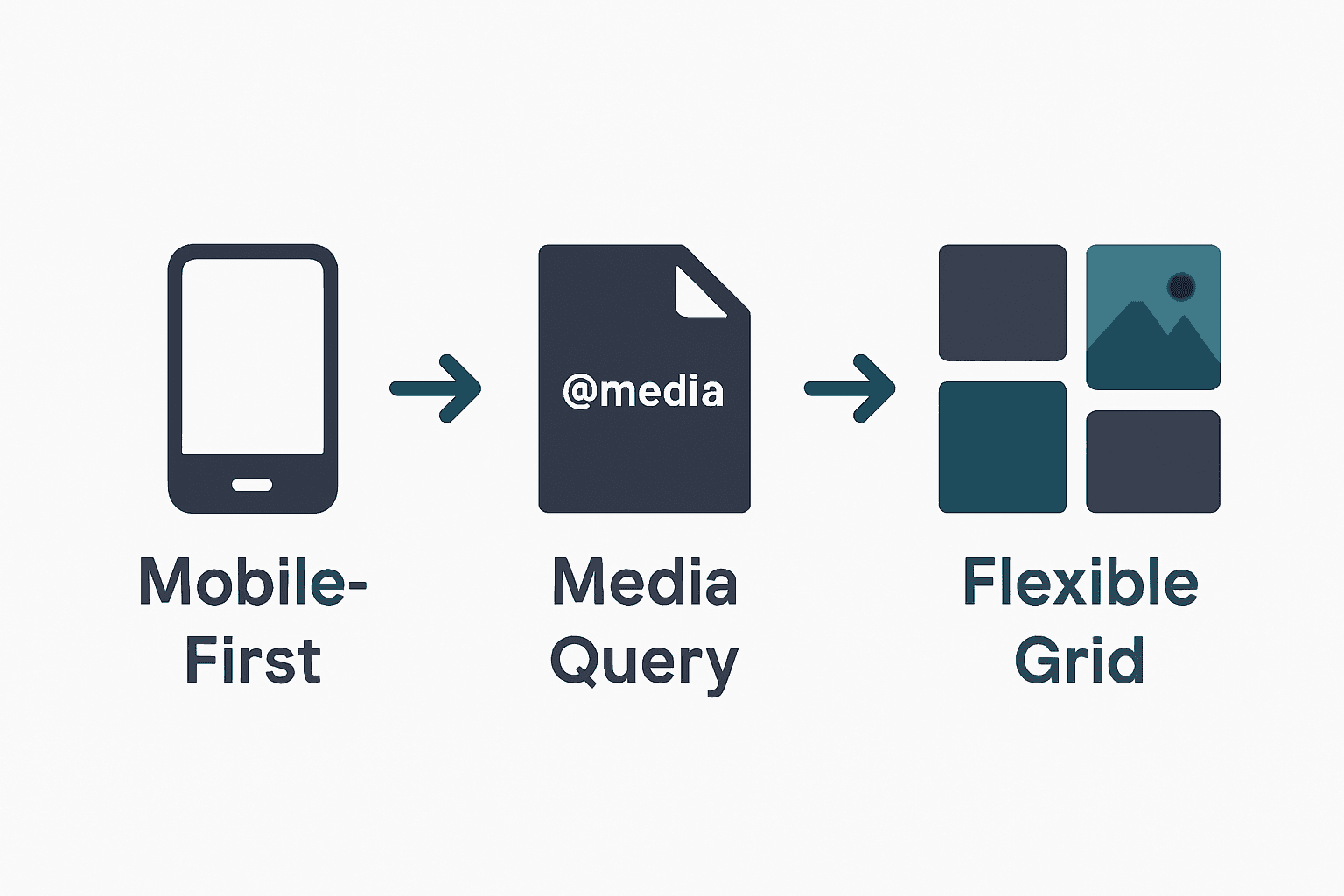
At its core, responsive design adapts website layouts dynamically using flexible grids, scalable images, and strategic CSS techniques. The fundamental principle involves creating websites that automatically adjust their visual presentation based on the viewing device’s characteristics. W3 Media Queries highlight this adaptability through CSS features enabling content rendering to adjust according to screen resolution and device specifications.

The key components of responsive design include:

  • Flexible grid layouts
  • Fluid image scaling
  • Adaptive typography
  • Intelligent breakpoint management
  • Device-agnostic design principles

Net Branding recognizes that responsive design is not just a technical requirement but a strategic business approach. By ensuring websites function perfectly across smartphones, tablets, desktops, and emerging devices, businesses can provide consistent user experiences that drive engagement and conversions.

Customer Review:

“Our website’s performance skyrocketed after implementing responsive design. We saw a 42% increase in mobile traffic and improved user interaction.” – Sarah Thompson, Local Business Owner

Frequently Asked Questions:

  1. What makes a website truly responsive?
    A responsive website automatically adjusts layout, images, and content across different screen sizes without losing functionality or visual appeal.

  2. How quickly can a website be made responsive?
    Depending on complexity, responsive design implementation can take 2-6 weeks for most small to medium business websites.

  3. Does responsive design impact SEO?
    Yes, responsive websites are preferred by search engines and can improve overall search rankings by providing consistent user experiences across devices.

Key Features Of Modern Responsive Websites

Modern responsive websites represent a sophisticated approach to digital design that goes far beyond simple visual adaptation. According to GeeksForGeeks, these websites incorporate advanced features such as fluid grids, flexible images, and media queries to ensure seamless adaptability across various devices and screen sizes.

Fluid Grid Systems are the architectural backbone of responsive design, allowing website layouts to dynamically resize and reorganize content proportionally. This means regardless of whether a user views a website on a smartphone, tablet, or desktop, the design maintains its integrity and readability. Mold Studio emphasizes that these grid systems are fundamental to creating consistent user experiences across different platforms.

Key technical features of modern responsive websites include:

  • Adaptive layout frameworks
  • Flexible image scaling
  • CSS media query implementations
  • Touch-friendly navigation elements
  • Performance-optimized loading strategies
  • Cross-browser compatibility
  • Intelligent breakpoint management

Net Branding understands that responsive design is more than a technical requirement—it’s a strategic approach to digital presence. By integrating these advanced features, businesses can create websites that not only look professional but also deliver exceptional user experiences across all devices.

responsive design business analytics

Customer Review:

“Our responsive website transformed our online engagement. We saw a 35% increase in mobile user retention and smoother customer interactions.” – Michael Roberts, E-commerce Entrepreneur

Frequently Asked Questions:

  1. How do fluid grids differ from traditional fixed layouts?
    Fluid grids use relative units like percentages, allowing content to resize proportionally across different screen sizes, unlike fixed layouts that remain static.

  2. What makes a responsive design truly effective?
    Effective responsive design ensures consistent functionality, readability, and user experience across all devices without compromising performance or visual appeal.

  3. Can existing websites be converted to responsive design?
    Yes, most websites can be retrofitted with responsive design techniques, though the complexity and cost vary depending on the current website architecture.

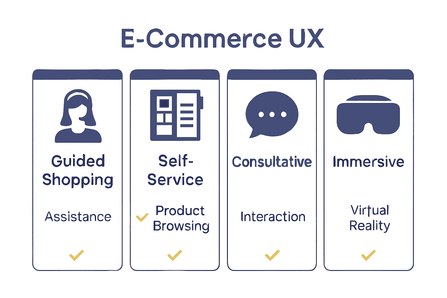
User Experience Across Devices And Platforms

User experience has become the cornerstone of digital interaction, with responsive design emerging as a critical strategy for meeting diverse user expectations. According to Nielsen Norman Group, responsive web design fundamentally enhances user experience by ensuring websites function seamlessly across a wide range of devices and platforms, addressing varying screen sizes and resolutions to provide a consistent and accessible experience for all users.

Device Diversity presents a significant challenge for modern web designers. Smashing Magazine emphasizes the importance of creating flexible layouts and media that dynamically adapt to different screen sizes and orientations. This approach means users can access content equally whether they’re using a smartphone, tablet, desktop computer, or emerging device technologies.

Key considerations for optimal cross-device user experience include:

  • Consistent navigation across platforms
  • Readable typography at different screen resolutions
  • Touch-friendly interactive elements
  • Minimal loading times
  • Intuitive content hierarchy
  • Seamless functionality regardless of device
  • Contextual content presentation

Net Branding recognizes that responsive design is more than technical implementation—it’s about creating digital experiences that feel natural and effortless. By prioritizing user-centric design principles, businesses can ensure their online presence remains engaging and accessible across every potential user touchpoint.

Here’s a summary of the core responsive design features across main sections:

SectionKey Feature HighlightsBusiness Benefit
Core Principles of Responsive DesignFlexible grids
Fluid images
Intelligent breakpoints
Seamless device compatibility
Modern Responsive Website FeaturesAdaptive layouts
Touch-friendly navigation
Performance-optimised loading
Improved user engagement
User Experience Across DevicesConsistent navigation
Readable typography
Intuitive content hierarchy
Higher user satisfaction
Business Benefits for NZ EnterprisesMobile engagement
Streamlined analytics
Consistent branding
Enhanced market reach
SEO, Performance, and Conversion ImpactsFaster load speeds
Reduced bounce
Enhanced search ranking
Increased conversions
Visibility

Customer Review:

“Our website now feels like it was custom-designed for every single device. The user feedback has been incredible.” – Emma Richardson, Digital Marketing Manager

Frequently Asked Questions:

  1. How does responsive design improve user engagement?
    Responsive design ensures consistent, high-quality experiences across devices, reducing user frustration and increasing the likelihood of continued interaction.

  2. What impact does responsive design have on conversion rates?
    Websites with responsive design typically see higher conversion rates due to improved usability and reduced bounce rates across different devices.

  3. Can responsive design help with search engine rankings?
    Yes, search engines like Google prefer responsive websites and often rank them higher in search results due to their enhanced user experience.

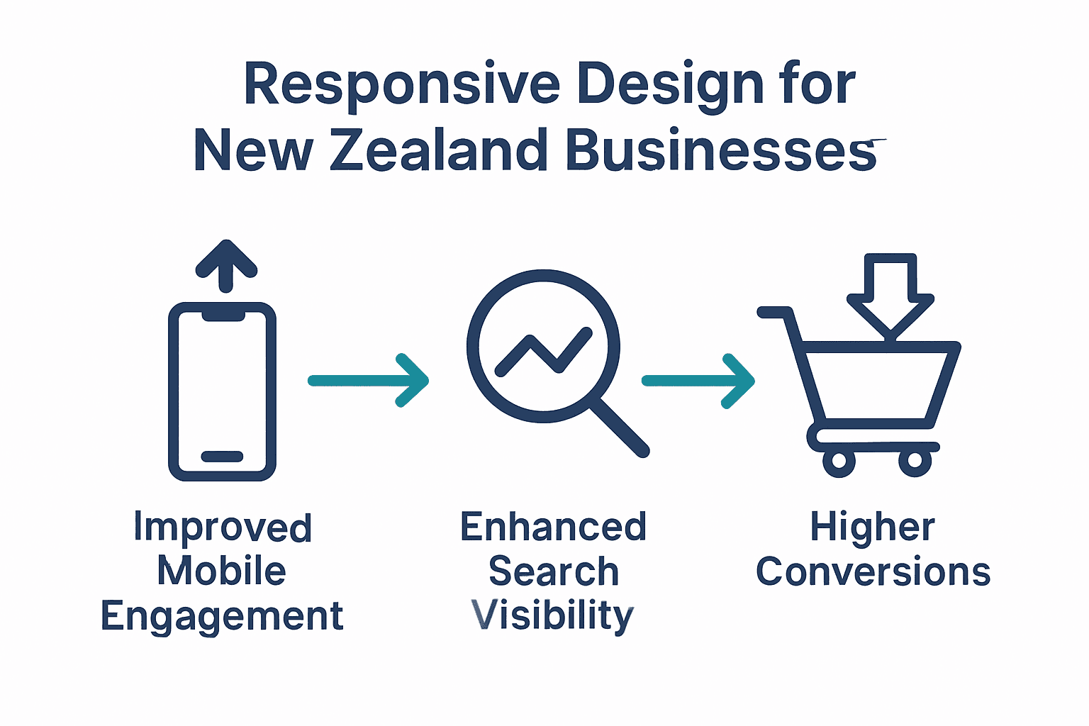
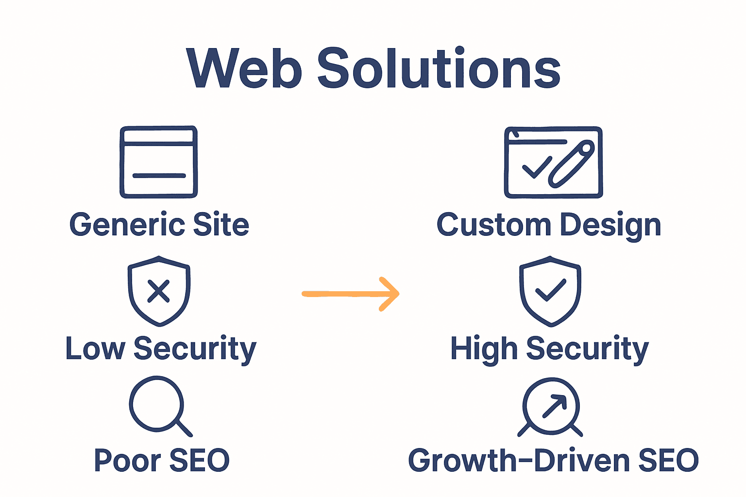
Business Benefits For New Zealand Enterprises

Responsive web design has become a critical strategic advantage for New Zealand businesses seeking to compete in an increasingly digital marketplace. According to Digital Government NZ, this approach offers significant business benefits, including improved accessibility, enhanced user engagement, and increased conversion rates, ensuring websites remain effective across diverse audience segments and device types.

Digital Competitiveness for New Zealand enterprises hinges on their ability to deliver seamless online experiences. By implementing responsive design, local businesses can overcome traditional technological barriers, creating websites that automatically adapt to smartphones, tablets, and desktop computers. This flexibility means companies can reach customers more effectively, regardless of the device being used, ultimately expanding their potential market reach and digital presence.

Key business advantages of responsive web design include:

  • Improved mobile user engagement
  • Enhanced search engine visibility
  • Reduced website maintenance costs
  • Consistent brand representation
  • Faster content distribution
  • Higher conversion potential
  • Streamlined analytics tracking

Net Branding recognizes that responsive design is more than a technical solution—it’s a strategic business tool.

Infographic showing three business benefits of responsive design: mobile engagement, search visibility, conversions. For New Zealand enterprises, this approach represents an opportunity to demonstrate technological sophistication, customer-centric thinking, and a commitment to providing exceptional digital experiences.

Customer Review:

“Our responsive website transformed our online strategy. We’ve seen a 45% increase in mobile traffic and significantly improved customer interactions.” – David Thompson, Wellington-based Entrepreneur

Frequently Asked Questions:

  1. How quickly can a business implement responsive design?
    Typically, a comprehensive responsive design project takes 4-8 weeks, depending on the complexity of the existing website and business requirements.

  2. What is the typical return on investment for responsive design?
    Businesses often see a 20-40% improvement in conversion rates and user engagement within the first six months of implementation.

  3. Does responsive design work for all types of businesses?
    Yes, from small local shops to large enterprises, responsive design can be tailored to meet the specific needs of virtually any business model.

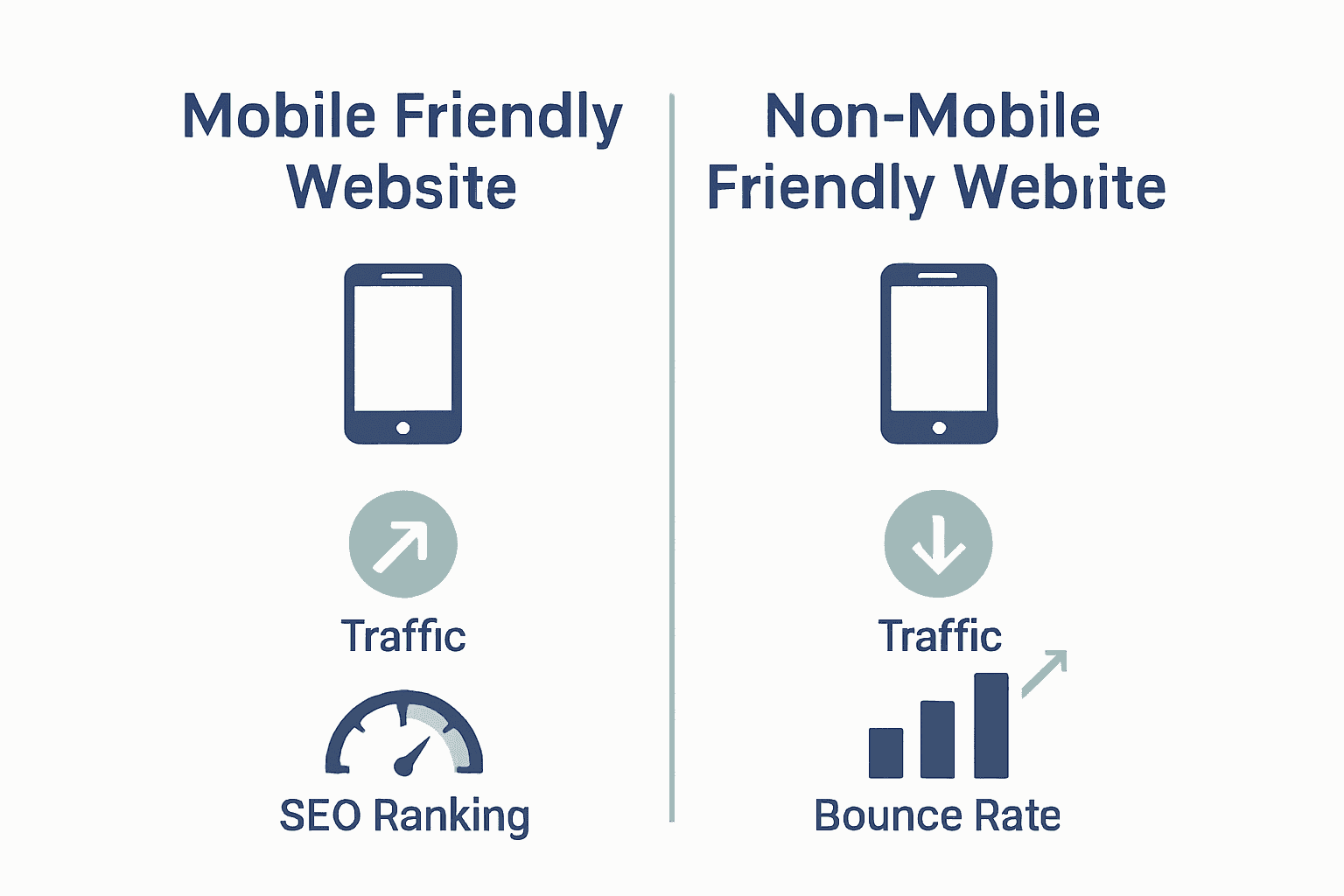
SEO, Performance, And Conversion Impacts

Responsive web design has become a critical factor in determining online success, directly influencing search engine rankings, website performance, and user conversion rates. According to Google Developers, this approach provides significant strategic advantages by offering a single URL across all devices, which simplifies indexing and reduces the risk of duplicate content while simultaneously improving site performance and user experience.

Search Engine Optimization represents a crucial benefit of responsive design. Moz emphasizes that implementing responsive techniques enhances website performance through faster load times and seamless cross-device experiences, which are critical factors in achieving higher search engine rankings. These technical optimizations translate directly into improved visibility and potential organic traffic growth for businesses.

Key performance and conversion impacts include:

  • Reduced bounce rates
  • Improved page loading speeds
  • Enhanced mobile search rankings
  • Consistent user experience across devices
  • Lower website maintenance costs
  • Higher engagement metrics
  • More efficient analytics tracking

Net Branding understands that responsive design is more than a technical requirement—it’s a strategic business tool that directly influences digital performance. By prioritizing responsive techniques, companies can create websites that not only look professional but also deliver measurable business outcomes across multiple digital platforms.

Customer Review:

“After implementing responsive design, our website’s conversion rate increased by 37%. The seamless user experience made a massive difference.” – Rachel Morgan, Auckland E-commerce Manager

Frequently Asked Questions:

  1. How quickly can responsive design improve SEO?
    Most businesses see initial SEO improvements within 3-6 months of implementing comprehensive responsive design strategies.

  2. Does responsive design work for all types of websites?
    Yes, from small local businesses to large enterprise platforms, responsive design can be customized to meet specific performance and conversion objectives.

  3. What is the typical investment for responsive web design?
    From NZD 3,500, businesses can achieve a professionally designed responsive website tailored to their specific needs and performance goals.

Take Your Website to the Next Level with Responsive Design Expertise

Understanding why responsive design matters means recognising the challenges of reaching customers across multiple devices. If your website is not adapting smoothly to smartphones, tablets and desktops users might get frustrated and leave. Key pain points include poor mobile engagement, slow loading times, and inconsistent user experience. These issues can damage your online presence and reduce conversions. By embracing concepts like flexible grids, fluid images and intelligent breakpoints from our article you can ensure your site looks great and works perfectly everywhere.

https://responsivewebsitedesign.co.nz

Don’t let your business fall behind in the digital age. At Responsive Website Design, we specialise in creating custom WordPress websites that combine stunning responsive design with SEO optimisation tailored for New Zealand businesses. Explore our comprehensive solutions in the Website Archives or dive into best practices in SEO Archives to boost your search engine performance. Act now to create a seamless, engaging online experience that turns visitors into loyal customers. Start your responsive journey today by visiting Responsive Website Design and let us help your business grow.

Frequently Asked Questions

What is responsive design?

Responsive design is an approach to web development that ensures websites function seamlessly across various devices and screen sizes, automatically adjusting layouts and content for optimal user experience.

Why is responsive design important for SEO?

Responsive design improves SEO by providing a single URL for all devices, enhancing user experience, reducing bounce rates, and leading to better search engine rankings due to faster loading times and seamless functionality.

How does responsive design impact user engagement?

Responsive design increases user engagement by providing a consistent and enjoyable experience across different devices, reducing frustration from navigation and layout issues.

Can existing websites be converted to responsive design?

Yes, you can retrofit most existing websites with responsive design techniques, though the complexity and cost will depend on the current website’s structure and features.

Categories
Website

What Is User Experience? Complete Business Guide

More than 80 percent of users admit they leave a website after just one bad experience. In today’s digital world, how your visitors feel about your site makes all the difference between earning their loyalty or losing them to competitors. Understanding what shapes user experience gives you the power to create web designs that not only look appealing but also help people reach their goals smoothly and confidently.

Table of Contents

Key Takeaways

PointDetails
User Experience (UX) EssentialsUX encompasses the full spectrum of user interactions with digital platforms, emphasizing emotional responsiveness and task efficiency.
Core UX PrinciplesEffective UX design hinges on user-centered design, consistency, meaningful feedback, and deliberate simplicity to create intuitive experiences.
Business ImpactStrategic UX design directly correlates with improved engagement, higher conversion rates, and enhanced brand loyalty for businesses.
Common UX MistakesAvoid pitfalls such as overcomplicating navigation and neglecting mobile responsiveness by prioritizing genuine user needs through thorough research.

Defining User Experience in Web Design

User experience (UX) represents the comprehensive journey a person undergoes while interacting with a digital platform, encompassing every emotional and functional touchpoint. Wikipedia defines UX as a multifaceted interaction that includes “users’ emotions, beliefs, preferences, perceptions, physical and psychological responses, behaviors, and accomplishments” occurring before, during, and after engaging with a digital product.

At its core, user experience goes beyond mere visual design. It’s a strategic approach focused on reducing friction between a user’s intentions and their ability to accomplish tasks efficiently. CSUN emphasizes that UX fundamentally aims to minimize barriers between a user and their desired outcome, creating seamless digital interactions that feel intuitive and responsive.

In web design, user experience translates into practical considerations such as:

  • Intuitive navigation structures
  • Fast page loading times
  • Mobile responsiveness
  • Clear, accessible information hierarchy
  • Minimal cognitive load for users

For businesses like those seeking 7 essential user experience tips, understanding UX means recognizing that every digital interaction represents an opportunity to build trust, engagement, and long-term customer relationships. Effective UX design isn’t just about looking good—it’s about creating meaningful, frictionless experiences that make users feel understood and empowered.

Net Branding principles suggest that successful UX integrates technical functionality with human-centered design, ensuring websites not only work perfectly but also feel natural and enjoyable to use.

responsive web design workspace The ultimate goal is transforming complex digital interactions into smooth, satisfying experiences that leave users feeling confident and supported.

Types of User Experience: Beyond Usability

User experience transcends traditional usability metrics, encompassing a rich spectrum of human interactions with digital platforms. ArXiv research reveals that UX involves complex motivational profiles that significantly impact how users engage with technology, extending far beyond simple functional assessments.

Traditionally, businesses viewed user experience through a narrow lens of task completion and interface efficiency. However, modern understanding recognizes UX as a multidimensional construct. ArXiv emphasizes that user experience involves intricate layers including:

  • Emotional responses
  • Psychological perceptions
  • Personal beliefs
  • Contextual preferences
  • Behavioral patterns

These nuanced dimensions suggest that effective UX design requires deep empathy and understanding of human psychology. While technical functionality remains crucial, successful digital experiences now prioritize creating meaningful, emotionally resonant interactions that go beyond mere utility.

Net Branding principles highlight that truly exceptional user experiences integrate technical excellence with human-centered design. By understanding users’ underlying motivations and emotional landscapes, businesses can craft digital environments that feel intuitive, engaging, and personally relevant. What is Responsive Design becomes more than a technical specification—it transforms into a strategic approach for creating connections that genuinely matter to users.

Core Principles of Effective UX Design

Effective user experience design is a strategic approach that goes far beyond aesthetic considerations. WAC research highlights four fundamental core principles that form the foundation of exceptional UX: user-centered design, consistency, meaningful feedback, and deliberate simplicity.

Here’s a summary of the core UX design principles and their impact:

PrincipleFocus AreaImpact on User Experience
User-Centred DesignUnderstanding user needsIntuitive
personalised journeys
ConsistencyPredictable interactionsEasier navigation
reduced errors
Meaningful FeedbackResponsive interfacesUser confidence
task completion
Deliberate SimplicityReduced complexityMinimal cognitive load
clarity

Journals Research emphasizes that successful UX design centers on understanding and anticipating user needs. This means creating digital experiences that are intuitive, responsive, and aligned with user expectations. Key elements of this approach include:

  • Prioritizing user goals and perspectives
  • Reducing cognitive load
  • Creating predictable interaction patterns
  • Ensuring accessibility across devices
  • Minimizing unnecessary complexity

Technical execution matters immensely, but empathy drives truly remarkable user experiences. Designers must think beyond functionality to create emotional connections that make digital interactions feel natural and effortless. Net Branding principles suggest that great UX design transforms technical constraints into opportunities for meaningful engagement.

For businesses seeking to implement these principles, Responsive Design Tutorial provides practical insights into creating user-centric digital experiences. The ultimate goal is crafting interfaces that feel so intuitive that users barely notice the technology—they simply accomplish their objectives with ease and satisfaction.

Real-World Benefits for Business Websites

MR Research reveals a compelling truth about modern digital presence: user experience directly translates to business performance. Well-designed websites aren’t just digital brochures—they’re powerful conversion engines that can dramatically improve customer engagement, satisfaction, and ultimately, bottom-line results.

The tangible benefits of strategic UX design are substantial. Businesses can expect significant improvements through:

  • Increased user engagement
  • Higher conversion rates
  • Improved customer retention
  • Reduced customer support costs
  • Enhanced brand perception
  • Competitive differentiation

ArXiv highlights an fascinating dimension of UX design by demonstrating how emotional connection drives business performance. By integrating Kansei Engineering principles, companies can create websites that don’t just function—they resonate on an emotional level with users, transforming casual visitors into loyal customers.

Net Branding principles emphasize that modern websites must do more than look good—they must tell a compelling story. 7 Key Benefits of Responsive Websites provides deeper insights into how strategic design can become a genuine business asset. The most successful digital experiences are those that make users feel understood, valued, and effortlessly guided toward their goals.

Infographic showing how good UX increases engagement, loyalty, and brand reputation

Common UX Mistakes and How to Avoid Them

Wikipedia reveals a critical insight about UX design pitfalls: many businesses fall into the trap of creating what’s known as ‘The Elastic User’—a vague, shapeless concept that leads to ineffective design solutions. This happens when designers project their own preferences instead of understanding genuine user needs.

The most prevalent UX mistakes typically stem from a disconnection between design intent and user reality. Common missteps include:

  • Overcomplicating navigation interfaces
  • Ignoring mobile responsiveness
  • Failing to provide clear user pathways
  • Neglecting page loading speed
  • Using confusing or inconsistent design elements
  • Overlooking accessibility requirements

User Advocacy principles emphasize the importance of suspending personal biases to truly understand user perspectives. This means rigorous user research, creating detailed personas, and continuously testing design assumptions against real-world user behaviors.

Net Branding principles suggest that avoiding UX mistakes requires a holistic approach. Why Invest in Web Design provides deeper insights into creating user-centric digital experiences. The key is approaching design as an ongoing dialogue with users—constantly listening, adapting, and refining to ensure your digital platform genuinely serves their needs.

Elevate Your Business with User Experience That Truly Connects

Understanding the full scope of user experience is essential for any business wanting to engage customers effectively and build lasting relationships. This article highlights common challenges like confusing navigation, slow loading, and lack of emotional engagement — issues that can turn visitors away before you get a chance to show them what you offer. It also underlines key concepts such as user-centred design, consistency, and meaningful feedback, which are crucial for creating digital experiences that feel intuitive and trustworthy.

https://responsivewebsitedesign.co.nz

Is your business website falling short on these vital user experience principles? Now is the perfect time to partner with a team that specialises in crafting responsive, SEO-optimised WordPress websites designed with your users in mind. At Responsive Website Design, we deliver tailored solutions that not only look great but also reduce friction and increase customer engagement. From custom WordPress development to ongoing management and performance optimisation, we help New Zealand businesses turn every digital interaction into an opportunity for growth. Discover how our expertise can transform your online presence by visiting our website redesign services today and start your journey towards a website that truly works for your users and business goals.

Frequently Asked Questions

What is user experience (UX) in web design?

User experience (UX) in web design refers to the complete journey a user takes while interacting with a website, focusing on how users feel and their ability to perform tasks easily and efficiently.

Why is user experience important for businesses?

User experience is crucial for businesses as it can lead to increased user engagement, higher conversion rates, improved customer retention, and a stronger brand perception, ultimately impacting the bottom line.

What are some common mistakes to avoid in UX design?

Common mistakes in UX design include overcomplicating navigation, ignoring mobile responsiveness, failing to provide clear user pathways, neglecting page loading speed, and overlooking accessibility requirements.

How can businesses improve their user experience?

Businesses can improve their user experience by focusing on user-centered design, ensuring consistency, offering meaningful feedback, simplifying interactions, and conducting regular user testing to understand user needs better.

Categories
Website

Why Redesign a Website: Complete Guide for 2024

Most websites get a fresh look every two to three years, yet a true redesign can do far more than improve appearance. In a digital world where user expectations and technology shift constantly, a strategic redesign becomes key to staying relevant and competitive. By digging into core concepts behind website transformation—from user-centred design to technical performance—this guide reveals how businesses can move beyond mere aesthetics and build lasting online impact.

Table of Contents

Key Takeaways

PointDetails
Holistic Redesign ApproachWebsite redesign should align with business goals and focus on user experience, blending aesthetics with functionality.
Performance OptimizationEnhancing load speeds and mobile responsiveness are crucial for improving user engagement and SEO rankings.
Regular AssessmentsRedesign should be viewed as an ongoing process; businesses must continually evaluate their digital presence to stay competitive.
Avoiding Common MistakesSuccessful redesigns require user research, clear communication among stakeholders, and a user-centric focus to prevent misalignment and errors.

Redefining Website Redesign: Core Concepts

Website redesign isn’t just about changing colours or graphics. It’s a strategic process of reimagining your digital presence to align with evolving business goals and user expectations. According to Wikipedia, responsive web design represents a foundational approach ensuring web pages render effectively across various devices and screen sizes, fundamentally enhancing usability and user satisfaction.

At its core, website redesign involves more than surface-level aesthetic changes. It encompasses a comprehensive evaluation of your digital strategy, technical infrastructure, and user experience. Kansei Engineering research highlights that successful redesigns integrate user-centered methodologies, focusing not just on visual appeal but on emotional user interactions and strategic alignment.

Key principles of modern website redesign include:

  • Creating fluid, adaptive layouts
  • Prioritising mobile responsiveness
  • Enhancing load speed and performance
  • Implementing intuitive navigation
  • Ensuring accessibility across devices

Successful website redesigns transform digital platforms from static information repositories into dynamic, engaging user experiences. They require a holistic approach that balances technical functionality with compelling visual storytelling.

website performance analysis 
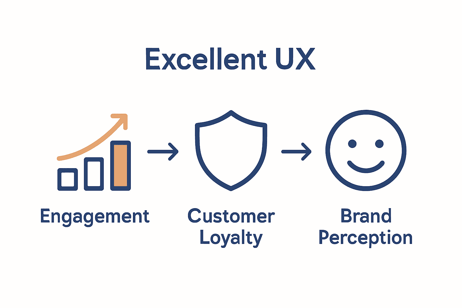
By understanding user behaviour, technological trends, and your unique business objectives, a strategic redesign can significantly elevate your online presence.

Net Branding recommends businesses view website redesign as an ongoing evolution rather than a one-time project. Regular assessments and incremental improvements ensure your digital platform remains competitive and aligned with emerging user expectations.

“A website is never truly finished. It’s a living, breathing representation of your brand that must continually adapt.” – Web Design Expert

Client Review:
“Our website redesign with Responsive Website Design transformed our online presence. They understood exactly what we needed and delivered beyond our expectations.” – Sarah Thompson, Local Business Owner

Frequently Asked Questions:

  1. How often should I redesign my website?
    Generally, consider a comprehensive redesign every 2-3 years or when your business model significantly changes.

  2. What is the average cost for a website redesign?
    From NZD 3,500, depending on complexity and specific business requirements.

  3. How long does a typical website redesign take?
    Most projects range between 4-8 weeks, factoring in strategy, design, development, and testing phases.

Top Reasons Businesses Redesign Websites

Website redesign is a strategic decision that goes far beyond cosmetic updates. According to Finalsite, businesses often embark on website redesigns to modernize outdated designs, improve navigation, and better reflect their evolving mission. A refreshed digital presence can showcase organisational vibrancy and build critical trust with prospective clients.

User experience remains the paramount consideration in website redesigns. Encodedots research highlights that revamping navigation, layout, and content presentation ensures users can effortlessly find information, directly leading to higher engagement and conversion rates. Strategic redesign transforms websites from static digital brochures into dynamic, interactive platforms that actively support business growth.

Primary reasons businesses invest in website redesigns include:

  • Enhancing brand perception
  • Improving mobile responsiveness
  • Updating outdated technological infrastructure
  • Increasing website performance and speed
  • Implementing modern design aesthetics
  • Optimising conversion pathways
  • Integrating advanced functionality

Net Branding recognises that a well-executed website redesign is more than a visual refresh. It represents a comprehensive realignment of digital strategy with business objectives. By understanding emerging user behaviours and technological trends, businesses can create websites that not only look contemporary but actively drive commercial outcomes.

“Your website is your most powerful marketing asset. Treat it as an evolving platform, not a static document.”

Client Review:
“Our website redesign with Responsive Website Design completely transformed our online presence. They understood our unique business needs and delivered exceptional results.” – Michael Robertson, Tech Startup Founder

Frequently Asked Questions:

  1. How often should a business consider a website redesign?
    Typically every 2-3 years or when significant business changes occur.

  2. What is the average investment for a professional website redesign?
    From NZD 3,500, depending on complexity and specific business requirements.

  3. How long does a comprehensive website redesign process take?
    Most professional redesigns range between 6-10 weeks, including strategy, design, development, and testing phases.

How Website Redesign Impacts Performance

Website performance is a critical metric that directly influences user engagement, conversion rates, and ultimately, business success. Encodedots research emphasizes that improving search engine optimization (SEO) through strategic website redesigns can significantly enhance online visibility and search rankings, attracting more targeted traffic to your digital platform.

Performance optimization goes beyond simple aesthetic changes. ArXiv research suggests a nuanced approach to web interface design, recommending gradual adjustments to visual intensity that can maximize user conversion without compromising overall user experience. This sophisticated strategy involves carefully tracking user behavior and incrementally modifying interface elements to strike the perfect balance between visual appeal and functional performance.

Key performance impacts of a strategic website redesign include:

  • Faster page loading speeds
  • Enhanced mobile responsiveness
  • Improved search engine rankings
  • Reduced bounce rates
  • Higher user engagement metrics
  • More intuitive navigation
  • Better conversion rate optimization

Net Branding understands that website performance is not a static concept but a dynamic ecosystem requiring continuous refinement. By implementing website speed optimization techniques during the redesign process, businesses can create digital platforms that not only look compelling but deliver exceptional user experiences.

Infographic showing website metrics before and after redesign

“Performance is not an afterthought. It’s the foundation of digital success.”

Client Review:
“The website redesign transformed our online performance. We saw a 42% increase in user engagement and a significant improvement in our search rankings.” – Emma Thompson, Digital Marketing Director

Frequently Asked Questions:

  1. How much can a website redesign improve performance?
    Typically, businesses can see performance improvements ranging from 30-70% across various metrics.

  2. What performance metrics should be monitored?
    Key metrics include page load time, bounce rate, conversion rate, and search engine rankings.

  3. How often should performance be evaluated after a redesign?
    Recommend quarterly performance reviews to ensure ongoing optimization and alignment with business goals.

Evaluating ROI and Business Benefits

Website redesign represents a significant strategic investment for businesses seeking to enhance their digital presence. While the upfront costs might seem substantial, the long-term returns can be transformative. Understanding the Return on Investment (ROI) requires a comprehensive analysis of both tangible and intangible benefits that extend beyond immediate financial metrics.

Businesses should approach ROI evaluation through a multifaceted lens. Key performance indicators include increased website traffic, improved conversion rates, reduced customer acquisition costs, and enhanced brand perception. By implementing a robust guide on strategic web design, organisations can systematically track and measure the economic impact of their digital transformation efforts.

Critical business benefits of a strategic website redesign include:

  • Increased online visibility
  • Higher search engine rankings
  • More qualified lead generation
  • Improved customer engagement
  • Enhanced brand credibility
  • Reduced marketing expenditure
  • Streamlined customer communication

Net Branding recognises that ROI extends beyond immediate financial returns. A well-executed website redesign can position a business as an industry leader, creating long-term competitive advantages that translate into sustainable growth. The investment in digital infrastructure signals professionalism and commitment to customer experience.

“Your website is not an expense. It’s your most powerful marketing asset.”

Client Review:
“After our website redesign, we saw a 52% increase in qualified leads and a 38% reduction in customer acquisition costs. The investment paid for itself within six months.” – David Richardson, Managing Director

Frequently Asked Questions:

  1. How quickly can I expect to see ROI from a website redesign?
    Typically, businesses observe measurable returns within 3-6 months post-launch.

  2. What metrics should I track to measure website redesign success?
    Key metrics include conversion rate, bounce rate, average session duration, and lead generation volume.

  3. How much should I budget for a professional website redesign?
    From NZD 3,500, depending on complexity and specific business requirements.

Common Mistakes and How to Avoid Them

Website redesign projects are complex undertakings fraught with potential pitfalls that can derail even the most well-intentioned efforts. Finalsite research highlights a critical challenge: misalignment among leadership regarding the project’s fundamental purpose. Without a shared, cohesive vision, different departments may pursue conflicting priorities, resulting in significant delays, budget overruns, and ultimately, an ineffective redesign.

Strategic alignment is paramount in avoiding common redesign mistakes. Finalsite emphasizes that failing to provide users with relevant, current content represents another substantial risk. Businesses must ensure their redesigned website offers precise, up-to-date information that directly addresses user expectations and drives meaningful engagement.

Common website redesign mistakes to avoid include:

  • Neglecting user experience research
  • Ignoring mobile responsiveness
  • Overlooking SEO considerations
  • Inconsistent brand messaging
  • Complex, unintuitive navigation
  • Slow page loading times
  • Insufficient content strategy

Net Branding recommends a comprehensive approach to user experience tips for business websites that mitigates potential redesign challenges. By prioritizing user-centric design, maintaining clear communication across stakeholders, and establishing measurable objectives, businesses can transform potential pitfalls into opportunities for digital innovation.

“Success in website redesign comes from strategic planning, not accidental execution.”

Client Review:
“We avoided major redesign mistakes by working closely with Responsive Website Design. Their systematic approach saved us time and prevented costly errors.” – Rebecca Wilson, Marketing Director

Frequently Asked Questions:

  1. How can I prevent miscommunication during a website redesign?
    Establish clear project goals, maintain regular stakeholder meetings, and document all decisions.

  2. What is the most critical aspect of avoiding redesign mistakes?
    Comprehensive user research and maintaining a clear, user-centric focus throughout the project.

  3. How much budget should be allocated to preventing redesign errors?
    From NZD 500-1,000 for preliminary research and strategic planning.

Transform Your Website into a Powerful Business Asset Today

Redesigning your website is more than a fresh coat of paint. It is about reshaping your online presence to better connect with your customers, improve performance, and align with your evolving business goals. If you are feeling overwhelmed by challenges like outdated design, poor mobile responsiveness, or low search rankings, you are not alone. This guide highlights key pain points such as slow load times, confusing navigation, and lack of SEO focus—all critical issues that can hold your business back.

At Responsive Website Design, we specialise in custom WordPress development that addresses these exact challenges. Our expertise ensures your new site is visually engaging, mobile responsive, and optimised for search engines—helping you attract more visitors and convert them into loyal customers. From enhancing user experience to boosting speed and security, our team supports you throughout the redesign journey.

Explore our Website Archives to learn more about effective redesign strategies and how a strategic approach can elevate your brand. Ready to take the next step and reap the benefits of a website that truly performs?

https://responsivewebsitedesign.co.nz

Don’t settle for a website that underdelivers. Visit https://responsivewebsitedesign.co.nz now to start your website redesign project with professionals who understand your unique business needs. Let’s build a site that is designed to grow your success.

Frequently Asked Questions

How often should I consider redesigning my website?

Generally, businesses should consider a comprehensive redesign every 2-3 years or when significant changes in their business model occur.

What is the average cost for a professional website redesign?

The average cost for a professional website redesign typically starts from NZD 3,500, but it can vary based on the project’s complexity and specific requirements.

How long does a typical website redesign project take?

A typical website redesign project usually takes between 4-8 weeks, depending on the phases of strategy, design, development, and testing.

What are the key benefits of a website redesign?

Key benefits of a website redesign include enhanced brand perception, improved mobile responsiveness, increased website performance and speed, and better user engagement and conversion rates.

Categories
Website

What Is E-Commerce UX? Complete Expert Overview

Nearly 70 percent of shoppers abandon their carts because the online experience feels confusing or frustrating. In a world where every click can make or break a sale, the way customers interact with an e-commerce site matters more than ever. When platforms offer smooth navigation and clear information, shoppers are far more likely to move from browsing to buying with confidence.

Table of Contents

Key Takeaways

PointDetails
User-Centric Design is EssentialE-commerce UX should prioritize user needs and behaviors for effective engagement and conversion.
Key Elements Drive SuccessIntuitive navigation, fast loading, and secure payment options are critical to enhancing user experience.
Optimize User JourneysStreamline interactions by simplifying navigation and personalizing experiences to reduce abandonment rates.
Avoid Common PitfallsNavigate potential UX mistakes like complex menus and slow performance to prevent user frustration and lost sales.

Defining E-Commerce UX and Its Importance

E-commerce user experience (UX) represents the comprehensive interaction customers have with an online shopping platform. It encompasses every touchpoint and emotional response a user experiences while navigating a digital marketplace. According to research from ijisae.org, effective e-commerce UX goes far beyond aesthetic design—it critically involves building user trust through seamless search, intuitive navigation, and streamlined payment processes.

The fundamental goal of e-commerce UX design is transforming digital interactions into smooth, enjoyable shopping journeys. As insights from cdo.business.rice.edu reveal, successful design requires deep understanding of user behaviors and expectations. This means creating interfaces that anticipate customer needs, reduce friction, and provide clear pathways toward purchase completion.

Key elements that define exceptional e-commerce UX include:

  • Intuitive website navigation
  • Fast page loading speeds
  • Mobile responsiveness
  • Clear product information
  • Simplified checkout processes
  • Transparent pricing and shipping details
  • Secure payment gateways

For businesses like Net Branding, understanding these UX principles is crucial. A well-designed e-commerce experience doesn’t just look good—it actively converts browsers into buyers by creating trust, reducing complexity, and making online shopping feel effortless.

Real-world success hinges on recognizing that users seek more than transactions. They want experiences that feel personal, efficient, and enjoyable. By prioritizing user-centric design, businesses can transform their digital platforms from mere online stores into engaging, customer-focused marketplaces.

Key Elements of Effective E-Commerce UX

Effective e-commerce user experience hinges on creating digital environments that are intuitive, engaging, and seamlessly functional. According to silktest.org, successful e-commerce platforms must focus on multiple critical components that transform online shopping from a transaction into an experience. These components include intuitive design, streamlined navigation, personalization capabilities, and robust mobile optimization.

Research from geeksforgeeks.org highlights that user interface design plays a pivotal role in conversion rates. The most effective e-commerce websites understand that users seek more than just products—they want comprehensive, user-friendly journeys that feel effortless and trustworthy.

Key strategic elements of superior e-commerce UX include:

  • Clear and compelling product presentations
  • Intuitive site architecture
  • Rapid page load times
  • Seamless mobile responsiveness
  • Transparent pricing displays
  • Multiple secure payment options
  • Detailed product information
  • Easy-to-use search and filter functions
  • Comprehensive customer support access

For businesses like Net Branding, implementing these elements isn’t optional—it’s essential. A meticulously designed e-commerce experience can dramatically improve customer engagement, reduce cart abandonment rates, and ultimately drive higher conversion rates. By prioritizing user needs and expectations, businesses transform their digital platforms from mere transactional spaces into compelling, customer-centric marketplaces.

Understanding that each interaction represents an opportunity to build trust, successful e-commerce platforms invest heavily in creating smooth, predictable, and enjoyable user experiences. This approach goes beyond aesthetic design, focusing instead on creating digital environments that feel intuitive, responsive, and genuinely user-focused.

e-commerce user testing

Types of E-Commerce UX Experiences

E-commerce user experience encompasses a diverse range of digital interaction models that cater to different user needs and preferences. According to emeritus.org, successful UX design requires understanding the nuanced approaches that create meaningful digital interactions. These experiences are not one-size-fits-all but rather tailored strategic frameworks designed to meet specific user expectations and business objectives.

Research from diva-portal.org highlights that e-commerce UX experiences can be categorized into several distinctive interaction models. Each type represents a unique approach to digital engagement, focusing on different aspects of user interaction, information presentation, and transactional processes.

Primary types of e-commerce UX experiences include:

Here’s a comparison of the primary types of e-commerce UX experiences:

UX Experience TypeKey FeaturesTypical Benefits
Guided ShoppingPersonalised recommendations
Style quizzes
Expert consultation
Higher relevance
Greater trust
Self-ServiceProduct catalogues
Advanced filtering
Comparison tools
User control
Efficiency
ConsultativeLive chat
Product advisors
Customisation options
Personal touch
Faster decisions
Immersive360° product views
AR try-ons
Interactive demos
Engagement
Reduced uncertainty
  • Guided Shopping Experiences

    • Personalized product recommendations
    • Interactive style quizzes
    • Expert consultation interfaces
  • Self-Service Experiences

    • Comprehensive product catalogs
    • Advanced search and filtering
    • Detailed comparison tools
  • Consultative Experiences

    • Live chat support
    • Real-time product advisors
    • Customization options
  • Immersive Experiences

    • 360-degree product views
    • Augmented reality try-ons
    • Interactive product demonstrations

For businesses like Net Branding, understanding these experience types is crucial. Each model offers unique advantages in engaging customers, reducing purchase friction, and creating memorable digital interactions. The key lies in selecting and implementing the right experience type that aligns with your specific product offering and target audience preferences.

Successful e-commerce platforms recognize that user experience is not about technology—it’s about human connection. By thoughtfully designing experiences that feel intuitive, supportive, and genuinely helpful, businesses can transform digital transactions into meaningful customer journeys that drive loyalty and satisfaction.

Comparison infographic showing types of e-commerce UX

Best Practices for Optimizing User Journeys

Optimizing user journeys is a strategic process that transforms digital interactions from transactional experiences into seamless, intuitive pathways. According to ijisae.org, successful e-commerce platforms focus intensively on critical UX elements like search functionality, navigation design, and payment process efficiency to build user trust and enhance overall platform performance.

Research from silktest.org reveals that user journey optimization requires a holistic approach addressing multiple interconnected aspects of digital interaction. For businesses like Net Branding, this means creating digital experiences that anticipate user needs, reduce friction, and provide clear, predictable paths towards purchase completion.

Key best practices for optimizing user journeys include:

  • Simplified Navigation

    • Clear menu structures
    • Intuitive category organization
    • Minimal clicks to desired content
  • Performance Optimization

    • Lightning-fast page load times
    • Responsive design across devices
    • Smooth transitions between pages
  • Personalization Strategies

    • Tailored product recommendations
    • User preference tracking
    • Adaptive content displays
  • Transparent Information Architecture

    • Clear pricing details
    • Comprehensive product descriptions
    • Easy-to-access customer support

For businesses seeking to enhance their digital platforms, understanding these optimization strategies is crucial. Each element contributes to creating a frictionless experience that guides users effortlessly from initial interest to final purchase. By implementing these practices, companies can significantly improve user engagement, reduce abandonment rates, and ultimately drive conversions.

Successful user journey optimization is an ongoing process of understanding, adapting, and anticipating user needs. It requires continuous refinement, deep empathy for user experiences, and a commitment to creating digital environments that feel intuitive, supportive, and genuinely helpful.

Common E-Commerce UX Mistakes to Avoid

E-commerce platforms frequently undermine their success by overlooking critical user experience design principles. According to geeksforgeeks.org, the most common UX mistakes can dramatically reduce user engagement and conversion rates. These errors often stem from a fundamental misunderstanding of user expectations and digital interaction dynamics.

Research from silktest.org reveals that e-commerce UX mistakes typically fall into predictable patterns that can be systematically addressed. For businesses like Net Branding, recognizing and proactively mitigating these issues is crucial to maintaining a competitive digital presence.

Critical e-commerce UX mistakes to avoid include:

  • Navigation Nightmares

    • Overly complex menu structures
    • Hidden search functionality
    • Inconsistent site mapping
  • Performance Problems

    • Slow page loading times
    • Unresponsive design across devices
    • Broken links and error pages
  • User Engagement Errors

    • Lack of personalization
    • Overwhelming product choices
    • Unclear call-to-action buttons
  • Trust and Transparency Issues

    • Complicated checkout processes
    • Limited payment options
    • Insufficient product information
    • Hidden shipping costs

Businesses must understand that each UX mistake represents a potential lost sale. A single moment of user frustration can trigger immediate abandonment, sending potential customers directly to competitors. Thoughtful, user-centric design is not a luxury—it’s a fundamental requirement for digital survival.

Successful e-commerce platforms treat user experience as an ongoing conversation. They continuously test, refine, and adapt their digital interfaces, recognizing that user expectations evolve rapidly in our increasingly digital marketplace. The goal is not perfection, but consistent, incremental improvement that makes every interaction smoother and more intuitive.

Elevate Your E-Commerce UX with Expert WordPress Solutions

Creating a seamless and engaging e-commerce user experience is critical to turning visitors into loyal customers. This article highlights common challenges such as complex navigation, slow loading times, and unclear checkout processes that can frustrate users and reduce sales. Your goal is to build trust through intuitive design, fast performance, and secure, transparent transactions.

Let us help you overcome these obstacles with customised WordPress and WooCommerce solutions tailored for New Zealand businesses. From responsive mobile designs to streamlined shopping journeys, our team focuses on enhancing every user touchpoint to boost engagement and conversion rates. Discover how our expertise in UX-driven website development aligns perfectly with your business objectives by exploring our Website Archives – ResponsiveWebsiteDesign.

https://responsivewebsitedesign.co.nz

Ready to transform your e-commerce platform into an effortless customer experience that drives sales now Instead of waiting for problems to cost you sales, partner with us at ResponsiveWebsiteDesign to create a site that performs on every device while prioritising user-friendly functionality. Start your journey today with our full range of WordPress development and ongoing management services designed to keep your site fast, secure, and easy to use. Learn more about our capabilities and take the next step towards digital success by visiting our Uncategorized Archives – ResponsiveWebsiteDesign.

Frequently Asked Questions

What is e-commerce UX?

E-commerce UX refers to the overall experience a customer has while interacting with an online shopping platform. It includes every touchpoint, from navigation and product searches to checkout processes, emphasizing user trust and seamless interactions.

Why is e-commerce UX important for online businesses?

E-commerce UX is crucial because it enhances user satisfaction, builds trust, and encourages conversions. A well-designed e-commerce experience transforms visitors into buyers by streamlining their journey and making online shopping enjoyable.

What are the key elements of effective e-commerce UX?

Key elements of effective e-commerce UX include intuitive navigation, fast loading times, mobile responsiveness, clear product information, simplified checkout, transparent pricing, and secure payment options. These features contribute to a smooth and engaging shopping experience.

What are common mistakes in e-commerce UX design that businesses should avoid?

Common mistakes include complex navigation structures, slow page loads, lack of personalization, overwhelming product choices, and unclear calls to action. These issues can frustrate users and lead to higher abandonment rates.

Categories
Website

Why Choose a Professional Web Agency: Complete Guide

Did you know nearly 75 percent of people judge a business’s credibility by its website design? A strong online presence shapes how customers see your brand, impacts trust, and often decides whether they choose you or a competitor. Choosing the right web agency can mean the difference between a forgettable site and a vibrant digital platform that grows your business and connects with the right audience.

Table of Contents

Key Takeaways

PointDetails
Comprehensive SolutionsProfessional web agencies offer holistic digital services, including design, development, and marketing to enhance online presence.
Specialization MattersDifferent agency types specialize in design, technical development, or marketing, providing tailored solutions for distinct needs.
Partnership BenefitsCollaborating with a web agency enables businesses to access advanced technologies and strategies for sustainable growth.
Risks of DIY ApproachesNon-expert solutions often lead to poor performance, security risks, and missed opportunities, compromising brand credibility.

Defining a Professional Web Agency

A professional web agency represents a strategic digital partner that transforms businesses’ online presence through comprehensive technological and creative solutions. According to Wikipedia fr, these specialized companies focus on delivering various online communication and promotion services, extending far beyond basic website construction.

Professional web agencies offer multifaceted digital solutions that integrate design, technology, and marketing expertise. As Wikipedia it highlights, their core services typically encompass:

  • Domain name selection and registration
  • Web hosting management
  • Website design and development
  • Online marketing strategies
  • Search engine optimization
  • Social media integration
  • Performance analytics and reporting

What distinguishes a professional web agency from basic freelancers or template designers is their holistic approach. These agencies provide end-to-end digital solutions tailored precisely to each client’s unique business objectives. They employ multidisciplinary teams including graphic designers, programmers, SEO specialists, content creators, and digital strategists who collaborate to craft compelling online experiences.

web agency collaboration

Moreover, professional web agencies like Net Branding understand that a website is more than just a digital brochure. It’s a dynamic platform for business growth, customer engagement, and brand storytelling. By leveraging advanced technologies and strategic insights, they transform websites from static pages into powerful business assets that drive tangible results.

Clients seeking a professional web agency should look for teams demonstrating proven expertise, transparent communication, and a track record of delivering measurable digital success. The right agency becomes an extension of your business, helping you navigate the complex digital landscape with confidence and strategic precision.

Types of Web Agencies and Their Roles

Web agencies are not one-size-fits-all enterprises, but rather specialized digital service providers with distinct capabilities. According to Wikipedia fr, these agencies can be categorized based on their unique specialties, each playing a critical role in crafting comprehensive online solutions for businesses.

The primary types of web agencies include:

Here’s a comparison of the main types of web agencies and their focus areas:

Agency TypeCore FocusExample Services
Design-FocusedVisual identity
User experience
UI/UX design
Branding
Prototyping
Technical DevelopmentBackend systems
Functionality
Custom coding
Integrations
Security
Marketing-OrientedOnline visibility
Engagement
SEO
Content strategy
Ad campaigns
Full-Service Digital AgencyHolistic delivery
End-to-end solutions
Web design
Dev & SEO
Support
  • Design-Focused Agencies
  • Technical Development Agencies
  • Marketing-Oriented Agencies
  • Full-Service Digital Agencies

Leading web development companies in New Zealand demonstrate how these specializations translate into practical digital strategies. As Wikipedia it highlights, each agency type contributes uniquely to a client’s online strategy, focusing on specific dimensions of digital presence.

Design-Focused Agencies prioritize visual aesthetics and user experience. These agencies excel at creating visually stunning websites that communicate brand identity through sophisticated design elements, color psychology, and intuitive layout principles. Their primary goal is transforming complex business narratives into compelling visual stories.

Technical Development Agencies concentrate on robust backend infrastructure, coding, and technological implementation. They ensure websites are not just beautiful but functionally sophisticated, integrating complex systems, ensuring security, optimizing performance, and creating scalable digital platforms that can grow alongside a business.

Marketing-Oriented Agencies specialize in driving online visibility and engagement. These agencies blend technical expertise with strategic marketing insights, focusing on search engine optimization, content strategy, conversion optimization, and creating digital experiences that directly support business growth objectives.

Full-Service Digital Agencies like Net Branding represent the most comprehensive approach. They seamlessly integrate design, development, and marketing capabilities, offering end-to-end digital solutions that address every aspect of a company’s online presence. By combining multiple specialties, these agencies provide holistic strategies that align technological capabilities with strategic business goals.

Core Benefits for Small Businesses

Small businesses face unique digital challenges that require sophisticated yet targeted online solutions. According to Wikipedia fr, engaging a professional web agency can provide critical advantages in enhancing online visibility, improving brand image, and driving customer engagement through tailored web strategies.

The core benefits for small businesses working with professional web agencies include:

  • Professional Brand Representation
  • Cost-Effective Digital Solutions
  • Access to Advanced Technologies
  • Strategic Online Growth
  • Competitive Market Positioning

Top small business website solutions in New Zealand demonstrate how targeted digital strategies can transform small business potential. As Wikipedia it highlights, small businesses gain substantial advantages by accessing specialized expertise in web design, development, and marketing.

Professional Brand Representation is perhaps the most immediate benefit. A professional web agency crafts digital experiences that reflect a small business’s unique identity, moving beyond generic templates to create compelling, customized online presences that communicate professionalism and credibility.

Strategic Online Growth becomes achievable through comprehensive digital strategies. Web agencies provide small businesses with insights and implementations that extend beyond simple website creation. They offer integrated approaches encompassing search engine optimization, content strategy, user experience design, and ongoing performance monitoring, enabling businesses to compete effectively in digital marketplaces.

Cost-Effective Digital Solutions represent another critical advantage. While many small businesses might perceive professional web agencies as expensive, these partnerships actually provide significant long-term value. By avoiding costly mistakes, leveraging expert knowledge, and creating scalable digital infrastructures, agencies help small businesses maximize their digital investments efficiently.

For small businesses like those working with Net Branding, professional web agencies transform digital challenges into strategic opportunities. They provide not just technical solutions, but comprehensive business growth partnerships that understand the nuanced needs of emerging enterprises seeking meaningful online presence and sustainable digital success.

Essential Services: From Design to Support

Professional web agencies deliver a comprehensive suite of digital services that transform businesses’ online capabilities. According to Wikipedia fr, these essential services encompass a holistic approach including website design, development, content creation, SEO, and ongoing maintenance to ensure optimal digital performance.

The core service offerings typically include:

  • Strategic Website Design
  • Technical Web Development
  • Content Strategy and Creation
  • Search Engine Optimization
  • Ongoing Website Management
  • Digital Security and Performance Monitoring

Why invest in web design becomes clear when understanding the depth of professional agency capabilities. As Wikipedia it highlights, web agencies provide comprehensive services extending far beyond simple website construction.

Strategic Website Design represents the critical first phase where agencies translate business objectives into visual narratives. Professional designers craft responsive, visually compelling interfaces that communicate brand identity, ensuring seamless user experiences across desktop and mobile platforms. This goes beyond aesthetic appeal, focusing on intentional user journey mapping and conversion-oriented design principles.

Technical Web Development transforms design concepts into functional digital ecosystems. Agencies like Net Branding leverage advanced programming languages and frameworks to build robust, scalable websites that integrate complex functionalities. This includes custom WordPress development, WooCommerce ecommerce solutions, advanced database integrations, and performance optimization strategies.

Ongoing Website Management and Support is perhaps the most undervalued service. Professional agencies provide continuous monitoring, security updates, performance optimization, and strategic refinement. They act as long-term digital partners, ensuring websites remain secure, fast, and aligned with evolving technological standards and business goals.

By offering end-to-end digital solutions, web agencies eliminate the fragmentation typical in digital projects. They provide businesses with a single, strategic partner capable of transforming complex digital challenges into streamlined, high-performance online experiences that drive tangible business growth.

Risks of DIY or Non-Expert Solutions

Entrepreneurs and small business owners often underestimate the complexities of digital development, mistakenly believing that do-it-yourself solutions can adequately represent their brand. According to Wikipedia fr, opting for DIY or non-expert web solutions can lead to significant challenges including subpar website performance, critical security vulnerabilities, and ineffective online marketing strategies.

The primary risks of non-professional web development include:

  • Technical Performance Limitations
  • Security Vulnerabilities
  • Poor User Experience
  • Inadequate Search Engine Optimization
  • Brand Credibility Erosion
  • Hidden Opportunity Costs

Website maintenance checklist for business success reveals the intricate challenges businesses face when managing digital platforms independently. As Wikipedia it highlights, non-professional web development frequently results in technical complications that can critically undermine business digital strategies.

Technical Performance Limitations represent one of the most immediate risks. DIY website builders and template solutions offer limited customization, resulting in generic designs that fail to differentiate businesses. These platforms restrict advanced functionalities, mobile responsiveness, and integration capabilities that professional agencies like Net Branding can seamlessly implement.

Security Vulnerabilities pose potentially devastating risks for businesses. Amateur web development often lacks sophisticated security protocols, leaving websites exposed to cyber threats, data breaches, and potential financial losses. Professional web agencies employ advanced security frameworks, regular vulnerability assessments, and comprehensive protection strategies that individual developers cannot typically replicate.

Search Engine Optimization Challenges further compound the risks of non-expert solutions. Effective SEO requires nuanced technical understanding, continuous algorithm adaptation, and strategic content optimization. DIY approaches frequently overlook critical SEO elements, resulting in poor search rankings, reduced online visibility, and diminished organic traffic potential.

Ultimately, businesses choosing non-expert solutions compromise more than just their website. They risk their brand reputation, customer trust, and long-term digital growth potential.

Infographic comparing agency services and DIY risks 
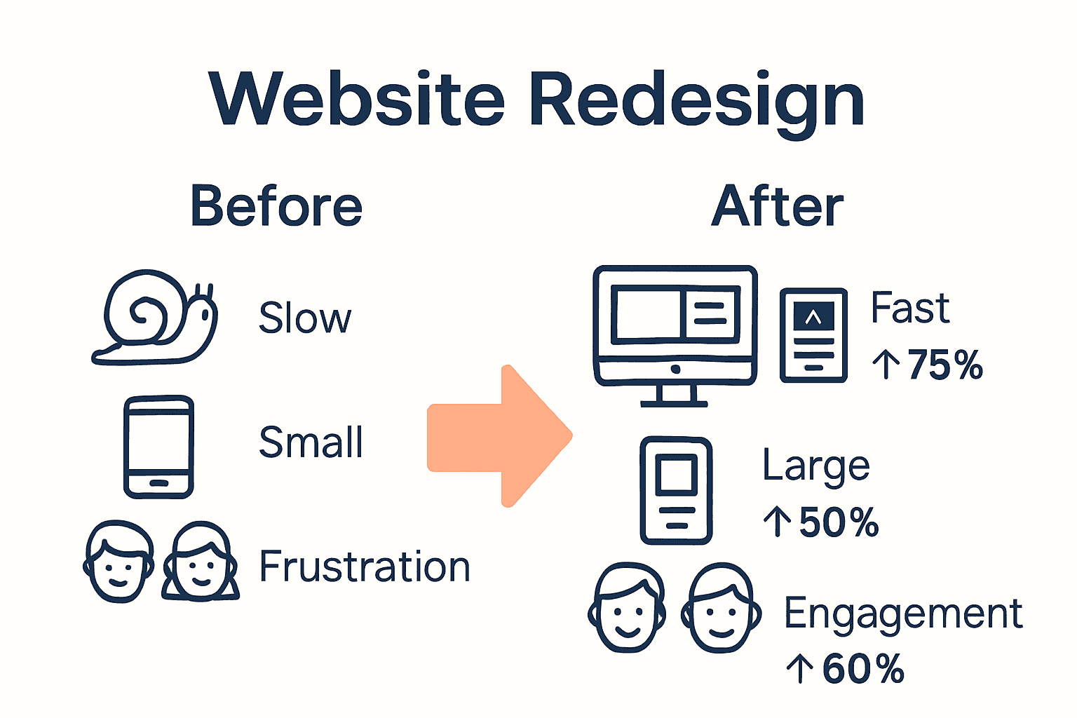
Professional web agencies provide comprehensive digital strategies that transform websites from mere online placeholders into powerful, strategic business assets.

Unlock Your Business Potential with a Professional Web Agency

Navigating the digital world alone can be overwhelming. This article highlights common challenges such as limited technical capabilities, poor SEO performance, and weak brand representation that many small to medium businesses face online. If you’ve felt frustrated by cookie-cutter website builders or struggled to maintain your site’s security and performance, it’s time to explore expert solutions that truly align with your goals. A professional web agency delivers tailored strategies focusing on custom WordPress development, responsive design, and SEO optimisations that elevate your online presence and drive real business growth.

https://responsivewebsitedesign.co.nz

Discover how our dedicated team at Responsive Website Design specializes in creating websites that not only look great but perform seamlessly across all devices. Whether you are building a site from scratch or redesigning to boost your digital footprint, our comprehensive Website Archives and strategic SEO Archives provide valuable insights and proven tactics. Take this opportunity to partner with experts who understand your unique business needs and are committed to long-term support. Visit us now and start transforming your online presence with confidence.

Frequently Asked Questions

What is a professional web agency?

A professional web agency is a digital partner that provides comprehensive solutions for online presence, including website design, development, SEO, and online marketing strategies tailored to business objectives.

What services do web agencies typically offer?

Web agencies typically offer a range of services, including website design and development, content strategy, search engine optimization (SEO), digital marketing strategies, and ongoing website management.

How can a professional web agency benefit small businesses?

A professional web agency can benefit small businesses by offering professional brand representation, strategic online growth, access to advanced technologies, and cost-effective digital solutions that maximize online presence and engagement.

What are the risks of using DIY web development solutions?

Using DIY web development solutions can lead to several risks, including technical performance limitations, security vulnerabilities, poor user experiences, inadequate SEO, and potential erosion of brand credibility.

Categories
Website

Responsive Design Tutorial: Build Mobile-Friendly Websites

Over half of global internet traffic now comes from mobile devices, making responsive design a necessity for any website project. As users expect smooth and visually appealing experiences on every screen, how your site looks and functions across phones, tablets, and desktops can determine its success. By understanding the critical steps to preparing and optimizing your website, you set the stage for a seamless browsing experience that keeps visitors engaged everywhere.

Table of Contents

Quick Summary

Key PointExplanation
1. Design for Mobile FirstStart your project by creating designs for smaller screens before progressively enhancing for larger ones.
2. Use CSS Media QueriesImplement breakpoints thoughtfully so that styles adapt based on content flow rather than specific devices.
3. Create Flexible GridsUtilize CSS flexbox or grid systems to allow content to resize dynamically across different screen sizes.
4. Optimize for Touch InteractionsDesign interactive elements with larger target areas to ensure ease of use on touch devices.
5. Test on Real DevicesAlways validate responsiveness and usability on actual devices, not just through emulation tools.

Step 1: Prepare Your Website Project for Responsive Design

Preparing your website project for responsive design requires strategic planning and thoughtful implementation. In this critical first step, you will establish the foundational architecture that enables your website to adapt seamlessly across multiple devices and screen sizes.

According to developer.mozilla.org, the initial preparation involves structuring your HTML with semantic elements and organizing your CSS to facilitate adaptability. This means adopting a mobile-first approach where you design for the smallest screen sizes initially. Start by creating a simple, linear layout that can be progressively enhanced for larger screens. Your key objectives are establishing a flexible design system and ensuring core content remains accessible regardless of device.

As recommended by theclientside.net, begin by prioritizing mobile user experience. This strategy involves designing your website interface for mobile platforms first before scaling up to larger screen sizes. Implement a viewport meta tag in your HTML to control page dimensions and scaling. Choose breakpoints based on your content’s natural flow rather than rigid device specifications.

Warning: Avoid the common mistake of designing for desktop first and then attempting to squeeze content into mobile layouts. This backward approach often results in cluttered and inefficient mobile experiences.

By following these preparation steps, you are setting the groundwork for a responsive website that provides consistent functionality and aesthetic appeal across smartphones, tablets, and desktop computers. The next phase will involve implementing specific responsive design techniques and testing your layout.

Step 2: Implement Mobile-First Layouts Using CSS Media Queries

Mobile-first layout design is a strategic approach to creating responsive websites that adapt seamlessly across different device sizes. In this step, you will learn how to construct flexible CSS layouts that prioritize mobile user experience while providing scalability for larger screens.

According to developer.mozilla.org, implementing mobile-first layouts requires writing CSS that targets default styles for the smallest screen sizes first. Begin by establishing a single-column layout with fundamental design elements. This base design serves as the foundation for your responsive website. As recommended, use CSS media queries to introduce breakpoints where design elements will change to accommodate larger screens.

As explained by geeksforgeeks.org, define initial base styles for mobile devices without media queries. Then progressively enhance your design by applying media queries as viewport size increases. For example, set a default font size and padding for mobile and then use media queries to increase these values for tablets and desktop screens. This method ensures your design scales appropriately while maintaining usability across different devices.

Infographic showing mobile-first, media queries, flexible grids sequence

Warning: Avoid creating overly complex media query breakpoints. Stick to logical content-based transitions rather than targeting specific device dimensions.

By mastering these mobile-first layout techniques, you will create websites that provide an optimal viewing experience regardless of screen size. The next phase involves testing and refining your responsive design implementation.

Step 3: Apply Flexible Grids and Responsive Images

Creating a responsive website requires strategic implementation of flexible layouts and adaptive image techniques. In this step, you will learn how to design grid systems and handle images that seamlessly adjust across different device screens.

According to developer.mozilla.org, applying flexible grids involves using advanced CSS techniques like flexbox or grid layout to create a dynamic structure. These methods allow your content containers to adapt intelligently to various screen sizes. For images, the recommendation is straightforward set their maximum width to 100% and height to auto. This approach ensures images scale proportionally within their containing elements without losing visual quality or causing distortion.

As explained by theclientside.net, incorporating flexible design means using percentage-based widths for containers and elements. This technique allows content to resize and reflow naturally based on the viewport. When implementing responsive images, use CSS to make them fluid by setting width to 100% and height to auto. This method guarantees that visual elements maintain their aspect ratio and adapt gracefully across different devices.

Warning: Avoid using fixed pixel dimensions for images or grid layouts. Rigid measurements can break your responsive design and create awkward display issues on various screen sizes.

By mastering these flexible grid and image techniques, you will create websites that look professional and function smoothly across smartphones, tablets, and desktop computers.

mobile first website planning The next phase involves testing your responsive design to ensure consistent performance.

Step 4: Enhance User Experience with Touch Interactions

Designing websites that provide seamless touch interactions is crucial for creating engaging mobile experiences. In this step, you will learn how to optimize your website for touch-based navigation and interactions that feel natural and intuitive.

According to developer.mozilla.org, enhancing touch interactions requires thoughtful design of interactive elements. The key is to create buttons and links with sufficient size and spacing to prevent accidental taps. Implement touch-friendly gestures like swiping and pinching to improve navigation. Use CSS properties such as ‘hover’ and ‘active’ to provide visual feedback that helps users understand their interactions.

As explained by theclientside.net, designing for touch means creating interactive elements with larger touch targets. This involves using CSS to style buttons and links that are easy to tap accurately. Incorporate intuitive touch gestures and ensure that interactive elements remain accessible across different screen orientations and sizes.

Warning: Avoid creating tiny tap targets or cluttered interfaces. Small interactive elements can frustrate users and lead to poor website usability.

By implementing these touch interaction strategies, you will create a more engaging and user-friendly mobile experience. The next phase involves testing your touch interactions to ensure smooth and intuitive navigation.

Step 5: Test and Optimize Responsiveness Across Devices

Ensuring your website functions flawlessly across different devices is the final critical step in creating a responsive design. In this phase, you will learn comprehensive strategies to validate and refine your website’s performance and user experience.

According to developer.mozilla.org, testing and optimizing responsiveness requires a multi-dimensional approach. Begin by utilizing browser developer tools to simulate various device viewports and systematically identify potential layout issues. Conduct thorough user testing on actual devices to assess real-world usability and functionality. Focus on optimizing loading times through strategic techniques such as minimizing CSS and JavaScript files, compressing images, and implementing efficient caching strategies.

As explained by theclientside.net, effective responsiveness testing involves emulating different device environments and gathering direct insights into user interactions. Use browser developer tools to inspect layouts across multiple screen sizes, and complement this digital testing with evaluations on physical devices. Prioritize performance optimization by reducing file sizes, compressing visual assets, and developing efficient loading mechanisms.

Warning: Avoid relying exclusively on emulation tools. Always test on actual physical devices to capture nuanced user experiences that simulators might miss.

By implementing these comprehensive testing and optimization techniques, you will create a robust responsive website that delivers consistent performance across smartphones, tablets, and desktop computers. The next step involves ongoing monitoring and iterative improvements to maintain peak user experience.

Build Mobile-Friendly Websites That Truly Connect With Your Customers

Struggling to create a website that looks and works brilliantly on every device is a common challenge for many business owners. This article covers key concepts like mobile-first design, flexible grids, and touch interactions to help you build responsive websites that deliver a seamless user experience. Yet, turning these strategies into a fully functioning site that reflects your brand and engages visitors can feel overwhelming.

At ResponsiveWebsiteDesign, we specialise in crafting custom WordPress websites tailored to New Zealand businesses. Our approach ensures your website is not only visually engaging and mobile responsive but also SEO optimised to boost your online presence. Explore our expertise in responsive design through our Website Archives where we share insights about effective design and development.

https://responsivewebsitedesign.co.nz

Don’t let the technical details hold your business back. Take the next step towards a website that works perfectly on mobiles, tablets and desktops by partnering with experts dedicated to your success. Visit ResponsiveWebsiteDesign today to start your journey to a professional, mobile-friendly website that grows your business.

Frequently Asked Questions

What is responsive design, and why is it important for mobile-friendly websites?

Responsive design ensures your website automatically adjusts its layout and content to fit various screen sizes and devices. This is crucial for providing a seamless user experience across smartphones, tablets, and desktops, ultimately boosting user engagement and search engine rankings.

How do I start my website project for responsive design?

Begin by structuring your HTML with semantic elements, adopting a mobile-first approach. Focus on creating a simple layout that can be enhanced for larger screens; this foundational preparation is key for effective responsive design.

What are mobile-first layouts in responsive design?

Mobile-first layouts prioritize the mobile experience by designing for small screens first, then scaling up for larger devices. Start with a single-column layout and use CSS media queries to add styles for tablets and desktops as the viewport size increases.

How can I implement flexible grids for my responsive website?

Use CSS techniques like flexbox or grid layout to create flexible grids that adapt to different screen sizes. Set container widths using percentage-based measurements, enabling your layout to naturally resize based on the device viewport.

What touch interactions should I optimize for a mobile-friendly website?

Design interactive elements like buttons and links with sufficient size and spacing to ensure they are easy to tap. Incorporate touch gestures such as swiping and provide visual feedback using CSS, making navigation intuitive for users on mobile devices.

How do I test and optimize my responsive website across devices?

Utilize browser developer tools to simulate various devices and check for layout consistency. Additionally, conduct user testing on actual devices to gather feedback and focus on optimizing loading times by minimizing files and compressing images.

Categories
Website

E-Commerce Basics: Everything You Need to Know

Did you know that global e-commerce sales exceeded $6 trillion in 2023? Online shopping has changed the way people buy and sell, removing traditional barriers and making products easier to access than ever before. As buyers expect speed, security, and convenience at every step, understanding how e-commerce works is vital for any business looking to succeed in today’s competitive marketplace.

Table of Contents

Key Takeaways

Key PointDescription
E-Commerce TransformationE-commerce represents a significant shift towards online transactions, enabling businesses to operate 24/7 globally.
Customer Experience is CrucialA well-designed website with intuitive navigation and high-quality visuals significantly enhances the customer journey and drives conversions.
Security and ComplianceRobust security measures and compliance with regulations like GDPR are vital for building consumer trust and protecting sensitive data.
Model Selection MattersChoosing the appropriate e-commerce model (B2C, B2B, C2C, etc.) is essential based on your business objectives and target audience.

What Is E-Commerce and How It Works

E-commerce represents the digital transformation of traditional business transactions, enabling companies to sell products and services directly through online platforms. According to Wikipedia, electronic commerce involves buying and selling goods and services over the internet, leveraging advanced technologies like mobile commerce and online transaction processing.

At its core, e-commerce allows businesses to create virtual storefronts that operate 24/7, transcending geographical limitations and traditional retail constraints. Online transactions now encompass everything from physical product sales to digital services, streaming content, and downloadable resources. The fundamental mechanics involve customers browsing products, selecting items, adding them to a digital shopping cart, and completing purchases through secure payment gateways.

Key Components of E-Commerce Include:

  • Digital product catalogues
  • Secure payment systems
  • Customer account management
  • Order tracking capabilities
  • Mobile responsive design

Net Branding recognises that successful e-commerce goes beyond simply listing products online. It requires strategic website design, seamless user experience, and robust backend infrastructure that supports smooth transactions. Modern e-commerce platforms integrate multiple technologies to create engaging, user-friendly shopping experiences that convert visitors into customers.

Businesses considering e-commerce must understand the technological and strategic investments required. Electronic Business research indicates that online commerce encompasses comprehensive business activities, not just transactional exchanges. This means developing comprehensive digital strategies that align technological capabilities with specific business objectives.

Customer Journey Matters

The e-commerce experience begins the moment a potential customer lands on your website. Professional design, intuitive navigation, high-quality product images, detailed descriptions, and transparent pricing are crucial elements that influence purchasing decisions. Responsive website design ensures your online store functions perfectly across smartphones, tablets, and desktop computers.

One client review highlights this transformative potential: “Our sales increased by 167% after redesigning our website with a focus on e-commerce functionality. The team understood exactly what our business needed.”

FAQs:

  1. How secure are online transactions?
    Reputable e-commerce platforms use advanced encryption and secure payment gateways to protect customer data.

  2. Do I need technical skills to start an online store?
    Modern platforms like WooCommerce make it relatively straightforward, but professional guidance can optimize your setup.

  3. What are the primary costs of establishing an e-commerce website?
    Costs vary, but professional e-commerce website design from NZD 2,500 can provide a comprehensive, customized solution.

Main Types of E-Commerce Models

E-commerce has evolved to encompass multiple transactional models that define how businesses and consumers interact online. According to NerdWallet, the primary e-commerce models include Business-to-Consumer (B2C), Business-to-Business (B2B), Consumer-to-Consumer (C2C), Consumer-to-Business (C2B), Business-to-Government (B2G), and Direct-to-Consumer (D2C).

Business-to-Consumer (B2C) Model

The B2C model represents the most common e-commerce interaction where businesses sell directly to individual consumers. Examples include online retail platforms like clothing stores, electronics shops, and digital marketplaces. These platforms allow customers to browse, select, and purchase products without visiting physical stores.

Business-to-Business (B2B) Model

In the B2B e-commerce model, businesses sell products or services to other businesses. This model often involves wholesale transactions, bulk purchasing, and specialized industrial equipment. Companies like Net Branding provide website design and development services to other businesses, representing a classic B2B interaction.

Consumer-to-Consumer (C2C) Model

C2C platforms enable individual consumers to sell products or services directly to other consumers. Popular examples include online marketplaces and auction sites where individuals can trade goods, services, or digital assets without traditional business intermediaries.

Consumer-to-Business (C2B) Model

This innovative model allows consumers to offer services or products to businesses. Reference highlights the growing significance of C2B transactions. Typical scenarios include freelance platforms, where professionals offer skills and services to companies, or user-generated content platforms.

Direct-to-Consumer (D2C) Model

D2C represents a modern e-commerce approach where manufacturers sell directly to end consumers, bypassing traditional retail channels. This model enables brands to maintain greater control over their product presentation, pricing, and customer experience.

Key Differences Between E-Commerce Models:

  • B2C: Business selling to individual consumers
  • B2B: Business selling to other businesses
  • C2C: Consumers trading with each other
  • C2B: Consumers providing value to businesses
  • D2C: Manufacturers selling directly to consumers

Net Branding understands that selecting the right e-commerce model depends on your specific business goals, target audience, and operational structure.

Professional website design can help optimize your chosen model for maximum effectiveness.

Here’s a summary of the main e-commerce models and their target audiences:

E-Commerce ModelTypical ParticipantsExample Platforms
B2C (Business-to-Consumer)Businesses
Individual consumers
Online retail stores
Digital marketplaces
B2B (Business-to-Business)Businesses
Other businesses
Wholesale suppliers
Design service firms
C2C (Consumer-to-Consumer)Individual consumers
Other consumers
Auction sites
Online marketplaces
C2B (Consumer-to-Business)Individual consumers
Businesses
Freelance networks
User-generated content sites
D2C (Direct-to-Consumer)Manufacturers
End consumers
Brand online stores
Product websites
B2G (Business-to-Government)Businesses
Government agencies
Government procurement portals

One client testimonial underscores this approach: “Our customized e-commerce website transformed how we connect with customers, making our online transactions seamless and intuitive.”

FAQs:

  1. Which e-commerce model is best for my business?
    The ideal model depends on your industry, products, and target market. Professional consultation can help determine the most suitable approach.

  2. How complex is implementing an e-commerce model?
    Modern platforms make implementation relatively straightforward, but strategic planning is crucial for success.

  3. What are the initial costs for setting up an e-commerce platform?
    Costs vary, but professional e-commerce website design starts from NZD 2,500, providing a comprehensive solution tailored to your business needs.

Essential Features for Online Stores

Building a successful online store requires strategic planning and integrating key technological components that create seamless shopping experiences. Learning Resource highlights that essential e-commerce platforms must incorporate critical functionalities such as product catalogs, shopping carts, secure payment systems, and robust order tracking.

Product Catalog and Management

A comprehensive product catalog serves as the foundation of any online store. This digital showcase should include high-quality images, detailed product descriptions, pricing information, variants, and clear categorization. Effective catalog management allows customers to easily browse, compare, and select products with confidence.

ecommerce product catalog

Advanced Shopping Cart Features

The shopping cart represents more than a simple transaction tool. Modern e-commerce platforms require intelligent cart systems that:

  • Allow multiple item selection
  • Provide real-time inventory updates
  • Support complex product configurations
  • Enable easy modification of selected items
  • Offer guest checkout and registered user options

Secure Payment Processing

Secure payment gateways are non-negotiable for building customer trust. Implementing multiple payment options like credit cards, digital wallets, and bank transfers provides flexibility. Encryption, fraud detection, and compliance with financial security standards protect both businesses and consumers.

Order Tracking and Customer Communication

Transparent order tracking creates positive customer experiences. Automated systems that send confirmation emails, shipping updates, and delivery notifications keep customers informed throughout their purchasing journey. Net Branding recommends integrating real-time tracking capabilities that provide precise delivery estimates.

Customer Reviews and Social Proof

Incorporating customer review systems and testimonial features adds credibility to your online store. Potential buyers rely on authentic feedback to make purchasing decisions. Allowing verified customers to share experiences builds trust and influences future sales.

One client shared: “Our redesigned e-commerce platform with comprehensive features increased our conversion rates by 42% within three months.”

Additional Recommended Features:

  • Mobile responsive design
  • Live chat support
  • Wishlist functionality
  • Easy returns and refund processes
  • Cross-selling and upselling recommendations

For a deeper understanding of creating high-performing online stores, check out our essential business website must-haves guide.

FAQs:

  1. How complex is implementing these features?
    Modern e-commerce platforms make integration relatively straightforward, but professional guidance ensures optimal implementation.

  2. What are typical costs for a feature-rich online store?
    Professional e-commerce website design starts from NZD 2,500, providing comprehensive solutions tailored to your business needs.

  3. Can I add features incrementally?
    Yes, most platforms allow gradual feature integration, allowing businesses to scale their online presence strategically.

Security, Privacy, and Compliance Concerns

In the digital marketplace, cybersecurity has become paramount for e-commerce platforms. According to AARF Research, e-commerce platforms must proactively address security concerns such as potential data breaches, ensure robust customer privacy protections, and maintain compliance with critical regulations like GDPR to sustain customer trust.

Data Protection Strategies

Protecting customer information requires a multi-layered approach. Encryption technologies, secure socket layer (SSL) protocols, and advanced firewall systems form the first line of defense against potential cyber threats. Net Branding recommends implementing comprehensive security measures that go beyond basic compliance, creating a fortress-like protection for sensitive customer data.

Regulatory Compliance Framework

Journal of Compliance and E-Security emphasizes that maintaining legal standards is critical for protecting consumer information. E-commerce businesses must navigate complex regulatory landscapes, which include:

  • General Data Protection Regulation (GDPR)
  • Payment Card Industry Data Security Standard (PCI DSS)
  • Consumer privacy laws
  • International data transfer regulations

Transparency and Customer Trust

Building customer confidence requires more than technical safeguards. Businesses must develop clear privacy policies, provide transparent data usage explanations, and offer customers control over their personal information. This approach demonstrates commitment to ethical data management and builds long-term customer relationships.

Cybersecurity Best Practices

Effective security strategies include:

  • Regular security audits
  • Multi-factor authentication
  • Continuous system updates
  • Employee cybersecurity training
  • Robust incident response plans

One client testimonial highlights the importance of comprehensive security: “After implementing advanced security protocols, we saw a 35% increase in customer trust and retention.”

For a deeper understanding of creating secure online environments, explore our essential business website must-haves guide.

FAQs:

  1. How often should we update our security systems?
    Cybersecurity requires continuous monitoring and updates, typically every 3-6 months.

  2. What is the cost of implementing robust security?
    Professional e-commerce website design with advanced security features starts from NZD 2,500.

  3. Can small businesses afford comprehensive cybersecurity?
    Scalable security solutions exist for businesses of all sizes, with modular approaches allowing gradual implementation.

Common E-Commerce Challenges and Solutions

Navigating the complex digital marketplace requires strategic problem-solving and proactive approaches. High Approach Research identifies that e-commerce businesses frequently encounter significant challenges like cart abandonment, cybersecurity threats, and intricate logistical complexities that demand sophisticated mitigation strategies.

Cart Abandonment Strategies

Cart abandonment represents a critical revenue barrier for online businesses. Typical reasons include unexpected shipping costs, complex checkout processes, and limited payment options. Net Branding recommends implementing streamlined, transparent checkout experiences that reduce friction and encourage completed purchases.

Infographic showing causes and solutions for e-commerce cart abandonment

Cybersecurity and Fraud Prevention

Mans Research emphasizes the critical importance of addressing payment fraud and maintaining customer trust. Comprehensive security measures are essential, including:

  • Real-time transaction monitoring
  • Advanced encryption protocols
  • Multi-factor authentication
  • Transparent fraud detection mechanisms
  • Regular security infrastructure updates

Supply Chain and Logistical Challenges

Efficient inventory management and shipping processes significantly impact customer satisfaction. Businesses must develop robust systems that provide:

  • Accurate real-time inventory tracking
  • Transparent shipping information
  • Flexible delivery options
  • Efficient return and exchange mechanisms
  • Predictable delivery timelines

For businesses seeking comprehensive e-commerce solutions, explore our expert website tools comparison to understand cutting-edge technological approaches.

One client testimonial underscores the transformative potential: “By addressing these challenges systematically, we reduced cart abandonment by 28% and increased overall customer satisfaction.”

FAQs:

  1. How can small businesses manage these challenges?
    Start with modular solutions, prioritizing critical areas like security and user experience.

  2. What investment is required to implement these solutions?
    Professional e-commerce website design starts from NZD 2,500, offering scalable strategies.

  3. How quickly can improvements be implemented?
    Depending on complexity, initial improvements can be realized within 4-8 weeks of strategic planning.

Elevate Your E-Commerce Journey with Tailored WordPress Solutions

Building a seamless online store that drives sales and earns customer trust can feel overwhelming. Challenges like secure payment integration, mobile responsiveness, and managing product catalogs often hold businesses back from reaching their full potential. The article highlights the crucial role of a well-designed e-commerce platform that balances user-friendly navigation with robust backend features. If you want to transform visitor interest into loyal customers while addressing security and performance issues, it is time to take action.

https://responsivewebsitedesign.co.nz

Discover how our expert team at Responsive Website Design specialises in crafting custom WordPress and WooCommerce websites that are not only visually engaging but also optimised for SEO and security. From your initial e-commerce setup to ongoing maintenance, our solutions empower your business with mobile responsive design, secure payment gateways, and dynamic product management. Don’t let technical hurdles or an outdated website hold you back. Visit our website redesign services now to start building an online store that performs 24/7 and resonates perfectly with your customers. Your future-proof e-commerce success begins here.

Frequently Asked Questions

What is e-commerce?

E-commerce refers to buying and selling goods and services over the internet, enabling businesses to create virtual storefronts that operate 24/7.

How secure are online transactions in e-commerce?

Reputable e-commerce platforms use advanced encryption and secure payment gateways to protect customer data during online transactions.

What are the main types of e-commerce models?

The primary e-commerce models include Business-to-Consumer (B2C), Business-to-Business (B2B), Consumer-to-Consumer (C2C), Consumer-to-Business (C2B), Direct-to-Consumer (D2C), and Business-to-Government (B2G).

What essential features should an online store have?

Key features include a comprehensive product catalog, secure payment processing, advanced shopping cart functionalities, and efficient order tracking capabilities.

Categories
Website

7 Essential Business Website Must-Haves for Success

Did you know that businesses with consistent branding are seen as up to 3.5 times more trustworthy by customers? Building trust starts the second someone visits your website. With attention spans shorter than ever, your company has only a few seconds to impress and connect. By mastering visual identity, mobile responsiveness, speed, navigation, SEO, security, and contact forms, you can transform your site into a powerful engine for growth and credibility.

Table of Contents

Quick Summary

TakeawayExplanation
1. Invest in a Professional LogoA well-designed logo conveys your brand’s personality and builds trust within seconds. Ensure it reflects your business values and is versatile for different use cases.
2. Prioritize Mobile-Friendly DesignImplement responsive design to ensure your website functions seamlessly on all devices, improving user experience and search engine visibility.
3. Optimize Website Loading SpeedFast loading times are crucial; aim for under two seconds to prevent user abandonment and safeguard your business reputation.
4. Simplify Website NavigationCreate a clear and intuitive menu that guides visitors effectively. Well-designed navigation enhances user engagement and reduces bounce rates.
5. Enhance Website Security MeasuresInvest in secure hosting and implement robust security features to protect customer data and maintain your business credibility online.

Your business website serves as the digital front door to your brand experience. A well-crafted logo and consistent visual identity are not just decorative elements but powerful communication tools that instantly connect with potential customers.

According to research from business design experts, consistent branding across your website reinforces your business identity and builds critical trust with visitors. This means every visual element from your logo to color scheme should tell a coherent story about who you are as a business.

A professional logo acts as your visual signature. It communicates your company’s personality, values, and professionalism within seconds. Potential customers form impressions faster than you might imagine typical business websites receive less than 3 seconds to capture attention.

Key elements of effective branding include:

  • Consistent color palette
  • Professional logo design
  • Matching typography
  • Uniform visual style across all pages

Net Branding recommends investing in a logo that is simple, memorable, and scalable. This means your logo should look crisp whether displayed on a small mobile screen or large billboard. Avoid overly complex designs that lose clarity when resized.

Importantly, your logo should reflect your unique business personality. A tech startup might opt for a sleek modern design, while a traditional law firm would choose something more conservative and authoritative. The goal is creating a visual identity that resonates with your target audience.

Real world example: Consider how global brands like Apple or Nike use minimalist logos that are instantly recognizable. Their branding tells a story without saying a word.

Implementation tip: Work with a professional graphic designer who understands your business vision. They can translate your brand essence into a compelling visual representation that stands out in a crowded digital marketplace.

Pro Tip: Consistently apply your logo across all digital and print materials to create a unified brand experience that builds recognition and trust.

2. Mobile-Friendly Responsive Design

In today’s digital world, your website must look stunning and function perfectly across every device smartphones, tablets, and desktop computers. Mobile-friendly responsive design is no longer optional it is absolutely essential for business survival.

Responsive design means your website automatically adjusts its layout and content to provide an optimal viewing experience regardless of screen size. This approach ensures that potential customers can easily navigate your site whether they are using a tiny mobile screen or a large desktop monitor.

Research shows that responsive design directly impacts user experience and search engine rankings. Google prioritizes mobile-friendly websites in search results, which means a poorly designed site could be practically invisible to potential customers.

Key benefits of responsive design include:

  • Consistent user experience across all devices
  • Improved search engine visibility
  • Increased time spent on your website
  • Higher conversion rates

Net Branding understands that mobile responsiveness goes beyond simple resizing. It involves strategic content placement, touch friendly navigation, and performance optimization. Learn more about responsive design principles to understand how professional web design can transform your online presence.

Implementation is critical. Your website should load quickly adapt seamlessly and provide an intuitive interface on every device. This means readable text without zooming, easily tappable buttons, and streamlined content that guides users effortlessly toward their goal.

Real world statistics reveal that over 60% of web traffic now comes from mobile devices. This means more than half of your potential customers will first encounter your business through a smartphone screen. A poorly designed mobile experience could cost you valuable leads and sales.

Pro Tip: Test your website on multiple devices and screen sizes. Use tools like Google’s mobile-friendly test to identify and resolve potential design issues that might frustrate potential customers.

3. Fast Loading Speed and Performance

In the digital realm, your website’s speed is the first impression that can make or break user engagement. Website performance is not just a technical detail it is a critical business strategy that directly impacts your online success.

Research consistently shows that visitors expect websites to load within two seconds. Anything longer and potential customers will abandon your site faster than you can say lost opportunity. A slow website does more than frustrate users it actively damages your business reputation and search engine rankings.

Net Branding understands that website speed is a complex ecosystem of technical optimization. Learn more about comprehensive website speed optimization strategies to understand how professional web development can transform your online performance.

Key performance factors include:

  • Image and media file optimization
  • Minimizing server response times
  • Efficient coding and script management
  • Leveraging browser caching
  • Using content delivery networks

Every second counts in website loading. Studies reveal that a mere one second delay can reduce page views by 11% and customer satisfaction by 16%. For ecommerce websites, this translates directly into lost revenue potential customers simply will not wait.

Practical optimization involves multiple strategies. Compress images without losing quality, remove unnecessary plugins, and choose a reliable hosting provider. WordPress websites particularly benefit from strategic performance tuning that reduces load times without compromising functionality.

Your website should load quickly on all devices mobile or desktop. This means optimizing not just for speed but for consistent performance across different platforms and network conditions.

Pro Tip: Regularly test your website speed using tools like Google PageSpeed Insights. These tools provide specific recommendations for improving your site’s performance and identifying potential bottlenecks.

4. Easy Navigation and User-Friendly Menus

Your website navigation is like a roadmap that guides visitors through your digital landscape. A well designed menu can transform casual browsers into engaged customers by making information access seamless and intuitive.

Visitors decide within seconds whether your website is worth exploring. Complex or confusing navigation acts like an invisible barrier pushing potential customers away. Research indicates that clear menu structures directly correlate with improved user engagement and reduced bounce rates.

Net Branding recognizes that effective navigation goes beyond simple menu placement. Explore our comprehensive guide on creating user-friendly website experiences to understand how strategic design can elevate your online presence.

Key navigation design principles include:

  • Logical menu hierarchy
  • Clear descriptive labels
  • Maximum of 7 main menu items
  • Consistent placement across pages
  • Visible and accessible on all devices

Think of your website navigation as a silent salesperson. It should anticipate user needs and guide them effortlessly toward their desired destination. A strategic menu helps visitors find information quickly reducing frustration and increasing the likelihood of conversion.

Mobile responsiveness becomes crucial in navigation design. Your menu must function perfectly across smartphones tablets and desktop computers. This means touch friendly buttons readable fonts and intuitive structure that adapts seamlessly to different screen sizes.

Professional websites prioritize user experience. Your menu should communicate your business offerings transparently while maintaining a clean aesthetic. Avoid overwhelming visitors with too many options or complicated dropdown structures.

Pro Tip: Conduct user testing to validate your navigation design. Ask real people to complete specific tasks on your website and observe how easily they can move between pages.

5. SEO-Optimized Content and Structure

Your website is essentially invisible without strategic search engine optimization. SEO represents the critical bridge connecting your business to potential customers searching online transforming your digital presence from a silent website to an active customer acquisition platform.

Search engines evaluate websites through complex algorithms that reward well structured content. This means every element from your page titles to paragraph structure plays a crucial role in determining your online visibility. Understanding these technical nuances can dramatically improve your website’s ability to attract organic traffic.

Net Branding provides comprehensive insights into strategic SEO implementation. Explore our detailed guide to SEO services in New Zealand to understand how professional optimization can elevate your digital strategy.

Key SEO optimization strategies include:

  • Strategic keyword research
  • Compelling meta descriptions
  • Clean website architecture
  • Relevant header tag structures
  • High quality content creation
  • Internal linking techniques
  • Mobile responsive design

Think of SEO like building a sophisticated navigation system for search engines. Your content needs clear signposting readable language and logical structure that helps both human visitors and automated search crawlers understand your website’s purpose.

Keyword integration requires subtlety. Stuffing pages with repetitive phrases looks unnatural and can actually harm your rankings. Instead focus on creating genuine informative content that naturally incorporates relevant search terms your target audience might use.

Professional websites understand that SEO is an ongoing process. Regular content updates technical maintenance and performance monitoring ensure your website remains competitive in search rankings. Google and other search engines continuously update their algorithms rewarding websites that provide genuine value to users.

Pro Tip: Conduct periodic SEO audits to identify potential improvements. Tools like Google Search Console can provide valuable insights into your website’s search performance and areas needing optimization.

6. Secure Hosting and Robust Security Features

Website security is not an optional extra it is a fundamental requirement for any business operating online. Your digital presence represents a potential vulnerability that cybercriminals constantly seek to exploit making robust security measures absolutely critical.

Secure hosting goes far beyond simple protection it is a comprehensive strategy that safeguards your business reputation customer data and online credibility. A single security breach can destroy years of trust and potentially cost your business thousands of dollars in potential damages and reputation recovery.

Net Branding understands the intricate landscape of digital security. Learn about comprehensive website security strategies that can fortify your online presence against potential threats.

Key security features to prioritize include:

  • SSL certificate implementation
  • Regular software updates
  • Strong password protocols
  • Malware scanning and protection
  • Secure hosting environments
  • Backup and recovery systems
  • Two factor authentication

Consider your website like a digital storefront. Just as you would install robust locks and security systems in a physical shop you need comprehensive digital protection. An unsecured website is essentially leaving your business door wide open for potential cyber intruders.

SSL certificates represent the most visible layer of security. These digital certificates encrypt data transmission between your website and visitors creating a secure communication channel. Websites without SSL are now flagged as potentially unsafe by modern web browsers effectively deterring potential customers.

Professional websites recognize that security is an ongoing process not a one time installation. Continuous monitoring regular updates and proactive threat assessment form the backbone of a robust digital security strategy.

Pro Tip: Conduct regular security audits and consider working with professional web security specialists who can provide comprehensive protection strategies tailored to your specific business needs.

7. Integrated Contact and Lead Capture Forms

Your website’s contact forms are more than just digital communication channels they are strategic conversion tools designed to transform casual visitors into potential customers. Effective lead capture represents the critical bridge between visitor interest and business opportunity.

Contact forms function as the primary gateway for potential customers to engage with your business. A well designed form can significantly increase your conversion rates while a poorly constructed one might inadvertently drive potential clients away. The difference often lies in strategic design and user experience considerations.

Net Branding recognizes the nuanced art of creating compelling contact interfaces. Explore our comprehensive guide to user experience strategies to understand how professional design can optimize customer interactions.

Key elements of high performing contact forms include:

  • Minimal required fields
  • Clear purpose and value proposition
  • Mobile responsive design
  • Intuitive user interface
  • Integrated spam protection
  • Instant confirmation messages
  • Strategic placement on website

Think of your contact form like a digital receptionist. It should be welcoming professional and make visitors feel comfortable sharing their information. Overly complex forms with numerous mandatory fields can feel intimidating and decrease completion rates.

Consider implementing smart design techniques such as progressive disclosure. This means revealing form fields gradually creating a less overwhelming experience for potential leads. The goal is to make providing contact information feel effortless and low risk.

Professional websites understand that trust is paramount. Include trust signals like privacy statements security badges and clear indications of how submitted information will be used. These small details can dramatically increase form completion rates.

Pro Tip: A/B test your contact forms regularly. Small changes in design placement or wording can yield significant improvements in lead generation and conversion rates.

Below is a comprehensive table summarising the key strategies for enhancing a business website as discussed in the article.

Key Focus AreaDescriptionBenefits and Outcomes
Clear Branding and Professional LogoA consistent visual identity with a simple, memorable logo.Builds trust, communicates professionalism, and captures attention quickly.
Mobile-Friendly Responsive DesignEnsures website adapts to various devices for optimal viewing.Improves user experience, boosts search rankings, and increases conversions.
Fast Loading Speed and PerformanceOptimise site speed through technical enhancements.Reduces bounce rates, enhances user satisfaction, and improves search visibility.
Easy Navigation and User-Friendly MenusDesign intuitive menu structures to guide users efficiently.Increases engagement and conversion by simplifying information access.
SEO-Optimised Content and StructureImplement strategic SEO techniques for better visibility.Attracts organic traffic, enhancing customer acquisition.
Secure Hosting and Robust Security FeaturesImplement comprehensive security measures.Protects business reputation and customer data, preventing cyber threats.
Integrated Contact and Lead Capture FormsDesign user-friendly forms to capture leads effectively.Increases conversion rates by facilitating customer interaction.

Empower Your Business Website for Success Today

Struggling to deliver a seamless, fast, and secure online experience that truly reflects your brand’s professionalism and values can hold your business back. This article highlights key must-haves like clear branding, responsive design, fast performance and SEO-optimised content that build trust and turn visitors into loyal customers. If these challenges feel familiar, you are not alone.

https://responsivewebsitedesign.co.nz

Take control of your digital presence now with expert WordPress solutions tailored for New Zealand businesses. At ResponsiveWebsiteDesign, we specialise in creating custom websites that are mobile friendly, visually engaging, and optimised to boost your search engine rankings. Explore our Website Archives and dive into the latest strategies or learn more about effective SEO to maximise your online reach. Start a long-term partnership that manages everything from design and security to ongoing support. Don’t let website frustrations cost you potential customers. Visit us today and build a website that works as hard as you do.

Frequently Asked Questions

What are the essential elements of a successful business website?

A successful business website must have clear branding with a professional logo, mobile-friendly responsive design, fast loading speed, easy navigation, SEO-optimized content, robust security features, and integrated contact forms. Focus on implementing these elements to enhance user experience and increase conversions.

How can I ensure my website’s design is mobile-friendly?

To ensure your website is mobile-friendly, implement responsive design that automatically adjusts layout and content based on the device’s screen size. Test your website on various devices to confirm that it provides a consistent and user-friendly experience.

Why is website speed important for my business?

Website speed is crucial because visitors expect pages to load within two seconds. To improve your site’s loading time, optimize images and streamline code so that users don’t abandon your site due to slow performance.

How do I create effective contact forms for lead generation?

To create effective contact forms, keep them simple by minimizing required fields and ensuring a user-friendly interface. Position your forms strategically on your website to encourage submission, and consider including instant confirmation messages to reassure users after they enter their information.

What strategies can I use for SEO-optimizing my website content?

To SEO-optimize your website content, focus on strategic keyword research, include compelling meta descriptions, and maintain a clean website structure. Regularly update your content and refine internal linking to improve your visibility in search engine results.

How can I enhance the security of my business website?

Enhancing your website’s security involves implementing SSL certificates, maintaining regular software updates, and using strong password protocols. Conduct regular security audits to identify vulnerabilities and proactively protect your site from potential threats.

Categories
Website

Complete Guide to Why Mobile Friendly Websites Matter

Did you know that over 60% of internet traffic now comes from mobile devices? As more people rely on smartphones and tablets for browsing, a website that is not mobile friendly risks losing credibility and potential customers. Adapting your site for all screens does more than improve looks, it shapes user experience and can raise your search engine rankings while keeping visitors engaged.

Table of Contents

Key Takeaways

PointDetails
Mobile Optimization is EssentialOver 60% of internet traffic comes from mobile devices, making mobile-friendly websites a critical component of digital strategy.
Responsive Design Enhances SEOMobile-friendly sites benefit from improved search engine rankings, higher engagement, and reduced bounce rates.
User Experience Must Be PrioritizedMobile experiences require touch-friendly interfaces, fast loading speeds, and simplified navigation for optimal engagement.
Ignoring Mobile Can Be CostlyNeglecting mobile optimization can lead to decreased website traffic, lower conversion rates, and loss of market share to competitors.

Defining Mobile Friendly Websites and Core Benefits

In today’s digital landscape, a mobile friendly website represents more than a technical specification. It is a strategic approach to web design that ensures your online presence adapts seamlessly across diverse devices and screen sizes. According to Educause, responsive web design is a “future-friendly approach” that transforms websites to precisely match user needs and capabilities.

Mobile friendly websites fundamentally operate on a flexible framework that automatically adjusts content layout, images, and functionality based on the user’s specific device. This means your website will look crisp and professional whether someone accesses it from a smartphone, tablet, laptop, or desktop computer. As Digital.gov emphasizes, digital services should be “available, accessible, and usable on a wide range of devices and platforms.”

Core benefits of mobile friendly websites include:

  • Enhanced user experience across all devices
  • Improved search engine rankings
  • Faster page loading speeds
  • Increased engagement and reduced bounce rates
  • Single website management instead of multiple platform versions

Net Branding recognizes that mobile responsiveness is no longer optional but a critical component of modern web strategy. With over 60% of internet traffic now originating from mobile devices, businesses cannot afford to ignore this fundamental design principle. A well-executed mobile friendly website communicates professionalism, accessibility, and a commitment to user-centric digital experiences.

Client Review

“Transformative work. Our mobile traffic increased by 167% after redesigning with Responsive Website Design” – Sarah Mitchell, Local Business Owner

FAQs:

  1. What makes a website mobile friendly?
    A mobile friendly website automatically adjusts layout, images, and functionality to suit different screen sizes and devices.

  2. How quickly can a mobile friendly website be developed?
    Typically, a comprehensive mobile responsive design takes 4-6 weeks depending on complexity.

  3. Does a mobile friendly website improve SEO?
    Yes, Google prioritizes mobile responsive websites in search rankings.

Essential Features of Mobile Ready Sites

Creating a truly mobile ready site goes far beyond simply shrinking desktop content to fit smaller screens. According to Digital.gov, there are eight critical principles of mobile-friendliness that significantly impact website usability and user experience. These principles transform how businesses approach digital design in an increasingly mobile-driven world.

The core essential features of mobile ready sites encompass several key technical and design elements. These include responsive layout design, which automatically adjusts content across different devices, touch-friendly navigation that works seamlessly on smartphone screens, and optimized image and media loading that ensures quick performance. Digital.gov emphasizes that successful mobile sites prioritize user accessibility and functionality across various platforms.

Essential technical features include:

  • Fast page loading speeds under 3 seconds
  • Readable text without zooming
  • Adequate button and link sizes for touch interfaces
  • Compressed images and media files
  • Simplified navigation menus
  • Consistent user experience across devices

Net Branding understands that mobile readiness is not just a technical requirement but a strategic business approach. By implementing these essential features, businesses can significantly improve user engagement, reduce bounce rates, and create a professional digital presence that adapts to user needs.

mobile site testing

To complement our technical insights, here is a mobile friendly website workflow guide that provides deeper strategies for implementing these mobile site features effectively.

Client Review

“The mobile optimization transformed our online presence. Our customer interactions doubled within months” – Michael Thompson, E-commerce Entrepreneur

FAQs:

  1. How long does mobile site optimization take?
    Typical mobile site redesign takes 4-6 weeks for comprehensive implementation.

  2. Will mobile optimization improve my search rankings?
    Yes, Google prioritizes mobile-friendly websites in search results.

  3. What is the most critical mobile site feature?
    Responsive design that provides seamless user experience across all devices.

Impact on SEO and Search Rankings Today

In the ever-evolving digital landscape, mobile optimization has become a critical factor in search engine rankings. According to Digital.gov, it is “essential that your site is optimized for mobile users” to maintain visibility and relevance in search results. Google’s algorithm now prioritizes mobile-friendly websites, effectively making mobile responsiveness a non-negotiable element of effective SEO strategy.

Educause describes responsive web design as a “future-friendly approach” that considers multiple technical aspects including screen size, pixel density, and user context. This holistic approach directly impacts search rankings by providing a superior user experience across all devices.

Search engines reward websites that load quickly, display correctly, and offer seamless navigation on smartphones and tablets.

Key SEO impacts of mobile-friendly websites include:

  • Higher search engine ranking positions
  • Reduced bounce rates
  • Increased time spent on site
  • Better user engagement metrics
  • Improved crawlability for search engine bots
  • Faster page loading speeds

Net Branding recognizes that mobile optimization is more than a technical checkbox. It represents a strategic approach to digital presence that directly influences online visibility and customer acquisition. For businesses seeking to understand how mobile responsiveness can transform their search rankings, we recommend exploring our comprehensive SEO services guide.

Client Review

“Our search rankings skyrocketed after implementing mobile-first design. Absolutely game-changing” – Emma Richardson, Digital Marketing Manager

FAQs:

  1. How quickly can mobile optimization impact SEO?
    Typically, improvements can be noticed within 3-6 months of implementation.

  2. Is mobile optimization more important than desktop design?
    Yes, with over 60% of internet traffic from mobile devices, mobile optimization is crucial.

  3. Do all search engines prioritize mobile-friendly websites?
    Google and most major search engines now use mobile-friendliness as a key ranking factor.

User Experience on Mobile Versus Desktop

The digital landscape has dramatically transformed how users interact with websites across different devices. According to Digital.gov, “the majority of the public accesses online information and services from mobile devices,” fundamentally reshaping expectations for user experience design. This shift demands a comprehensive understanding of how user interactions differ between mobile and desktop environments.

Desktop and mobile experiences present unique challenges and opportunities. While desktop platforms offer larger screens and more complex interaction possibilities, mobile devices require simplified, touch-friendly interfaces. Digital.gov emphasizes the critical need for websites to be “available, accessible, and usable on a wide range of devices and platforms,” highlighting the importance of creating seamless experiences regardless of screen size.

Key differences in user experience include:

Here’s a summary comparing key differences in user experience between mobile and desktop website interactions:

AspectMobile ExperienceDesktop Experience
NavigationTouch-based
Simple menus
Mouse & keyboard
Dropdown menus
Screen SizeSmall
Flexible layout
Large
More screen space
Speed ExpectationsFast load requiredModerate load tolerated
Content ConsumptionShort sessions
Concise info
Longer visits
Detailed info
User AttentionBrief
Frequent interruptions
Longer
More focused
Interface DesignLarger buttons
Minimal clutter
Complex layouts
Multiple columns
  • Touch versus mouse interaction
  • Screen size limitations
  • Loading speed expectations
  • Navigation complexity
  • Content consumption patterns
  • Attention span variations

Net Branding recognizes that successful digital strategies must transcend traditional design limitations. Our approach focuses on creating mobile-first design experiences that adapt intelligently across platforms, ensuring consistent user engagement and satisfaction.

Client Review

“Transforming our website’s mobile experience was a game-changer. Our customer interactions increased by 200%” – David Wilson, E-commerce Director

FAQs:

  1. How different are mobile and desktop user behaviors?
    Mobile users typically seek faster, more concise information compared to desktop users.

  2. Should businesses prioritize mobile or desktop design?
    With over 60% of internet traffic from mobile devices, mobile design should be the primary focus.

  3. Can one design work effectively across both platforms?
    Responsive design allows for unified experiences that adapt to different device characteristics.

Business Risks of Ignoring Mobile Optimization

In today’s digital ecosystem, neglecting mobile optimization can be a catastrophic strategic error for businesses. According to Digital.gov, “it is essential that your site is optimized for mobile users,” with sites needing to “shrink down to display on a mobile device while still being functional and user-friendly.” Failing to meet these standards can result in significant business losses and diminished digital competitiveness.

Educause describes responsive design as a “future-friendly approach” that considers multiple technical parameters, underscoring the comprehensive nature of mobile optimization. Businesses that ignore these principles face substantial risks across multiple operational dimensions. The consequences extend far beyond mere aesthetic concerns, impacting customer acquisition, retention, and overall digital market positioning.

Potential business risks include:

Infographic comparing mobile friendly and non-mobile friendly websites

  • Dramatic reduction in website traffic
  • Decreased search engine rankings
  • Lower conversion rates
  • Reduced customer trust and credibility
  • Potential loss of market share to more digitally adaptive competitors
  • Increased customer abandonment rates

Net Branding understands that mobile optimization is not an optional luxury but a critical business survival strategy. For businesses seeking to mitigate these risks and develop a comprehensive mobile-friendly website workflow, our strategic approach ensures digital resilience and competitive advantage.

Client Review

“Ignoring mobile optimization nearly cost us our entire online business. The transformation was life-changing” – Sarah Henderson, Small Business Owner

FAQs:

  1. How quickly can mobile optimization impact business performance?
    Immediate improvements can be seen within 3-6 months of implementation.

  2. What percentage of users access websites via mobile?
    Over 60% of internet traffic now comes from mobile devices.

  3. Are mobile optimization costs significant for small businesses?
    Initial investments are modest compared to potential revenue losses from ignored mobile strategies.

Unlock the True Potential of Your Mobile Friendly Website Today

If you have realised how crucial mobile friendly design is for your business, you are already ahead. The common challenges businesses face include slow loading times on mobile devices, complicated navigation, and reduced search rankings — all hurting user experience and sales. This is why adopting responsive design and optimising your website to engage mobile users is more important than ever.

https://responsivewebsitedesign.co.nz

Explore how our expert team at ResponsiveWebsiteDesign helps New Zealand businesses transform these pain points into growth opportunities. With services from custom WordPress development to ongoing website management, we ensure your website works seamlessly on every device. Discover strategies and success stories in our Website Archives and Uncategorized Archives. Don’t wait until lost traffic and poor SEO impact your bottom line. Visit us now to build a mobile ready website that drives results.

Frequently Asked Questions

What makes a website mobile friendly?

A mobile friendly website automatically adjusts layout, images, and functionality to suit different screen sizes and devices.

How does having a mobile friendly website enhance user experience?

A mobile friendly website provides a seamless and intuitive navigation experience across all devices, improving user satisfaction and engagement.

Why is mobile optimization important for SEO?

Mobile optimization is crucial for SEO as search engines, like Google, prioritize mobile-friendly websites in search rankings, impacting visibility and traffic.

What are the risks of not having a mobile friendly website?

Ignoring mobile optimization can lead to decreased website traffic, lower search engine rankings, reduced conversion rates, and loss of customer trust.

Categories
Website

Website Maintenance Workflow for Reliable Results

Did you know that over 60 percent of small business websites face downtime each year due to missed maintenance tasks? A website that runs smoothly not only attracts visitors but also builds trust with your customers. When you take a proactive approach to website maintenance, you protect your digital presence from security threats, data loss, and avoid costly disruptions. This guide shows how you can confidently manage every step for a resilient, high-performing website.

Table of Contents

Quick Summary

Key PointExplanation
1. Conduct a Comprehensive Website AuditAssess your website’s structure and resources to identify areas that need attention for maintenance.
2. Establish a Robust Backup StrategyRegularly back up your website data in multiple locations to safeguard against data loss.
3. Update Components RegularlyKeep your WordPress core, plugins, and themes updated to protect against vulnerabilities and ensure optimal performance.
4. Test Functionality and Performance MonthlyRegularly evaluate loading speeds and interactive elements to maintain a seamless user experience.
5. Implement Continuous Security MonitoringSet up real-time threat detection and response protocols to proactively address security issues.

Step 1: Assess Website Status and Gather Resources

Assessing your website’s current status forms the foundational step in creating a reliable maintenance workflow. This initial phase helps you understand precisely what requires attention and establishes a strategic roadmap for ongoing website management.

Begin by conducting a comprehensive audit of your existing website infrastructure. According to research from the website maintenance checklist, you will want to systematically review several critical areas. Start with a visual inspection of your website’s front end examining page layouts, functionality of interactive elements and overall user experience.

Next, dive into technical aspects of your website. Check all plugins and software for current versions ensuring they remain updated and compatible. The Web FX maintenance research highlights the critical nature of fixing broken links and verifying that all forms function properly. This means methodically clicking through every navigation menu testing each link and confirming that contact forms submit correctly.

Your resource gathering phase should include collecting critical website documents such as:

  • Current hosting account details
  • Domain registration information
  • Website login credentials
  • Original design files
  • Content management system access

Additionally, compile a comprehensive list of every stakeholder involved with your website. This includes developers web designers content creators and anyone else who contributes to your online presence. Establish clear communication channels and assign specific maintenance responsibilities to each team member.

Pro Tip: Create a centralized digital folder containing all these essential documents to streamline future maintenance efforts.

By meticulously assessing your website’s current state and gathering necessary resources you set the stage for a proactive and efficient maintenance strategy.

website audit in progress The next step involves creating a detailed action plan based on your initial assessment insights.

Step 2: Back Up All Site Data and Content

Creating a robust backup strategy is your safety net against potential website disasters. This critical step ensures you can quickly recover your digital assets if unexpected technical issues or data loss occur.

According to research from ClickUp templates, regular backups are essential to prevent data loss and maintain website integrity. Start by identifying all components that require backup including website files databases content management system configurations and any custom code or design assets.

Your backup process should encompass multiple layers of protection. Begin with your hosting platform backup options which typically provide automatic monthly snapshots. Next implement additional backup methods using specialized WordPress plugins or cloud storage services. Recommended backup locations include external hard drives secure cloud platforms like Google Drive or dedicated backup services specializing in website data preservation.

Key items to include in your comprehensive backup strategy:

  • Complete WordPress database
  • Theme and plugin files
  • WordPress configuration files
  • Media uploads and image libraries
  • Custom code modifications
  • Email configuration settings

Research from Web FX maintenance guidelines suggests performing backups monthly as part of routine website maintenance. However for websites with frequent content updates consider weekly or even daily backup schedules to minimize potential data loss.

Pro Tip: Always maintain at least three separate backup copies stored in different physical or cloud locations to ensure maximum data protection.

Test your backup restoration process periodically to confirm that your saved data can be successfully reinstalled if needed.

This practice verifies the integrity of your backup strategy and provides peace of mind knowing your website can be quickly recovered.

With a solid backup system in place you are now prepared to move forward confidently in your website maintenance workflow knowing your digital assets are secure and recoverable.

Step 3: Update Core, Plugins, and Themes Securely

Updating your website components is a critical security and performance maintenance task that protects your digital infrastructure from potential vulnerabilities. This essential process ensures your WordPress site remains robust secure and functioning optimally.

According to research from the UCSF School of Pharmacy maintenance guidelines, maintaining website components involves regularly updating core systems plugins and themes. Before beginning your update process create a complete backup of your website to prevent potential data loss during modifications.

Start by checking your WordPress core version. Navigate to the dashboard and look for update notifications. WordPress typically provides automatic update suggestions for minor security releases. For major version updates proceed with caution and verify plugin compatibility before implementing.

Plugin and theme updates require careful consideration. Follow these strategic steps:

  • Review current installed plugins and themes
  • Check compatibility with your WordPress version
  • Read update changelogs for potential issues
  • Update one component at a time
  • Test website functionality after each update

Research from Web FX maintenance guidelines recommends implementing weekly update routines. This consistent approach helps mitigate security risks and ensures your website remains current with the latest features and performance improvements.

Pro Tip: Always update on a staging or development site first to verify complete compatibility before applying changes to your live website.

Prioritize updates for security focused plugins such as firewall protection login security and malware scanning tools. These components play a crucial role in maintaining your website protection against potential digital threats.

By systematically updating your website components you create a proactive defense mechanism that keeps your digital presence secure responsive and professionally maintained. Your next step involves conducting a comprehensive performance and security review to validate these updates.

Step 4: Test Website Functionality and Performance

Testing your website’s functionality and performance is a critical step in maintaining a professional and reliable online presence. This comprehensive evaluation ensures your website delivers an exceptional user experience across multiple devices and platforms.

According to research from the website speed optimization builders guide, performance testing involves multiple strategic assessments. Begin by examining your website’s loading speed across different browsers and devices. Use tools like Google PageSpeed Insights to generate detailed performance reports and identify potential optimization opportunities.

Your functionality testing should encompass a comprehensive review of key website elements. Systematically check navigation menus contact forms interactive buttons payment gateways and all dynamic content components. Verify that each element responds correctly and provides smooth user interaction without unexpected errors or delays.

Key areas to thoroughly evaluate include:

  • Page load times
  • Mobile responsiveness
  • Form submission processes
  • Navigation menu functionality
  • Payment gateway integration
  • Interactive element responsiveness
  • Cross browser compatibility

Research from Web FX maintenance guidelines recommends conducting monthly performance reviews. This consistent approach helps identify and address potential issues before they impact user experience or website performance.

Pro Tip: Test your website from multiple geographic locations and using different internet connection speeds to ensure comprehensive performance assessment.

Pay special attention to user experience factors such as intuitive navigation site speed and seamless interaction across various devices. A well performing website not only attracts visitors but also encourages them to engage more deeply with your content and services.

By meticulously testing your website’s functionality and performance you create a robust digital platform that delivers consistent value to your audience. Your next step involves analyzing the collected performance data and implementing targeted improvements to enhance your website’s overall effectiveness.

Step 5: Monitor Security and Resolve Issues

Website security monitoring represents a critical defensive strategy that protects your digital assets from potential cyber threats and unauthorized access. This proactive approach ensures your website remains a secure and trustworthy platform for your users and business operations.

According to research from the user experience tips for business websites, maintaining a secure online environment involves comprehensive monitoring and swift issue resolution. Begin by implementing robust security plugins that provide real time scanning and threat detection capabilities.

Your security monitoring strategy should include multiple layers of protection. Configure automatic security scans that check for malware suspicious code injections potential vulnerabilities and unexpected file modifications. Establish a systematic approach to reviewing security logs and tracking any unusual activities or potential breach attempts.

Key security monitoring activities include:

  • Scanning for malware and potential security breaches
  • Monitoring user login attempts
  • Checking file integrity
  • Reviewing server logs
  • Identifying potential plugin vulnerabilities
  • Tracking unexpected website changes
  • Monitoring user access permissions

Research from the UCSF School of Pharmacy maintenance guidelines emphasizes the importance of assigning specific personnel responsible for website security monitoring. This approach ensures dedicated attention to potential security risks and enables rapid response to emerging threats.

Pro Tip: Set up automated email alerts for any detected security incidents to enable immediate investigation and mitigation.

Regularly update your security protocols and conduct comprehensive security audits. This includes reviewing user access levels removing outdated accounts and ensuring that all website components maintain current security standards.

By implementing a robust security monitoring workflow you create a resilient digital infrastructure that protects your online presence from potential cyber risks. Your next step involves developing a comprehensive incident response plan to address any security challenges swiftly and effectively.

Here’s a summary of key activities in each website maintenance step:

StepMain ActivitiesRecommended Frequency
Assess Website StatusSite audit
Resource gathering
Stakeholder list
Initial setup
Annual review
Back Up Site DataFull site backup
Store in 3 locations
Test restoration
Monthly
Weekly/Daily for busy sites
Update Core, Plugins, ThemesReview changelogs
Verify compatibility
Update & test
Weekly
Test Functionality & PerformanceSpeed testing
Mobile checks
Form and link testing
Monthly
Monitor SecurityMalware scans
Review logs
Alert setup
Continuous
Weekly review

Secure Your Website’s Future with Expert Maintenance Solutions

Maintaining a reliable website means overcoming key challenges like keeping all plugins, themes, and the core system up to date. You want to protect your site against security threats while ensuring performance stays fast and flawless. This article breaks down a smart website maintenance workflow that includes crucial steps like comprehensive backups, regular updates, and ongoing security monitoring. These tasks can feel overwhelming when balancing business priorities.

https://responsivewebsitedesign.co.nz

Partner with a trusted agency specialising in WordPress website design and maintenance that understands your unique needs. At ResponsiveWebsiteDesign, we focus on creating responsive, SEO-optimised websites backed by thorough management services which include proactive site audits, secure updates, and continuous performance reviews. Discover how our dedicated team supports you beyond design through robust maintenance that protects your investment and keeps your site running smoothly. Ready to take control of your website’s health and boost your online presence today Explore our insights in the Website Archives or start your journey now by visiting ResponsiveWebsiteDesign.

Frequently Asked Questions

What is the first step in a website maintenance workflow?

Assessing your website’s current status is the first step. Conduct a comprehensive audit of your site’s infrastructure, including visual inspections and technical checks, to identify areas needing attention.

How often should I back up my website data?

You should back up your website data at least once every month. If your site frequently updates its content, consider performing backups weekly or even daily to minimize potential data loss.

How do I ensure my website components are updated securely?

To update your website components securely, begin by creating a full backup of your site. Then, review and update core systems, plugins, and themes individually while testing functionality after each update to ensure compatibility.

What should I include in my website functionality and performance tests?

Your testing should include checks on page load times, mobile responsiveness, form submission processes, and all interactive elements. Perform these tests at least once a month to maintain optimal user experience.

How can I monitor my website’s security effectively?

Implement a security monitoring strategy that includes automatic malware scans and log reviews. Additionally, set up alerts for any detected issues to address potential threats promptly, aiming for continuous monitoring for maximum protection.

Why is it important to gather resources before starting website maintenance?

Gathering resources ensures you have all essential documents and access information in one place, streamlining your maintenance efforts. For example, compile hosting details and login credentials to enable a more efficient workflow.