Struggling to make your New Zealand business website truly welcoming for every visitor is more common than you might think. As more people rely on digital platforms, web accessibility has become far more than a technical checkbox. Embracing an inclusive design helps your site work better for everyone, unlocking broader audience reach and minimising legal risks. Discover how adopting accessible web design strategies can provide real value for both your business and your customers.
Table of Contents
- Defining Web Accessibility and Common Myths
- Key Principles and Types of Accessibility
- How Accessible Websites Are Built
- New Zealand Laws and Global Standards
- Risks, Business Benefits, and Best Practices
Key Takeaways
| Point | Details |
|---|---|
| Web Accessibility Benefits Everyone | Web accessibility enhances user experiences for all, not just those with disabilities, improving overall usability across devices. |
| Accessibility Principles are Fundamental | Implementing the POUR principles (Perceivable, Operable, Understandable, Robust) is crucial for creating inclusive digital experiences. |
| Legal Compliance is Essential | Businesses must adhere to New Zealand’s accessibility laws and global standards to avoid legal risks and enhance their market reach. |
| Ongoing Commitment is Necessary | Web accessibility requires continuous efforts, including regular audits and user testing, to ensure digital platforms remain inclusive and effective. |
Defining Web Accessibility and Common Myths
Web accessibility is more than just a technical requirement – it’s a fundamental approach to designing digital experiences that welcome everyone. Web accessibility fundamentally means creating online environments where people with diverse abilities can navigate, understand, and interact with digital content seamlessly.
Contrary to popular misconceptions, web accessibility isn’t exclusively about accommodating individuals with disabilities. Rather, it represents an inclusive design philosophy that benefits all users. Consider these key perspectives:
- Supports users with permanent disabilities
- Assists people with temporary limitations
- Improves overall user experience for everyone
- Enhances website usability across different devices
Disability encompasses a broader spectrum than many realise. This includes visual, auditory, cognitive, neurological, and physical impairments. A website designed with accessibility in mind ensures that screen readers, keyboard navigation, and adaptive technologies can effectively interact with the content.
Common myths about web accessibility often prevent businesses from taking meaningful action. Many misconceptions persist about inclusive web design, creating unnecessary barriers. Let’s debunk some prevalent misunderstandings:
- Myth: Accessibility is expensive
- Reality: Thoughtful design requires minimal additional investment
- Myth: Only affects a small user group
- Reality: Improves experience for all users
- Myth: Reduces aesthetic quality
- Reality: Can enhance overall design sophistication
For New Zealand businesses, web accessibility isn’t just an ethical choice – it’s a strategic advantage. By creating inclusive digital experiences, companies demonstrate social responsibility while simultaneously expanding their potential audience reach.

Pro tip: Conduct a free accessibility audit of your website to identify potential improvements and create a more inclusive digital presence.
Key Principles and Types of Accessibility
Web accessibility is fundamentally built on four core principles that guide inclusive design. These principles – Perceivable, Operable, Understandable, and Robust (POUR) – provide a comprehensive framework for creating digital experiences that accommodate diverse user needs.
Let’s break down each principle:
- Perceivable: Information and user interface components must be presentable to users in ways they can perceive
- Operable: Interface components and navigation must be functional for all users
- Understandable: Content and operation must be clear and comprehensible
- Robust: Content must be interpreted reliably by a wide variety of user agents, including assistive technologies
Accessibility encompasses multiple types of disabilities, addressing unique challenges across different user experiences. These include:
- Visual Accessibility: Supporting users with colour blindness, low vision, or complete vision impairment
- Auditory Accessibility: Providing alternatives for audio content for hearing-impaired users
- Cognitive Accessibility: Designing interfaces that are easy to understand and navigate
- Motor Accessibility: Ensuring keyboard navigation and alternative input methods
For New Zealand businesses, understanding these principles isn’t just about compliance – it’s about creating genuinely inclusive digital experiences. By implementing these accessibility strategies, companies can reach broader audiences and demonstrate social responsibility.
Here’s a summary of how the four accessibility principles translate to practical website features and business outcomes:
| Principle | Typical Implementation | Business Impact |
|---|---|---|
| Perceivable | Captions and alt text | Broader audience access |
| Operable | Keyboard-only navigation | Inclusion of all users |
| Understandable | Simple instructions | Reduced user errors |
| Robust | Compatible code | Future-proofed digital assets |
Pro tip: Conduct regular accessibility audits to identify and address potential barriers in your digital platforms.
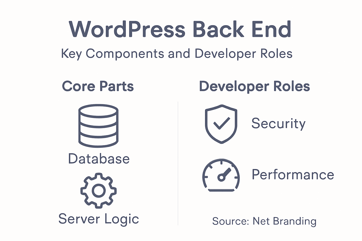
How Accessible Websites Are Built
Creating an accessible website requires a comprehensive approach that goes beyond basic design considerations. Web developers use specific strategies to ensure digital platforms are inclusive and navigable for all users, regardless of their abilities or assistive technology requirements.
The fundamental building blocks of accessible web design include:
- Semantic HTML: Using correct markup that describes content meaning
- ARIA Roles: Implementing accessibility attributes for complex interface elements
- Keyboard Navigation: Ensuring full site functionality without mouse interaction
- Colour Contrast: Maintaining sufficient visual differentiation for users with visual impairments
- Alternative Text: Providing descriptive text for images and multimedia content
Net Branding recognises that accessibility is not a one-time task but an ongoing commitment. The development process requires continuous testing and refinement, involving multiple strategies:
- Initial Design Planning
- Comprehensive Accessibility Auditing
- User Testing with Assistive Technologies
- Iterative Improvements
- Regular Compliance Monitoring
Technical implementation demands attention to multiple layers of web development. Developers must integrate accessibility features directly into the code, ensuring that screen readers, keyboard navigation, and other assistive technologies can effectively interpret and interact with website content.
Accessibility is not about perfect compliance, but about creating genuine digital experiences that welcome everyone.
For New Zealand businesses, investing in accessible web design means expanding potential audience reach and demonstrating social responsibility. By prioritising inclusive design, companies can create digital platforms that serve diverse user needs effectively.
Pro tip: Engage users with disabilities during your design process to gain authentic insights into accessibility requirements.
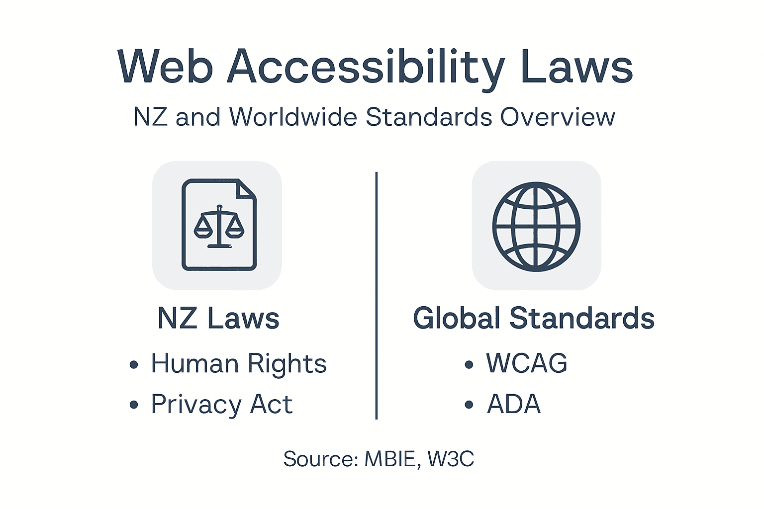
New Zealand Laws and Global Standards
Web accessibility in New Zealand is increasingly recognised as a critical aspect of digital inclusion, with global standards shaping legal frameworks across various jurisdictions. The evolving landscape of digital rights requires businesses to understand and implement comprehensive accessibility strategies.
Key legal considerations for New Zealand businesses include:
- Human Rights Act 1993: Prohibits discrimination based on disability
- New Zealand Bill of Rights: Ensures equal access to information
- Web Accessibility Guidelines: Adoption of international WCAG standards
- Government Web Standards: Mandatory compliance for public sector websites
The World Wide Web Consortium (W3C) has established the Web Content Accessibility Guidelines (WCAG), which serve as the primary international standard for digital accessibility. These guidelines are structured across three levels of compliance:
- Level A: Minimum accessibility requirements
- Level AA: Most commonly required standard
- Level AAA: Highest level of accessibility
Net Branding recognises that accessibility is not just a legal obligation but a fundamental aspect of inclusive digital design. New Zealand businesses must proactively address accessibility to demonstrate social responsibility and expand their potential audience reach.
Accessibility is a legal requirement and a moral imperative for modern businesses.
For organisations operating in New Zealand, understanding these standards is crucial. Compliance involves more than technical implementation – it requires a genuine commitment to creating digital experiences that welcome all users.
Pro tip: Consult with accessibility experts to perform a comprehensive audit of your digital platforms and identify potential improvements.
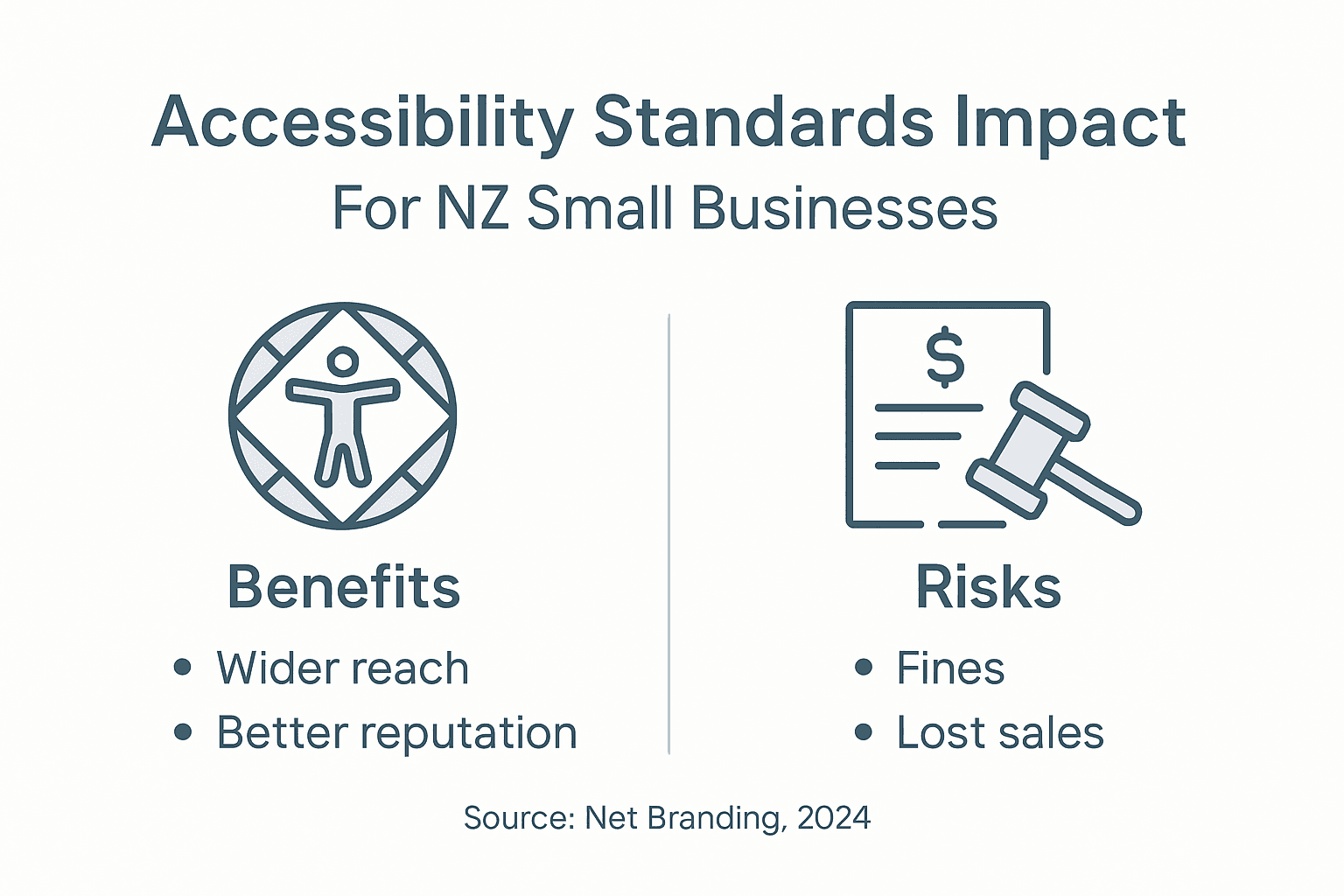
Risks, Business Benefits, and Best Practices
Businesses that neglect web accessibility face significant challenges and missed opportunities. Digital accessibility risks extend beyond legal compliance into critical areas of brand reputation, market reach, and organisational effectiveness.
Key risks for businesses include:
- Potential legal challenges and discrimination claims
- Reduced audience accessibility
- Potential loss of market share
- Negative brand perception
- Limited digital engagement opportunities
Net Branding understands that web accessibility delivers substantial business benefits:
- Expanded customer reach
- Enhanced brand reputation
- Improved search engine optimisation (SEO)
- Demonstration of corporate social responsibility
- Increased user engagement
Best practices for implementing web accessibility involve a comprehensive, strategic approach. This means moving beyond technical compliance to create genuinely inclusive digital experiences that serve diverse user needs.
Accessibility is not a cost – it’s an investment in your business’s future and social responsibility.
Implementation strategies should include ongoing staff training, regular accessibility audits, user testing with diverse groups, and integrating accessibility principles into every stage of digital product development.
Compare core benefits and risks for New Zealand businesses regarding web accessibility:
| Factor | Business Benefit | Risk if Neglected |
|---|---|---|
| Audience Reach | Market expansion | Loss of potential customers |
| Brand Reputation | Positive public perception | Negative publicity |
| Compliance | Legal protection | Exposure to legal action |
| Engagement | Higher user interaction | Lower site traffic and engagement |
Pro tip: Develop a continuous improvement framework for web accessibility that involves regular testing and user feedback.
Make Your Website Truly Inclusive and Powerful Today
Web accessibility is a vital challenge for New Zealand businesses aiming to reach all users and meet legal requirements. If you want to eliminate barriers created by poor design and outdated technology and create a website that is perceivable, operable, understandable, and robust, an expert partner can help you achieve it. By focusing on accessibility, you benefit from better user experience, enhanced brand reputation, and increased audience reach.
Take the first step to transform your digital presence by exploring our Website Archives – ResponsiveWebsiteDesign. Our team specialises in developing custom WordPress websites optimised for accessibility, mobile responsiveness, and SEO. Don’t wait for costly legal risks or lost customers. Visit ResponsiveWebsiteDesign now and get expert help to build an inclusive website that truly supports your business goals.
Frequently Asked Questions
What is web accessibility?
Web accessibility refers to designing digital experiences that allow people with diverse abilities, including disabilities, to navigate, understand, and interact with online content effectively.
Why is web accessibility important for businesses?
Web accessibility is crucial as it not only demonstrates social responsibility, but it also expands potential audience reach, improves user experience for everyone, and enhances brand reputation.
What are the core principles of web accessibility?
The four core principles of web accessibility are Perceivable, Operable, Understandable, and Robust (POUR), which provide a framework for creating inclusive digital experiences.
How can businesses ensure their websites are accessible?
Businesses can ensure accessibility by using semantic HTML, implementing ARIA roles, ensuring keyboard navigation, maintaining appropriate colour contrast, and providing alternative text for images and multimedia content.
Recommended
- Website Accessibility How To for Business Owners – ResponsiveWebsiteDesign
- Website Compliance: Why It Matters for NZ Businesses – ResponsiveWebsiteDesign
- Web Usability: Boosting Engagement and Sales – ResponsiveWebsiteDesign
- Top Small Business Website Solutions in New Zealand: Our Top Picks – ResponsiveWebsiteDesign
- Wat Is Digitale Toegankelijkheid – Impact en Voordelen Voor Bedrijven | BYTE24