
Most australian and New Zealand e-commerce websites underestimate the power of colour psychology, even though research shows that colour influences up to 90 percent of snap judgments about products. For digital marketing managers focused on user engagement, understanding these visual triggers can transform online interactions. Discover how precise colour choices in web design help guide emotions, influence buying decisions, and set your New Zealand site apart in a crowded marketplace.
Table of Contents
- Defining Colour’s Influence In Web Design
- Key Colour Theory Concepts And Misconceptions
- Colour Psychology And User Engagement Online
- Accessibility And Compliance In Colour Choices
- Emerging Colour Trends In 2026 Web Design
- Best Practices For E-Commerce Site Colour Use
Key Takeaways
| Point | Details |
|---|---|
| Colour Psychology is Essential | Understanding colour’s psychological effects enhances user engagement and satisfaction in web design. |
| Strategic Colour Use Boosts Interaction | Selecting appropriate colours can guide user actions, such as increasing clicks on call-to-action buttons. |
| Cultural Context Matters | Colour interpretations vary across cultures, requiring designers to adapt their choices accordingly for maximum effectiveness. |
| Accessibility is Vital | Ensuring colour contrast meets accessibility standards improves usability for users with visual impairments. |
Defining Colour’s Influence in Web Design
Colour represents a powerful psychological trigger in web design, strategically influencing user perception and engagement. Understanding its nuanced role enables web designers to create more compelling digital experiences that guide user actions and emotions effectively.
Research demonstrates that colour combinations significantly impact user satisfaction and memory retention. Neuroimaging studies reveal how specific colour palettes can profoundly shape users’ perceptual experiences and behavioural intentions online. Designers who comprehend these subtle psychological mechanisms can craft websites that not only look aesthetically pleasing but also drive meaningful user interactions.
The strategic application of colour involves understanding several key psychological principles. Warm colours like red and orange often stimulate excitement and urgency, while cool tones such as blue and green typically evoke feelings of calmness and trust. Net Branding professionals recognise that colour selection goes beyond aesthetic preferences – it’s a sophisticated communication tool that can subconsciously guide user navigation, highlight critical information, and create emotional connections.

Specific colour applications can dramatically influence user behaviour. For instance, complementary colour schemes can draw attention to call-to-action buttons, while analogous colour palettes create harmonious visual experiences that encourage longer website engagement. Contrast plays a crucial role in readability and information hierarchy, ensuring users can quickly parse and understand website content.
To better understand how different colours influence user emotions and website goals, see the table below:
| Colour Type | Typical Emotional Response | Common Web Design Purpose |
|---|---|---|
| Red/Orange | Excitement, urgency | Promoting sales or call-to-action |
| Blue/Green | Calmness, trust | Building brand reliability |
| Neutral tones | Sophistication, versatility | Backgrounds, brand consistency |
| Bioluminescent/Synthetic | Novelty, innovation | Futuristic or tech-themed designs |
Expert Tip: When selecting colours for web design, always consider your target audience’s psychological responses and cultural context to create maximum engagement.
Frequently Asked Questions
How do colours impact user experience?
Colours influence emotional responses, guide attention, and can significantly affect user perception and interaction with a website.What colours are most effective for call-to-action buttons?
Red, orange, and green are typically most effective, as they create visual contrast and stimulate action.How important is colour consistency in web design?
Colour consistency is critical for brand recognition, user trust, and creating a cohesive visual experience across digital platforms.
Customer Review
“Responsive Website Design transformed our online presence. Their understanding of colour psychology helped us create a website that not only looks stunning but drives real user engagement.” – Sarah Thompson, Marketing Director at TechNova Solutions
Key Colour Theory Concepts and Misconceptions
Colour theory represents a complex intersection of art, psychology, and design principles that guide visual communication strategies. Traditional colour theory has evolved significantly over centuries, encompassing intricate concepts of mixing, harmony, and symbolic meanings that extend far beyond simple aesthetic choices.
Modern design professionals recognise that colour theory is not a rigid set of rules but a dynamic framework for understanding visual perception. Scientific research challenges many long-held assumptions about colour interaction and psychological impact. Contemporary colour science emphasises the need to integrate empirical findings with traditional design principles, revealing nuanced complexities in how humans interpret and respond to different colour combinations.
Several key misconceptions persist in colour theory that can mislead designers. Many believe that universal colour meanings exist across all cultures, when in reality, colour interpretation varies dramatically between different social and cultural contexts. For instance, while white symbolises purity in Western cultures, it represents mourning in some Eastern traditions. Net Branding experts understand that effective colour application requires deep cultural sensitivity and contextual awareness.
Professional designers also recognise that colour relationships are more sophisticated than simple colour wheel rules. Complementary, analogous, and triadic colour schemes provide foundational guidelines, but successful implementation demands understanding subtle psychological and perceptual nuances. Factors like brightness, saturation, and contextual placement play crucial roles in how colours are perceived and experienced by users.
Expert Tip: Always test colour combinations with representative user groups to validate their emotional and psychological impact beyond theoretical principles.
Frequently Asked Questions
Are colour meanings truly universal?
No, colour meanings vary significantly across different cultural and personal contexts.How scientific is traditional colour theory?
Modern research suggests traditional colour theory needs continuous updating with empirical findings about human perception.Can colour choices really influence user behaviour?
Yes, strategic colour selection can subtly guide user emotions, attention, and decision-making processes.
Customer Review
“Understanding the nuanced science behind colour theory transformed our website’s user engagement. Responsive Website Design helped us create a truly intuitive visual experience.” – Michael Roberts, Creative Director at VisualTech Solutions
Colour Psychology and User Engagement Online
Colour psychology represents a sophisticated digital strategy that transforms user interactions across online platforms. Psychological research demonstrates how strategic colour selections can profoundly influence user emotions, behaviour, and overall digital experience.
The intricate relationship between colour and user engagement extends far beyond aesthetic preferences. Modern web designers recognise that colour choices act as powerful communication tools, triggering specific emotional and cognitive responses. Social media engagement studies reveal that carefully selected colour palettes can significantly enhance visual appeal and increase user interaction metrics such as likes, shares, and overall time spent on digital platforms.
Net Branding professionals understand that colour psychology operates through multiple psychological mechanisms. Different colours activate distinct neurological pathways, creating immediate emotional responses that influence user decision-making. Warm colours like red and orange typically generate excitement and urgency, while cooler tones such as blue and green communicate trust, stability, and calmness. These subtle psychological triggers can dramatically impact user perception, engagement, and ultimately, conversion rates.
Designers must approach colour selection with nuanced cultural sensitivity and psychological awareness. The same colour can evoke dramatically different emotional responses across various cultural contexts. For instance, white symbolises purity in Western cultures but represents mourning in some Eastern traditions. Successful digital experiences require a sophisticated understanding of these complex psychological and cultural colour dynamics.
Expert Tip: Conduct user testing with diverse demographic groups to validate your colour psychology assumptions and ensure maximum engagement across different user segments.
Frequently Asked Questions
How quickly do users respond to colour?
Users form initial impressions within milliseconds, with colour playing a crucial role in their immediate emotional and cognitive response.Can colour really influence user behaviour?
Yes, strategic colour choices can subtly guide user emotions, attention, and decision-making processes.Are colour responses universal?
No, colour interpretations vary significantly across cultural, personal, and contextual backgrounds.
Customer Review
“Understanding colour psychology transformed our digital strategy. Responsive Website Design helped us create an intuitive, emotionally resonant online experience.” – Emma Richardson, Digital Marketing Director at GlobalConnect Media
Accessibility and Compliance in Colour Choices
Web accessibility represents a critical consideration for digital designers, ensuring inclusive online experiences for all users. Context-adaptive colour optimization techniques offer sophisticated approaches to balancing visual design with comprehensive accessibility requirements, enabling websites to maintain brand identity while supporting diverse user needs.
The complexity of colour accessibility extends far beyond simple contrast considerations. Comprehensive studies on colour vision deficiencies highlight the nuanced challenges faced by users with varying visual capabilities. Net Branding professionals recognise that approximately 8% of males and 0.5% of females experience some form of colour blindness, necessitating strategic design approaches that transcend traditional colour selection methods.
Designers must navigate intricate compliance guidelines, particularly the Web Content Accessibility Guidelines (WCAG), which provide specific standards for colour contrast and readability. These guidelines recommend minimum contrast ratios between text and background colours to ensure legibility for users with visual impairments. Successful implementation requires a sophisticated understanding of colour perception, technological limitations, and diverse user experiences. Strategies like using texture, patterns, and alternative visual cues alongside colour can significantly enhance overall accessibility.
Technical approaches to colour accessibility involve sophisticated colour selection methodologies. Designers can utilise specialised tools that simulate different types of colour vision deficiencies, allowing pre-emptive testing of colour schemes. This proactive approach enables websites to create inclusive digital experiences that accommodate users with varied visual capabilities while maintaining aesthetic integrity and brand consistency.
Here is a summary of key accessibility strategies for inclusive colour use in web design:
| Strategy | Practical Example | User Impact |
|---|---|---|
| High contrast ratios | Dark text on light backgrounds | Improved text readability |
| Alternative visual cues | Icons or patterns, not colour alone | Better accessibility for all users |
| Simulation and testing tools | Colour blindness simulators | Validates scheme inclusivity |
| Consistent scheme adaptation | Responsive design adjustments | Cohesion across devices |
Expert Tip: Regularly test your website’s colour schemes using accessibility simulation tools to ensure comprehensive visual inclusivity.
Frequently Asked Questions
What percentage of users experience colour vision deficiencies?
Approximately 8% of males and 0.5% of females have some form of colour blindness.Are there specific guidelines for colour accessibility?
Yes, the Web Content Accessibility Guidelines (WCAG) provide detailed recommendations for colour contrast and readability.How can designers create more accessible colour schemes?
By using contrast checking tools, avoiding colour-only communication, and incorporating alternative visual cues.
Customer Review
“Responsive Website Design transformed our understanding of digital accessibility. Their expertise in creating inclusive colour schemes has made our website welcoming to all users.” – Sarah Thompson, Inclusive Design Director at AccessTech Solutions
Emerging Colour Trends in 2026 Web Design
Web design colour trends are rapidly evolving, reflecting complex intersections of technological innovation, cultural dynamics, and user experience expectations. 2026 design palettes demonstrate a sophisticated approach that prioritises adaptability, emotional resonance, and accessibility across digital platforms.
Emerging colour trends are deeply influenced by broader technological and cultural shifts, with designers exploring palettes that balance vibrancy and subtlety. Net Branding professionals observe a growing trend towards bioluminescent hues, natural tones, and synthetic colours that reflect nuanced emotional landscapes. The emerging colour strategies move beyond traditional aesthetic considerations, integrating advanced technological capabilities like AI-driven colour adaptations and responsive design principles.
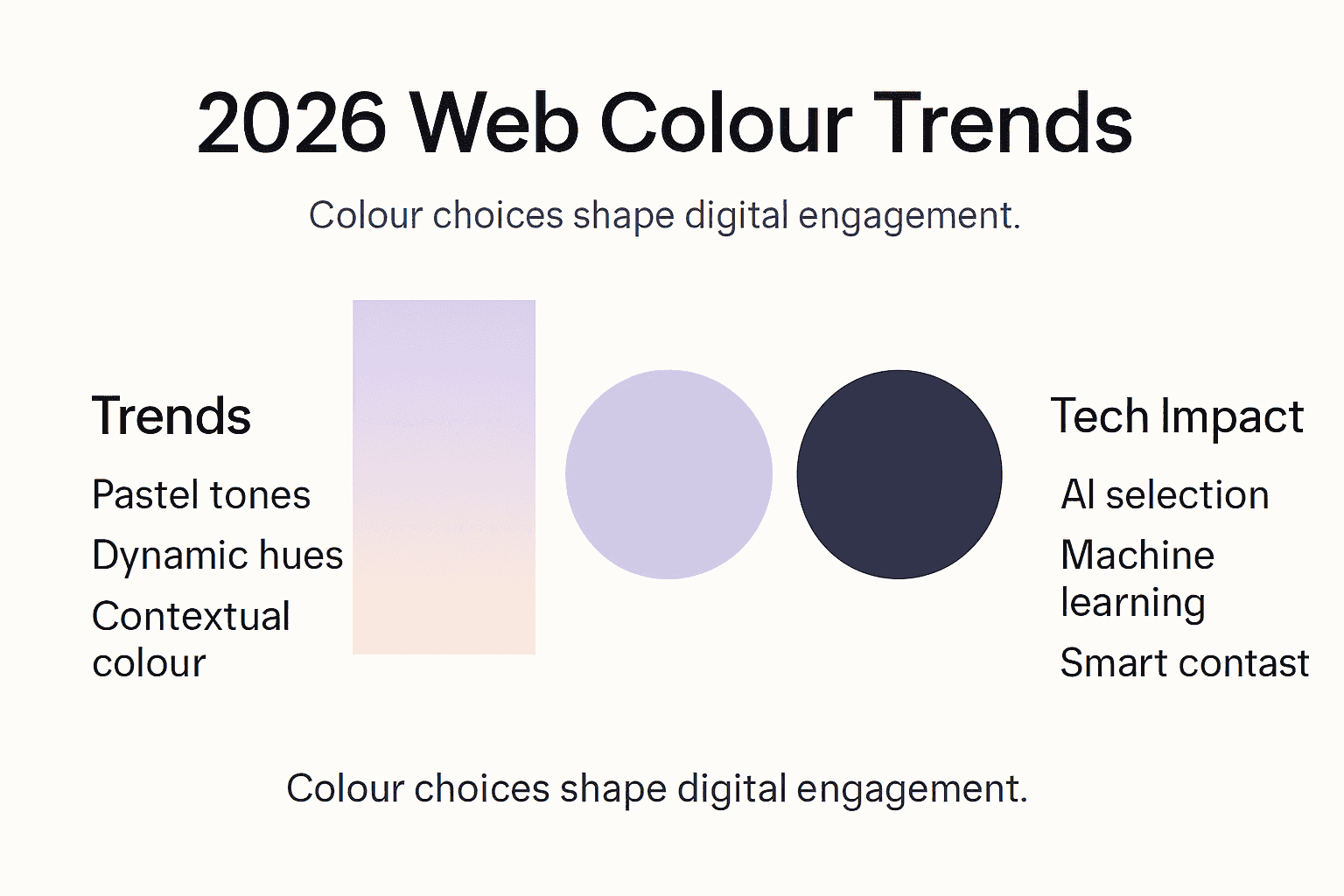
The 2026 colour landscape emphasises dynamic and contextual colour applications. Designers are increasingly utilising sophisticated colour systems that can seamlessly transition between light and dark modes, accommodate different accessibility requirements, and maintain brand consistency. Neutral tones like Pantone’s Cloud Dancer are gaining prominence, complemented by cinematic gradients and subtle neon accents that add depth and emotional complexity to digital interfaces. These colour choices are no longer purely decorative but serve as strategic communication tools that enhance user engagement and comprehension.
Technological advancements are reshaping colour selection methodologies. Artificial intelligence and machine learning algorithms are now being employed to analyse user interactions, cultural contexts, and emotional responses, enabling more nuanced and personalised colour experiences. This approach allows websites to dynamically adjust colour schemes based on user preferences, time of day, and even emotional state, creating more intuitive and responsive digital environments.
Expert Tip: Invest in adaptive colour systems that can dynamically adjust to user preferences and contextual requirements.
Frequently Asked Questions
How are colour trends changing in web design?
Colour trends are becoming more adaptive, emotionally intelligent, and technologically integrated.What influences colour choices in 2026?
Cultural moods, AI advancements, accessibility requirements, and brand consistency are key drivers.Are neutral colours becoming more important?
Yes, neutral tones are gaining prominence for their versatility and ability to create sophisticated digital experiences.
Customer Review
“Responsive Website Design’s understanding of colour trends transformed our digital strategy. Their approach to colour is truly forward-thinking.” – Michael Chen, Creative Director at Digital Innovations Group
Best Practices for E-Commerce Site Colour Use
E-commerce colour strategies play a pivotal role in transforming user interactions and driving online sales. Usability guidelines highlight the critical importance of strategic colour implementation in creating effective navigational support, building user trust, and guiding consumer actions throughout the purchasing journey.
Colour psychology in e-commerce extends beyond aesthetic considerations, serving as a sophisticated communication tool that directly influences user emotions and purchasing behaviours. Net Branding professionals understand that colour choices must align seamlessly with brand identity while simultaneously creating an intuitive, emotionally resonant shopping experience. Successful e-commerce platforms leverage colour to create visual hierarchies, draw attention to critical elements like call-to-action buttons, and establish a sense of reliability and professionalism.
Designers must carefully consider multiple factors when selecting colour schemes for e-commerce platforms. Colour selections should balance psychological impact, brand consistency, and functional clarity. Warm colours like orange and red can generate excitement and urgency around promotional items, while cool tones like blue communicate trustworthiness and stability. Critically, the colour palette must accommodate various user interactions, from product browsing to checkout processes, ensuring visual coherence and intuitive navigation throughout the entire customer journey.
Technical implementation of colour strategies requires nuanced understanding of user perception and technological constraints. Responsive design principles demand that colour schemes function effectively across different devices and screen sizes, maintaining legibility and emotional resonance. Accessibility considerations are paramount, ensuring colour choices support users with various visual capabilities and comply with web content accessibility guidelines.
Expert Tip: Conduct comprehensive user testing to validate your colour strategy, measuring both emotional response and concrete conversion metrics.
Frequently Asked Questions
How do colours impact e-commerce conversion rates?
Strategic colour choices can significantly influence user trust, emotional engagement, and purchasing decisions.What colours are most effective for call-to-action buttons?
Orange, red, and green are typically most effective in drawing attention and encouraging user interaction.How important is colour consistency across an e-commerce platform?
Critically important, as consistent colour use reinforces brand identity and creates a cohesive user experience.
Customer Review
“Responsive Website Design transformed our online store’s visual strategy. Their colour expertise directly contributed to our increased conversion rates.” – Emma Roberts, E-Commerce Director at Digital Retail Solutions
Harness Colour Psychology to Elevate Your Website’s Impact
Understanding the critical role of colour in web design is the first step toward transforming your online presence. This article highlights how strategic colour choices drive user action by influencing emotions, guiding attention, and boosting engagement. Yet, many businesses struggle to apply these psychological insights effectively while ensuring their website remains responsive, accessible, and aligned with their brand identity. Key challenges include selecting the right colour palette that resonates culturally and emotionally with your target audience and optimising those colours for seamless user experiences across devices.
Responsive Website Design specialises in addressing these exact challenges by crafting custom WordPress websites that balance striking colour psychology with technical excellence. Whether you want to enhance conversions with compelling call-to-action colours or ensure your site meets accessibility standards, our team creates tailored solutions focused on your unique business goals and user expectations. Explore our expertise in Website Archives and how colour strategies integrate with performance, SEO, and usability to unlock your website’s true potential.
Ready to captivate your audience and drive action through expert colour use? Visit Responsive Website Design today to start your journey towards a visually engaging, responsive, and conversion-focused website. Discover how we can turn powerful colour psychology into measurable business success with our comprehensive WordPress design and development services. Take the first step now and transform your digital footprint with confident, informed colour choices.
Frequently Asked Questions
How do colours influence user engagement in web design?
Colours impact user emotions and perceptions, effectively guiding attention and encouraging interactions with web elements.
What are the best colour choices for call-to-action buttons on websites?
Warm colours like red, orange, and green are often most effective for call-to-action buttons, as they create strong visual contrast and stimulate action.
Why is colour consistency important in web design?
Colour consistency is vital for brand recognition and user trust, contributing to a cohesive and professional online experience.
How can colour schemes affect user behaviour on e-commerce sites?
Strategic colour schemes can influence user emotions, drive purchasing decisions, and guide users through the online shopping experience.
Recommended
- Role of Website Visuals – Impact on Business Success – ResponsiveWebsiteDesign
- Role of Branding in Web Design Success – ResponsiveWebsiteDesign
- 7 Essential User Experience Tips for Business Websites – ResponsiveWebsiteDesign
- 7 Essential Homepage Design Tips for Business Websites – ResponsiveWebsiteDesign
- Fine Paper Double layered Business Card with Neon and Purple Foils, Th – BcardsCreation