
Selecting the right typography can feel confusing for business owners aiming to stand out online. When every detail matters, clear and attractive text becomes part of your brand’s digital handshake with customers. Effective typography enhances user experience, optimises usability, and catches users’ attention, turning a simple visit into lasting engagement. Discover how smart font choices, thoughtful spacing, and visual consistency can lift your website’s presence above the competition.
Table of Contents
- Defining Typography’s Purpose In Web Design
- Choosing Fonts For Brand And Clarity
- Hierarchy, Readability, And Accessibility Essentials
- Responsive Typography For All Devices
- Common Mistakes And Seo Implications
Key Takeaways
| Point | Details |
|---|---|
| Typography is a Design Strategy | Typography transforms text into a visual experience that communicates tone and guides user attention. |
| Font Selection Impacts Branding | Appropriate font choices evoke emotions and reinforce brand identity, making it essential for effective digital communication. |
| Hierarchy Enhances User Engagement | A clear typographic hierarchy improves readability and comprehension, making information more digestible for users. |
| Responsive Typography is Crucial | Adapting typography to various devices ensures consistent readability and user experience across all platforms. |
Defining Typography’s Purpose in Web Design
Typography represents a fundamental design discipline that transforms text from mere communication into a strategic visual experience. Web designers understand typography as more than selecting attractive fonts—it is a sophisticated method of arranging type to create meaningful, engaging digital interfaces.
At its core, typography serves multiple critical purposes in web design. Graphic design professionals strategically use typography to communicate tone, establish hierarchy, and guide user attention. The selection of typefaces, their arrangement, spacing, and visual weight directly impacts how users perceive and interact with digital content.
Effective typography goes beyond aesthetic appeal. It plays a crucial role in user experience by enhancing readability, comprehension, and emotional connection. Professional web designers recognise that typography influences user interaction through carefully chosen font styles, sizes, and relationships between different text elements.
Net Branding professionals understand that typography communicates brand personality. Different font choices can evoke specific emotional responses—serif fonts might suggest tradition and reliability, while sans serif fonts often represent modernity and simplicity. This strategic approach transforms typography from a design element into a powerful communication tool.
Pro Tip: Always test your typography across multiple devices and screen sizes to ensure consistent readability and visual impact.
Choosing Fonts for Brand and Clarity
Selecting appropriate fonts is a critical strategic decision that goes far beyond aesthetic preferences. Web designers must carefully consider how font selection impacts brand communication and user experience, ensuring that typography becomes a powerful visual language for businesses.
Professional typography involves understanding the psychological impact of different font styles. Serif fonts traditionally communicate reliability and established credibility, while sans serif fonts represent modernity and clean design. When choosing fonts for business documents, designers must balance readability, brand personality, and digital screen performance.

Net Branding professionals recognise that font choices create immediate visual impressions. A well-chosen typeface can evoke specific emotions and reinforce brand identity. Limiting font varieties and creating consistent typography across digital platforms helps maintain visual coherence and strengthen brand recognition. The key is selecting fonts that align with the brand’s core messaging and target audience expectations.
Here’s a comparison of popular font styles and their psychological business effects:
| Font Style | Common Associations | Business Impact |
|---|---|---|
| Serif | Tradition, authority | Builds trust, credibility |
| Sans Serif | Modernity, simplicity | Promotes clarity, approachability |
| Script | Creativity, elegance | Evokes luxury, personal touch |
| Monospace | Precision, functionality | Implies tech-savvy and accuracy |
The technical aspects of font selection are equally crucial. Designers must consider factors like legibility across different devices, loading speeds, and accessibility. Pairing complementary fonts, maintaining appropriate font sizes, and ensuring clear hierarchical structure are essential for creating user-friendly digital experiences.
Pro Tip: Always conduct user testing with your selected fonts to validate readability and emotional resonance across different devices and screen sizes.
Hierarchy, Readability, and Accessibility Essentials
Typographic hierarchy serves as the visual roadmap that guides users through digital content, transforming complex information into digestible experiences. Typography legibility research reveals that effective design goes beyond mere font selection, requiring strategic arrangement that enhances comprehension and user engagement.
Accessibility in typography demands a nuanced approach that considers diverse user needs. Accessible typography guidelines emphasise creating layouts that support users with different visual capabilities. This means selecting fonts with clear letterforms, maintaining appropriate line spacing, and ensuring sufficient contrast between text and background.
Net Branding professionals understand that typographic hierarchy involves more than size differences. It requires a sophisticated system of font weights, sizes, and spatial relationships that create visual priority. Headers, subheaders, body text, and captions must work together seamlessly, guiding the user’s eye and communicating information structure intuitively.
Technical considerations are paramount in creating accessible typography. Designers must balance aesthetic preferences with functional requirements, considering factors like screen resolution, device compatibility, and user interaction patterns. This means selecting fonts that render clearly across multiple platforms and maintaining consistent readability regardless of display context.
Key technical considerations for accessible web typography:
| Factor | Why It Matters | Best Practice Example |
|---|---|---|
| Line Spacing | Eases reading flow | Use 1.5x font size spacing |
| Contrast Ratio | Ensures text is distinguishable | Minimum 4.5:1 for body text |
| Font Size | Improves legibility | Minimum 16px for general text |
| Font Family | Supports clarity | Choose sans serif for body content |
Pro Tip: Use typography style guides to create consistent, accessible design standards that work across all digital platforms and user scenarios.
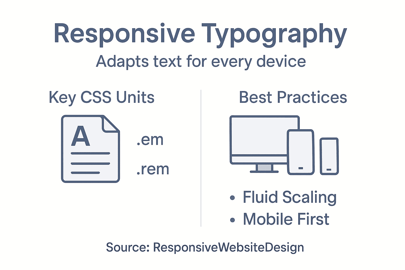
Responsive Typography for All Devices
Responsive web design principles transform typography from static text to dynamic, adaptable communication across digital platforms. Modern web designers recognise that typography must seamlessly scale and adjust to deliver consistent user experiences from desktop monitors to smartphone screens.
The technical foundation of responsive typography involves sophisticated CSS techniques that dynamically adjust font sizes, line heights, and spacing. Unlike traditional fixed-width designs, responsive approaches use fluid grids and media queries to ensure text remains legible and visually appealing across diverse device dimensions. Net Branding professionals understand that this adaptive approach goes beyond simple scaling—it requires strategic type design that maintains hierarchy and readability.
Accessibility emerges as a critical consideration in responsive typography. Responsive design techniques enable text to adjust intelligently, ensuring users with different devices and visual capabilities can comfortably read and interact with digital content. This means implementing flexible font sizes, maintaining appropriate contrast ratios, and creating typography systems that work harmoniously across screen sizes.
Technical implementation requires a holistic approach. Designers must consider viewport settings, use relative units like em and rem, and test typography across multiple devices and screen resolutions. The goal is creating a fluid, responsive typographic system that feels intentional and cohesive, regardless of the viewing environment.
Pro Tip: Implement a mobile-first typography strategy that prioritises readability on smaller screens and progressively enhances design for larger displays.
Common Mistakes and SEO Implications
Common typography errors significantly impact website performance and search engine rankings. Web designers must understand that typography is not merely aesthetic but a critical communication strategy that directly influences user experience and search engine perception.
Net Branding professionals recognise that typography mistakes can create substantial SEO challenges. Improper font selection, inconsistent spacing, and poor text hierarchy can increase bounce rates, reduce user engagement, and negatively signal content quality to search algorithms. Search engines prioritise websites that demonstrate clear, readable, and professionally structured content.
Technical typography errors extend beyond visual appeal. Oversized fonts, illegible typefaces, and excessive decorative elements can dramatically slow page loading speeds, another crucial SEO ranking factor. Websites with clean, optimised typography typically experience lower bounce rates, longer user session times, and improved overall digital performance.
SEO-conscious designers must adopt a strategic approach to typography. This involves selecting readable fonts, maintaining consistent font weights and sizes, ensuring appropriate line spacing, and creating a clear visual hierarchy that guides user attention. Sophisticated typography transforms from a design element into a powerful communication and SEO optimization tool.
Pro Tip: Conduct regular typography audits to ensure your website’s text remains both visually appealing and search engine friendly.
Elevate Your Website’s Impact with Expert Typography and Responsive Design
Typography shapes how your audience experiences your website. The article highlights crucial challenges like maintaining clarity, creating a strong visual hierarchy, and ensuring accessibility across devices. These pain points can cause frustration when fonts fail to communicate your brand or when your site’s text becomes difficult to read on mobile devices. Understanding typography’s role in user experience and SEO is vital for businesses aiming to engage visitors effectively and stand out online.
At ResponsiveWebsiteDesign, we specialise in WordPress website design that harnesses the power of thoughtful typography and responsive layouts. Our team focuses on crafting visually engaging, SEO-optimised sites tailored to New Zealand businesses. Whether you need a fresh start or a website redesign, our custom solutions emphasise readability, brand consistency, and seamless responsiveness. Explore real results and insights in our Website Archives and discover how we can transform your digital presence into a clear, impactful message. Don’t let poor typography hold your business back—take the next step toward a website that truly connects with your audience today.
Frequently Asked Questions
What is the role of typography in web design?
Typography in web design transforms text into a strategic visual experience, enhancing communication and guiding user attention through the careful arrangement of type.
How does typography affect user experience?
Effective typography enhances readability, comprehension, and emotional connections, influencing how users interact with digital content.
What should I consider when choosing fonts for my website?
When selecting fonts, consider readability, brand personality, psychological impact, and device performance to ensure a coherent and appealing user experience.
How can I improve the accessibility of my website’s typography?
To improve accessibility, choose fonts with clear letterforms, maintain appropriate line spacing, ensure sufficient contrast between text and background, and test readability across different devices.
Recommended
- Role of Branding in Web Design Success – ResponsiveWebsiteDesign
- Why Minimalism in Web Design Boosts Business Results – ResponsiveWebsiteDesign
- Role of Website Visuals – Impact on Business Success – ResponsiveWebsiteDesign
- Role of Colour in Web Design: Driving User Action – ResponsiveWebsiteDesign
- Understanding the Role of Visual Branding in Business – Blog