Did you know that nearly 53 percent of mobile users leave a site if it takes longer than three seconds to load? People judge your business in a matter of seconds, often before reading a single word. Fast loading times, clear navigation, and mobile friendly design can turn visitors into customers. You hold the power to shape first impressions and drive business growth with a few smart website choices.
Table of Contents
- 1. Prioritize Fast Website Loading For User Satisfaction
- 2. Ensure Mobile Responsiveness Across All Devices
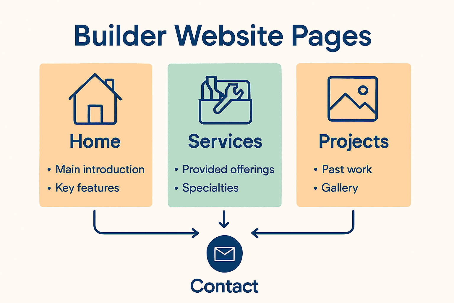
- 3. Use Clear Navigation For Easy User Journeys
- 4. Optimize Call-to-Action Buttons For Conversions
- 5. Simplify Content And Make Information Accessible
- 6. Enhance Trust With Secure And Professional Design
- 7. Gather Feedback To Continuously Improve Experience
Quick Summary
| Takeaway | Explanation |
|---|---|
| 1. Improve Website Speed for Engagement | Fast loading times are crucial; over three seconds risks losing 53% of mobile visitors. |
| 2. Ensure Mobile Responsiveness on All Devices | A mobile-friendly design increases user satisfaction and encourages more recommendations. |
| 3. Simplify Navigation for User Clarity | Intuitive navigation helps users find what they need quickly, enhancing their overall experience. |
| 4. Optimize Call-to-Action Buttons | Visually engaging buttons guide users to take desired actions, boosting conversions. |
| 5. Gather User Feedback for Continuous Improvement | Collecting user input transforms your website into a responsive platform that evolves with audience needs. |
1. Prioritize Fast Website Loading for User Satisfaction
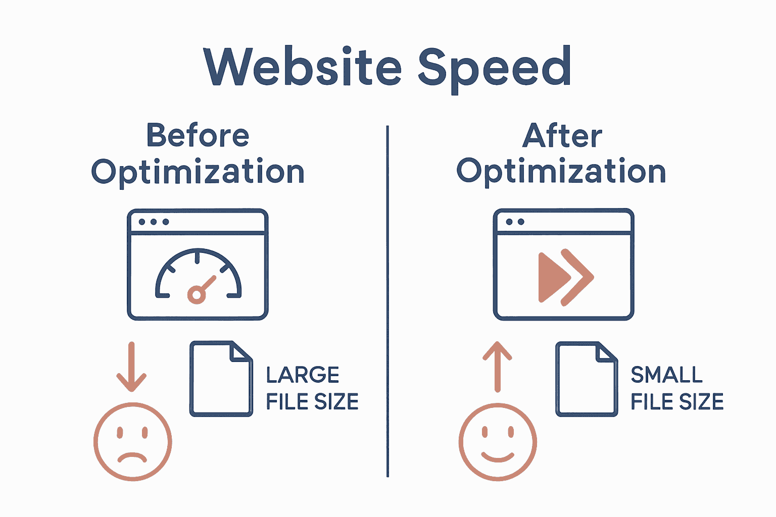
Website speed is the silent make-or-break factor for user engagement that most business owners underestimate. In our increasingly impatient digital world, users expect websites to load quickly and smoothly.
Research indicates that website loading time dramatically impacts user perception and satisfaction. According to advanced studies analyzing web performance, traditional metrics like page load times do not fully capture the user experience. Modern web design requires a nuanced understanding of perceived speed.
When a website takes more than three seconds to load, you risk losing nearly 53% of potential mobile visitors. This isn’t just an inconvenience it represents potential lost revenue and missed business opportunities.
Key Performance Optimization Strategies:
- Compress image files to reduce overall page weight
- Minimize complex JavaScript and CSS scripts
- Leverage browser caching mechanisms
- Use content delivery networks (CDNs)
- Select efficient web hosting solutions
Net Branding specialists recommend implementing performance measurement tools like Google PageSpeed Insights to diagnose and address loading bottlenecks. These tools provide specific recommendations tailored to your website’s unique architecture.
A fascinating research system called DriveShaft suggests innovative approaches to reducing perceived mobile web performance delays. By strategically displaying visually complete pages faster, websites can significantly enhance user satisfaction without requiring extensive backend changes.
Practically speaking, every 100 millisecond improvement in loading speed can translate to meaningful increases in user engagement and conversion rates. Smart business owners view website speed as a critical competitive advantage.
Quick Performance Test Recommendation: Run your current website through multiple speed testing platforms to get a comprehensive performance assessment.
Remember website speed is not just a technical metric it represents your brand’s digital responsiveness and commitment to user experience.
2. Ensure Mobile Responsiveness Across All Devices
In the digital age, your website must look perfect whether accessed from a smartphone, tablet, laptop, or desktop computer. Mobile responsiveness is no longer optional it is an absolute necessity for business survival.
According to recent research, approximately 72% of consumers prefer mobile friendly websites. Even more critically, 57% are unlikely to recommend businesses with poorly designed mobile sites. This means your website design can directly impact your brand reputation and potential customer referrals.
Responsive web design goes beyond simply shrinking content to fit smaller screens. It involves creating a fluid user experience that adapts seamlessly across different device sizes and orientations.
Key Mobile Responsiveness Strategies:
- Use flexible grid layouts
- Implement responsive image techniques
- Design touch friendly navigation menus
- Optimize text readability on smaller screens
- Ensure buttons and clickable elements are appropriately sized
For businesses looking to understand this concept more deeply, our guide on responsive web design provides comprehensive insights into creating adaptable web experiences.
Adaptive web design techniques allow content to be tailored specifically to different screen sizes and device capabilities. This approach ensures that users receive an optimal viewing experience regardless of their device type.
Net Branding specialists recommend conducting regular mobile compatibility tests using tools like Google Mobile Friendly Test. These assessments help identify potential issues and ensure your website performs exceptionally across various platforms.
Remember that mobile responsiveness directly influences user engagement, search engine rankings, and ultimately your business bottom line. A well designed mobile experience can transform casual visitors into loyal customers.
3. Use Clear Navigation for Easy User Journeys
Website navigation is your digital roadmap guiding visitors exactly where they want to go. Think of it as the GPS for your online business journey where clarity and simplicity reign supreme.
Research consistently demonstrates that intuitive navigation dramatically influences user satisfaction and engagement. A comprehensive study evaluating online platforms revealed that users rate navigation as a critical component of their overall web experience.
Key Navigation Design Principles:
- Maintain a logical menu structure
- Use descriptive and concise menu labels
- Limit main navigation items to 57 categories
- Include a search function
- Ensure consistent navigation across all pages
The guide on responsive web design highlights how navigation must adapt seamlessly across different devices while maintaining its core functionality.
Net Branding specialists recommend implementing a hierarchical approach where users can move through your website intuitively. This means organizing content in a manner that allows visitors to understand their current location and potential next steps with minimal cognitive effort.
The Webreep model identifies navigation as a fundamental factor influencing website satisfaction. By prioritizing ease of use and searchability, you create an environment where users feel empowered and supported rather than confused or frustrated.
Practical tip always test your navigation from a user perspective. Ask friends or colleagues to navigate your website and provide honest feedback about their experience. Their insights can reveal hidden complexities you might have overlooked.
Remember that great navigation is not just about helping users find information it is about creating a smooth pleasant journey that encourages exploration and builds trust in your brand.
4. Optimize Call-to-Action Buttons for Conversions
Your website’s call-to-action buttons are the digital equivalent of a sales representative they guide visitors toward taking meaningful actions that drive business growth. When strategically designed these buttons can transform casual browsers into committed customers.
Research in user experience design highlights that intuitive and visually appealing call-to-action buttons significantly contribute to improved user retention and conversion rates. These buttons are not just design elements they are critical communication tools that bridge user interest and business objectives.
Strategic Call-to-Action Button Design Principles:
- Use contrasting colors that stand out
- Write clear compelling action text
- Position buttons strategically on the page
- Make buttons large enough to be easily tapped
- Create a sense of urgency
Content strategist Karen McGrane emphasizes the critical role of user experience in business design. By crafting call-to-action buttons that are both visually engaging and functionally precise, you create pathways that naturally guide users toward desired outcomes.
Net Branding specialists recommend conducting A/B testing to determine which button designs and placements generate the most conversions. This data driven approach allows you to refine your strategy based on actual user behavior.
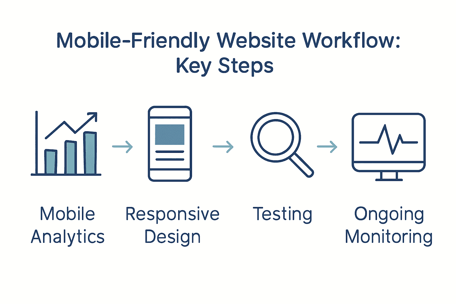
For businesses seeking deeper insights, our guide on mobile-friendly website workflow provides comprehensive strategies for creating compelling user interfaces.
Consider your call-to-action buttons as your website’s silent salespeople. They should communicate value propose clearly and create an irresistible invitation for users to take the next step. The right button can mean the difference between a visitor who browses and a customer who buys.
5. Simplify Content and Make Information Accessible
Your website content is the primary communication channel between your business and potential customers. The key is to transform complex information into clear digestible messages that immediately resonate with your audience.
Karen McGrane advocates for content strategies that prioritize accessibility and user experience. This means creating information that speaks directly to your audience without unnecessary complexity or jargon.
Essential Content Simplification Strategies:
- Use plain language
- Break text into short paragraphs
- Implement clear headings
- Utilize bullet points for key information
- Create scannable content layouts
Research on online learning platforms reveals that users consistently rate high quality content as a critical factor in their overall satisfaction. This underscores the importance of crafting information that is both informative and easy to consume.
Net Branding specialists recommend adopting a reader first approach. This means understanding your audience and presenting information in a manner that addresses their specific needs and questions.
For businesses seeking deeper insights into creating accessible web content, our responsive design guide offers comprehensive strategies for effective digital communication.
Think of your website content like a conversation. Would you explain your business services using complex technical language in a face to face meeting? Probably not. Apply the same principle to your website communicate clearly concisely and with genuine understanding of your audience’s perspective.
Remember that accessible content is not about dumbing down information it is about making your valuable insights understandable and engaging for every potential customer who visits your website.
6. Enhance Trust with Secure and Professional Design
Your website is more than a digital brochure it is the digital face of your business that communicates credibility and professionalism to potential customers. First impressions matter significantly in the online world where users make split second decisions about your brand’s trustworthiness.
The Webreep model identifies trustworthiness as a critical factor influencing website satisfaction. This means your design choices directly impact how potential customers perceive your business reliability and expertise.
Professional Design Trust Building Strategies:
- Use high quality professional imagery
- Implement clean consistent color schemes
- Display security certifications prominently
- Include genuine customer testimonials
- Maintain updated and error free content
Karen McGrane emphasizes the role of professional design in creating user trust. This involves creating a visual experience that feels both authentic and polished.
Net Branding specialists recommend focusing on visual consistency and subtle design elements that communicate professionalism. Small details like typography alignment and color harmony can significantly influence user perception.
For businesses looking to understand the deeper principles of professional web design, our guide on why invest in web design provides comprehensive insights into creating a trustworthy online presence.
Think of your website design like a business suit. Just as professional attire communicates competence in a face to face meeting your website design speaks volumes about your brand before a single word is read.
Remember that trust is earned through consistent attention to detail professionalism and a genuine commitment to meeting your customers needs.
7. Gather Feedback to Continuously Improve Experience
Your website is a living digital ecosystem that should evolve with your users needs and expectations. Collecting and implementing user feedback is not just a strategy it is a continuous conversation with your audience.
Research consistently demonstrates that applications and websites prioritizing user input foster significantly higher engagement and retention rates. By creating channels for honest user feedback you transform your website from a static platform into a dynamic responsive experience.
Effective Feedback Collection Strategies:
- Implement short online surveys
- Add user rating systems
- Create accessible feedback forms
- Use website analytics tools
- Encourage direct email communication
Karen McGrane emphasizes the critical role of user feedback in refining content strategy. This approach recognizes that your users are not just passive consumers but active participants in your digital experience.
Net Branding specialists recommend treating feedback as a valuable resource. Each comment suggestion or critique represents an opportunity to understand your audience more deeply and improve your digital presence.
For businesses seeking comprehensive insights into user experience design, our guide on why invest in web design provides strategic approaches to integrating user perspectives.
Think of user feedback like a GPS for your digital strategy. It provides real time guidance helping you navigate towards a more user friendly and effective website.
Remember that great websites are not built once they are continually crafted through listening understanding and responding to your users genuine experiences and needs.
Below is a comprehensive table summarising the main strategies and insights for improving website user experience as discussed throughout the article.
| Aspect | Strategy/Action | Benefits |
|---|---|---|
| Fast Loading | Compress images, minimise scripts, leverage CDNs | Improve user retention, decrease bounce rates |
| Mobile Responsiveness | Use flexible grids, touch-friendly menus, optimise readability | Enhance user satisfaction, boost brand reputation |
| Clear Navigation | Logical menu structure, concise labels, consistent navigation | Improve user journeys, increase engagement |
| Call-to-Action | Contrasting colours, strategic placement, urgency | Boost conversion rates, guide user actions |
| Simplified Content | Use plain language, clear headings, scannable layout | Increase information accessibility, enhance user comprehension |
| Trust & Professional Design | High-quality images, security certifications, customer testimonials | Build credibility, increase user trust |
| Feedback for Improvement | Surveys, analytics, feedback forms | Drive continuous enhancement, align with user needs |
Elevate Your Business Website with Proven User Experience Strategies
Struggling to keep visitors engaged and turn clicks into customers? The challenges of fast loading, mobile responsiveness, clear navigation, and compelling calls to action are common pain points that can make or break your online success. This article highlights essential user experience tips every business website needs to overcome these hurdles and build lasting trust with visitors.
Ready to transform your digital presence with tailored WordPress solutions crafted for New Zealand businesses? At ResponsiveWebsiteDesign, we understand how critical seamless user journeys and mobile-friendly design are to your growth. Discover expert insights and customised services in our comprehensive Website Archives and stay ahead with strategies featured in our SEO Archives. Don’t let slow load times or confusing navigation hold your business back. Take the next step today by visiting https://responsivewebsitedesign.co.nz and partner with us to build a website experience your customers will trust and love.
Frequently Asked Questions
How can I prioritize fast website loading for better user experience?
To prioritize fast website loading, compress images and minimize complex scripts. Start by using tools to measure your current loading times and aim to improve them by at least 100 milliseconds for increased user engagement.
What strategies can I use to ensure my website is mobile responsive?
To ensure your website is mobile responsive, implement a flexible grid layout and use touch-friendly navigation. Test your site on various devices to confirm a seamless experience, aiming for full compatibility across smartphones and tablets.
What are the best practices for creating clear website navigation?
Best practices for clear website navigation include using descriptive menu labels and maintaining a logical structure. Limit main navigation items to around 5-7 categories to simplify user journeys and encourage exploration.
How can I optimize call-to-action buttons to increase conversions?
To optimize call-to-action buttons, use contrasting colors and write clear, compelling action text. Position buttons prominently and test different designs to see what yields the best conversion rates.
What are effective strategies for simplifying website content?
Effective strategies include using plain language and breaking text into short paragraphs. Employ headings and bullet points to enhance readability, aiming for a scannable format that quickly delivers key information to visitors.
How do I gather feedback to continuously improve my website experience?
To gather feedback, implement online surveys and user rating systems on your site. Encourage direct communication by providing accessible feedback forms to learn from user experiences and adapt your website accordingly.


 Developers and designers must focus on: