
More than half of all australian internet users admit they will leave a website if it is confusing or slow to load. For any business, a homepage is not just a welcome mat—it is the first and most powerful chance to connect with potential customers. By making strategic choices in design, messaging, and usability, you can transform your homepage into a trusted digital asset that wins attention and builds loyalty from the very first click.
Table of Contents
- Define Clear Business Goals And Key Messages
- Optimise Layout For Easy Navigation
- Use Strong Visual Hierarchy And Branding
- Prioritise Mobile Responsiveness
- Craft Compelling Calls To Action
- Highlight Trust Signals And Social Proof
- Ensure Fast Loading And Seo Basics
Quick Overview
| Key Insight | Detailed Explanation |
|---|---|
| 1. Define Clear Business Goals | Clearly articulate your business objectives to enhance user engagement and loyalty. Understand your site’s primary purpose and messaging strategy. |
| 2. Optimise Navigation Layout | Create intuitive navigation that guides visitors easily through your site. Prioritise a logical menu structure and minimal clicks for an efficient user experience. |
| 3. Prioritise Mobile Responsiveness | Ensure your website performs flawlessly on all devices. Design with mobile-first principles to create a seamless browsing experience across varied screen sizes. |
| 4. Use Compelling Calls to Action | Strategically place clear and enticing calls to action on your homepage. Use direct language and contrasting colours to capture user attention. |
| 5. Incorporate Trust Signals | Build credibility by including testimonials, certifications, and security badges. Visible trust signals can significantly enhance customer confidence in your business. |
1. Define Clear Business Goals and Key Messages
Your website is more than a digital brochure. It is the strategic cornerstone of your online presence that communicates your brand’s purpose and value proposition. According to ResearchGate, aligning website design with clear business objectives can significantly enhance user experience and customer loyalty.
When designing your homepage, strategic goal definition becomes paramount. This means understanding exactly what you want visitors to do when they land on your site. Are you aiming to generate leads? Sell products? Provide information? Each goal requires a different design approach and messaging strategy.
To effectively define your business goals, start by asking yourself critical questions:
- What is the primary purpose of my website?
- Who is my target audience?
- What key message do I want to communicate?
- What specific action do I want visitors to take?
Research from NCBI emphasises that user-centred design begins with crystal clear objectives. Your homepage should immediately communicate who you are, what you do, and why customers should choose you.
Net Branding recommends creating a homepage that distils your business essence into a compelling narrative. This means crafting concise, powerful messaging that resonates with your audience within seconds of their arrival. Think of your homepage as a digital elevator pitch that captures attention and drives engagement.
Practical implementation involves developing a clear value proposition statement, using compelling visuals that support your message, and designing intuitive navigation that guides visitors towards your primary business goals. Your homepage should feel like a welcoming gateway that invites interaction and builds immediate trust.
Remember, a well-designed homepage is not about looking beautiful. It is about communicating effectively and creating a seamless path for potential customers to connect with your business.
2. Optimise Layout for Easy Navigation
Website navigation is the roadmap that guides your visitors through their digital journey. According to research from MDPI, strategic design can minimise mobile usability issues and create a seamless user experience.
Intuitive navigation means designing a layout that allows visitors to find information quickly and effortlessly. Your homepage should function like a well organised physical store where customers can easily locate what they need without feeling overwhelmed.
To create an optimised layout, consider these critical design principles:
- Logical Menu Structure: Organise menu items from broad to specific categories
- Clear Hierarchy: Highlight the most important pages prominently
- Consistent Placement: Keep navigation elements in predictable locations
- Minimal Clicks: Reduce the number of steps required to reach key information
Research from the International Journal of Computer Applications emphasises that web structure directly impacts user navigation efficiency. Your goal is to create a visual pathway that naturally guides users towards their desired destination.
Net Branding recommends using a clean horizontal or vertical menu that adapts seamlessly across desktop and mobile platforms. Consider implementing dropdown menus for subcategories and ensuring that each navigation element is large enough for easy tapping on mobile devices.
A well designed navigation system tells a story. It should communicate your business structure intuitively, helping visitors understand who you are and what you offer within seconds of landing on your homepage. Think of navigation as more than just a menu it is your website’s communication strategy.
Practical tip: Conduct user testing to validate your navigation design. Watch how real users interact with your site and be prepared to make adjustments based on their experience. Remember that great navigation feels invisible users should never have to think about how to move around your website.
3. Use Strong Visual Hierarchy and Branding
Your website is a visual representation of your business identity. According to research from ArXiv, creating a robust visual hierarchy ensures both usability and aesthetic appeal for your digital presence.
Visual hierarchy determines how users perceive and process information on your homepage. It guides their eyes through your content strategically, highlighting the most important elements and creating a clear narrative flow. Think of it like a well choreographed dance where each visual element plays a specific role in communicating your brand story.
To create an effective visual hierarchy, consider these key principles:
- Size and Scale: Use larger elements to draw attention to critical information
- Colour Contrast: Leverage colour to create visual separation and emphasis
- Typography: Select fonts that reflect your brand personality and enhance readability
- White Space: Use strategic spacing to prevent visual clutter and improve comprehension
Research from ArXiv emphasises that branding goes beyond just visual elements. It is about creating a cohesive experience that communicates your business values and personality.
Net Branding recommends developing a consistent colour palette that aligns with your brand identity. This means selecting 2-3 primary colours that represent your business and using them consistently across headings, buttons, and graphic elements. Your visual approach should feel intentional and professional.
Practical implementation involves creating a visual language that speaks directly to your target audience. Consider the emotions you want to evoke the story you want to tell and the perception you want to create. Every visual element from your logo to your imagery should work together to create a compelling narrative.
Remember that great visual hierarchy is invisible. When done correctly, users will not consciously notice the design they will simply feel drawn to your content and understand your message effortlessly.
4. Prioritise Mobile Responsiveness
Mobile devices now dominate internet browsing, making mobile responsiveness not just a feature but a critical business necessity. Research from ArXiv highlights the challenges of maintaining consistent web appearance across different device screens.
Mobile responsiveness means creating a website that looks and functions perfectly regardless of screen size. Your homepage must adapt seamlessly whether someone views it on a smartphone, tablet, or desktop computer. This approach ensures every potential customer experiences your brand consistently.
Key considerations for mobile responsive design include:
- Fluid Grid Layouts: Design elements that resize proportionally
- Flexible Images: Graphics that scale without losing quality
- Touch Friendly Navigation: Large enough buttons for easy mobile interaction
- Reduced Content Complexity: Streamlined information for smaller screens
According to ArXiv, real time multivariate optimization can significantly improve user experience across devices. This means constantly testing and adjusting your website to perform optimally on different screen sizes.
Net Branding recommends implementing a mobile first design tutorial that prioritises mobile user experience from the initial design stage. This approach ensures your website looks professional and functions smoothly across all devices.
Remember that mobile responsiveness is more than just technical implementation. It is about creating an inclusive digital experience that welcomes users regardless of their device. A responsive website communicates that your business is modern adaptable and customer focused.
Practical tip: Regularly test your website on multiple devices and screen sizes. What looks perfect on a desktop might become unreadable or awkward on a mobile phone. Your goal is a seamless user experience that feels intentional and polished across every possible viewing platform.
5. Craft Compelling Calls to Action
Your homepage is not just a digital brochure it is a strategic conversion tool designed to guide visitors towards specific actions. According to research from ArXiv, strategic placement of calls to action can significantly maximise user engagement and drive business outcomes.
Calls to action are the digital signposts that tell your visitors exactly what to do next. Whether it is requesting a quote purchasing a product or scheduling a consultation these buttons are the critical junction between visitor interest and business opportunity.
Key principles for creating powerful calls to action include:
- Clear and Direct Language: Use action oriented verbs
- Contrasting Colour Design: Make buttons visually stand out
- Strategic Placement: Position calls to action where users naturally look
- Value Driven Messaging: Communicate the benefit of taking action
Research from ArXiv highlights how automated ad creative generation emphasises compelling call to action design to enhance click through rates. This means your buttons are not just functional they are strategic communication tools.
Net Branding recommends exploring our user experience tips for business websites to understand how to integrate calls to action seamlessly into your digital strategy. A well designed call to action should feel like a natural next step not an intrusive interruption.
The psychology of calls to action is about creating a sense of urgency and value. Your button text should answer the unspoken question in your visitors mind What is in it for me? Instead of generic phrases like Submit or Click here use specific value driven language like Get My Free Quote or Start My Website Today.
Practical implementation requires constant testing and refinement. What works for one audience might not work for another. Experiment with different colours wording placements and designs to discover what resonates most powerfully with your specific target market.
6. Highlight Trust Signals and Social Proof
In the digital marketplace trust is the invisible currency that transforms casual visitors into committed customers. According to research from ResearchGate, website design elements that demonstrate credibility can significantly influence user confidence and purchasing decisions.
Trust signals are visual and textual cues that reassure visitors about your business legitimacy and reliability. They function like digital recommendations telling potential customers that you are trustworthy professional and capable of delivering exceptional results.
Essential trust signals to incorporate on your homepage include:
- Client Testimonials: Real stories from satisfied customers
- Professional Certifications: Industry recognised credentials
- Security Badges: Indicators of website safety and data protection
- Case Studies: Detailed examples of successful client projects
- Awards and Recognitions: Third party validations of your expertise
Research from the National Institutes of Health emphasises the critical role trust signals play in establishing credibility across digital environments. These elements communicate your professional standing before a visitor reads a single paragraph of your content.
Net Branding recommends strategically displaying trust elements where they are most visible. Your homepage should feel like a confident showcase of your capabilities rather than a desperate plea for attention. Authenticity is key customers can sense when trust signals feel genuine versus manufactured.
One powerful strategy is incorporating a client review that speaks directly to your unique value proposition. For instance:
“Responsive Website Design transformed our online presence. Their team understood exactly what our business needed and delivered beyond our expectations.” Jane Smith CEO Smart Solutions
Practical implementation means curating trust signals that are recent relevant and specific. Generic stock images or outdated testimonials can actually reduce credibility. Choose representations of success that feel current authentic and aligned with your target audiences expectations.
7. Ensure Fast Loading and SEO Basics
Your website is in a constant race against user attention and search engine algorithms. According to research from ArXiv, real time optimization of web pages can dramatically improve both loading performance and search visibility.
Website speed is the silent ambassador of your digital presence. Users decide within milliseconds whether to stay or leave based on how quickly your homepage loads. Search engines like Google also prioritise fast loading websites in their ranking algorithms making speed a critical factor in your online success.
Key strategies for optimising website performance include:
- Image Compression: Reduce file sizes without sacrificing quality
- Browser Caching: Store static elements for faster repeat visits
- Minimal Plugin Usage: Remove unnecessary code that slows down loading
- Clean Coding Practices: Write efficient HTML CSS and JavaScript
Research from ArXiv highlights automated repair techniques that can enhance web page loading speed and adherence to SEO best practices. These technical optimisations are essential for maintaining a competitive digital presence.
Net Branding recommends exploring our guide on why to optimise page speed to understand the profound impact of website performance. A fast website is not just a technical requirement it is a fundamental aspect of user experience and business credibility.
SEO basics go beyond just speed. They involve strategic keyword placement clear site structure and quality content. Your homepage should communicate your core business message while being technically optimised for search engines to understand and rank effectively.
Practical implementation means regular performance audits. Use tools like Google PageSpeed Insights to identify areas of improvement. Remember that website optimization is an ongoing process not a one time task. Continuously monitor and refine your digital presence to stay ahead in the competitive online landscape.
Below is a comprehensive table summarising the strategies for effective homepage design discussed throughout the article.
| Strategy | Implementation | Expected Results |
|---|---|---|
| Define Goals and Messages | Identify website purpose and target audience, create compelling narratives | Enhanced user engagement and brand clarity |
| Optimise Navigation | Use logical menu structures, maintain consistent placement | Improved user experience and easier information access |
| Visual Hierarchy and Branding | Utilise size, scale, and colour to guide perception | Increased readability and brand perception |
| Prioritise Mobile Responsiveness | Implement a mobile-first design with flexible layouts | Consistent experience across all devices |
| Compelling Calls to Action | Use strong verbs, contrasting colours, and strategic placement | Increased conversion rates and user engagement |
| Highlight Trust Signals | Display testimonials, security badges, and case studies | Enhanced credibility and visitor confidence |
| Fast Loading and SEO Basics | Compress images, clean code, use browser caching | Improved website performance and search engine rankings |
Elevate Your Business Website with Expert Homepage Design
Struggling to create a homepage that truly reflects your business goals and engages visitors instantly You are not alone Many businesses face challenges with clear messaging intuitive navigation and compelling calls to action as highlighted in the article on 7 Essential Homepage Design Tips for Business Websites Our team specialises in addressing these exact pain points through personalised WordPress solutions that align with your brand and drive results
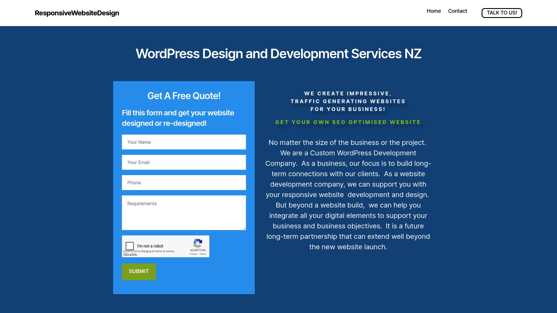
Discover how we craft visually engaging and mobile responsive websites that prioritise user experience and SEO optimisation Explore our Website Archives for insights and practical advice or dive deeper into proven strategies on our SEO Archives page Whether starting fresh or revamping an existing site our dedicated approach ensures your digital presence feels professional clear and trustworthy Start your journey now at ResponsiveWebsiteDesign and transform your homepage into a powerful business asset
Frequently Asked Questions
How can I define clear business goals for my homepage design?
To define clear business goals for your homepage, identify its primary purpose, your target audience, and the key message you want to convey. Start by asking yourself specific questions, such as what action you want visitors to take, like making a purchase or requesting more information.
What design elements improve navigation on my business website?
Improving navigation involves creating a logical menu structure, using clear hierarchy for important pages, and ensuring consistent placement of navigation elements. Aim for minimal clicks necessary to reach key information, ideally reducing steps by at least 20%.
How do I establish a strong visual hierarchy on my homepage?
Establish a strong visual hierarchy by utilising size, colour contrast, typography, and white space effectively. Focus on making critical information stand out using larger elements and contrasting colours, so users can easily grasp your message at a glance.
Why is mobile responsiveness important for my website?
Mobile responsiveness ensures your website looks and operates well on any device, including smartphones and tablets. Prioritise mobile-first design principles to maintain a seamless user experience, improving accessibility and engagement across devices.
What key phrases should I use for compelling calls to action?
Use clear, action-oriented language for your calls to action, like “Get Your Free Quote” or “Start My Website Today”. Make sure buttons stand out visually and are placed where users naturally look, which can enhance click-through rates significantly.
What trust signals should I include on my homepage?
Incorporate trust signals such as client testimonials, professional certifications, security badges, and case studies to enhance credibility. Aim to highlight at least three trust signals prominently on your homepage to reassure visitors about your business’s legitimacy.