
Did you know that over 60 percent of web traffic now comes from mobile devices? Businesses that overlook mobile optimization risk losing valuable customers who expect a fast and smooth browsing experience wherever they are. Understanding how users interact with your site on their phones is the first step toward delivering a digital experience that meets modern expectations and stays ahead of the competition.
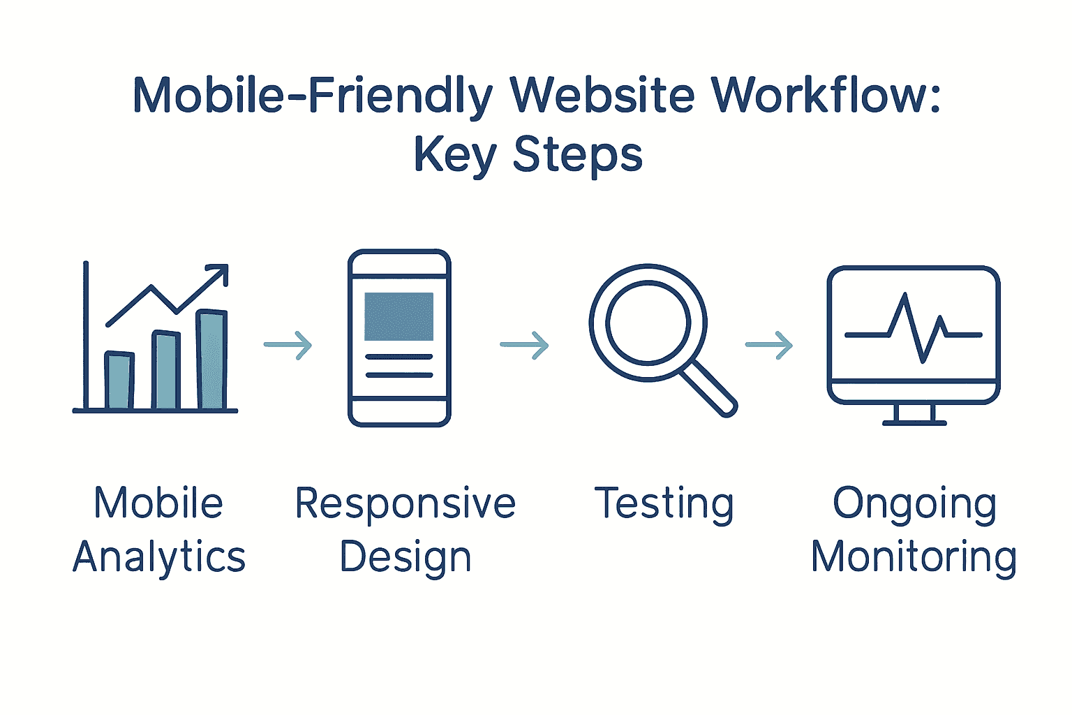
Quick Summary
| Key Point | Explanation |
|---|---|
| 1. Gather Mobile Analytics Data | Analyze device types, traffic patterns, and conversion rates to understand user engagement on mobile. |
| 2. Prioritize Responsive Design | Use flexible layouts that adapt to screen sizes ensuring an optimal viewing experience across devices. |
| 3. Optimize for Speed and SEO | Focus on improving loading times and implementing SEO best practices to enhance mobile usability and search rankings. |
| 4. Conduct Comprehensive Testing | Test your website on real devices and emulators to ensure a flawless user experience under various conditions. |
| 5. Implement Continuous Performance Monitoring | Regularly track performance metrics to quickly identify and resolve issues, maintaining an exceptional mobile experience. |
Table of Contents
- Step 1: Assess Business Needs And Mobile User Goals
- Step 2: Plan Responsive Design Layouts And Content
- Step 3: Develop Mobile-First WordPress Website Structure
- Step 4: Optimize Speed, Seo, And Mobile Usability
- Step 5: Test And Validate Mobile-Friendliness Across Devices
- Step 6: Deploy And Monitor Ongoing Performance
Step 1: Assess Business Needs and Mobile User Goals
In this critical phase, you will map out the specific mobile user experience your business website needs to deliver. Your goal is to understand precisely what your target audience wants when they visit your mobile site and align your design strategy accordingly.
Starting with analytics provides a powerful foundation for your assessment. According to Mobile Web Analytics research, tracking key metrics like device type, screen resolution, visit patterns, and conversion rates gives you a comprehensive picture of mobile user behavior. This data reveals exactly how people interact with your site across different mobile devices.
Begin by gathering comprehensive data about your current mobile traffic. Use tools like Google Analytics to examine critical insights such as:
Here’s a summary of key considerations when assessing mobile user needs:
| Metric | Why It Matters | Example Insights |
|---|---|---|
| Device Breakdown | Tailors design to top devices | 70% smartphones 30% tablets |
| Average Time on Site | Measures engagement | 45 seconds average |
| Top Visited Pages | Identifies priority content | Homepage Contact Blog |
| Conversion Rate (Mobile) | Tracks mobile success | 2.5% from mobile users |
| Bounce Rate (Mobile) | Reveals user friction | 60% indicates improvement need |
- Device breakdown (smartphones versus tablets)
- Average time spent on site
- Pages most frequently visited
- Conversion rates from mobile traffic
- Bounce rates for mobile users
Research from academic sources highlights that intuitive navigation and performance optimization are crucial for mobile user satisfaction. Essentially, mobile users want fast loading times and straightforward paths to the information or actions they seek.
Pro Tip: Don’t just collect data observe and interpret it. Look for patterns that reveal user preferences and potential friction points in your current mobile experience.
Once you have collected and analyzed your mobile user data, you will be ready to design a mobile website experience that meets your audience’s specific needs and expectations. The next step involves translating these insights into a strategic design approach that prioritizes user experience and business objectives.
Net Branding recommends approaching this assessment with a user-first mindset that balances analytical insights with genuine understanding of your audience’s goals and challenges.
Step 2: Plan Responsive Design Layouts and Content
In this crucial phase, you will create a mobile-friendly website design that looks great and functions seamlessly across all devices. Your primary goal is to develop flexible layouts and content strategies that adapt intelligently to different screen sizes and user interactions.
According to professional web design research, using fluid grid layouts through frameworks like Bootstrap or CSS Grid provides the foundation for responsive design. These tools help you create layouts that automatically adjust and reorganize content based on device screen dimensions.
Start by mapping out your content hierarchy and visual priorities. Consider how different screen sizes will impact the arrangement of text, images, and interactive elements. Implement responsive typography using rem or em units to ensure text remains readable across devices. This approach allows font sizes to scale proportionally without losing clarity.
Key strategies for responsive layout planning include:
- Utilizing flexible image techniques
- Implementing srcset for adaptive image resolution
- Creating scalable breakpoints for different device sizes
- Reducing visual clutter on smaller screens
- Optimizing form designs for mobile interaction
Business-focused design advice emphasizes the importance of content adaptability. As technology strategy experts recommend, reducing unnecessary elements and focusing on core user goals dramatically improves mobile user experience.
Pro Tip: Always test your design across multiple devices and screen sizes to ensure consistent performance and user experience.
Net Branding suggests approaching responsive design with a mobile-first mindset that prioritizes simplicity, speed, and user-centered functionality. By planning your layouts thoughtfully, you create a website that not only looks professional but also delivers an exceptional user experience.

With your responsive design foundations established, you are now prepared to move forward with implementing these strategic layout and content approaches.
Step 3: Develop Mobile-First WordPress Website Structure
In this critical stage, you will transform your WordPress website into a mobile-responsive powerhouse that delivers exceptional user experiences across all devices. Your mission is to create a flexible website structure that looks stunning and functions flawlessly on smartphones, tablets, and desktops.
According to WordPress development experts, selecting the right foundation is crucial. Start by choosing lightweight and responsive WordPress themes like Astra, GeneratePress, or Neve. These themes are specifically engineered to provide seamless adaptability across different screen sizes and device types.
Begin your mobile-first development by focusing on block layouts that naturally stack and reorganize vertically on smaller screens. WordPress block editor offers powerful tools to preview and adjust your design for mobile interfaces. This approach ensures your content remains readable and visually appealing regardless of device dimensions.
Key strategies for mobile-first WordPress structure include:
- Minimizing plugin usage to reduce loading times
- Enabling lazy loading for images and media
- Implementing image compression techniques
- Utilizing content delivery networks (CDNs)
- Simplifying navigation for touch interfaces
Practical mobile design guidance emphasizes creating an intuitive user experience. As design strategy researchers recommend, ensure all interactive elements like forms and sliders function smoothly on small screens. Consider implementing mobile-friendly formats such as Accelerated Mobile Pages (AMP) to further enhance performance.
Pro Tip: Always test your WordPress site on multiple devices and use browser developer tools to simulate various screen sizes and resolutions.
Net Branding suggests approaching WordPress development with a user-centric mindset. Optimize images using WebP formats and srcset attributes, which automatically serve appropriately sized images based on device capabilities.
With your mobile-first WordPress structure established, you are now prepared to refine and polish your website’s responsive design and functionality.
Step 4: Optimize Speed, SEO, and Mobile Usability
In this pivotal phase, you will transform your mobile website into a performance powerhouse that delights users and satisfies search engine algorithms. Your mission is to create a lightning fast mobile experience that keeps visitors engaged and improves your overall digital presence.
According to mobile performance experts, website speed is critical. Google research indicates users abandon sites that take longer than 3 seconds to load. This means every millisecond counts in maintaining user interest and preventing potential customer loss.
Start by focusing on Core Web Vitals metrics that Google uses to evaluate website performance. These include Largest Contentful Paint (LCP), Interaction to Next Paint (INP), and Cumulative Layout Shift (CLS). Utilize tools like PageSpeed Insights and Google Search Console to comprehensively assess and improve your mobile site’s performance.
Key strategies for optimization include:
- Implementing lazy loading for images and media
- Compressing and appropriately sizing images
- Minimizing CSS and JavaScript files
- Leveraging content delivery networks (CDNs)
- Enabling browser caching
Business-focused research emphasizes that responsive design directly impacts user engagement. As technology strategy researchers recommend, improving load times and creating flexible image solutions can significantly reduce bounce rates and enhance overall SEO performance.
Pro Tip: Regularly monitor your website performance and be prepared to make continuous incremental improvements.
Net Branding recommends adopting a proactive approach to mobile optimization. Consider implementing HTTP/2 support, which allows multiple simultaneous connections and can dramatically improve loading speeds.
With your speed, SEO, and mobile usability optimized, you are now prepared to create a robust online presence that attracts and retains your target audience.
Step 5: Test and Validate Mobile-Friendliness Across Devices
In this critical validation phase, you will thoroughly test your mobile website to ensure a seamless user experience across multiple devices, operating systems, and browsers. Your mission is to identify and resolve any potential usability issues before launching your website to the public.
According to mobile testing experts, comprehensive testing requires a multi-faceted approach. This means going beyond simple browser previews and using a combination of real devices, emulators, and sophisticated testing platforms to simulate diverse user conditions.
Begin your testing strategy by creating a comprehensive device matrix that covers the most common smartphones and tablets. Include devices running different operating systems like iOS and Android, and test across various screen sizes and resolutions. This approach ensures your website looks and functions perfectly for the broadest possible audience.
Key testing methods include:
- Using real physical devices for authentic experience testing
- Leveraging browser developer tools for mobile emulation
- Utilizing cloud based testing platforms
- Implementing automated testing frameworks
- Checking performance under different network conditions
Professional web development research recommends integrating tools like BrowserStack or Sauce Labs to streamline cross device testing. These platforms allow you to test your website on hundreds of device and browser combinations without purchasing multiple physical devices.
Pro Tip: Always test interactive elements like forms and navigation menus to ensure they function smoothly on touch interfaces.
Net Branding suggests incorporating visual regression testing into your workflow. This technique helps catch subtle layout shifts or design inconsistencies that might not be immediately apparent during initial testing.
With your mobile website thoroughly validated, you are now prepared to confidently launch a responsive digital experience that meets the highest standards of usability and performance.
Step 6: Deploy and Monitor Ongoing Performance
In this final critical phase, you will establish a robust monitoring strategy that ensures your mobile website continues to deliver exceptional performance long after its initial launch. Your mission is to create a proactive system that consistently tracks, analyzes, and optimizes your website’s mobile experience.
According to mobile performance experts, continuous monitoring is essential for maintaining optimal website functionality. This means regularly tracking key performance metrics and responding quickly to any emerging issues or potential degradation in user experience.
Begin by implementing comprehensive performance tracking tools that provide deep insights into your website’s mobile performance. Focus on monitoring Core Web Vitals metrics which Google uses to evaluate user experience. These critical metrics include Largest Contentful Paint (LCP), Interaction to Next Paint (INP), and Cumulative Layout Shift (CLS).
Key ongoing monitoring strategies include:
- Using PageSpeed Insights for regular performance audits
- Tracking Core Web Vitals through Google Search Console
- Scheduling automated speed tests
- Analyzing real user performance data
- Setting up alerts for performance drops
Commercial monitoring platforms recommend using tools that provide both real and synthetic performance testing across global locations. These advanced solutions offer waterfall diagnostics and provide tailored optimization recommendations to help you continuously improve your mobile website.
Pro Tip: Set up monthly performance reviews to proactively identify and address potential issues before they impact user experience.
Net Branding suggests developing a performance improvement workflow that includes regular audits, performance testing, and incremental optimizations. This approach ensures your mobile website remains fast, responsive, and competitive in an ever changing digital landscape.
By establishing a rigorous ongoing monitoring process, you have now completed a comprehensive mobile friendly website development workflow that positions your business for digital success.
Transform Your Mobile Website into a Growth Machine for Your Business
Trying to master the mobile-friendly website workflow brings its own set of challenges. You may feel frustrated by slow sites, lost leads from poor user experience, or uncertainty about how to keep your WordPress site fast and responsive on every device. The article highlighted essential steps such as responsive design, performance optimisation, and ongoing testing, all aimed at helping your business grow online. Your goal is a site that converts more visitors and strengthens your position in the competitive digital landscape.
Discover how our team at Responsive Website Design simplifies this process. Explore success stories and actionable solutions for mobile websites at our Website resources.
Ready to solve your mobile website headaches and focus on growth? Partner with us for tailored WordPress solutions built with Australian business needs in mind. Visit our homepage now or dive into our expert SEO insights to unlock your digital potential before your competitors do.
Frequently Asked Questions
What are the first steps to assess my business needs for a mobile-friendly website?
Begin by analyzing your current mobile traffic using web analytics tools. Gather data on device types, user engagement metrics, and conversion rates to understand what your audience seeks on mobile.
How can I design a responsive website that effectively caters to mobile users?
Create flexible layouts that adapt to different screen sizes by employing fluid grid systems. Focus on simplifying navigation and optimizing image sizes to enhance user experience across devices.
What image optimization strategies can I use to improve my mobile website’s speed?
Implement techniques like lazy loading and compress images to reduce loading times. Aim to decrease image sizes by up to 50% without compromising quality, which can significantly enhance performance.
How do I validate that my mobile website is user-friendly before launching it?
Conduct testing on multiple devices and screen sizes to identify usability issues. Utilize both real devices and emulators to ensure a consistent experience across different platforms.
What ongoing monitoring should I implement for my mobile-friendly website?
Set up performance tracking tools that focus on Core Web Vitals metrics to identify potential issues quickly. Schedule monthly performance reviews to ensure your site remains fast and responsive, ideally improving user satisfaction continuously.
How can I enhance my site’s conversion rates from mobile users?
Optimize your website layout for mobile interactions, ensuring easy navigation and accessible call-to-action elements. Conduct A/B testing on different elements to determine what drives higher conversion rates, aiming for at least a 10% improvement.


 Developers and designers must focus on:


