
Mobile devices now drive more than 60 percent of online traffic for New Zealand and Australian businesses, making mobile-first design an urgent priority. If your customers expect fast, seamless browsing across screens, outdated layouts can cost you sales and damage your search ranking. Discover practical ways to transform your website with the latest 2025 design trends, from bold colours to smarter navigation, giving your business an edge in both user experience and SEO.
Table of Contents
- 1. Mobile-First and Responsive Design Priority
- 2. Bold Colours and Visual Storytelling
- 3. Micro-Animations for Better Engagement
- 4. Advanced SEO-Optimised Layouts
- 5. Minimalist Navigation for Simplicity
- 6. Accessibility as a Core Principle
- 7. AI-Powered Personalisation in Websites
Quick Summary
| Takeaway | Explanation |
|---|---|
| 1. Mobile-first design is essential | Over 60% of internet traffic comes from mobile devices, making mobile-first design crucial for engagement and rankings. |
| 2. Use bold colours for storytelling | Strategic colour choices enhance user engagement and communicate your brand’s narrative effectively. |
| 3. Implement micro-animations | Subtle animations provide immediate feedback, making interactions more intuitive and improving user experience. |
| 4. Prioritise SEO-optimised layouts | Integrating design and SEO helps improve search engine rankings and user experience simultaneously. |
| 5. Accessibility is critical | Designing for inclusivity ensures your website is usable for everyone, expanding your audience and improving SEO. |
1. Mobile-First and Responsive Design Priority
In 2025, mobile-first design is no longer optional for New Zealand businesses seeking digital success. With over 60% of internet traffic now originating from mobile devices, creating websites that seamlessly adapt across screens has become a critical competitive advantage.
The mobile-first approach fundamentally transforms how websites are designed by prioritising compact mobile experiences. Instead of shrinking desktop designs, developers now start with the smallest screen and progressively enhance layouts for larger displays. This strategy ensures optimal performance and user experience across smartphones, tablets, and desktop computers.
Key Mobile-First Design Principles:
• Flexible grid systems
• Scalable image techniques
• Touch-friendly navigation
• Performance-optimised code
By implementing mobile-first design, businesses dramatically improve user engagement. Websites load faster, navigate more intuitively, and provide consistent experiences regardless of device. Google’s mobile-first indexing means these designs also receive preferential treatment in search rankings.
Net Branding recommends businesses conduct thorough mobile responsiveness testing, examining how websites perform across different devices and screen sizes. This approach ensures your digital presence remains adaptable and user-friendly.
Pro tip: Use browser developer tools to simulate various mobile device sizes and test your website’s responsiveness before launching.
2. Bold Colours and Visual Storytelling
In 2025, web design has transformed into a powerful visual communication medium where bold colours and strategic storytelling create compelling digital experiences for New Zealand businesses. Colour psychology drives user engagement through carefully selected palettes that evoke specific emotional responses.
Modern web design embraces vibrant colour strategies that go beyond aesthetic appeal. Businesses are now using hyper-real neon gradients and digital glows to signal innovation while simultaneously incorporating muted earth tones that communicate sustainability and warmth.
Strategic Colour Application Principles:
• Use 2-3 core colours maximum
• Create high contrast for accessibility
• Align colours with brand identity
• Leverage emotional colour triggers
Net Branding recommends selecting colours that not only look striking but also communicate your brand’s unique narrative. A well-designed colour palette can guide user attention, highlight critical calls-to-action, and create memorable visual experiences that distinguish your digital presence.
The key is understanding how different colour combinations trigger specific psychological responses. Bright accents against minimalist backgrounds can draw attention to important elements, while cohesive colour schemes build trust and professional credibility.
Pro tip: Conduct A/B testing with different colour variations to determine which palette generates the most user engagement and conversion rates.
3. Micro-Animations for Better Engagement
Micro-animations have evolved from decorative elements to critical user experience tools in 2025. These subtle digital movements lasting just milliseconds are transforming how New Zealand businesses communicate and interact with online audiences.
Micro-animations provide instant user feedback by creating dynamic visual responses that guide attention and reduce cognitive load. Think of them as digital body language that communicates system status without overwhelming users.
Strategic Micro-Animation Applications:
• Button hover effects
• Loading progress indicators
• Scroll movement signals
• Slide-in confirmations
• Interactive menu transitions
Net Branding recommends implementing micro-animations that align with your brand personality. These tiny interactions can significantly enhance perceived website responsiveness and create memorable user experiences. Well-designed micro-animations communicate professionalism while making digital interactions feel more intuitive and human.
The psychology behind micro-animations is fascinating. By providing immediate visual feedback through subtle movements, websites can reduce user uncertainty and create a sense of direct manipulation. A button that subtly changes colour or slightly expands when hovered over signals interactivity and improves overall engagement.
Pro tip: Limit micro-animations to 200-500 milliseconds to maintain a smooth user experience and prevent potential distraction from core website functionality.
4. Advanced SEO-Optimised Layouts
In 2025, SEO and web design have become inseparable disciplines where layout directly impacts search engine performance. Successful websites now integrate design and search optimisation strategies to create user friendly digital experiences that rank prominently.
Advanced layouts prioritise user experience through strategic content presentation and technical performance. Modern SEO requires websites to be intuitive accessible and lightning fast across all devices.
Key SEO Layout Principles:
• Modular grid systems
• Hierarchical content presentation
• Mobile responsive design
• Clean semantic HTML
• Fast loading infrastructure
• Structured data integration
• Accessible navigation pathways
Net Branding understands that effective SEO optimised layouts are not just about looking good but performing exceptionally. Websites must communicate clearly with both human visitors and search engine algorithms through intelligent design choices.
Core Web Vitals have become critical metrics for ranking. This means your layout must ensure visual stability minimal loading interruptions and swift interactive responses. Designers now craft experiences that load quickly adapt seamlessly and guide users intuitively through content.
Structured data and semantic markup play pivotal roles in modern web design. By implementing schema markup and ensuring clear content hierarchies websites can significantly improve their chances of appearing in rich search results and featured snippets.
Pro tip: Regularly audit your website layout using Google Search Console to identify and resolve potential SEO performance bottlenecks.
5. Minimalist Navigation for Simplicity
Minimalist navigation represents a strategic approach to website design that prioritises user clarity and reduces cognitive overload. In 2025, successful websites communicate more effectively by saying less and showing more.
Minimalist design enhances user experience through clean layouts that guide visitors precisely where they need to go. By eliminating unnecessary visual clutter websites can create more intuitive and engaging digital environments.
Core Minimalist Navigation Principles:
• Prioritise essential links
• Reduce visual noise
• Create spacious layouts
• Implement sticky headers
• Use hamburger menus strategically
• Highlight critical pathways
• Ensure mobile responsiveness
Net Branding recognises that minimalist navigation is about intelligent design choices. Each menu item should serve a clear purpose and help users navigate seamlessly through your digital ecosystem. The goal is to make website interactions feel effortless and natural.
Modern users appreciate websites that respect their time and attention. A well designed minimalist navigation system communicates professionalism and user centricity. By presenting information cleanly and logically you create an environment that encourages exploration and reduces user frustration.
Pro tip: Conduct user testing to validate your navigation design and ensure it meets your target audience’s intuitive expectations.
6. Accessibility as a Core Principle
Accessibility is no longer an optional feature but a fundamental requirement for digital experiences in 2025. Every website must provide inclusive design that welcomes users with diverse abilities and technological constraints.
Digital accessibility supports universal design by creating interfaces that are usable by people with different physical cognitive and technological capabilities. This approach ensures your digital presence is welcoming and functional for everyone.
Essential Accessibility Strategies:
• Semantic HTML structure
• Keyboard navigation support
• High colour contrast options
• Screen reader compatibility
• Text scaling capabilities
• Alternative text for images
• Clear simple language
Net Branding recognises that accessibility is not just about compliance but about creating genuinely inclusive digital experiences. By designing websites that work for everyone you demonstrate social responsibility and expand your potential audience reach.
Modern web accessibility goes beyond traditional disability considerations. It encompasses users with temporary limitations temporary technological constraints and diverse interaction methods. This holistic approach ensures your website remains adaptable and user friendly across various scenarios.
Implementing accessibility features also provides significant search engine optimisation benefits. Search engines reward websites that provide clear structured and universally navigable content with better ranking potential.
Pro tip: Regularly test your website using free accessibility evaluation tools to identify and address potential barriers for users with different abilities.
7. AI-Powered Personalisation in Websites
AI-powered personalisation transforms digital experiences by creating websites that dynamically adapt to individual user preferences and behaviours. In 2025 this technology goes far beyond simple recommendation algorithms to deliver truly intelligent user interactions.
AI transforms web personalisation strategies through advanced machine learning models that analyse user data in real-time. These sophisticated systems understand contextual nuances enabling websites to provide hyper targeted experiences.
Key AI Personalisation Capabilities:
• Dynamic content adaptation
• Contextual user journey mapping
• Predictive user behaviour analysis
• Customised interface configurations
• Real-time interaction optimisation
• Personalised product recommendations
• Intelligent navigation suggestions
Net Branding recognises that AI personalisation represents more than technological innovation it represents a fundamental shift in how businesses connect with their audience. By understanding individual user needs websites can create more meaningful and engaging digital experiences.
Modern AI systems leverage natural language processing and machine learning to understand subtle user preferences. This means websites can now adjust their entire presentation navigation and content delivery based on individual user characteristics creating a truly personalised digital environment.
The potential extends across multiple business domains from e-commerce platforms to educational websites. AI-powered personalisation enables businesses to deliver precisely what each user needs precisely when they need it.
Pro tip: Start with smaller personalisation experiments and gradually expand your AI integration to understand your specific audience dynamics.
Below is a comprehensive table summarising the key design principles and strategies for digital success in 2025 as discussed in the article.
| Main Topic | Description | Key Considerations |
|---|---|---|
| Mobile-First and Responsive Design | Emphasises prioritising designs for mobile devices, ensuring seamless adaptation across varied screen sizes and devices. | Use flexible grid systems, touch-friendly navigation, and conduct thorough responsiveness testing. |
| Bold Colours and Visual Storytelling | Applies vibrant and purposeful colour schemes to engage users and communicate brand identity effectively. | Leverage colour psychology; use 2-3 core colours to maintain clarity and accessibility. |
| Micro-Animations for Engagement | Employs subtle animations to provide user feedback and enhance interactivity without overwhelming the user experience. | Limit animation duration to 200-500 milliseconds to maintain focus and smoothness. |
| SEO-Optimised Layouts | Combines superior design practices with advanced SEO tactics to improve search rankings and user accessibility. | Integrate structured data and ensure layouts are hierarchical, mobile responsive, and optimise loading times. |
| Minimalist Navigation | Streamlines menus to reduce user cognitive load, enabling intuitive navigation and faster content location. | Prioritise essential links; implement accessible and responsive design structures. |
| Accessibility as Core Principle | Focuses on creating websites that cater inclusively to diverse user abilities and conditions. | Design for screen readers, include alternative texts for images, and maintain keyboard navigation support. |
| AI-Powered Personalisation | Utilises artificial intelligence to tailor user experiences dynamically based on behavioural data and preferences. | Start personalisation through small-scale AI experimentation, growing integration as capability and understanding of audience expand. |
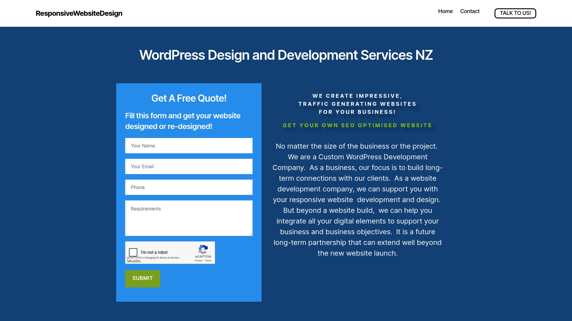
Unlock Success with Cutting-Edge Web Design Tailored for New Zealand Businesses
Facing the challenge of staying ahead in New Zealand’s competitive digital space means embracing the latest trends like mobile-first responsive design, bold colour palettes, and SEO-optimised layouts. Your business deserves a website that not only looks great but drives results by enhancing user experience and search engine rankings. At ResponsiveWebsiteDesign, we specialise in creating customised WordPress solutions that address these exact needs, helping you build a professional online presence that truly connects with your audience.
Explore expert insights and strategies through our Website Archives and boost your search visibility with proven techniques featured in our SEO Archives. Don’t wait to transform your digital footprint. Visit ResponsiveWebsiteDesign now and partner with specialists who understand the unique demands of New Zealand businesses. Begin your journey to a more engaging, efficient, and successful website today.
Frequently Asked Questions
What are the key principles of mobile-first design for my website?
Mobile-first design prioritises user experience on mobile devices, ensuring your website is responsive and accessible across all screen sizes. Focus on implementing flexible grid systems, scalable images, and touch-friendly navigation to enhance user engagement. Conduct mobile responsiveness testing to identify areas for improvement.
How can I choose an effective colour palette for my website in 2025?
To create a compelling colour palette, select 2-3 core colours that align with your brand identity and evoke the desired emotional response. Ensure high contrast for accessibility and test different colour combinations through A/B testing to find the most engaging options that enhance user interaction.
What are micro-animations, and how can they enhance my website’s user experience?
Micro-animations are subtle digital movements that provide immediate feedback and enhance interactivity on your website. Implement them for buttons, loading indicators, and menu transitions to guide user attention and convey professionalism. Limit animations to 200-500 milliseconds to ensure a smooth user experience.
Why are SEO-optimised layouts crucial for my website’s ranking?
SEO-optimised layouts improve user experience and help search engines understand your site’s structure. Focus on modular grid systems, clean semantic HTML, and fast loading times to enhance your site’s performance. Regularly audit your website using analytics tools to find and fix any SEO performance issues.
How can I ensure my website is accessible to all users?
To make your website accessible, implement strategies such as semantic HTML structure, keyboard navigation support, and high colour contrast options. Ensure your content is easy to read by using simple language and providing alternative text for images. Regularly test your website with accessibility evaluation tools to identify and address any barriers.
What are some initial steps to integrate AI personalisation into my website?
Start by analysing user data to understand their preferences and behaviours, then begin implementing small personalisation features like customised content and tailored navigation suggestions. Gradually expand these features based on user feedback to create a more personalised experience that meets individual user needs.
Recommended
- Blog – ResponsiveWebsiteDesign
- Leading Web Development Companies in New Zealand – ResponsiveWebsiteDesign
- Leading Web Development Companies in New Zealand – ResponsiveWebsiteDesign
- Why Invest in Web Design: Complete Guide for Business – ResponsiveWebsiteDesign
- Top 5 types of business cards for a nail artist | business cards idea – BcardsCreation