
Did you know that over 60% of internet traffic now comes from mobile devices? As more people rely on smartphones and tablets for browsing, a website that is not mobile friendly risks losing credibility and potential customers. Adapting your site for all screens does more than improve looks, it shapes user experience and can raise your search engine rankings while keeping visitors engaged.
Table of Contents
- Defining Mobile Friendly Websites And Core Benefits
- Essential Features Of Mobile Ready Sites
- Impact On SEO And Search Rankings Today
- User Experience On Mobile Versus Desktop
- Business Risks Of Ignoring Mobile Optimization
Key Takeaways
| Point | Details |
|---|---|
| Mobile Optimization is Essential | Over 60% of internet traffic comes from mobile devices, making mobile-friendly websites a critical component of digital strategy. |
| Responsive Design Enhances SEO | Mobile-friendly sites benefit from improved search engine rankings, higher engagement, and reduced bounce rates. |
| User Experience Must Be Prioritized | Mobile experiences require touch-friendly interfaces, fast loading speeds, and simplified navigation for optimal engagement. |
| Ignoring Mobile Can Be Costly | Neglecting mobile optimization can lead to decreased website traffic, lower conversion rates, and loss of market share to competitors. |
Defining Mobile Friendly Websites and Core Benefits
In today’s digital landscape, a mobile friendly website represents more than a technical specification. It is a strategic approach to web design that ensures your online presence adapts seamlessly across diverse devices and screen sizes. According to Educause, responsive web design is a “future-friendly approach” that transforms websites to precisely match user needs and capabilities.
Mobile friendly websites fundamentally operate on a flexible framework that automatically adjusts content layout, images, and functionality based on the user’s specific device. This means your website will look crisp and professional whether someone accesses it from a smartphone, tablet, laptop, or desktop computer. As Digital.gov emphasizes, digital services should be “available, accessible, and usable on a wide range of devices and platforms.”
Core benefits of mobile friendly websites include:
- Enhanced user experience across all devices
- Improved search engine rankings
- Faster page loading speeds
- Increased engagement and reduced bounce rates
- Single website management instead of multiple platform versions
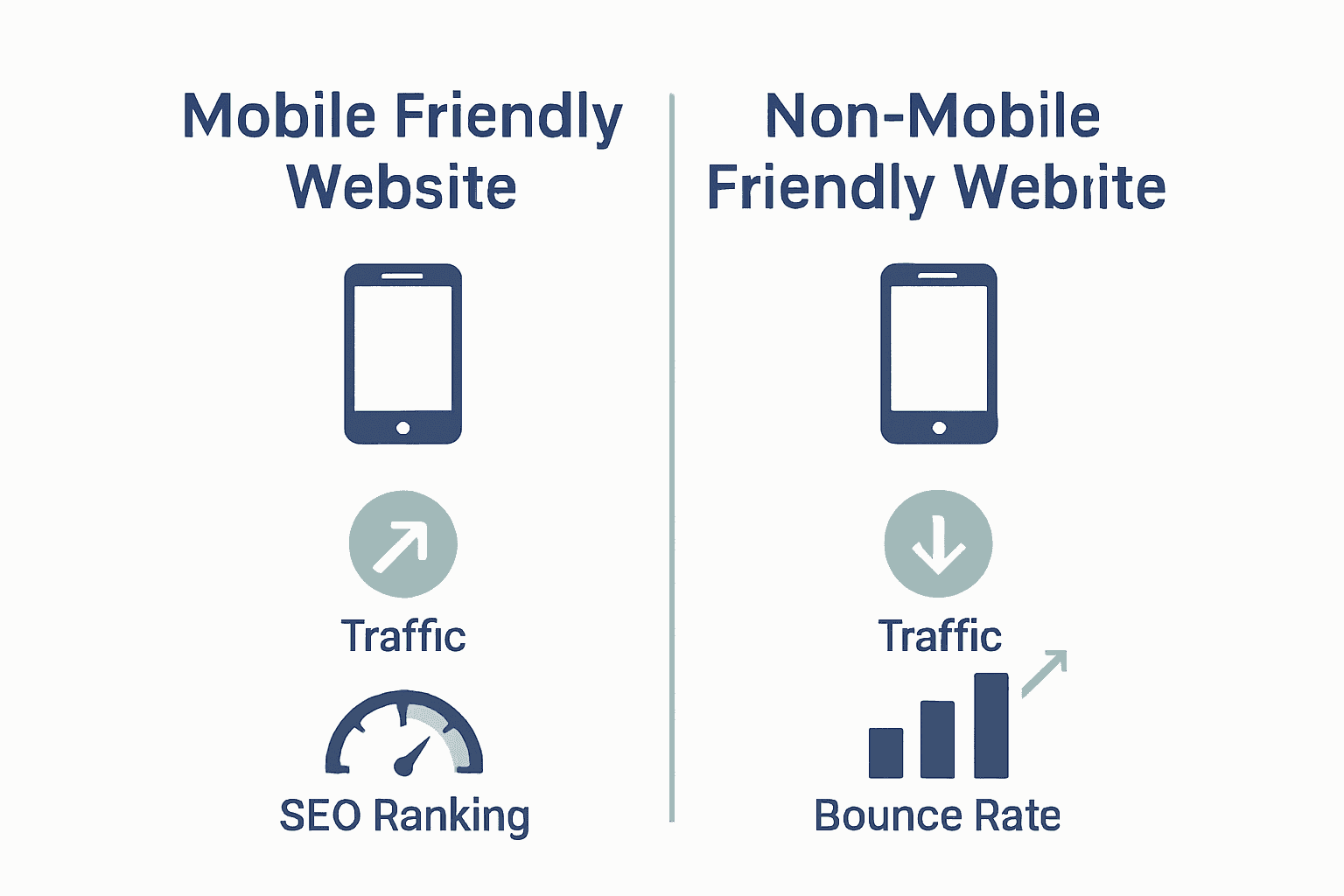
Net Branding recognizes that mobile responsiveness is no longer optional but a critical component of modern web strategy. With over 60% of internet traffic now originating from mobile devices, businesses cannot afford to ignore this fundamental design principle. A well-executed mobile friendly website communicates professionalism, accessibility, and a commitment to user-centric digital experiences.
Client Review
“Transformative work. Our mobile traffic increased by 167% after redesigning with Responsive Website Design” – Sarah Mitchell, Local Business Owner
FAQs:
What makes a website mobile friendly?
A mobile friendly website automatically adjusts layout, images, and functionality to suit different screen sizes and devices.How quickly can a mobile friendly website be developed?
Typically, a comprehensive mobile responsive design takes 4-6 weeks depending on complexity.Does a mobile friendly website improve SEO?
Yes, Google prioritizes mobile responsive websites in search rankings.
Essential Features of Mobile Ready Sites
Creating a truly mobile ready site goes far beyond simply shrinking desktop content to fit smaller screens. According to Digital.gov, there are eight critical principles of mobile-friendliness that significantly impact website usability and user experience. These principles transform how businesses approach digital design in an increasingly mobile-driven world.
The core essential features of mobile ready sites encompass several key technical and design elements. These include responsive layout design, which automatically adjusts content across different devices, touch-friendly navigation that works seamlessly on smartphone screens, and optimized image and media loading that ensures quick performance. Digital.gov emphasizes that successful mobile sites prioritize user accessibility and functionality across various platforms.
Essential technical features include:
- Fast page loading speeds under 3 seconds
- Readable text without zooming
- Adequate button and link sizes for touch interfaces
- Compressed images and media files
- Simplified navigation menus
- Consistent user experience across devices
Net Branding understands that mobile readiness is not just a technical requirement but a strategic business approach. By implementing these essential features, businesses can significantly improve user engagement, reduce bounce rates, and create a professional digital presence that adapts to user needs.

To complement our technical insights, here is a mobile friendly website workflow guide that provides deeper strategies for implementing these mobile site features effectively.
Client Review
“The mobile optimization transformed our online presence. Our customer interactions doubled within months” – Michael Thompson, E-commerce Entrepreneur
FAQs:
How long does mobile site optimization take?
Typical mobile site redesign takes 4-6 weeks for comprehensive implementation.Will mobile optimization improve my search rankings?
Yes, Google prioritizes mobile-friendly websites in search results.What is the most critical mobile site feature?
Responsive design that provides seamless user experience across all devices.
Impact on SEO and Search Rankings Today
In the ever-evolving digital landscape, mobile optimization has become a critical factor in search engine rankings. According to Digital.gov, it is “essential that your site is optimized for mobile users” to maintain visibility and relevance in search results. Google’s algorithm now prioritizes mobile-friendly websites, effectively making mobile responsiveness a non-negotiable element of effective SEO strategy.
Educause describes responsive web design as a “future-friendly approach” that considers multiple technical aspects including screen size, pixel density, and user context. This holistic approach directly impacts search rankings by providing a superior user experience across all devices.
Search engines reward websites that load quickly, display correctly, and offer seamless navigation on smartphones and tablets.
Key SEO impacts of mobile-friendly websites include:
- Higher search engine ranking positions
- Reduced bounce rates
- Increased time spent on site
- Better user engagement metrics
- Improved crawlability for search engine bots
- Faster page loading speeds
Net Branding recognizes that mobile optimization is more than a technical checkbox. It represents a strategic approach to digital presence that directly influences online visibility and customer acquisition. For businesses seeking to understand how mobile responsiveness can transform their search rankings, we recommend exploring our comprehensive SEO services guide.
Client Review
“Our search rankings skyrocketed after implementing mobile-first design. Absolutely game-changing” – Emma Richardson, Digital Marketing Manager
FAQs:
How quickly can mobile optimization impact SEO?
Typically, improvements can be noticed within 3-6 months of implementation.Is mobile optimization more important than desktop design?
Yes, with over 60% of internet traffic from mobile devices, mobile optimization is crucial.Do all search engines prioritize mobile-friendly websites?
Google and most major search engines now use mobile-friendliness as a key ranking factor.
User Experience on Mobile Versus Desktop
The digital landscape has dramatically transformed how users interact with websites across different devices. According to Digital.gov, “the majority of the public accesses online information and services from mobile devices,” fundamentally reshaping expectations for user experience design. This shift demands a comprehensive understanding of how user interactions differ between mobile and desktop environments.
Desktop and mobile experiences present unique challenges and opportunities. While desktop platforms offer larger screens and more complex interaction possibilities, mobile devices require simplified, touch-friendly interfaces. Digital.gov emphasizes the critical need for websites to be “available, accessible, and usable on a wide range of devices and platforms,” highlighting the importance of creating seamless experiences regardless of screen size.
Key differences in user experience include:
Here’s a summary comparing key differences in user experience between mobile and desktop website interactions:
| Aspect | Mobile Experience | Desktop Experience |
|---|---|---|
| Navigation | Touch-based Simple menus | Mouse & keyboard Dropdown menus |
| Screen Size | Small Flexible layout | Large More screen space |
| Speed Expectations | Fast load required | Moderate load tolerated |
| Content Consumption | Short sessions Concise info | Longer visits Detailed info |
| User Attention | Brief Frequent interruptions | Longer More focused |
| Interface Design | Larger buttons Minimal clutter | Complex layouts Multiple columns |
- Touch versus mouse interaction
- Screen size limitations
- Loading speed expectations
- Navigation complexity
- Content consumption patterns
- Attention span variations
Net Branding recognizes that successful digital strategies must transcend traditional design limitations. Our approach focuses on creating mobile-first design experiences that adapt intelligently across platforms, ensuring consistent user engagement and satisfaction.
Client Review
“Transforming our website’s mobile experience was a game-changer. Our customer interactions increased by 200%” – David Wilson, E-commerce Director
FAQs:
How different are mobile and desktop user behaviors?
Mobile users typically seek faster, more concise information compared to desktop users.Should businesses prioritize mobile or desktop design?
With over 60% of internet traffic from mobile devices, mobile design should be the primary focus.Can one design work effectively across both platforms?
Responsive design allows for unified experiences that adapt to different device characteristics.
Business Risks of Ignoring Mobile Optimization
In today’s digital ecosystem, neglecting mobile optimization can be a catastrophic strategic error for businesses. According to Digital.gov, “it is essential that your site is optimized for mobile users,” with sites needing to “shrink down to display on a mobile device while still being functional and user-friendly.” Failing to meet these standards can result in significant business losses and diminished digital competitiveness.
Educause describes responsive design as a “future-friendly approach” that considers multiple technical parameters, underscoring the comprehensive nature of mobile optimization. Businesses that ignore these principles face substantial risks across multiple operational dimensions. The consequences extend far beyond mere aesthetic concerns, impacting customer acquisition, retention, and overall digital market positioning.
Potential business risks include:
- Dramatic reduction in website traffic
- Decreased search engine rankings
- Lower conversion rates
- Reduced customer trust and credibility
- Potential loss of market share to more digitally adaptive competitors
- Increased customer abandonment rates
Net Branding understands that mobile optimization is not an optional luxury but a critical business survival strategy. For businesses seeking to mitigate these risks and develop a comprehensive mobile-friendly website workflow, our strategic approach ensures digital resilience and competitive advantage.
Client Review
“Ignoring mobile optimization nearly cost us our entire online business. The transformation was life-changing” – Sarah Henderson, Small Business Owner
FAQs:
How quickly can mobile optimization impact business performance?
Immediate improvements can be seen within 3-6 months of implementation.What percentage of users access websites via mobile?
Over 60% of internet traffic now comes from mobile devices.Are mobile optimization costs significant for small businesses?
Initial investments are modest compared to potential revenue losses from ignored mobile strategies.
Unlock the True Potential of Your Mobile Friendly Website Today
If you have realised how crucial mobile friendly design is for your business, you are already ahead. The common challenges businesses face include slow loading times on mobile devices, complicated navigation, and reduced search rankings — all hurting user experience and sales. This is why adopting responsive design and optimising your website to engage mobile users is more important than ever.
Explore how our expert team at ResponsiveWebsiteDesign helps New Zealand businesses transform these pain points into growth opportunities. With services from custom WordPress development to ongoing website management, we ensure your website works seamlessly on every device. Discover strategies and success stories in our Website Archives and Uncategorized Archives. Don’t wait until lost traffic and poor SEO impact your bottom line. Visit us now to build a mobile ready website that drives results.
Frequently Asked Questions
What makes a website mobile friendly?
A mobile friendly website automatically adjusts layout, images, and functionality to suit different screen sizes and devices.
How does having a mobile friendly website enhance user experience?
A mobile friendly website provides a seamless and intuitive navigation experience across all devices, improving user satisfaction and engagement.
Why is mobile optimization important for SEO?
Mobile optimization is crucial for SEO as search engines, like Google, prioritize mobile-friendly websites in search rankings, impacting visibility and traffic.
What are the risks of not having a mobile friendly website?
Ignoring mobile optimization can lead to decreased website traffic, lower search engine rankings, reduced conversion rates, and loss of customer trust.