
Choosing a web design that genuinely fits your business can feel complicated when users visit from smartphones, tablets, and desktop computers every day. For New Zealand companies building or upgrading WordPress sites, adaptive web design provides a way to deliver tailored digital experiences that match each device’s unique needs. This introduction explains how creating distinct layouts and using intelligent detection methods leads to improved user satisfaction, more effective SEO, and a stronger online presence for your business.
Table of Contents
- Adaptive Design Defined For Modern Websites
- Key Characteristics And How It Functions
- Types Of Adaptive Design Solutions For NZ Businesses
- Benefits For WordPress Sites And User Experience
- Pitfalls And How Adaptive Differs From Responsive
Key Takeaways
| Point | Details |
|---|---|
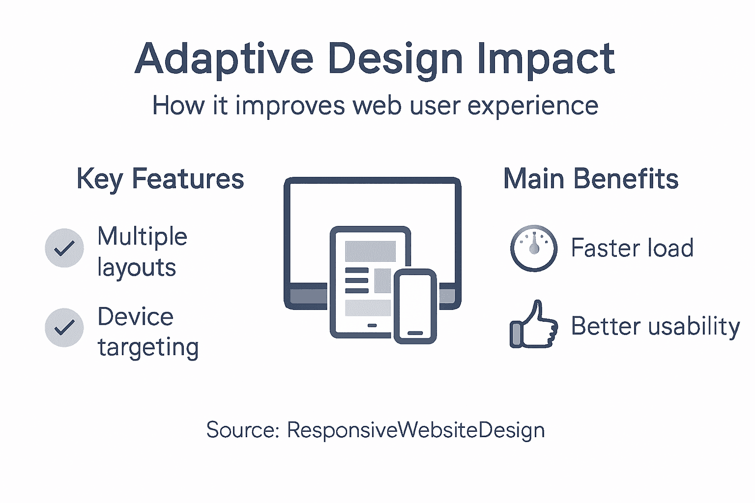
| Adaptive Design Enhances User Experience | By using multiple pre-built layouts tailored for device-specific capabilities, adaptive design provides a tailored and optimised user experience across various devices. |
| Intelligent Device Detection is Crucial | Effective adaptive design relies on precise device detection mechanisms, allowing websites to deliver context-aware content based on user device characteristics. |
| Performance Optimisation Leads to Higher Engagement | Adaptive design can result in faster loading times and better mobile user experience, contributing to increased user retention rates and overall satisfaction. |
| Understand the Trade-offs Between Design Approaches | While adaptive design offers tailored experiences, it comes with complexities and higher maintenance needs compared to responsive design. |
Adaptive Design Defined For Modern Websites
Adaptive web design represents a sophisticated approach to creating digital experiences that seamlessly adjust to different user devices. Unlike traditional static websites, adaptive design dynamically transforms website layouts to match specific screen dimensions and device capabilities.
At its core, adaptive design involves creating multiple pre-designed website versions optimised for various device types. Web design experts describe this strategy as a method that detects a user’s device and serves the most appropriate layout configuration, ensuring optimal viewing and interaction experiences.
Key characteristics of adaptive design include:
- Multiple pre-built website layouts for different screen sizes
- Intelligent device detection mechanisms
- Customised content presentation based on device capabilities
- Enhanced user experience across smartphones, tablets, and desktop computers
The fundamental goal of adaptive design is addressing the growing diversity of digital devices. Modern web design approaches focus on creating flexible interfaces that provide consistent, high-quality interactions regardless of screen size or device type.
Net Branding recognises that adaptive design goes beyond simple responsiveness. While responsive websites fluidly adjust layouts, adaptive designs create distinct, purpose-built experiences for each device category. This approach ensures that users receive a tailored interface optimised for their specific device’s characteristics.
Pro tip: Test your adaptive design across multiple devices to ensure consistent user experience and functionality.
Key Characteristics And How It Functions
Adaptive web design operates through sophisticated mechanisms that go far beyond traditional website development strategies. Server-side detection techniques allow websites to intelligently recognise and respond to specific device characteristics, delivering tailored user experiences across different platforms.
The fundamental functioning of adaptive design involves creating multiple fixed layouts optimised for common screen sizes. These layouts are strategically designed to accommodate various device types, ensuring seamless visual and interactive experiences. Adaptive design considers complex user contexts by dynamically adjusting navigation, interactive elements, and content presentation based on device capabilities.
Key technical characteristics of adaptive web design include:
- Precise device detection mechanisms
- Multiple pre-configured layout templates
- Context-aware content rendering
- Performance optimisation for different screen resolutions
- Intelligent scaling of visual and interactive elements
Net Branding understands that adaptive design transcends simple responsiveness. Unlike fluid responsive designs, adaptive websites create distinct, purpose-built experiences that anticipate and meet user needs across smartphones, tablets, and desktop environments.

The technical process typically involves:
The table below summarises key business impacts of adaptive web design features:
| Feature | Business Impact | Suitable Use Cases |
|---|---|---|
| Precise device detection | Tailored user engagement | Large e-commerce platforms |
| Context-aware content | Improved relevancy and conversion | Media-rich corporate sites |
| Performance optimisation | Higher user retention rates | Organisations targeting mobile users |
| Intelligent scaling | Consistent branding across devices | Educational and government portals |
- User device identification
- Selecting appropriate pre-designed layout
- Rendering content specific to detected device
- Optimising user interface elements
Adaptive design represents a strategic approach to creating digital experiences that intelligently respond to diverse technological ecosystems.
Pro tip: Continuously test your adaptive design across multiple devices to ensure consistent functionality and optimal user experience.
Types Of Adaptive Design Solutions For NZ Businesses
New Zealand businesses have multiple adaptive design strategies available to enhance their digital presence. Content delivery networks provide sophisticated mechanisms for tailoring web experiences across diverse technological platforms.
The primary adaptive design solutions for New Zealand enterprises typically encompass several strategic approaches. Targeted layout designs enable businesses to create specialised web experiences that dynamically respond to different device characteristics, ensuring optimal user engagement and accessibility.
Key adaptive design solutions include:
- Server-side device detection systems
- Responsive content management platforms
- Intelligent layout scaling mechanisms
- Context-aware user interface adaptations
- Multi-template web design frameworks
Net Branding recognises that effective adaptive design goes beyond simple responsiveness. The approach involves creating multiple pre-configured layouts that intelligently anticipate user needs across various digital platforms.
For New Zealand businesses, adaptive design solutions typically involve:
- Comprehensive device capability assessment
- Creating multiple layout templates
- Implementing intelligent content rendering
- Continuous performance monitoring
Adaptive design represents a strategic approach to delivering personalised digital experiences that meet the evolving technological expectations of modern users.
Pro tip: Invest in comprehensive device testing to ensure your adaptive design performs seamlessly across different screen sizes and platforms.
Benefits For WordPress Sites And User Experience
Adaptive design transforms WordPress websites by delivering exceptional user experiences across multiple devices. Performance optimisation strategies enable websites to dynamically adjust interfaces, ensuring seamless interactions for users on smartphones, tablets, and desktop computers.
WordPress site owners gain significant advantages through adaptive design implementations. Mobile user engagement techniques help businesses create responsive interfaces that dramatically improve site usability, reducing bounce rates and enhancing overall user satisfaction.
Key benefits for WordPress websites include:
- Faster page loading times across devices
- Improved mobile user experience
- Enhanced search engine optimisation
- Increased user retention rates
- Consistent brand presentation
Net Branding understands that adaptive design goes beyond simple responsiveness. The approach involves creating intelligent, context-aware interfaces that anticipate and meet user needs across diverse technological platforms.
Adaptive design for WordPress typically delivers:
- Dynamic content presentation
- Device-specific navigation optimisation
- Intelligent scaling of visual elements
- Context-aware user interface adjustments
Adaptive design represents a strategic approach to creating digital experiences that intelligently respond to diverse user requirements.
Pro tip: Regularly audit your WordPress site’s adaptive design performance using comprehensive cross-device testing tools to ensure optimal user experience.
Pitfalls And How Adaptive Differs From Responsive
Adaptive web design presents unique challenges that distinguish it from traditional responsive approaches. Server-side detection strategies create complex development environments that require careful management and strategic implementation.
The primary differences between adaptive and responsive design emerge from their fundamental architectural approaches. While responsive design uses fluid layouts that dynamically resize across devices, adaptive design creates multiple fixed-width layouts specifically tailored for different screen dimensions and device capabilities.
Key distinctions between adaptive and responsive design include:
- Server-side vs client-side rendering
- Multiple predefined layouts vs fluid scaling
- Context-specific content delivery
- More complex development processes
- Higher initial design and maintenance costs
Net Branding recognises that each approach offers unique advantages. Responsive design provides seamless visual transitions, whereas adaptive design delivers more precise, device-specific experiences that can be meticulously crafted for optimal user interaction.
Here’s a quick comparison of adaptive versus responsive web design approaches:
| Criteria | Adaptive Design | Responsive Design |
|---|---|---|
| Rendering Method | Server-side device detection | Client-side fluid resizing |
| Layout Structure | Multiple fixed-width templates | Single flexible layout |
| Customisation | Device-specific experiences | Universal adjustments for all devices |
| Development Complexity | Higher, with separate layouts | Lower, with flexible grids |
| Performance Impacts | Depends on layout selection | Consistent across devices |
| Maintenance Needs | More upkeep, multiple layouts | Easier maintenance, single layout |
| Initial Costs | Typically higher | Lower due to single approach |
The potential pitfalls of adaptive design encompass:
- Increased development complexity
- Higher maintenance requirements
- Potentially slower initial page loads
- More intricate content management
Successful web design requires understanding the nuanced trade-offs between adaptive and responsive methodologies.
Pro tip: Consider hybrid design approaches that combine adaptive and responsive techniques to maximise user experience and development efficiency.
Unlock Seamless User Experiences with Expert Adaptive Design
Understanding the unique challenges of creating tailored digital experiences for every device is vital for modern businesses. This article explored how adaptive design enhances web user experience by delivering device-specific layouts, optimising performance, and boosting user engagement. If you’re striving to overcome pain points like inconsistent interface scaling or sluggish mobile interactions, adopting an adaptive approach is key to reaching your audience effectively.
Discover how ResponsiveWebsiteDesign helps New Zealand businesses harness the power of adaptive design through custom WordPress development, ecommerce solutions, and ongoing website optimisation. Our solutions prioritise visually engaging, mobile-responsive frameworks that improve site speed and SEO rankings while providing tailored user journeys across all devices. Visit our Website Archives – ResponsiveWebsiteDesign and explore insights in our Uncategorized Archives – ResponsiveWebsiteDesign to learn more. Take the next step today and partner with us for a digital presence that truly adapts and excels at user experience.
Frequently Asked Questions
What is adaptive design in web development?
Adaptive design is a web design approach that creates multiple pre-configured layouts tailored to specific device types, ensuring optimal user experiences across different screen sizes and capabilities.
How does adaptive design differ from responsive design?
Adaptive design uses fixed-width layouts specifically tailored for different devices, while responsive design employs fluid layouts that dynamically resize to fit any screen across all device types.
What are the key benefits of using adaptive design for websites?
Key benefits of adaptive design include improved mobile user experience, faster page loading times, enhanced search engine optimisation, and increased user retention rates through context-aware and tailored interfaces.
How can adaptive design impact user experience?
Adaptive design enhances user experience by providing device-specific layouts and content presentation, ensuring a seamless and engaging interaction regardless of the device being used.
Recommended
- What Is Responsive Design? Complete Guide Explained – ResponsiveWebsiteDesign
- What Is Responsive Design? Complete Guide Explained – ResponsiveWebsiteDesign
- What Is UI Design and Why It Matters – ResponsiveWebsiteDesign
- What Is UX Design and Why It Matters – ResponsiveWebsiteDesign
- Responsive Web Design Explained: Essential Guide – seo analytic
- Website Conversion Optimization for U.S. Businesses – BizDev Strategy